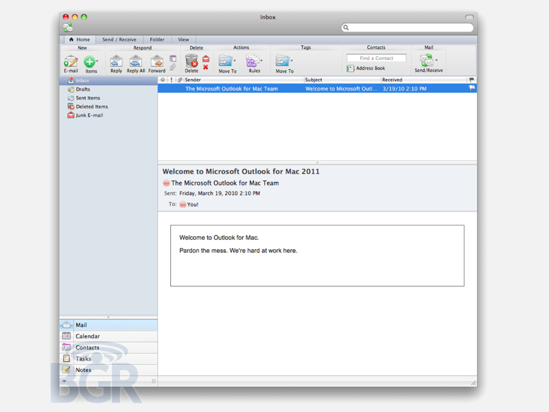
New Office 11 for Mac sports dense ribbons of buttons
Screenshots of Microsoft's 2011 version of its productivity suite for Mac have appeared, highlighting a more serious user interface appearance and the Vista Ribbon.
The screenshots, posted by BoyGeniusReport, present the new look of Word, Excel, PowerPoint, and the entirely new Outlook for Mac (with Exchange support) and separate Address Book, Notes, and Calendar apps.
Formerly, Office for Mac combined all messaging related features into Entourage, which has served as a second-rate equivalent to the Windows-only Outlook ever since Microsoft canceled its Mac Outlook client for Exchange nearly a decade ago.
Microsoft has since unbundled its "everything" Outlook strategy to deliver individual contact, email and calendar apps since Windows Vista, matching Apple's component app model for Mac OS X.
Using a toned down strip of buttons that drops the candy colored theme Office 2008, the upcoming Office 11 for Mac will incorporate a version of the Windows Vista-era "Ribbon" to present organize a huge array of options typically hidden away in standard menus.

The new UI (as demonstrated in Outlook 2011, above) incorporates more of Apple's standard human interface guidelines, in part because it now uses Cocoa, which makes it easier to deliver familiar feeling apps on the Mac than the legacy Carbon framework that Office was originally developed under decades ago.
Office 11 vs iWork 09
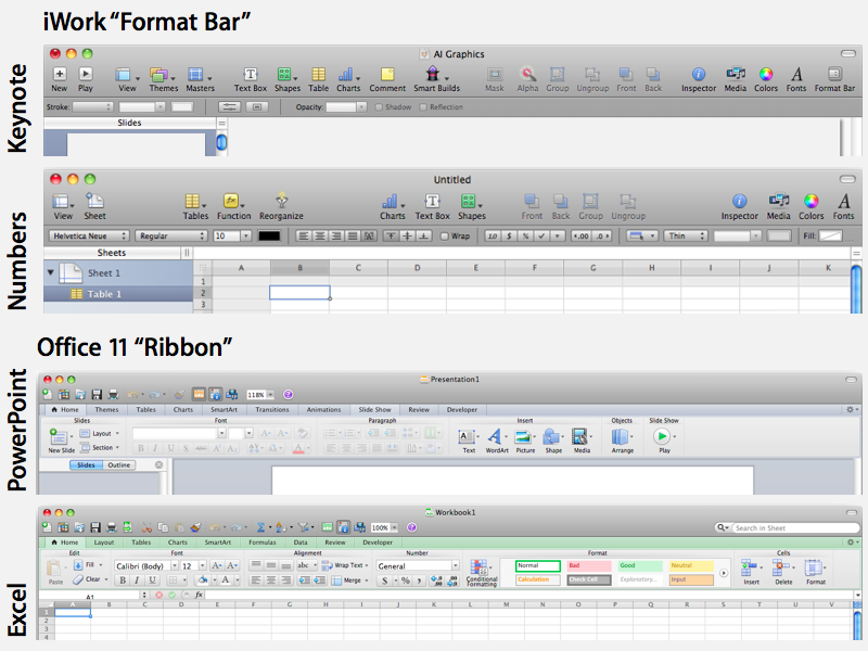
Still, Office 11 looks decidedly different than Apple's own iWork apps, which present a standard Mac OS X toolbar along with "Format Bar" of contextually relevant tools that change as different elements are selected.
The iWork apps also leave many minor options hidden within the standard Mac OS X menu bar, which Windows lacks (apps for Windows incorporate menu bars directly within their own window).
For the iPad, Apple adapted the user interface for iWork in such a way so as to present nearly all of the same features without requiring much in the way of relearning how to use it. Microsoft has not delivered a tablet version of Office, reportedly because of political and management issues flaring between the Office group and engineers working on Tablet PC.

The Office Ribbon
Starting with Vista, Microsoft added a "start button" and turned the standard Office menu bars into a Ribbon, which packed a dense number of options into a tight space, organized by feature.
The Ribbon feature has proven controversial, with Microsoft's supporters hailing it as the future of user interfaces, and its critics arguing that the move is simply an arbitrary change intended to derail any familiarity with (and therefore potential for competition from) its free OpenOffice doppelgnger.
Because the Mac version of Office doesn't need to incorporate the system menu bar within its own window, the idea of the Windows Ribbon makes less sense to Mac users, but the MacBU has created a Ribbon for the new Office suite that seems to work, even if it does consume a lot of screen real estate.
The screenshots, posted by BoyGeniusReport, present the new look of Word, Excel, PowerPoint, and the entirely new Outlook for Mac (with Exchange support) and separate Address Book, Notes, and Calendar apps.
Formerly, Office for Mac combined all messaging related features into Entourage, which has served as a second-rate equivalent to the Windows-only Outlook ever since Microsoft canceled its Mac Outlook client for Exchange nearly a decade ago.
Microsoft has since unbundled its "everything" Outlook strategy to deliver individual contact, email and calendar apps since Windows Vista, matching Apple's component app model for Mac OS X.
Using a toned down strip of buttons that drops the candy colored theme Office 2008, the upcoming Office 11 for Mac will incorporate a version of the Windows Vista-era "Ribbon" to present organize a huge array of options typically hidden away in standard menus.

The new UI (as demonstrated in Outlook 2011, above) incorporates more of Apple's standard human interface guidelines, in part because it now uses Cocoa, which makes it easier to deliver familiar feeling apps on the Mac than the legacy Carbon framework that Office was originally developed under decades ago.
Office 11 vs iWork 09
Still, Office 11 looks decidedly different than Apple's own iWork apps, which present a standard Mac OS X toolbar along with "Format Bar" of contextually relevant tools that change as different elements are selected.
The iWork apps also leave many minor options hidden within the standard Mac OS X menu bar, which Windows lacks (apps for Windows incorporate menu bars directly within their own window).
For the iPad, Apple adapted the user interface for iWork in such a way so as to present nearly all of the same features without requiring much in the way of relearning how to use it. Microsoft has not delivered a tablet version of Office, reportedly because of political and management issues flaring between the Office group and engineers working on Tablet PC.

The Office Ribbon
Starting with Vista, Microsoft added a "start button" and turned the standard Office menu bars into a Ribbon, which packed a dense number of options into a tight space, organized by feature.
The Ribbon feature has proven controversial, with Microsoft's supporters hailing it as the future of user interfaces, and its critics arguing that the move is simply an arbitrary change intended to derail any familiarity with (and therefore potential for competition from) its free OpenOffice doppelgnger.
Because the Mac version of Office doesn't need to incorporate the system menu bar within its own window, the idea of the Windows Ribbon makes less sense to Mac users, but the MacBU has created a Ribbon for the new Office suite that seems to work, even if it does consume a lot of screen real estate.

Comments
PS: Bring back my TabsOnTop in Safari.
But on the other hand on 16:10 the ribbon is still okay especially since it is easy to minimize it and it only shows when you actually need it and many things work with keyboard short cuts and the mouse menu. If you need the ribbon it is definitely better than all the old menus IMO. It makes it much easier to find your way in all those endless features MS office offers nowadays. I can work a lot faster with Office 2007 than I could with 2003 although feature wise they are pretty much the same. But accessibility changed a lot and the Office for Mac 2008 is IMHO a mess and sucks compared to the windows version (2007).
I never really understood why they made everything blue in Office 2007. 2010 changes this childish color theme, but besides this there is little GUI change.
This MAC Version is much better IMO than the old one but it waste more horizontal space than windows. If you hide the doc you still have the menu bar and the little gray title bar and than the office icon menu bar. A set up in Win7 with the thin taskbar saves a lot more space and offers the same functionality.
Screenshots of Microsoft's 2011 version of its productivity suite for Mac have appeared, highlighting a more serious user interface appearance and the Vista Ribbon.
...
Starting with Vista, Microsoft added a "start button" and turned the standard Office menu bars into a Ribbon, which packed a dense number of options into a tight space, organized by feature.
The Ribbon feature has proven controversial, with Microsoft's supporters hailing it as the future of user interfaces, and its critics arguing that the move is simply an arbitrary change intended to derail any familiarity with (and therefore potential for competition from) its free OpenOffice doppelgänger.
Because the Mac version of Office doesn't need to incorporate the system menu bar within its own window, the idea of the Windows Ribbon makes less sense to Mac users, but the MacBU has created a Ribbon for the new Office suite that seems to work, even if it does consume a lot of screen real estate.
[ View this article at AppleInsider.com ]
What the heck is a Vista Ribbon? The new menu bar appeared in Office 2007 for Windows not because the OS was Vista.
As far as not being necessaray to duplicate the ribbon on the Mac...
Would the average user want 2 different looks depending on which platform of Office you happen to be working on.
Terrible article that the writer is clearly not informed on the subject matter other than scamming info off of other review sites.
Good. They can keep it.
Don't use it then. You have a clear choice.
That ribbon is the sickest invention ever, I know several companies that have aborted the Office 2007 roll-out because of it, and even two that went back to 2003 after trying 2007 for months.
What the heck is a Vista Ribbon? The new menu bar appeared in Office 2007 for Windows not because the OS was Vista.
As far as not being necessaray to duplicate the ribbon on the Mac...
Would the average user want 2 different looks depending on which platform of Office you happen to be working on.
Terrible article that the writer is clearly not informed on the subject matter other than scamming info off of other review sites.
As usual you fail on every level, even attacking the author for your ignorance.
MS Office 2007 offered the Fluent user interface. This is similar in both appearance and functionality to the Windows Ribbon Framework, often referred to as Vista Ribbon because the minimum requirements were Windows Vista SP2.
- You can minimize the ribbon to gain back your space
- Office for Mac includes the menu's so you don't have to use the ribbon.
So this is the best of both worlds. Use menu's if you want. Use ribbon if you want. And we get Outlook and Office Communicator client. Along with SharePoint 2010 integration. These are all good things because these are becoming the standard tools out there. All of this means more Mac's being sold into more business environments.
DJ
As usual you fail on every level, even attacking the author for your ignorance.
MS Office 2007 offered the Fluent user interface. This is similar in both appearance and functionality to the Windows Ribbon Framework, often referred to as Vista Ribbon because the minimum requirements were Windows Vista SP2.
Do you ever get tired of being proved wrong?
http://office.microsoft.com/en-us/pr...668651033.aspx
" Note The 2007 Microsoft Office system programs client is a 32-bit application and can run on a Windows 64-bit platform (Windows XP, Windows Server 2003, and Windows Vista) but there may be some feature limitations as noted in the system requirements below."
I installed Office 2007 on my Mac running Vista in Bootcamp (I need it for my work), and I *hate* it. If Office 11 for Mac mimics Office 2007, I will think twice before I am going to purchase it.
Do you ever get tired of being proved wrong?
http://office.microsoft.com/en-us/pr...668651033.aspx
" Note The 2007 Microsoft Office system programs client is a 32-bit application and can run on a Windows 64-bit platform (Windows XP, Windows Server 2003, and Windows Vista) but there may be some feature limitations as noted in the system requirements below."
LEARN TO READ
What I wrote...What you wrote... * I used Comic Sans because your comical
LEARN TO READ
? MS Office 2007 = Fluent user interface » Is similar in both appearance and functionality to the Windows Ribbon Framework
? Windows Ribbon Framework (aka Vista Ribbon) = Minimum requirements is Windows Vista SP2
You are digging yourself in deeper with each posting. Quit while you are behind.
I'd give you a screen shot but have upgraded to Win 7 on all my computers.
http://en.wikipedia.org/wiki/Microsoft_Office_2007
Office 2007 contains a number of new features, the most notable of which is the entirely new graphical user interface called the Fluent User Interface[2] (initially referred to as the Ribbon User Interface), replacing the menus and toolbars ? which have been the cornerstone of Office since its inception ? with a tabbed toolbar, known as the Ribbon. Office 2007 requires Windows XP with Service Pack 2 or higher, Windows Server 2003 with Service Pack 1 or higher, Windows Vista or Windows 7.[3] Office 2007 is the last version of Microsoft Office available for Windows XP Professional x64 Edition.
The 'Ribbon User Interface' is a task-oriented Graphical User Interface (GUI). It features a central menu button, widely known as the 'Office Button'. The Ribbon Interface stayed in Microsoft Office 2010.
As far as not being necessaray to duplicate the ribbon on the Mac...
Would the average user want 2 different looks depending on which platform of Office you happen to be working on.
They should use the best interface for each OS - I don't know what that would mean for Windows, but for Mac they should use less horizontal real estate - for those of us who know what we're doing, let us get rid of the ribbon totally, and stock our toolbars with the tools we use, and have more space for the document itself. Oh wait, that was so 2004 - and that's why I haven't upgraded since then (and won't now).
Terrible article that the writer is clearly not informed on the subject matter other than scamming info off of other review sites.
You might consider that nobody has access to the software - somebody snuck out some screenshots, and that's it.
You are digging yourself in deeper with each posting. Quit while you are behind.
I'd give you a screen shot but have upgraded to Win 7 on all my computers.
http://en.wikipedia.org/wiki/Microsoft_Office_2007
Gobbledygook
How about a link from the company that actually made the Windows Ribbon Framework.Look at that, tou even got lucky because Microsoft even stats everything I previous stated all in one page as this is general knowledge for those that have a working knowledge of Windows.
Office 2008 - UI optimized for editing index cards.
Office 2011 - UI optimized for editing business cards.
Coming soon - Microsoft Post Office, perfect for stamps!
Would that the Democrats would pry MS apart with an antitrust crowbar, perhaps allowing some competition in a market that hasn't seen anything other beyond bland evolution and the cosmetic repackaging of the same features for decades.
Ditto Adobe. The only thing more bloated than these products is the complacency of the companies that produce them.
Does the program generate a little whirring/clicking noise, just for nostalgia's sake?
(C'mon, MacBU, it's Two Thousand And Ten already!)