iPhone X tips: Miss the home button? Here's how to add a virtual one

Posted:
in iPhone edited October 2020
The removal of the home button on the iPhone X is a bold decision by Apple, but some customers may find themselves pining for the way things once were. Thankfully, the home button is not gone entirely, as iOS allows you to add a customizable virtual one to your screen. AppleInsider explains how to do it.


AssistiveTouch is nothing new in iOS, and many users have taken advantage of this accessibility feature for years. But AssistiveTouch takes on a new role in the iPhone X, which lacks a home button in favor of a gesture-based home bar.

Using the home bar is an adjustment, and requires users to relearn how to interact with their iPhone. While most users will adapt, some may find themselves preferring the way things worked before.

Here's where AssistiveTouch fills that role: It not only allows you to have a home button-shaped virtual icon on the screen, but it can be customized to function just as the physical home button did before, including long pressing for Siri and double-pressing for multitasking.

To enable AssistiveTouch, open the Settings app and then navigate to General, then Accessibility, and scroll down to find AssistiveTouch. At the top, flip the switch to turn it on.


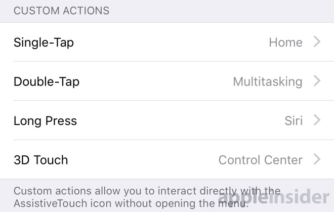
If you want it to work just like your old iPhone's home button, you'll need to dig into the custom actions. For Single-Tap, choose Home. For Double-Tap, select Multitasking. And for Long Press, choose Siri.

In addition, if you don't like the new location of Control Center (it's now accessed by swiping from the upper right corner), you can use AssistiveTouch to offer quick access to that, too. Under 3D Touch, choose Control Center, and then you'll be able to access it without having to swipe down from the top of the screen.


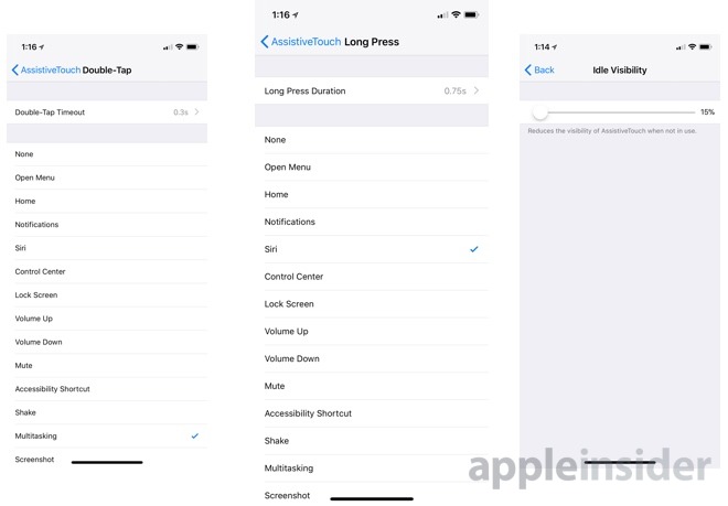
You can also adjust the opacity of the AssistiveTouch virtual home button so it's more subtle and does not obscure content as much. iOS 11 lets you reduce the visibility of AssistiveTouch to as little as 15 percent when not in use.

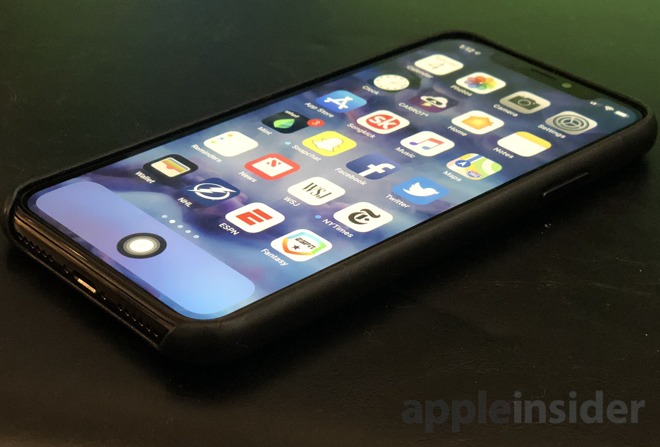
Finally, if you want your iPhone to function just as before, you'll want to press and hold on the AssistiveTouch button to drag it around. Place it at the bottom of the iPhone X display in the center, and you'll have a familiar experience. You can even leave the app dock empty so it doesn't obscure any apps on the home screen.

For more, see AppleInsider's ongoing iPhone X Tips series, some of which are featured below:

Got an iPhone X? Here are the tips and techniques you should know to get started

How to use animoji on Apple's iPhone X

How to invoke Control Center and Notification Center on iPhone X

How to enable and use Reachability on iPhone X

These low-cost wireless Qi chargers will juice your new iPhone X or iPhone 8
«1

Comments

  • Reply 1 of 25
    JFC_PAJFC_PA Posts: 932member
    I’ve used assistive touch for fast, convenient screenshots for a long time now. 

    Useful tool. 
    SpamSandwich
  • Reply 2 of 25
    wood1208wood1208 Posts: 2,913member
    If iPhone X and IOS 11, virtual home button appears under screen as picture and explanation suggested, it is like a home button under screen !!!. Tell you the truth, i played with iPhone X a bit and the black thin bar at the bottom for swipe up to get to the Home screen is awesome. I wish Apple just add that to the rest of iPhones so I don't have to click Home button to get to Home screen. Double tap to wake up screen and should do the same double tap where no apps are located to put the screen to sleep.
    edited November 2017 jmg8650rrrizejony0
  • Reply 3 of 25
    wood1208 said:
    If iPhone X and IOS 11, virtual home button appears under screen as picture and explanation suggested, it is like a home button under screen !!!. Tell you the truth, i played with iPhone X a bit and the black thin bar at the bottom for swipe up to get to the Home screen is awesome. I wish Apple just add that to the rest of iPhones so I don't have to click Home button to get to Home screen. Double tap to wake up screen and should do the same double tap where no apps are located to put the screen to sleep.
    I agree. I got used to the "home bar" after just a few hours yesterday.  I really like it.  But on another note, I don't know about the notch at top.  I've heard all kinds of reviews of people saying they don't even notice it, but my experience has been quite the opposite.  It really stands out like a swolen nose, especially when the screen is completely white like in iMessages, Mail, Contacts and I even notice it and cannot help but feel a bit annoyed by it when looking at video. ...sigh. Otherwise I love the size and feel and spped and I really like FaceID.  Still playing with it so will discover more - but the notch is a no-g0 for me.
    doozydozen
  • Reply 4 of 25
    nhughesnhughes Posts: 770editor
    wood1208 said:
    If iPhone X and IOS 11, virtual home button appears under screen as picture and explanation suggested, it is like a home button under screen !!!. Tell you the truth, i played with iPhone X a bit and the black thin bar at the bottom for swipe up to get to the Home screen is awesome. I wish Apple just add that to the rest of iPhones so I don't have to click Home button to get to Home screen. Double tap to wake up screen and should do the same double tap where no apps are located to put the screen to sleep.
    rrrize said:
    wood1208 said:
    If iPhone X and IOS 11, virtual home button appears under screen as picture and explanation suggested, it is like a home button under screen !!!. Tell you the truth, i played with iPhone X a bit and the black thin bar at the bottom for swipe up to get to the Home screen is awesome. I wish Apple just add that to the rest of iPhones so I don't have to click Home button to get to Home screen. Double tap to wake up screen and should do the same double tap where no apps are located to put the screen to sleep.
    I agree. I got used to the "home bar" after just a few hours yesterday.  I really like it.  But on another note, I don't know about the notch at top.  I've heard all kinds of reviews of people saying they don't even notice it, but my experience has been quite the opposite.  It really stands out like a swolen nose, especially when the screen is completely white like in iMessages, Mail, Contacts and I even notice it and cannot help but feel a bit annoyed by it when looking at video. ...sigh. Otherwise I love the size and feel and spped and I really like FaceID.  Still playing with it so will discover more - but the notch is a no-g0 for me.
    lightvox said:
    Nope.  Not for me.  Already used to not having a Home button after less than a day, and I prefer not having a home button now.  Much easier using the phone one-handed without a home button.

    Notch is also fine and doesn't bother me one bit.  Now that I've had the phone, I realized that without the notch, and with no home button, it would be really difficult to tell which side is top or bottom.  The notch helps me easily orient the phone.
    I'm very happy with the home bar and swipe gesture, but I hate, hate, hate the new multitasking view/interface. The app icons/windows feel unwieldy, like they are slipping on ice when I interact with them, not quite doing what I want. I also find myself instinctively wanting to swipe up to force close, even though that no longer works. And force closing is now done by long pressing and tapping a tiny icon, which takes longer and is less convenient.

    I wonder if Apple did this to discourage people from the bad habit of needlessly and obsessively force closing all of their apps.

    Either way, I think it's a step backwards. Hopefully a future iOS update brings back swiping up to force close. Apple actually did something similar already with the iPad multitasking/control center view on iOS 11. Early betas required a long press and icon tap to close, but later betas (and the eventual final release) brought back swipe up to force close.

    Regardless, swiping up to return home is great. And left and right to jump between apps is a pleasure too. But the rest of the multitasking experience, not so much.
    SpamSandwichwaverboydoozydozenjony0
  • Reply 5 of 25
    dysamoriadysamoria Posts: 3,430member
    Anyone know anyone using this as their first iOS experience?
  • Reply 6 of 25
    cgWerkscgWerks Posts: 2,952member
    Great tip, especially about clearing out the home bar and replacing it with the virtual button. I'm safe for now (with my SE) but suppose it's inevitable that if I stick with the platform, I'll eventually have no home button.

    I used to use the virtual home button on an iPod touch that had the button going bad on it. I found it got in the way a heck of a lot too, though. Not sure if it is improved for iOS 10/11.
    nhughes said:
    I also find myself instinctively wanting to swipe up to force close, even though that no longer works. And force closing is now done by long pressing and tapping a tiny icon, which takes longer and is less convenient.

    I wonder if Apple did this to discourage people from the bad habit of needlessly and obsessively force closing all of their apps.
    I'm not sure it's really bad habit though. Unless you set all the 'background' settings properly, and the apps are all written perfectly, killing them off is more simple and reliable. The whole idea that you don't have to do this, IMO, is an 'on paper' but not reality kind of thing. Plus, with more apps being given permission to use mic, camera, location, etc. in the background... having any such apps not running any more than necessary is also a privacy thing.
    edited November 2017 mike1h2p
  • Reply 7 of 25
    wood1208wood1208 Posts: 2,913member
    You don't even notice notch unless some one points at it or when background is white. So, notch debate will die. Users will like swipe up for Home screen as it helps in part one handed handling. Double tap for screen wake up is good but same for screen sleep would be even better. Good to have but not sure how virtual Home button easier than gesture control.
  • Reply 8 of 25
    cgWerkscgWerks Posts: 2,952member
    wood1208 said:
    You don't even notice notch unless some one points at it or when background is white. So, notch debate will die. Users will like swipe up for Home screen as it helps in part one handed handling. Double tap for screen wake up is good but same for screen sleep would be even better. Good to have but not sure how virtual Home button easier than gesture control.
    Don't you have to swipe up from the bottom edge (off-screen)? I find it hard enough to do on my iPhone SE to bring up Control Center, especially one-handed, as to do so you have to hold it in a way that would make it easy to drop. I'd think this would be even harder with the X, having to get even further down right to the bottom edge. This puts the control back on-screen in a somewhat more natural spot (I suppose the more towards middle, the more natural in terms of reach alone).
  • Reply 9 of 25
    rolsrols Posts: 68member
    lightvox said:
    Nope.  Not for me.  Already used to not having a Home button after less than a day, and I prefer not having a home button now.  Much easier using the phone one-handed without a home button.

    Notch is also fine and doesn't bother me one bit.  Now that I've had the phone, I realized that without the notch, and with no home button, it would be really difficult to tell which side is top or bottom.  The notch helps me easily orient the phone.
    I'm the same - I haven't looked back. Added the option for 'reachability' so I can continue with one hand use. The interface is now much more like that on the recent iPad, with swipe from bottom, and I much prefer it in every way. When looking at my iPad yesterday I was thinking how easy it would be to fit the face ID into it and get rid of the large top and bottom bezels, the old home button already looked clunky. 

    Very happy with the X. 
  • Reply 10 of 25
    nhughes said:
    wood1208 said:
    If iPhone X and IOS 11, virtual home button appears under screen as picture and explanation suggested, it is like a home button under screen !!!. Tell you the truth, i played with iPhone X a bit and the black thin bar at the bottom for swipe up to get to the Home screen is awesome. I wish Apple just add that to the rest of iPhones so I don't have to click Home button to get to Home screen. Double tap to wake up screen and should do the same double tap where no apps are located to put the screen to sleep.
    rrrize said:
    wood1208 said:
    If iPhone X and IOS 11, virtual home button appears under screen as picture and explanation suggested, it is like a home button under screen !!!. Tell you the truth, i played with iPhone X a bit and the black thin bar at the bottom for swipe up to get to the Home screen is awesome. I wish Apple just add that to the rest of iPhones so I don't have to click Home button to get to Home screen. Double tap to wake up screen and should do the same double tap where no apps are located to put the screen to sleep.
    I agree. I got used to the "home bar" after just a few hours yesterday.  I really like it.  But on another note, I don't know about the notch at top.  I've heard all kinds of reviews of people saying they don't even notice it, but my experience has been quite the opposite.  It really stands out like a swolen nose, especially when the screen is completely white like in iMessages, Mail, Contacts and I even notice it and cannot help but feel a bit annoyed by it when looking at video. ...sigh. Otherwise I love the size and feel and spped and I really like FaceID.  Still playing with it so will discover more - but the notch is a no-g0 for me.
    lightvox said:
    Nope.  Not for me.  Already used to not having a Home button after less than a day, and I prefer not having a home button now.  Much easier using the phone one-handed without a home button.

    Notch is also fine and doesn't bother me one bit.  Now that I've had the phone, I realized that without the notch, and with no home button, it would be really difficult to tell which side is top or bottom.  The notch helps me easily orient the phone.
    I'm very happy with the home bar and swipe gesture, but I hate, hate, hate the new multitasking view/interface. The app icons/windows feel unwieldy, like they are slipping on ice when I interact with them, not quite doing what I want. I also find myself instinctively wanting to swipe up to force close, even though that no longer works. And force closing is now done by long pressing and tapping a tiny icon, which takes longer and is less convenient.

    I wonder if Apple did this to discourage people from the bad habit of needlessly and obsessively force closing all of their apps.

    Either way, I think it's a step backwards. Hopefully a future iOS update brings back swiping up to force close. Apple actually did something similar already with the iPad multitasking/control center view on iOS 11. Early betas required a long press and icon tap to close, but later betas (and the eventual final release) brought back swipe up to force close.

    Regardless, swiping up to return home is great. And left and right to jump between apps is a pleasure too. But the rest of the multitasking experience, not so much.
    After long pressing the first open app in the multitasking view, you can force close by swiping up instead of pressing the little red icon.
    h2p
  • Reply 11 of 25
    wood1208 said:
    You don't even notice notch unless some one points at it or when background is white. So, notch debate will die.
    Sadly, for the multitudes of Apple Haters out there, the 'notch' is just another thing to sling back at Apple. Like 'you are holding it wrong', non repacable battery, no SD Card and more recently, the headphone socket it will be used all over the internet to reinforce the deficiencies of the iPhone as compared to their beloved Android.
  • Reply 12 of 25
    nhughes said:
    wood1208 said:
    If iPhone X and IOS 11, virtual home button appears under screen as picture and explanation suggested, it is like a home button under screen !!!. Tell you the truth, i played with iPhone X a bit and the black thin bar at the bottom for swipe up to get to the Home screen is awesome. I wish Apple just add that to the rest of iPhones so I don't have to click Home button to get to Home screen. Double tap to wake up screen and should do the same double tap where no apps are located to put the screen to sleep.
    rrrize said:
    wood1208 said:
    If iPhone X and IOS 11, virtual home button appears under screen as picture and explanation suggested, it is like a home button under screen !!!. Tell you the truth, i played with iPhone X a bit and the black thin bar at the bottom for swipe up to get to the Home screen is awesome. I wish Apple just add that to the rest of iPhones so I don't have to click Home button to get to Home screen. Double tap to wake up screen and should do the same double tap where no apps are located to put the screen to sleep.
    I agree. I got used to the "home bar" after just a few hours yesterday.  I really like it.  But on another note, I don't know about the notch at top.  I've heard all kinds of reviews of people saying they don't even notice it, but my experience has been quite the opposite.  It really stands out like a swolen nose, especially when the screen is completely white like in iMessages, Mail, Contacts and I even notice it and cannot help but feel a bit annoyed by it when looking at video. ...sigh. Otherwise I love the size and feel and spped and I really like FaceID.  Still playing with it so will discover more - but the notch is a no-g0 for me.
    lightvox said:
    Nope.  Not for me.  Already used to not having a Home button after less than a day, and I prefer not having a home button now.  Much easier using the phone one-handed without a home button.

    Notch is also fine and doesn't bother me one bit.  Now that I've had the phone, I realized that without the notch, and with no home button, it would be really difficult to tell which side is top or bottom.  The notch helps me easily orient the phone.
    I'm very happy with the home bar and swipe gesture, but I hate, hate, hate the new multitasking view/interface. The app icons/windows feel unwieldy, like they are slipping on ice when I interact with them, not quite doing what I want. I also find myself instinctively wanting to swipe up to force close, even though that no longer works. And force closing is now done by long pressing and tapping a tiny icon, which takes longer and is less convenient.

    I wonder if Apple did this to discourage people from the bad habit of needlessly and obsessively force closing all of their apps.

    Either way, I think it's a step backwards. Hopefully a future iOS update brings back swiping up to force close. Apple actually did something similar already with the iPad multitasking/control center view on iOS 11. Early betas required a long press and icon tap to close, but later betas (and the eventual final release) brought back swipe up to force close.

    Regardless, swiping up to return home is great. And left and right to jump between apps is a pleasure too. But the rest of the multitasking experience, not so much.
    Those instinctual muscle memory actions that have been built up, for almost a decade now for some, are not easily or quickly forgotten or changed.
    dysamoria
  • Reply 13 of 25
    kevin keekevin kee Posts: 1,289member
    I am also very happy with the X. The new gesture feels organic and second nature-ly to me. I don't miss the button at all. I can see future iPhone will be all screen with no buttons whatsoever. Gesture, 3D touch, AI for predicting actions, are going to stay far to the future.
  • Reply 14 of 25
    ben20ben20 Posts: 126member
    Getting rid of the home button was a wonderful idea! The X is an awesome phone! Great job Apple!
  • Reply 15 of 25
    dysamoriadysamoria Posts: 3,430member
    Since no one has answered my prior inquiry, how about this one: how does this change improve user interaction? Does it reduce required motions or reduce the memorization of gestures or actions?
  • Reply 16 of 25
    cgWerkscgWerks Posts: 2,952member
    rotateleftbyte said:
    Sadly, for the multitudes of Apple Haters out there, the 'notch' is just another thing to sling back at Apple. Like 'you are holding it wrong', non repacable battery, no SD Card and more recently, the headphone socket it will be used all over the internet to reinforce the deficiencies of the iPhone as compared to their beloved Android.
    The Apple haters are always going to find things to pick at Apple about, whether relevant or not. I'd just ignore them for the most part (been doing so myself for 30 years+). But your list there is a mixed bag. Some of those things are good moves, some necessary, others are more problematic. Whether one can get used to, or deal with something, though, isn't the same thing as whether something was actually a good (user beneficial) move or good UX/UI. Sometimes the haters are right, even if they don't know why.

    SpamSandwich said:
    Those instinctual muscle memory actions that have been built up, for almost a decade now for some, are not easily or quickly forgotten or changed.
    Besides that, it seems like an awkward move to relearn. It's one thing with an iPad, as you're using it two-handed minimally (or on your lap, or propped up on a table, etc.). Trying to swipe up from the bottom edge of something your holding the size of an X seems difficult or even dangerous (i.e.: dropping). I've tried with my SE and my wife's 7, and I don't see how I'd like it on the X better. Do non-hand-sized iPhone users just all use two hands for everything now?

    And, if the iPad had it, but iPhones haven't until now, why? When I bought my iPhone, I was a bit surprised I couldn't do that. I'm guessing Apple didn't think it was good UI? Or, they just never got around to adding that feature from the iPad to the iPhone?

    dysamoria said:
    Since no one has answered my prior inquiry, how about this one: how does this change improve user interaction? Does it reduce required motions or reduce the memorization of gestures or actions?
    I think the improvement is that it increases screen size. While I don't have one, it seems like it complicates required motions and memorization of gestures. They made the decision that was an acceptable tradeoff.

    But, I suppose to be fair to them... UX isn't always something in isolation. I just read a rather silly UX article complaining about how passwords and security work on the Web, where their suggested course of action (purely improving UI from the user standpoint) would make sites horribly insecure. But, that would... on the whole... create a degraded UX. So, it could be argued, I suppose, that having a bigger screen is more important in the UX big-picture, than following best or most optimal UI practices. I don't necessarily agree with Apple here, but it's possible their logic ran along those lines. My fear, though, is that it ran more along the lines of a decision from the marketing department.
    edited November 2017
  • Reply 17 of 25
    StrangeDaysStrangeDays Posts: 12,876member
    rrrize said:
    wood1208 said:
    If iPhone X and IOS 11, virtual home button appears under screen as picture and explanation suggested, it is like a home button under screen !!!. Tell you the truth, i played with iPhone X a bit and the black thin bar at the bottom for swipe up to get to the Home screen is awesome. I wish Apple just add that to the rest of iPhones so I don't have to click Home button to get to Home screen. Double tap to wake up screen and should do the same double tap where no apps are located to put the screen to sleep.
    I agree. I got used to the "home bar" after just a few hours yesterday.  I really like it.  But on another note, I don't know about the notch at top.  I've heard all kinds of reviews of people saying they don't even notice it, but my experience has been quite the opposite.  It really stands out like a swolen nose, especially when the screen is completely white like in iMessages, Mail, Contacts and I even notice it and cannot help but feel a bit annoyed by it when looking at video. ...sigh. Otherwise I love the size and feel and spped and I really like FaceID.  Still playing with it so will discover more - but the notch is a no-g0 for me.
    I don’t notice it when I’m reading the content of my screen instead of looking for a silhouette. I’ve spent exactly no time annoyed or distraught by it. 

    How is it you see it during a video when videos by default don’t zoom in to take the whole screen? I never zoomed in my videos on older phones because it clips the edges of the video content, so why would I start now??
    edited November 2017
  • Reply 18 of 25
    StrangeDaysStrangeDays Posts: 12,876member
    nhughes said:
    wood1208 said:
    If iPhone X and IOS 11, virtual home button appears under screen as picture and explanation suggested, it is like a home button under screen !!!. Tell you the truth, i played with iPhone X a bit and the black thin bar at the bottom for swipe up to get to the Home screen is awesome. I wish Apple just add that to the rest of iPhones so I don't have to click Home button to get to Home screen. Double tap to wake up screen and should do the same double tap where no apps are located to put the screen to sleep.
    rrrize said:
    wood1208 said:
    If iPhone X and IOS 11, virtual home button appears under screen as picture and explanation suggested, it is like a home button under screen !!!. Tell you the truth, i played with iPhone X a bit and the black thin bar at the bottom for swipe up to get to the Home screen is awesome. I wish Apple just add that to the rest of iPhones so I don't have to click Home button to get to Home screen. Double tap to wake up screen and should do the same double tap where no apps are located to put the screen to sleep.
    I agree. I got used to the "home bar" after just a few hours yesterday.  I really like it.  But on another note, I don't know about the notch at top.  I've heard all kinds of reviews of people saying they don't even notice it, but my experience has been quite the opposite.  It really stands out like a swolen nose, especially when the screen is completely white like in iMessages, Mail, Contacts and I even notice it and cannot help but feel a bit annoyed by it when looking at video. ...sigh. Otherwise I love the size and feel and spped and I really like FaceID.  Still playing with it so will discover more - but the notch is a no-g0 for me.
    lightvox said:
    Nope.  Not for me.  Already used to not having a Home button after less than a day, and I prefer not having a home button now.  Much easier using the phone one-handed without a home button.

    Notch is also fine and doesn't bother me one bit.  Now that I've had the phone, I realized that without the notch, and with no home button, it would be really difficult to tell which side is top or bottom.  The notch helps me easily orient the phone.
    And force closing is now done by long pressing and tapping a tiny icon, which takes longer and is less convenient.

    I wonder if Apple did this to discourage people from the bad habit of needlessly and obsessively force closing all of their apps.

    Either way, I think it's a step backwards. Hopefully a future iOS update brings back swiping up to force close. 
    But why? Craig said you don't need to force quit every app the way you see clueless people compulsively do. Kernel engineers have commented on Gruber's twitter to say the same. The times you really need to force quit apps are rare, thus it's not needed to have a speed technique to do so, and in fact having one actually is detrimental to users and the system due to full re-launches using more processing and thus more power. So it sounds like the right decision to me.
  • Reply 19 of 25
    StrangeDaysStrangeDays Posts: 12,876member

    cgWerks said:

    nhughes said:
    I also find myself instinctively wanting to swipe up to force close, even though that no longer works. And force closing is now done by long pressing and tapping a tiny icon, which takes longer and is less convenient.

    I wonder if Apple did this to discourage people from the bad habit of needlessly and obsessively force closing all of their apps.
    I'm not sure it's really bad habit though. Unless you set all the 'background' settings properly, and the apps are all written perfectly, killing them off is more simple and reliable. The whole idea that you don't have to do this, IMO, is an 'on paper' but not reality kind of thing. Plus, with more apps being given permission to use mic, camera, location, etc. in the background... having any such apps not running any more than necessary is also a privacy thing.
    You may not be sure, but Craig Federighi, head of software engineering, is sure. It's been explained many times. All apps (with the exception of select process types like GPS and music) go into a suspended state after a short time. This is done by iOS, not the app devs. Their states are frozen to the file system, and when you come back they are unfrozen to resume operations. Killing the app forces it to restart from full stop, which takes more processing/energy to accomplish. It's akin to shutting off you car engine at every stop sign -- sorta makes sense, but is actually stupid. 

    iOS engineers have chimed in the same on John Gruber's twitter. There's no ambiguity about it. And no, apps cannot use the camera from the background, your privacy concerns are just FUD.
    edited November 2017 h2p
  • Reply 20 of 25
    StrangeDaysStrangeDays Posts: 12,876member

    cgWerks said:
    wood1208 said:
    You don't even notice notch unless some one points at it or when background is white. So, notch debate will die. Users will like swipe up for Home screen as it helps in part one handed handling. Double tap for screen wake up is good but same for screen sleep would be even better. Good to have but not sure how virtual Home button easier than gesture control.
    Don't you have to swipe up from the bottom edge (off-screen)? I find it hard enough to do on my iPhone SE to bring up Control Center, especially one-handed, as to do so you have to hold it in a way that would make it easy to drop. I'd think this would be even harder with the X, having to get even further down right to the bottom edge. This puts the control back on-screen in a somewhat more natural spot (I suppose the more towards middle, the more natural in terms of reach alone).
    No, it's not a swipe from off-screen. There's a section of the screen at the bottom that is dedicated to the Home Indicator, that you "grab" and drag up. It's easier that the old control center gesture.

    Also, it's actually a single tap to wake from sleep, assuming you didn't use raise-to-wake.
    edited November 2017
Sign In or Register to comment.