How to quickly request the desktop version of a website on your iPhone

Posted:
in iOS edited October 2020
Need to access the desktop version of a website instead of the mobile-friendly version from your iPhone? AppleInsider shares two quick tricks to order your iOS devices to show the full version of sites in Safari, regardless of the screen size.


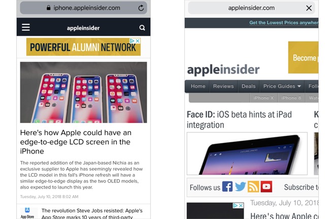
At a time when more and more people use smartphones and tablets to go online, many websites have adapted to the wide variety of screen sizes by using responsive design, allowing for the experience to be relatively close to the full page version, as seen in web browsers on Mac desktops and PCs.

Not all sites go down this route, and instead funnel iPhone users towards a mobile-friendly version of the website. Typically produced to offer the essential elements of the web page but on a narrower display, these versions are optimized to use small amounts of data and to make it readable in a compact display, and in some cases can perform a lot better than the responsive design version.

That being said, there's sometimes a need for an iPhone user to break from the constraints of the mobile site and instead view the desktop version. For example, some features available in the full page may not be offered in the mobile site.

To make it easy for users needing to view the desktop site, Apple has added ways to force it to load in Safari, instead of taking users to the mobile-friendly variant.

Method 1: Reload Icon

Start off by loading the relevant website in Safari, then once it's completed loading the mobile site, hold down the refresh icon in the URL bar, at the top right corner of the screen.


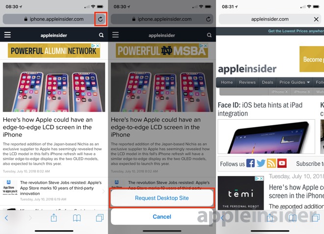
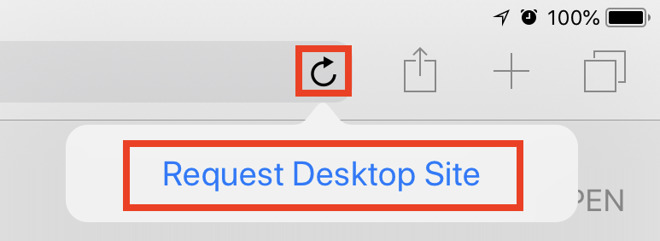
For iPhone users, this will bring up buttons at the bottom of the screen, offering to Request Desktop Site or to Cancel the request. Select Request Desktop Site.

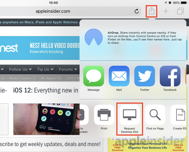
The same thing can also be requested on the iPad, but instead of appearing at the bottom of the screen, there is instead a pop-up button for Request Desktop Site that appears just below the refresh icon. Tap Request Desktop Site.


In either case, Safari will reload the page to display the desktop version of the website. Depending on the site's width, users may need to scroll sideways in order to see the complete page, even if the iPhone is turned to a landscape orientation.

Method 2: Sharing Menu

As before, enter Safari and load up the page you want to view.

On iPhone, scroll up or tap the top bar to bring up the bottom menu bar, and select the Share icon. In the Share menu, scroll along the bottom grey-and-white icons to find Request Desktop Site, and select it.


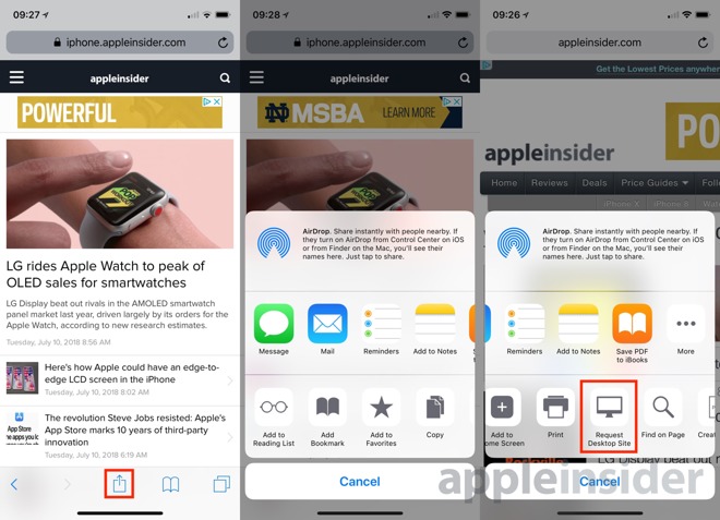
On iPad, the same icon is just to the right of the Reload icon, in the top-right corner. Navigate to the same section within the menu, and tap Request Desktop Site.


Further notes

If you request the non-mobile version of a website, Safari will retain your preferences, and will always request that version in the future. Bear this in mind before selecting the option.
«1

Comments

  • Reply 1 of 22
    sflagelsflagel Posts: 805member
    Interesting (not). What I'd really like to know is how to access the desktop site on a MacBook Air as it keeps loading the Facebook mobile site!
  • Reply 2 of 22
    Mike WuertheleMike Wuerthele Posts: 6,861administrator
    sflagel said:
    Interesting (not). What I'd really like to know is how to access the desktop site on a MacBook Air as it keeps loading the Facebook mobile site!
    Does this happen even if you type the full url, as in https://www.facebook.com or just when you type facebook in the URL bar?
  • Reply 3 of 22
    riverkoriverko Posts: 222member
    It happens very often that I request the desktop version of a site and still get served with mobile version. Which is often very annoying and i didn’t find any way how to fix this...
    zeus423jahbladetallest skil
  • Reply 4 of 22
    Mike WuertheleMike Wuerthele Posts: 6,861administrator
    riverko said:
    It happens very often that I request the desktop version of a site and still get served with mobile version. Which is often very annoying and i didn’t find any way how to fix this...
    If the mobile version still gets served after the request, then the web developers from that site are not adhering to standards. You'll need to take it up with them, I'm afraid.
    riverkojahbladedysamoria
  • Reply 5 of 22
    sflagelsflagel Posts: 805member
    riverko said:
    It happens very often that I request the desktop version of a site and still get served with mobile version. Which is often very annoying and i didn’t find any way how to fix this...
    If the mobile version still gets served after the request, then the web developers from that site are not adhering to standards. You'll need to take it up with them, I'm afraid.
    OK, I'll call Facebook and see if I cans peak to their head of development. No seriously, I think it is the way Safari remembers Favourites; if you use a website often on a mobile device, it put the mobile url in Favourites; which also brings it up when you just type "facebook" in the URL window..
  • Reply 6 of 22
    flydogflydog Posts: 1,123member
    The request desktop site button might as well not exist given that it works maybe one time out of a hundred.
  • Reply 7 of 22
    zeus423zeus423 Posts: 240member
    While the request button doesn't always work, I appreciate the article since I knew the second method but not the first. Thanks for the tip!
    retrogusto
  • Reply 8 of 22
    flydogflydog Posts: 1,123member
    riverko said:
    It happens very often that I request the desktop version of a site and still get served with mobile version. Which is often very annoying and i didn’t find any way how to fix this...
    If the mobile version still gets served after the request, then the web developers from that site are not adhering to standards. You'll need to take it up with them, I'm afraid.
    It has nothing to do with adhering to standards. There is no web standard for honoring "request desktop site."  All that button does is change the user agent in the mobile browser to a desktop use agent.  But these days most websites are optimized for devices based on the detected screen width and device orientation, not on the user agent, which is the correct way to implement the behavior.
    minicoffee
  • Reply 9 of 22
    irelandireland Posts: 17,798member

    Further notes

    If you request the non-mobile version of a website, Safari will retain your preferences, and will always request that version in the future. Bear this in mind before selecting the option.
    Safari needs an option on that button to return to the mobile version of the site. And I'd love if Safari could force the desktop version if you request it, as several website will ignore your request.
    edited July 2018 jahbladeretrogustominicoffee
  • Reply 10 of 22
    irelandireland Posts: 17,798member

    flydog said:
    riverko said:
    It happens very often that I request the desktop version of a site and still get served with mobile version. Which is often very annoying and i didn’t find any way how to fix this...
    If the mobile version still gets served after the request, then the web developers from that site are not adhering to standards. You'll need to take it up with them, I'm afraid.
    It has nothing to do with adhering to standards. There is no web standard for honoring "request desktop site."  All that button does is change the user agent in the mobile browser to a desktop use agent.  But these days most websites are optimized for devices based on the detected screen width and device orientation, not on the user agent, which is the correct way to implement the behavior.
    Interesting. I'm sure Apple could trick the site into displaying the desktop site, no?
    edited July 2018
  • Reply 11 of 22
    maltzmaltz Posts: 454member
    flydog said:
    riverko said:
    It happens very often that I request the desktop version of a site and still get served with mobile version. Which is often very annoying and i didn’t find any way how to fix this...
    If the mobile version still gets served after the request, then the web developers from that site are not adhering to standards. You'll need to take it up with them, I'm afraid.
    It has nothing to do with adhering to standards. There is no web standard for honoring "request desktop site."  All that button does is change the user agent in the mobile browser to a desktop use agent.  But these days most websites are optimized for devices based on the detected screen width and device orientation, not on the user agent, which is the correct way to implement the behavior.
    No it isn't. Resolution (well, width) helps determine how you flow the page, but it isn't how you determine whether you're displaying on a 20" screen or a 5" touch screen. I don't see how orientation comes into play at all. I have a 27" monitor that's in portrait, but I sure don't want the mobile layout on there!

    The most reliable way to know if you're displaying on a mobile device is the user agent. And it's also the "standard" (as in normal, conventional, most used, and for that matter, only) method by which users are able to request the desktop version of the site, unless your intent is to ignore such requests and shove the format you decree down their throats.
    edited July 2018 StrangeDaysmuthuk_vanalingam
  • Reply 12 of 22
    StrangeDaysStrangeDays Posts: 12,876member
    Sure would be swell if AI had a cookie-able preference toggle to allow users on iPhone to *always* get the desktop version instead of the mobile version.

    The problem? The mobile version doesn't display the comments count on the stories on the front page. The comments are most of the value for me, so it's mandatory to switch to desktop-mode to see the comment counts.
  • Reply 13 of 22
    StrangeDaysStrangeDays Posts: 12,876member

    sflagel said:
    riverko said:
    It happens very often that I request the desktop version of a site and still get served with mobile version. Which is often very annoying and i didn’t find any way how to fix this...
    If the mobile version still gets served after the request, then the web developers from that site are not adhering to standards. You'll need to take it up with them, I'm afraid.
    OK, I'll call Facebook and see if I cans peak to their head of development. No seriously, I think it is the way Safari remembers Favourites; if you use a website often on a mobile device, it put the mobile url in Favourites; which also brings it up when you just type "facebook" in the URL window..
    No, the issue is some websites insist on serving the mobile version even when you use this feature in Safari. It's not Apple, it's the site.
  • Reply 14 of 22
    StrangeDaysStrangeDays Posts: 12,876member

    Further notes

    If you request the non-mobile version of a website, Safari will retain your preferences, and will always request that version in the future. Bear this in mind before selecting the option.
    Not in my experience with this very website -- when browsing on my iPhone, many times a week I have to use the technique to re-request the desktop version and get off the mobile version. 
  • Reply 15 of 22
    volcanvolcan Posts: 1,799member
    flydog said:
    It has nothing to do with adhering to standards. There is no web standard for honoring "request desktop site."  All that button does is change the user agent in the mobile browser to a desktop use agent.  But these days most websites are optimized for devices based on the detected screen width and device orientation, not on the user agent, which is the correct way to implement the behavior.
    This is correct. I am a web programmer and I find it annoying when developers constrain the viewport size for iPhone. It is better if the the page loaded initially to the viewport size but allowed you to zoom. Responsive layout design is clever but a nuisance sometimes. My vision is not that great and I want to zoom in order to read the small text.
    StrangeDays
  • Reply 16 of 22
    bonobobbonobob Posts: 382member
     When you request the desktop site, it sticks to the tab to which you applied it.  If you open the site in a new tab, you will get the mobile site.
    unbeliever2
  • Reply 17 of 22
    dysamoriadysamoria Posts: 3,430member
    sflagel said:
    riverko said:
    It happens very often that I request the desktop version of a site and still get served with mobile version. Which is often very annoying and i didn’t find any way how to fix this...
    If the mobile version still gets served after the request, then the web developers from that site are not adhering to standards. You'll need to take it up with them, I'm afraid.
    OK, I'll call Facebook and see if I cans peak to their head of development. No seriously, I think it is the way Safari remembers Favourites; if you use a website often on a mobile device, it put the mobile url in Favourites; which also brings it up when you just type "facebook" in the URL window..
    Facebook is just garbage. Seriously one of the most broken user experiences I have regularly.

    there are other sites that fail to respond to the desktop version request, too.

    and then there are the websites that are so slow that they're useable. Like twitter currently. 
  • Reply 18 of 22
    SpamSandwichSpamSandwich Posts: 33,407member
    Burns me up that I was not aware of that hidden reload icon function.
    edited July 2018
  • Reply 19 of 22
    irelandireland Posts: 17,798member
    Burns me up that I was not aware of that hidden reload icon function.
    It’s funny how being aware I just presume everyone else is. Muscle memory at this point.
  • Reply 20 of 22
    tallest skiltallest skil Posts: 43,388member
    How about a setting to FORCIBLY, ALWAYS LOAD THE DESKTOP SITE, Apple? The iPhone was created to dispense with the “baby Internet” as Steve called it. Instead we’ve seen mobile sites explode.
    SpamSandwich
Sign In or Register to comment.