Hands on look at everything new in macOS Big Sur

Apple has finally injected the Mac with new life as part of a radical overhaul and feature set infusion set to arrive with macOS Big Sur. We took the first beta for a spin to see how it all plays out.

It is immediately noticeable, right from the initial boot, that macOS Big Sur has a wholly refreshed design. It's clean, bright, and consistent, and jibes with similar designs tweaks seen on iOS and iPadOS.
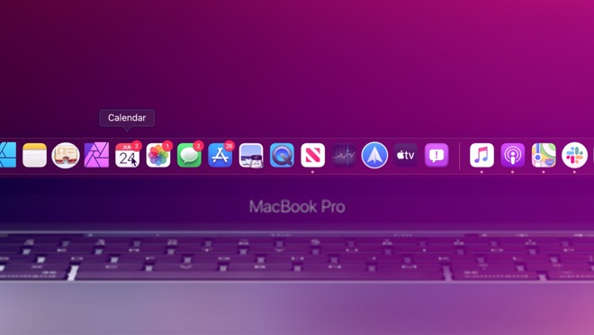
You can see it in the new dock that is full of rich new icons. Some icons look a bit off -- such as Quicktime that just stuck a Quicktime "Q" on a blue background -- but many of the icons look great.
The menu bar is translucent and blends into the background. This looks great though the translucency may cause legibility issues for those with impaired vision. The menu bar to the right with all of your status icons is enhanced as well.
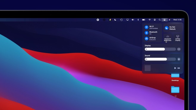
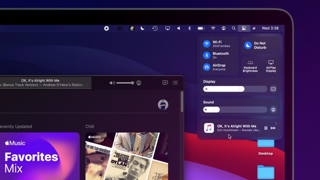
Menu bar items like volume, AirPlay, Wi-Fi, have all gotten a new look that feels much more in line with what was offered by iPhones and iPads. Much has been tucked into a new feature for Mac -- Control Center. Control Center houses Wi-Fi, Bluetooth, AirPlay, and many other common utilities. This helps remove clutter from the menu bar itself, but if you do want to keep them in your menu bar, they can just be dragged right to where you'd like.
Many apps have new looks as well. They come with full-height sidebars and new icons from SF Symbols 2 which was ported from iOS and again, makes everything more consistent.
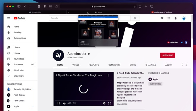
It has a clean interface with a new customizable start page that can be tailored to your liking. Tabs are more user-friendly and accessible with better icons and previews whenever they are hovered over.
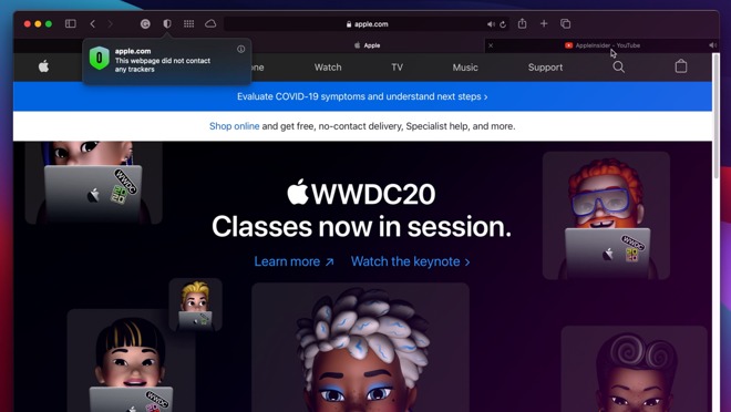
Safari has a new feature called Privacy Report which, when clicked on when visiting a website, will let you know how many trackers were encountered and if they were stopped using Safari's cross-site tracking.
Safari also has password monitoring, built in translation for web pages, and more.
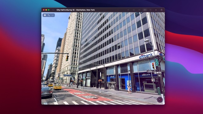
Maps not only looks better but includes cycle routing, EV vehicle routing with charging locations, curated guides, Look Around, and indoor maps for airports and malls.
Messages is nearly on par with its iPhone and iPad counterparts in Big Sur, too. Up to nine conversations can be pinned on the left side bar making them much more easy keep track of. Search is also robust and works much better than it did in previous version of macOS. These changes are very welcome.
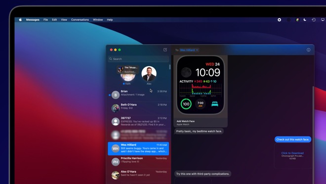
Group conversations can be named, have an image assigned, feature mentions for different participants, and offer inline replies for more manageable reading.
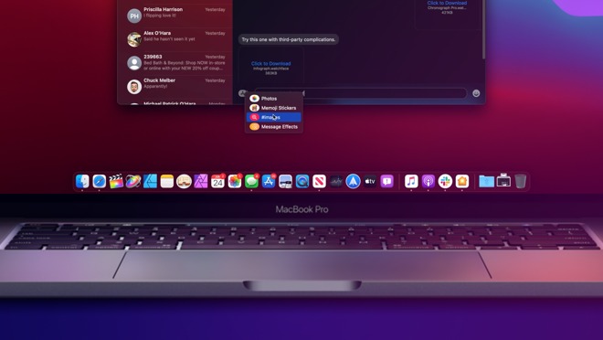
The app icon is here on the Mac as well. When clicked, it allows users to now insert Memoji stickers, search for gifs, access photos with a new image chooser, and send messages with various effects.
Messages has long lagged behind the iPhone and iPad with a poor interface, non-responsive search, and none of the new features that Apple has added to its mobile variant over the years. It finally seems as though Mac is getting some love with this massive Big Sur update.
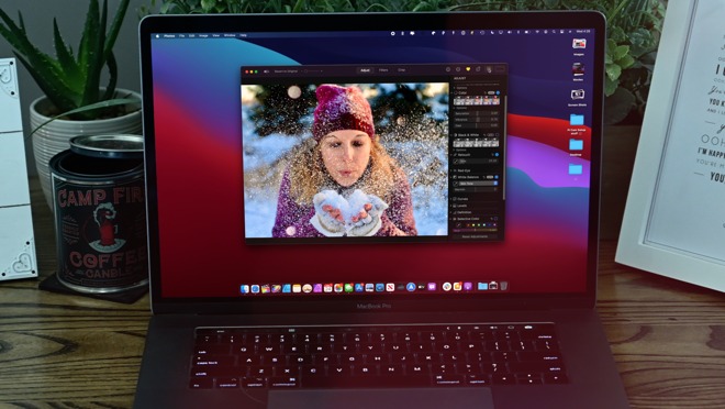
We saw some nice changes in Photos such as a more fluid interface, an improved retouch tool powered by machine learning, new editing options for photos, portrait photos, and videos, and more relevant memories with additional soundtracks.
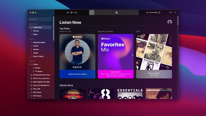
Music and Podcasts have new layouts and For You recommendations, like many other system apps.
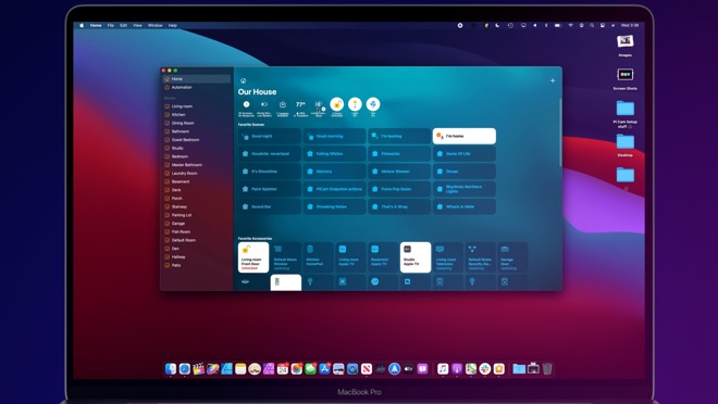
The Home app got a major update with a new sidebar, status icons along the top, and countless changes as part of HomeKit Secure Video. Apple is opening Catalyst to HomeKit apps this year as well, so we should now see many third-party Home apps coming to the Mac.
The Mac feels reinvigorated and fresh for the first time in years, and users will instantly recognize the difference with a new look, feel, improved performance, and new features.
Stay tuned to AppleInsider for additional coverage of Apple's new operating systems. And for the best deals on MacBook Pros and iMacs, be sure to check out the AI Mac Price Guide.
Existing features
A refreshed design

It is immediately noticeable, right from the initial boot, that macOS Big Sur has a wholly refreshed design. It's clean, bright, and consistent, and jibes with similar designs tweaks seen on iOS and iPadOS.
You can see it in the new dock that is full of rich new icons. Some icons look a bit off -- such as Quicktime that just stuck a Quicktime "Q" on a blue background -- but many of the icons look great.
The menu bar is translucent and blends into the background. This looks great though the translucency may cause legibility issues for those with impaired vision. The menu bar to the right with all of your status icons is enhanced as well.
Menu bar items like volume, AirPlay, Wi-Fi, have all gotten a new look that feels much more in line with what was offered by iPhones and iPads. Much has been tucked into a new feature for Mac -- Control Center. Control Center houses Wi-Fi, Bluetooth, AirPlay, and many other common utilities. This helps remove clutter from the menu bar itself, but if you do want to keep them in your menu bar, they can just be dragged right to where you'd like.
Many apps have new looks as well. They come with full-height sidebars and new icons from SF Symbols 2 which was ported from iOS and again, makes everything more consistent.
Safari
Safari has received a massive overhaul as well and frankly deserves a deep dive on its own. But hitting the high points, Safari is now faster and more power efficient than ever.It has a clean interface with a new customizable start page that can be tailored to your liking. Tabs are more user-friendly and accessible with better icons and previews whenever they are hovered over.
Safari has a new feature called Privacy Report which, when clicked on when visiting a website, will let you know how many trackers were encountered and if they were stopped using Safari's cross-site tracking.
Safari also has password monitoring, built in translation for web pages, and more.
Other app improvements
Maps was another app overhauled this year. It is built on Catalyst and is much more fluid and natural than the previous design. We are only in the first beta of macOS Big Sur, but it is a big improvement over what we had before.Maps not only looks better but includes cycle routing, EV vehicle routing with charging locations, curated guides, Look Around, and indoor maps for airports and malls.
Messages is nearly on par with its iPhone and iPad counterparts in Big Sur, too. Up to nine conversations can be pinned on the left side bar making them much more easy keep track of. Search is also robust and works much better than it did in previous version of macOS. These changes are very welcome.
Group conversations can be named, have an image assigned, feature mentions for different participants, and offer inline replies for more manageable reading.
The app icon is here on the Mac as well. When clicked, it allows users to now insert Memoji stickers, search for gifs, access photos with a new image chooser, and send messages with various effects.
Messages has long lagged behind the iPhone and iPad with a poor interface, non-responsive search, and none of the new features that Apple has added to its mobile variant over the years. It finally seems as though Mac is getting some love with this massive Big Sur update.
We saw some nice changes in Photos such as a more fluid interface, an improved retouch tool powered by machine learning, new editing options for photos, portrait photos, and videos, and more relevant memories with additional soundtracks.
Music and Podcasts have new layouts and For You recommendations, like many other system apps.
The Home app got a major update with a new sidebar, status icons along the top, and countless changes as part of HomeKit Secure Video. Apple is opening Catalyst to HomeKit apps this year as well, so we should now see many third-party Home apps coming to the Mac.
A whole new Mac
Apple is putting a lot of work into the Mac. Not just reworking the user interface, but doubling down on Catalyst for easier ports of existing iPad apps. Macs will also be running on Apple silicon with future hardware, allowing iPad and iPhone apps to run natively.The Mac feels reinvigorated and fresh for the first time in years, and users will instantly recognize the difference with a new look, feel, improved performance, and new features.
Stay tuned to AppleInsider for additional coverage of Apple's new operating systems. And for the best deals on MacBook Pros and iMacs, be sure to check out the AI Mac Price Guide.
Existing features
Comments
Mail.app is back, as I was damn close to switch to another app.
Now if iOS and iPadOS Mail would finally allow for viewing raw messages and inspecting links’ URLs without clicking them, they could be actually used, too...
I think the menu bar's transparency makes windows that are sat right next to it look a little off, and the too-subtle menu title highlighting when selected (and its discontinuity with the menu itself) doesn't look right.
I very much doubt Apple would have changed that.
Doubt that will float too many peoples boats, but she will update just for that!
1) Mac OS X Tiger
2) Windows Vista
However, it does seem to be executed light years better here.
I was turned off by transparency due to the crappy way it was done in Vista.
But if there never was a Windows Vista, I think we would all appreciate this take a lot more. Very well done.