Apple executives detail 24-inch iMac design, features in new interview

Posted:
in Current Mac Hardware
A pair of Apple executives talk Apple's new 24-inch iMac, its design elements, and the inclusion of the M1 chip in a recent podcast interview.

Credit: Apple
Credit: Apple


Apple worldwide senior produce marketing manager Colleen Novielli and engineering program manager Navpreet Kaloty recently appeared on Relay FM's "Upgrade" podcast to speak about the new M1 iMac refresh ahead of preorders opening on Friday.

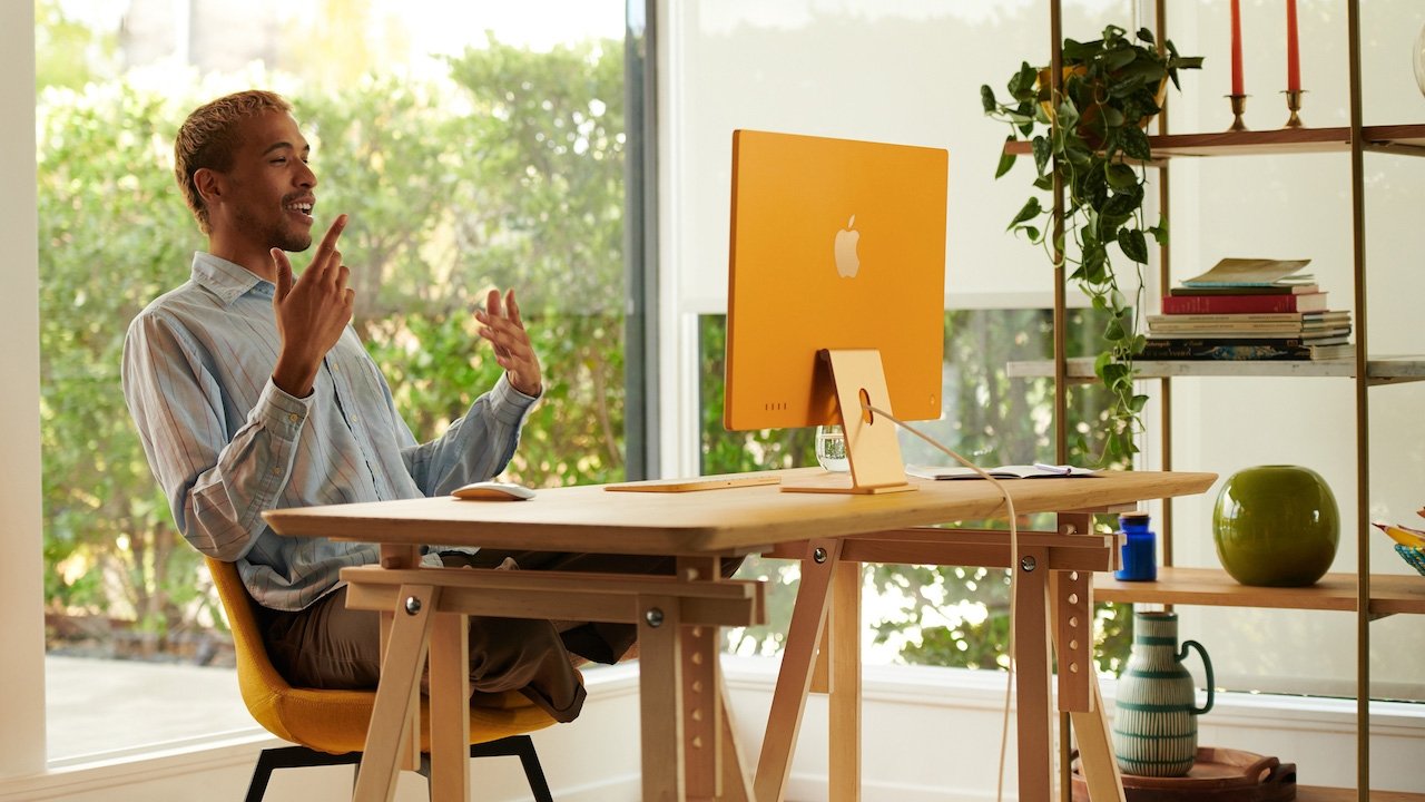
On the fact that the iMacs now come in a bevy of bright new shades, Novielli explained that the colors "are designed to bring a sense of brightness, optimism, and joy." She added that "I think we can all agree that's something everyone needs at the moment."

The Apple Mac product manager also touched on the design elements of the 24-inch iMac, including the controversial chin and bezels on the front side of the device.

"The borders are meant to complement the typical home design, for one, and blend into the background. The light gray borders are awesome. The lack of the stark contrast provides a more seamless experience for the user," Novielli said.

As for the chin, Novielli explains that Apple was able to fit the iMac's internal components within that space. She says the chin makes the iMac's color "shine," while also allowing Apple to reduce the device's thickness by a significant amount.

When asked about whether Apple would sell the Magic Keyboard with Touch ID separately, Novielli declined to comment. However, she added that the keyboard would work with any M1-equipped Mac.

On the overall design, hardware manager Kaloty said that the inclusion of the Apple Silicon chip affected every aspect of the new iMac's design. That includes the I/O on the rear of the device, which now exclusively consists of USB-C and Thunderbolt 3 ports.

The full interview contains other tidbits about the iMac's design and features, and is available to listen on Relay FM.
«1

Comments

  • Reply 1 of 24
    thttht Posts: 5,444member
    Apple worldwide senior produce marketing manager Colleen Novielli
    Ms. Novielli doesn't market literal apples.
    mobirdWgkruegerfahlmanmknelsonBeatsAI_liasrundhvidapplguydysamoriaCloudTalkin
  • Reply 2 of 24
    fahlmanfahlman Posts: 740member

    Worldwide Senior Product Marketing Manager

    watto_cobra
  • Reply 3 of 24
    BeatsBeats Posts: 3,073member
    People complain about the design as if the old design was better.

    My gripe is no OPTION for dark colors. I get the complimented a bright home but what if you want one in a dark studio?

    Dark options should have reversed the front and back colors. Someone made a model of this and it looked good.
    baconstangdysamoriajony0
  • Reply 4 of 24
    MplsPMplsP Posts: 3,925member
    tht said:
    Apple worldwide senior produce marketing manager Colleen Novielli
    Ms. Novielli doesn't market literal apples.
    “In other news, Technology giant Apple is branching out into actual produce development. ‘People love the experience we bring to computing. We want to bring that same level of magic to fruit.’ said CEO Tim Cook. Others are not so happy. Maleficent has already filed suit, claiming witches have copyrights on magic apples and citing prior art as evidence.”
    Beatsiqatedorundhviddysamorianeilmmac daddy zeewatto_cobra
  • Reply 5 of 24
    I love the new iMac.. the design, the colors, the color matched accessories, the TouchID on the keyboard.. and even the chin, which I was hoping would be gone, I'm glad to see is still there, and I hope they keep it. However, white borders..? I read through this just to see Apple's justification for white borders, and I'm even more disappointed now than before. Apple should at least own up to wanting their computers to look 'cute' with the white borders, instead of some nonsense about 'complimenting the typical home design', whatever that means (hopefully I'm just missing context here by reading vs listening to the podcast), with a bizarre motivation to 'bring a sense of optimism and joy', which is actually just condescending to its users. And how does apple just ignore simple facets of human perception.. ie justifying the white borders as being 'light grey,' when to the human eye, that light grey looks white next to any adjacent black areas (including the thin black border that goes around the *entire screen*). I hope this is only a misstep. And if they're going to go with white borders, why not make a full 'Apple White' iMac? That's the only thing I can think of that would justify the white borders. 
    edited April 2021 iqatedodysamoriawatto_cobra
  • Reply 6 of 24
    AI_liasAI_lias Posts: 434member
    On one hand, I like that they try to explain their design decisions. That alone can go a long way. On the other side, everything people commented above :)
    patchythepiratewatto_cobra
  • Reply 7 of 24
    baconstangbaconstang Posts: 1,105member
    Beats said:
    People complain about the design as if the old design was better.

    My gripe is no OPTION for dark colors. I get the complimented a bright home but what if you want one in a dark studio?

    Dark options should have reversed the front and back colors. Someone made a model of this and it looked good.
    When the 27' replacement comes, (30"?) I'm sure it will be available in subdued shades.
    watto_cobra
  • Reply 8 of 24
    BeatsBeats Posts: 3,073member
    Beats said:
    People complain about the design as if the old design was better.

    My gripe is no OPTION for dark colors. I get the complimented a bright home but what if you want one in a dark studio?

    Dark options should have reversed the front and back colors. Someone made a model of this and it looked good.
    When the 27' replacement comes, (30"?) I'm sure it will be available in subdued shades.

    And I forgot to say THIS.

    I am too also betting Apple is saving dark colors for more “serious” and pro models.
    canukstormwatto_cobra
  • Reply 9 of 24
    BeatsBeats Posts: 3,073member
    I love the new iMac.. the design, the colors, the color matched accessories, the TouchID on the keyboard.. and even the chin, which I was hoping would be gone, I'm glad to see is still there, and I hope they keep it. However, white borders..? I read through this just to see Apple's justification for white borders, and I'm even more disappointed now than before. Apple should at least own up to wanting their computers to look 'cute' with the white borders, instead of some nonsense about 'complimenting the typical home design', whatever that means (hopefully I'm just missing context here by reading vs listening to the podcast), with a bizarre motivation to 'bring a sense of optimism and joy', which is actually just condescending to its users. And how does apple just ignore simple facets of human perception.. ie justifying the white borders as being 'light grey,' when to the human eye, that light grey looks white next to any adjacent black areas (including the thin black border that goes around the *entire screen*). I hope this is only a misstep. And if they're going to go with white borders, why not make a full 'Apple White' iMac? That's the only thing I can think of that would justify the white borders. 

    Someone photoshopped black borders and it looked ugly on the light colors. Unless you mean dark colors then I’d agree  
    applguyStrangeDayswatto_cobra
  • Reply 10 of 24
    When the 27' replacement comes, (30"?) I'm sure it will be available in subdued shades.
    With Apples large base of artistic customers 31,5"(aka 32") 16:9 is more likely. Personally I would prefer 21:9 as my 32" most of the time has som wasted space vertically, and space to be desired horizontally. 

    ....or maybe I should chop 2" off my working desk legs... 
  • Reply 11 of 24
    24” not aimed at professionals.
    The lighter borders will lower the perceived black floor and make content “pop” more.
    I agree professionals in studios will prefer black borders. Fingers crossed for 32”.
    I wished the colours were not as insipid on the chin and stand, the colours back and sides look great but would hardly ever get seen in my scenario; the front should have been the priority for colour. Imho.
    dysamoriawatto_cobra
  • Reply 12 of 24
    Beats said:
    People complain about the design as if the old design was better.

    My gripe is no OPTION for dark colors. I get the complimented a bright home but what if you want one in a dark studio?

    Dark options should have reversed the front and back colors. Someone made a model of this and it looked good.
    Very likely that the darker color options will show up for the larger screen sizes of iMac...30" or 32", whichever it ends up being. Those will probably have the M2 as well and effectively be the "pro" part of the iMac lineup. 
    watto_cobra
  • Reply 13 of 24
    dysamoriadysamoria Posts: 3,430member
    AI_lias said:
    On one hand, I like that they try to explain their design decisions. That alone can go a long way. On the other side, everything people commented above :)
    Explain? More like excuse. “Typical home design”? What?

    Maybe they’re hoping the “grey” border will make the insufficient dark of the onscreen blacks look darker when surrounded by a light border.

    I think it looks stupid. As others said above, cute colors that can only be seen from the back of the machine make absolutely no sense. Most people have the back of their machines facing walls. Because it’s the BACK.

    This is like the nonsense of “beautiful design” on iPhones that are so thin and slippery that the “beautiful design” needs to be completely hidden by a case that makes it thicker (easier on the palm) and far less slippery. Just yesterday I removed my iPhone 6s from
    its case to do a regular cleaning and almost dropped it (which doesn’t happen with the silicone case on).

    These iMacs won’t be in cases, but they are stupidly thin, and their “beautiful design” elements will be facing walls and corners and almost never be seen (but the odd grey border will be in your face!). So why do it? Because it looks good in advertising?

    Nonsensical design still lives on at Apple, even without Jonathan Ive. 

    As for the “chin”, I don’t care. You still need a place to put the actual electronics and heat dissipation, which is already insufficient.
  • Reply 14 of 24
    Beats said:
    People complain about the design as if the old design was better.

    My gripe is no OPTION for dark colors. I get the complimented a bright home but what if you want one in a dark studio?

    Dark options should have reversed the front and back colors. Someone made a model of this and it looked good.
    People complained about the old design being dated.  I don't think anyone ever said the old design was ugly, just that it was an old design that needed a refresh.  The new design is being called ugly.  I can't disagree with that assessment.  Apple clearly made some form-over-function design aesthetic choices.  Regardless, people are eventually going to get over it like the got over the AirPods hanging stem and notched forehead on the iPhone.

    Besides, all will be forgiven when the 27" 32" iMacs are revealed.  I'd bet good money they will look a helluva lot less like the 24" and a whole lot more like the XDR.  
  • Reply 15 of 24
    neilmneilm Posts: 987member
    I love the new iMac.. the design, the colors, the color matched accessories, the TouchID on the keyboard.. and even the chin, which I was hoping would be gone, I'm glad to see is still there, and I hope they keep it. However, white borders..?
    Reading comprehension fail.

    As the article clearly states, the borders aren't white, they're light grey. None of us have actually seen them yet, but I'm reasonably sure that black would be a jarring contrast against the unsaturated colors of the chin. It would be appropriate to consider that Apple does think about this stuff, and that they're pretty good at that.
    edited April 2021 fastasleep
  • Reply 16 of 24
    thedbathedba Posts: 763member
    So many remember this when thinking of what an iMac should be


    But few remember this


    or this


    They're all iMacs. 
    StrangeDaysthtpatchythepiratewatto_cobra
  • Reply 17 of 24
    thedba said:
    So many remember this when thinking of what an iMac should be


    But few remember this


    or this


    They're all iMacs. 
    Or, you know, these. Look at them with their colors on the back and white bezels! It has been hilarious to see so many people basically repeating the the same criticisms we heard when the G3 iMacs came out in the late 90s.


    edited April 2021
  • Reply 18 of 24
    I like the new iMac fine except I want a Apple logo stick-on on the front.  Lower weight and larger screen are also welcome. And moving the Ethernet port to the floor power adapter is nice.  A faster M system chip that’s not Intel is wonderful decision.
    watto_cobra
  • Reply 19 of 24
    StrangeDaysStrangeDays Posts: 12,877member
    thedba said:
    So many remember this when thinking of what an iMac should be


    But few remember this


    or this


    They're all iMacs. 
    Yup. Amazingly, no one whined about the all-white iMac. Or the decades of white (beige) Macs. For most people, it's fine. If you're doing professional color correction work and can't tolerate any contrast eye tricks w/ a white border, you're very likely not using an AIO's display. It's my experience that the most vocal critics don't even use the gear they're criticizing -- it's just an emotional battleground for them to stamp their feet about.
    edited April 2021 thtthedbafastasleepweirdsmithDetnator
  • Reply 20 of 24
    fastasleepfastasleep Posts: 6,417member
    I love the new iMac.. the design, the colors, the color matched accessories, the TouchID on the keyboard.. and even the chin, which I was hoping would be gone, I'm glad to see is still there, and I hope they keep it. However, white borders..? I read through this just to see Apple's justification for white borders, and I'm even more disappointed now than before. Apple should at least own up to wanting their computers to look 'cute' with the white borders, instead of some nonsense about 'complimenting the typical home design', whatever that means (hopefully I'm just missing context here by reading vs listening to the podcast), with a bizarre motivation to 'bring a sense of optimism and joy', which is actually just condescending to its users. And how does apple just ignore simple facets of human perception.. ie justifying the white borders as being 'light grey,' when to the human eye, that light grey looks white next to any adjacent black areas (including the thin black border that goes around the *entire screen*). I hope this is only a misstep. And if they're going to go with white borders, why not make a full 'Apple White' iMac? That's the only thing I can think of that would justify the white borders. 
    The vast majority of walls in homes are some variety of white or off-white, meaning viewed in that context, the bezels blends in with those walls in the background and increasing focus on the content. 

    It’s “light gray” because that’s what it is. White is something different. Words have meaning. 

    “Optimism and joy” is a great way to describe a rainbow-colored lineup in a global pandemic. You’re sure getting worked up over some marketing language. 
    watto_cobra
Sign In or Register to comment.