Apple walks back macOS Monterey tab changes, refines search in iOS

Posted:
in macOS
Apple has made a major change to Safari tabs in the latest macOS Monterey beta, reverting the design back to a more familiar layout after receiving feedback from beta testers.
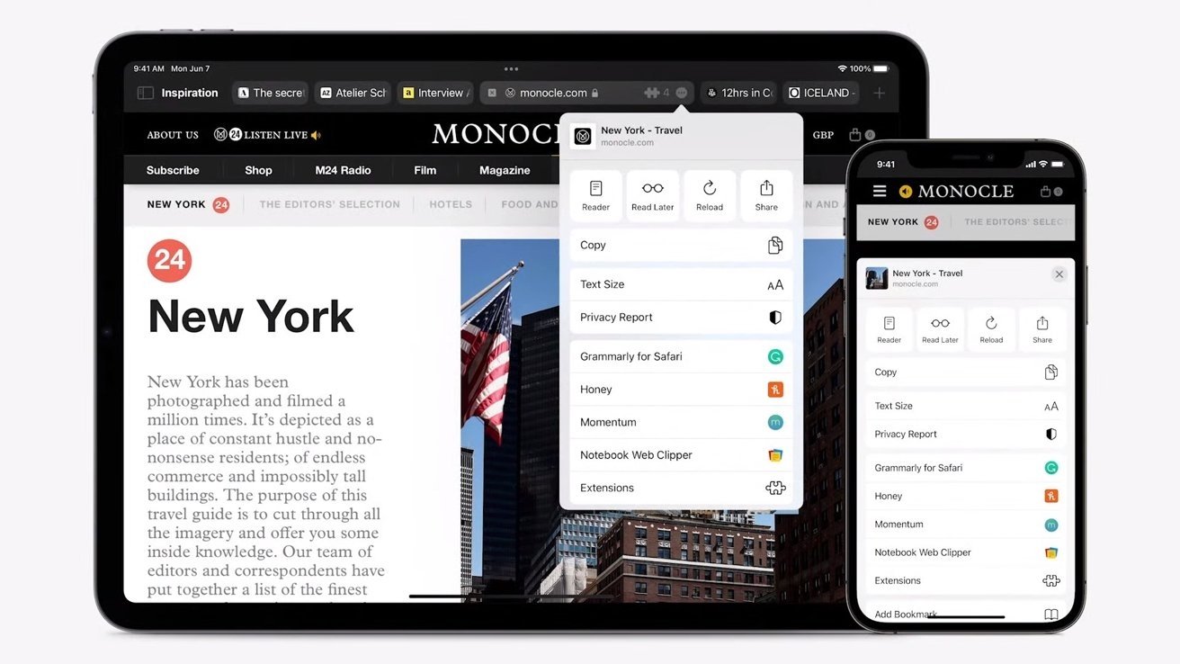
Credit: Apple
Credit: Apple


In macOS Monterey, Apple introduced a new tab system that allowed each individual tab to act as a search and URL field. It also nixed the standard URL and search bar that's long been a part of Safari.

However, it appears that Apple is now walking back on that design choice in the third beta version of macOS Monterey, which was released Wednesday. The latest version features a dedicated URL and search interface at the top with tabs arranged beneath it.

Users who are a fan of the Monterey-style search bar can still enable the user interface design in the View menu.

In addition to the interface change, Apple also made several other updates to Safari across its other operating systems. In iOS 15, for example, Apple has refined the Safari search UI and added the ability to initiate a page refresh by long-pressing on a tab bar.

In addition to UI changes, Safari will receive extension support on iOS and iPadOS and new user interaction changes exclusively for mobile.

Keep up with everything Apple in the weekly AppleInsider Podcast -- and get a fast news update from AppleInsider Daily. Just say, "Hey, Siri," to your HomePod mini and ask for these podcasts, and our latest HomeKit Insider episode too.If you want an ad-free main AppleInsider Podcast experience, you can support the AppleInsider podcast by subscribing for $5 per month through Apple's Podcasts app, or via Patreon if you prefer any other podcast player.

Comments

  • Reply 1 of 11
    stompystompy Posts: 408member
    "Users who are a fan of the Monterey-style search bar can still enable the user interface design in the View menu."

    Is there any such person, not counting Apple employees?
    williamlondondavgreg
  • Reply 2 of 11
    stompy said:
    "Users who are a fan of the Monterey-style search bar can still enable the user interface design in the View menu."

    Is there any such person, not counting Apple employees?
    If it makes the browser window more compact then yes, I'm a HUGE fan!
    williamlondonronn
  • Reply 3 of 11
    tjwolftjwolf Posts: 424member
    stompy said:
    "Users who are a fan of the Monterey-style search bar can still enable the user interface design in the View menu."

    Is there any such person, not counting Apple employees?
    I actually liked the more compact design - the only thing that sucked was that there was no "Reload" button.  When I got the new beta, I re-enabled the "Monterey" way because Apple now added that reload button.

    Alas, there is now a very annoying bug - you can't close the current tab using the 'x' to the left of the address bar (the 'x' appears as you hover over the web site icon).  Ctrl-W still works to close the tab, so no biggie, I guess, but I can never remember that keyboard shortcut (or most others, it seems :-(
    williamlondondewme
  • Reply 4 of 11
    elijahgelijahg Posts: 2,759member
    It's good that Apple are giving us options instead of forcing one or the other upon everyone as they usually do because they know best, apparently. Just need the iOS Safari's bottom address bar to be moved back to the top now - or at least stop hiding content under it at the bottom. It's impossible to touch website UI elements that fall under the address bar - basically any site with a footer - without first swiping it out the way. Which randomly does and doesn't work, and then after prodding the website's button the address bar pops back in the way again. Also the way it rockets to the top of the screen when you touch it is jarring, it could go to the top of the keyboard instead. And hiding as much as possible behind the ellipsis is stupid. At least one extra button press for everything just for the sake of minimalism.

    Edit: I see they have done as above, still no fix for it sitting above website UI elements though. 
    edited July 2021
  • Reply 5 of 11
    elijahg said:
    It's good that Apple are giving us options instead of forcing one or the other upon everyone as they usually do because they know best, apparently. Just need the iOS Safari's bottom address bar to be moved back to the top now - or at least stop hiding content under it at the bottom. It's impossible to touch website UI elements that fall under the address bar - basically any site with a footer - without first swiping it out the way. Which randomly does and doesn't work, and then after prodding the website's button the address bar pops back in the way again. Also the way it rockets to the top of the screen when you touch it is jarring, it could go to the top of the keyboard instead. And hiding as much as possible behind the ellipsis is stupid. At least one extra button press for everything just for the sake of minimalism.
    Edit: I see they have done as above, still no fix for it sitting above website UI elements though.

    From my understanding (and watching some WWDC sessions), it is supposed to be up to the website developers to handle this. They've introduced some environment variables that developers can use to detect and account for those changes. More info on this is found in the session called Design for Safari 15: https://developer.apple.com/wwdc21/10029

    Note: I am not stating that putting the responsibility on the developer is the correct way to handle it, but it is the way that Apple is currently going about it.
    FileMakerFellermuthuk_vanalingamelijahg
  • Reply 6 of 11
    davgregdavgreg Posts: 1,037member
    I often have tons of tabs going and the new Safari version in the Public Beta is awful.
    Moving sharing and other items from the top of the window was also change for change sake.
  • Reply 7 of 11
    JapheyJaphey Posts: 1,767member
    This gives me hope that they might make the iOS Safari changes optional too. I may be in the minority here, but I absolutely hate the address bar on the bottom of the screen. 
  • Reply 8 of 11
    lukeilukei Posts: 379member
    stompy said:
    "Users who are a fan of the Monterey-style search bar can still enable the user interface design in the View menu."

    Is there any such person, not counting Apple employees?

    It truly is awful
  • Reply 9 of 11
    z3r0z3r0 Posts: 238member
    stompy said:
    "Users who are a fan of the Monterey-style search bar can still enable the user interface design in the View menu."

    Is there any such person, not counting Apple employees?
    Its the same thing with the unified title bar and navigation bar in the finder and other apps (the expanded sidebar is also bad design). Previously everything had its distinct area which lead to better usability. Now its a unified inconsistent mess that doesn't improve usability and presents new problems as user interface elements move/grow/shrink all nilly willy.

    Forget developing any kind of motor skills. 

    Great Design:


    BAD Design:


    elijahgdewme
  • Reply 10 of 11
    elijahgelijahg Posts: 2,759member
    elijahg said:
    It's good that Apple are giving us options instead of forcing one or the other upon everyone as they usually do because they know best, apparently. Just need the iOS Safari's bottom address bar to be moved back to the top now - or at least stop hiding content under it at the bottom. It's impossible to touch website UI elements that fall under the address bar - basically any site with a footer - without first swiping it out the way. Which randomly does and doesn't work, and then after prodding the website's button the address bar pops back in the way again. Also the way it rockets to the top of the screen when you touch it is jarring, it could go to the top of the keyboard instead. And hiding as much as possible behind the ellipsis is stupid. At least one extra button press for everything just for the sake of minimalism.
    Edit: I see they have done as above, still no fix for it sitting above website UI elements though.

    From my understanding (and watching some WWDC sessions), it is supposed to be up to the website developers to handle this. They've introduced some environment variables that developers can use to detect and account for those changes. More info on this is found in the session called Design for Safari 15: https://developer.apple.com/wwdc21/10029

    Note: I am not stating that putting the responsibility on the developer is the correct way to handle it, but it is the way that Apple is currently going about it.
    Interesting thanks! Some continually developed websites may adjust their pages to support this awful new UI, but I imagine it’d be pretty low down the priority list. Also seems like they’re pretty serious about keeping it since they’ve written it into the HTML spec. This kind of vendor specific stuff stinks of Microsoft’s attempts in the 90’s to bend the web to its will. 

    Besides that it’s not even a good design. A floating blob over the content? Whoever thought that was a good idea? If they want the address bar at the bottom, move it to the bottom and keep it there until it’s prodded, without it popping up into a weird in-the-way bubble. Way too many things are now two button presses not one, screen real estate isn’t an issue anymore so they need to stop hiding buttons behind more buttons. It makes the UI feel really clunky.
    muthuk_vanalingam
  • Reply 11 of 11
    HeliBumHeliBum Posts: 129member
    Japhey said:
    This gives me hope that they might make the iOS Safari changes optional too. I may be in the minority here, but I absolutely hate the address bar on the bottom of the screen. 
    Me too. The more I use iOS 15 Safari, the more I hate it.
Sign In or Register to comment.