Apple's macOS Ventura beta review: great new features, but some concerns

It's only in beta, but macOS Ventura is already shaping up to be a particularly welcome update that brings new features, new apps and new refinements to the Mac.
Announced at WWDC, macOS Ventura is the future of the Mac, at least for the next year. Even at this earliest developer beta stage, it looks like it has a rather good future.
Or at least it does if you're on Apple Silicon Macs.
To be clear, macOS Ventura does work on Intel Macs, but this year's minimum requirements have shut out more devices than usual. Apple is moving on, and macOS Ventura exploits the benefits of Apple Silicon.

That progression is far from surprising. Apple even said at the launch of Apple Silicon that it was doing the transition specifically to be able to take the Mac further.
What also shouldn't be surprising is that macOS Ventura isn't finished yet. Apple was up front about how features like the Freeform collaboration tool won't be released until later this year, and going through the beta you see other elements that aren't ready or complete.
It is a beta, though. It's a beta released in June when the final, shipping version of macOS Ventura won't be available until at least September.
So while this review does point out missing elements, rough edges, and some slight disappointments, all of it can be fixed by release date and at least most of it will.
There aren't the fundamental changes in macOS Ventura that we saw in Monterey and especially Big Sur, though. There isn't an equivalent of the Safari Tabs where the radical redesign got toned down over the beta process.
Nonetheless, with developers working on this beta, and later on members of the public -- perhaps foolishly -- trying it out too, there is the potential for a kind of sanding down of the macOS, getting it into shape.
There's plenty for developers and beta tests to see, too, as macOS Ventura does overhaul the Mac, it does bring in new features -- and it does bring in new standard apps.
Apple's new macOS Ventura is yellow in light mode, blood orange in dark
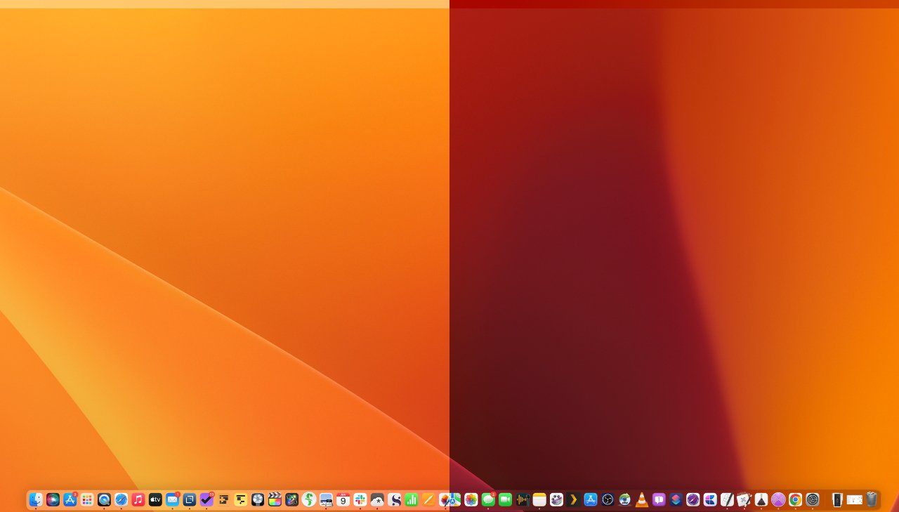
As with every release the OS, other than the more radical macOS Big Sur, what happens on installation is that for a moment, you can't see the difference. If you use custom wallpaper, you don't even get the clue of how yellow the new design is.
Then you start using apps, you start using the Finder and system-wide tools, and you see small differences, small refinements. You get down to work in earnest and now you're seeing what seem like quite small but rather handy features.
Nothing stops you working, nothing gets in your way and makes you have to learn something new in order to get on with what you need to do.
But if you truly want to appreciate what you've got in a new macOS, you don't deep-dive into the really new features. Instead, after a few days of regular work, find a way to use a Mac with the previous version.
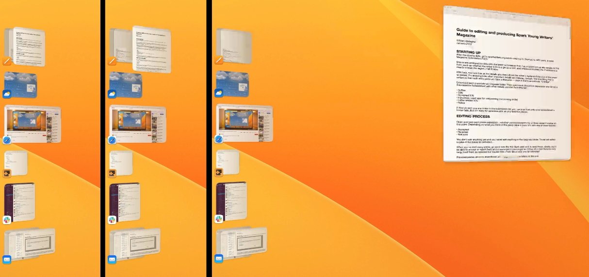
The benefits and the differences are really in how the myriad small changes add up, but then there are also very large and clear improvements. For instance, we'll remember that the new macOS Ventura is the version that brought us Stage Manager.
L-R clicking on a recent app in the column makes the top window zoom out
On a 14-inch MacBook Pro, for instance, you can already have two, three, or as many apps open as you want, but the screen size better suits working in just one. What Stage Manager does it make it much faster, much easier, and much clearer how you can switch between apps.
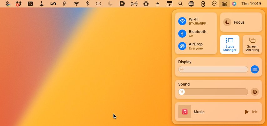
Turn on Stage Manager in Control Center, and your screen is rearranged:
To switch to a different app -- that you've already got running -- you click on its Stack-like icon in the column on the left. Instantly, that app moves to center stage, and the previous one jumps over into the column.
You can't change the order of recent apps in this column and beyond half a dozen or so of them, the column starts to get cluttered.
L-R Dragging a window toward the left of the screen pushes the recent apps column away
To close one of these recent apps, you click to bring it center stage, then quit it as normal.
If you want to add an app to the column, you launch it as usual, and it becomes the main app. Click on the column to switch apps, and the new one instantly jumps over to the column.
It is instant and this part is smooth, even enjoyable. There are two points where it gets a little slower, either because it slows your working, or because Apple's animation isn't yet optimized.
The slower working process is the more important. Since Stage Manager hides all of your desktop files, it now takes a few steps to drag a document from the desktop into an app.

First you click somewhere on the apparently empty desktop. That really makes the Finder be the main active app and everything else is now immediately in the recent apps column.
With the Finder active, your desktop files are back. Click and drag on one, and then you can take it over to any of the recent apps in the column.
It then takes a beat before the app you hover over reacts. The app opens up center stage, and finally you can drop the file into it.
Right now it's hard to see how Apple could cut down the number of steps for that, but it might be that it at least speeds up the reaction time of the app as you hover over it.
Part 1 of exiting Stage Manager
Doubtlessly the final version of macOS Ventura will speed up the slow animation part of Stage Manager, though. This is when you resize the center app's window to fill more of the screen, or when you drag it close to the recent apps column.
The column disappears under the app's window, just as if, and just as quickly, as if you were merely dragging the window over a regular Finder desktop. But then when you move the window away again, the recent apps column rather judders back into view.
Use it on a larger monitor, especially an ultrawide one, and it's a little different. By default, Stage Manager makes the main center app be quite skinny, and you see rather a lot of desktop wallpaper around it.
You can resize the center app and macOS Ventura does remember the size, though.
Plus if you drag on an app in the recent apps column, instead of clicking on it, then you pull out that other app and can have two on screen at once. Or three. Or four.
Part 2 of exiting Stage Manager
What's good is that macOS Ventura also remembers this pairing, or this trio, whatever it is. And it treats them as one set, so now you can easily switch between this group of apps, and another.
Perhaps even better is that really what's happening is that Stage Manager is remembering a window, not a whole app.
So if you have Pages, say, in your recent apps column, you might have half a dozen documents open in it, and you can see them all right there in the column. Clicking on Pages in the recent apps column brings the app center stage, but then rotates between the documents as you click.
Since it's treating each document, or each of Pages's windows, as a separate item, it means you can also deal with the documents separately. Drag one out of the column to join, say, Numbers, and now you have a pairing that is Numbers and this one Pages document.
Drag another Pages document out and you can pair it with Mail. It's a particularly handy boon of Stage Manager and can become quite addictive.
Although ultimately you can end up negating the whole value of Stage Manager by using it to group too many apps and documents together. It's easy to do that, it's very easy to start using Stage Manager -- and it's not quite so easy stopping.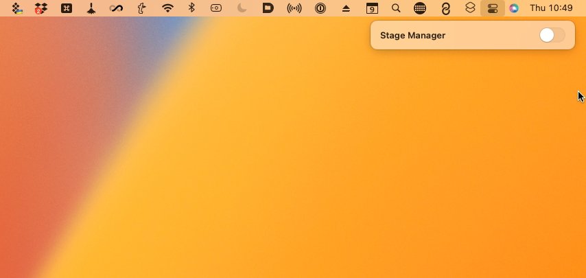
Part 3 of exiting Stage Manager, you're still not done
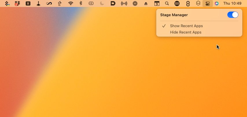
This is an awkward part of macOS Ventura and surely likely to change. To get into Stage Manager, you open Control Center, click the toggle button, and you're done.
But to get out of it, you open Control Center, click the toggle button -- and you're not done.
Instead of exiting Stage Manager, you get a second notification-style banner that includes a switch for turning it off and you have to click that, then click to dismiss the banner. It should surely, clearly be that the one toggle turns this on and off, and the reason it doesn't is that Apple wants to offer you an extra option.
In that notification-style banner, you also get to choose whether or not exiting Stage Manager hides your recent apps. Choose hide and when you come out, you've just got the main app in the foreground.
Choose not to hide them, and you get all of those recent apps on screen at once.
This is not something you're going to change your mind about every time you come in or out of Stage Manager. You're going to prefer one way or the other, so it should be a preference setting, it shouldn't slow down the quitting process every time.
Stage Manager could do a better job, too, when you've chosen to let it show all recent apps. Because, at least at present, macOS Ventura does not remember where all your apps were before you switched on Stage Manager.
Consequently, when you come out of it, the apps are all rather dumped in the middle of your screen. This tool for automatically organizing your app windows to avoid clutter, ends up creating a cluttered mess of app windows.
Even so, in the heat of a working day when you're trying to focus, you will reach for Stage Manager. It's the stand-out feature of macOS Ventura because it's the most visible change, plus it's the most immediately useful addition that applies across the whole Mac.
Most of the other changes and improvements are in individual different apps, but there are also some more system-wide updates. These are chiefly in the Finder and the new System Settings, but there is also one new Accessibility feature that could rival Stage Manager for being the most visual improvement to macOS.
It won't ever be perfect, it is a transcription after all, but it is an impressive addition. And in these days of constant Zoom calls, it is a deeply welcome new feature of the Mac.
However, although Live Captions is system-wide, don't expect it to be worldwide. Even after macOS Ventura is publicly released, too, this Live Captions element will continue to be listed as a beta for some unknown time.
Apple says that this Live Captions (Beta) will also be only available in English, and for solely users in the US and Canada. That's common for any of Apple's language work, and we can expect more countries to follow over the next year.
For now, even the beta macOS Ventura is geo-locked like this. If you are in the US or Canada, then going to System Settings, Accessibility, shows you an option for Live Captions (Beta).
The setting is entirely missing when you're a user anywhere outside the US or Canada.
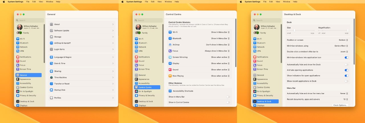
The new System Settings
It's a small thing, and the chief difference is just that you will notice it looks neater and smaller. It's feels clearer and cleaner, but it also surfaces more detail -- you can send to particular contacts without first choosing Messages.
And on a bigger scale, that's the same with the new System Settings, it is cleaner and it offers more detail.
Until now, the more you worked across Mac and iPhone, the more often you would notice that iOS has Settings where macOS has System Preferences.
No longer. Now it's Settings on iOS and System Settings on the Mac.
It's a curious change. Making the two systems, iOS and macOS be the same makes sense, but this isn't the same. It's going from one difference to another difference, and since there's no benefit at all to keeping the word "System," it's a fair bet this will change.
Less curious, but possibly more controversial, is how the whole of System Settings itself has been changed to more resemble Settings in iOS. It's visually a much changed design and does take getting used to.
That's chiefly, though, less because of the visual changes and more because of the organizational ones. The new System Settings is very clear, arguably much clearer than the old collection of icons, but certain parts have been moved.
Login Items, for instance, used to be in a settings pane called Users & Groups, but now it's within General. No criticism here, if anything the new place makes more sense.
Only, when macOS Ventura is finally shipping, it is going to take longstanding Mac users time to find where everything is. And at the moment, in the beta, there are two issues that make this more frustrating than it should be.
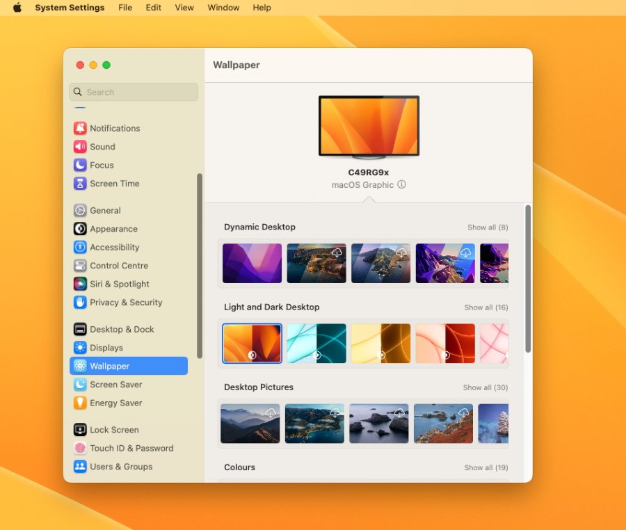
The new, separate Wallpaper section in System Settings
One is that for some reason, macOS Ventura does not keep all of the login items, the startup apps or utilities, that were set under macOS Monterey. There's no obvious pattern to it, but in our testing, for example, it was as if Ventura forgot we had TextExpander -- and remembered we use Alfred 4.
Consequently, an early job in using macOS Ventura is putting back all of the missing login items. And consequently not being able to find the section in Users & Groups is a small annoyance.
The big annoyance, which will doubtlessly be fixed by release, is that the search feature in System Settings does not work at all. It will not return the right result if you search for "Login Items," it won't return any result.
Yet overall, the new System Settings is an improvement. Under the old System Preferences for instance, you could change your wallpaper but there wasn't actually a section called that.
You had to go into Desktop & Screen Saver, which doesn't sound arduous, yet even within that section, even though that was where you changed wallpaper, the word "wallpaper" was nowhere to be found.
Whereas now there is a section in System Settings that is just called Wallpaper.
There are many changes like this, surfacing common items better than before, making it clearer where everything is.
The new System Settings is good, it will just take time to get used to, the longer you've been working on Macs.
There has also been a question, though, over whether the redesign will prove to be a problem for AppleScript users. The old System Preferences supported scripting, it had an AppleScript dictionary so users could include changing settings in their scripts.
Apple hasn't commented on this yet, but it's probable that AppleScripts will continue to work as normal. It's possible that some will have to be rewritten, but the new System Settings does present the same AppleScript dictionary.
Plus although search within System Settings doesn't work, search outside it does. If you use Alfred 4, the Spotlight replacement, then you can type the name of a System Preference pane and it will open the correct part of the new System Settings.
That suggests that whatever the surface redesign is, the back end of System Settings remains the same. And so should remain as controllable by AppleScript.
Spotlight continues to offer quick access to searches
The new macOS Ventura's Spotlight isn't going to pull fans of those third-party apps back into the Apple fold, but it is improved.
Visually, it now presents relevant photos in searches, and it's also more neatly designed overall. It's able to present long lists of results in a smaller space, while also appearing clearer.
Those results, too, are improved in how they can for instance include recent websites you've visited that are relevant to your search. Plus when you scroll down to a result, you can tap the space bar to get a Quick Look at the image, the document, and so on.
Spotlight now also does more in presenting information rather than showing links to webpages with what you want. So it will better show sports results right there in the search field, for instance.
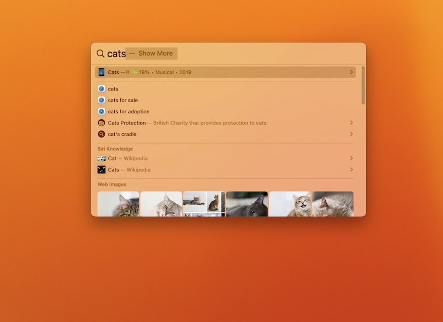
But Spotlight is now neater, breaks down results better and (very bottom) includes relevant photos
It's also added the ability to perform actions such as setting timer. Although good luck figuring out what to type to get that to work.
You're better off holding down the Command key and the space bar, waiting a beat for Siri to appear, and then saying, "Hey, Siri, set a timer for ten minutes," or whatever you need.
You can now tap the Space Bar in Spotlight to get Quick Look
This mostly resembles the form and layout of Clock on iPadOS, but now does everything you could on either iPhone or iPad.
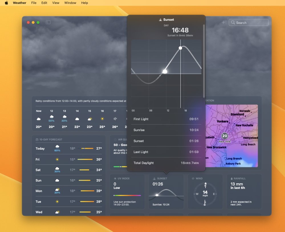
Similarly, Apple has finally brought over the Weather app from iOS, and it is very nicely done. All of the same clarity and simply gorgeous graphics from the iPhone Weather app are here, just arranged in a different order.

The new Clock app will be familiar to iPad users
Where you would scroll to see all of the elements of the Weather app on iPhone, for the Mac they are all presented in a kind of dashboard layout. See basic information at a glance, or click on an element to get more detail.
It's particularly well done how you can click and drag sliders to show, for instance, predicted rainfall at different times of the day.
Although it's currently less well done how you handle the weather for multiple locations. By default, you of course get the weather for where you are now, but you can add alternatives.
Only, there is a plus sign on the top of the Weather app's screen and it does not add an alternative city. It doesn't do anything, not at first.
Instead, you have to use the search field next to the plus sign. Find a city or other location you want, then as the Weather app displays data for there, now you can click that plus sign.
Once you've added more than one location, they are all available in a sidebar. This optionally pops out in exactly the same way that, for instance, you can get Preview to show you thumbnails, or Pages to show you a table of contents.
The new Weather app in macOS Ventura
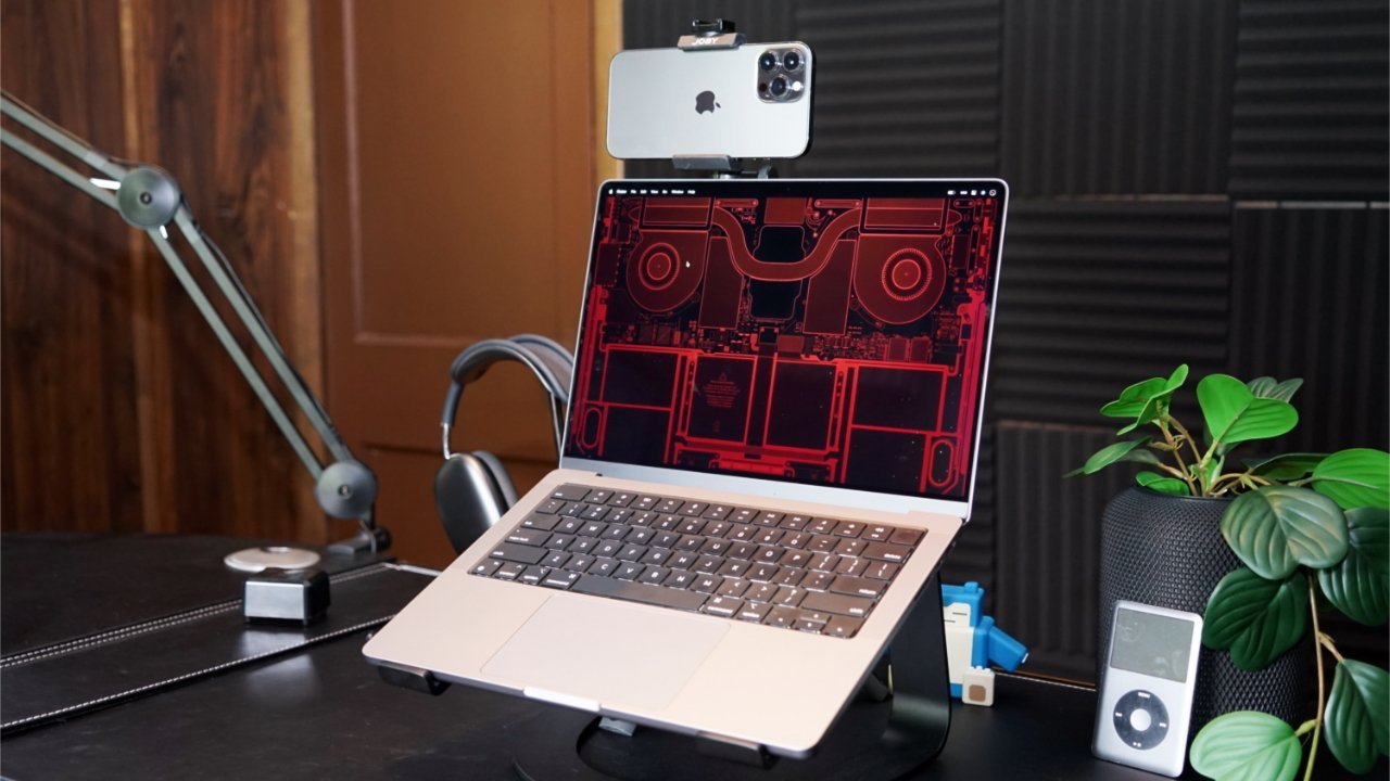
Apps like Pages continue to have their impressive Continuity Camera feature, whereby your Mac can control your iPhone to take photos or scan documents. That Continuity Camera feature, though, has been radically extended to bring key iPhone features to the Mac.
It's a little unwieldy, and physically looks more like a Rube Goldberg or Professor Branestawm invention. You mount your heavy iPhone atop your delicately slim MacBook Pro display, and hope it doesn't fall forward.
Physically it's unwieldy, but once the iPhone is mounted, Continuity Camera is great
Apple used what it implied were forthcoming mounts from Belkin, and plenty of users are already successfully trying to tape their iPhones to the screen. Just, you know, don't go slamming shut the lid.
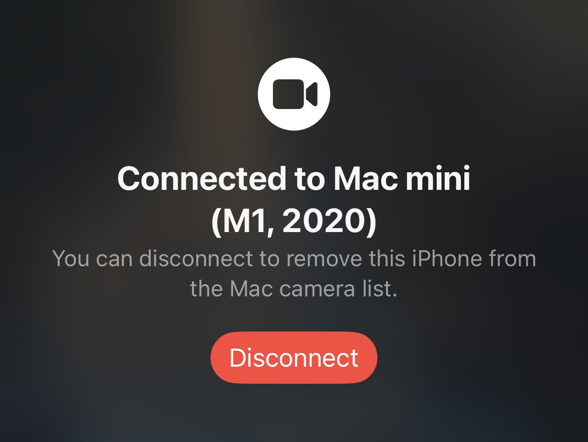
If it's physically not wonderful, though, it is rather startlingly amazing in actual use. As long as you have an iPhone 11 or later, and it's running iOS 16, then simply being on the same Wi-Fi network, and logged in to the same Apple ID, is enough.
Your iPhone doesn't even have to be unlocked. The Mac still recognizes that it's near, turns on the iPhone's camera, and presents that as the webcam in FaceTime, Zoom, Teams, and even QuickTime Player.
With an iPhone and Continuity Camera, you get iPad-like benefits for the Mac. Specifically, you get Center Stage.
So just as with an iPad, you can move about in shot, or someone else can join you on your side of a video call, and the screen automatically re-frames the image to show you perfectly.
There is more, though. If you have an iPhone 12 or later, then you also get a feature called Studio Light.
FaceTime automatically uses your iPhone camera, wherever it's pointing
Turn this on, and the iPhone alters the image. It automatically dims the background and lightens your face, intelligently distinguishing between the two and creating a better image.
And if Stage Manager is the most visible improvement in macOS Ventura for all users, Continuity Camera is the wow moment -- for some users.
Note that being able to run iOS 16 on your iPhone is not enough. The second generation iPhone SE, for instance, is newer than the iPhone 11 and is officially supported by iOS 16 yet the new Continuity Camera features don't work on it.
So again just requiring an iPhone 11 or later, Continuity Camera on macOS Ventura and iOS 16 introduces Desk View. Without you doing anything to reposition that wobbly iPhone atop your Mac's screen, the lenses in it are able to simultaneously focus on you and your desk.
Have a search for craft planner videos on YouTube. Countless videos like this show an overhead view of a crafter working at his or her desk, demonstrating something.
That's what Continuity Camera with Desk View brings to everyone in a video call like FaceTime or Zoom.
What you see on the iPhone screen when it connects to Continuity Camera
As of macOS Ventura and iOS 16, FaceTime supports Apple's handoff feature. This is feature, previously seen in audio with the iPhone and the HomePod mini, where you can switch devices seamlessly.
In that audio example, you listen to music on your iPhone until you reach home, then you handoff that music to your HomePod mini, which then plays it.
Now you can be on a quick FaceTime call on your iPhone when you realise this conversation is going to take a lot longer than you expect, so you just hand it off to your Mac.
Without a moment's interruption to the call, you are now able to continue the video conversation on your Mac while you make coffee in the background.
And if you are at your Mac, you can of course do this the other way around, starting with the Mac and continuing on your iPhone as you head out to work.
Only, if you're at your Mac, there is a new way to start a FaceTime call. You can do it as part of the improvements to Safari.
If you do this a lot with the same people, you are probably working together, or perhaps just plotting a trip together. In either case, you're likely to each be looking up websites -- and now you can better share what you're up to.
Since macOS Monterey, Safari has had Tab Groups and they are superb. With a couple of clicks, you can have every site you need for work open in a tab -- and not see any of your vacation-planning ones.
Or with the same clicks, dismiss all of your work tabs and only see that vacation one. Or only see your favorite news sites.
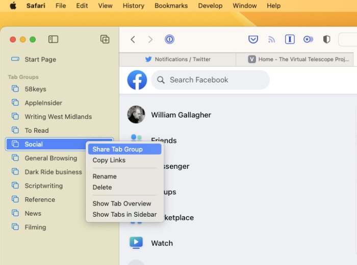
You can now share an entire Safari tab group
It's sometimes proved a little buggy, and the macOS Ventura beta oddly re-orders the list of your tab groups, but it is little short of fantastic for productivity.
Now, though, you can take one of your carefully curated tab groups and share it with colleagues, family, friends, basically anyone who needs it and will muck it up for you.
They mean well, though, and they're probably helpfully adding useful websites to your shared tab group.
There are people who do not mean well, though, and who have anything but your interests at heart -- and Safari is aiming to make things more difficult for them.
As long as there is an actual password that you can read out after a phishing attack, there is a risk. And as long as there are actual passwords stored on companies' servers that could be hacked, there's even more of a risk.
Apple, along with Microsoft, Google and very many more, wants to fix this by entirely eradicating the password. And macOS Ventura is beginning the job.
Under Ventura, you can create what Apple calls a Passkey instead of a password. Log in to a new site and where you would ordinarily be asked to create a password with so many letters, numbers and punctuation symbols, Safari will now offer to make a Passkey instead.
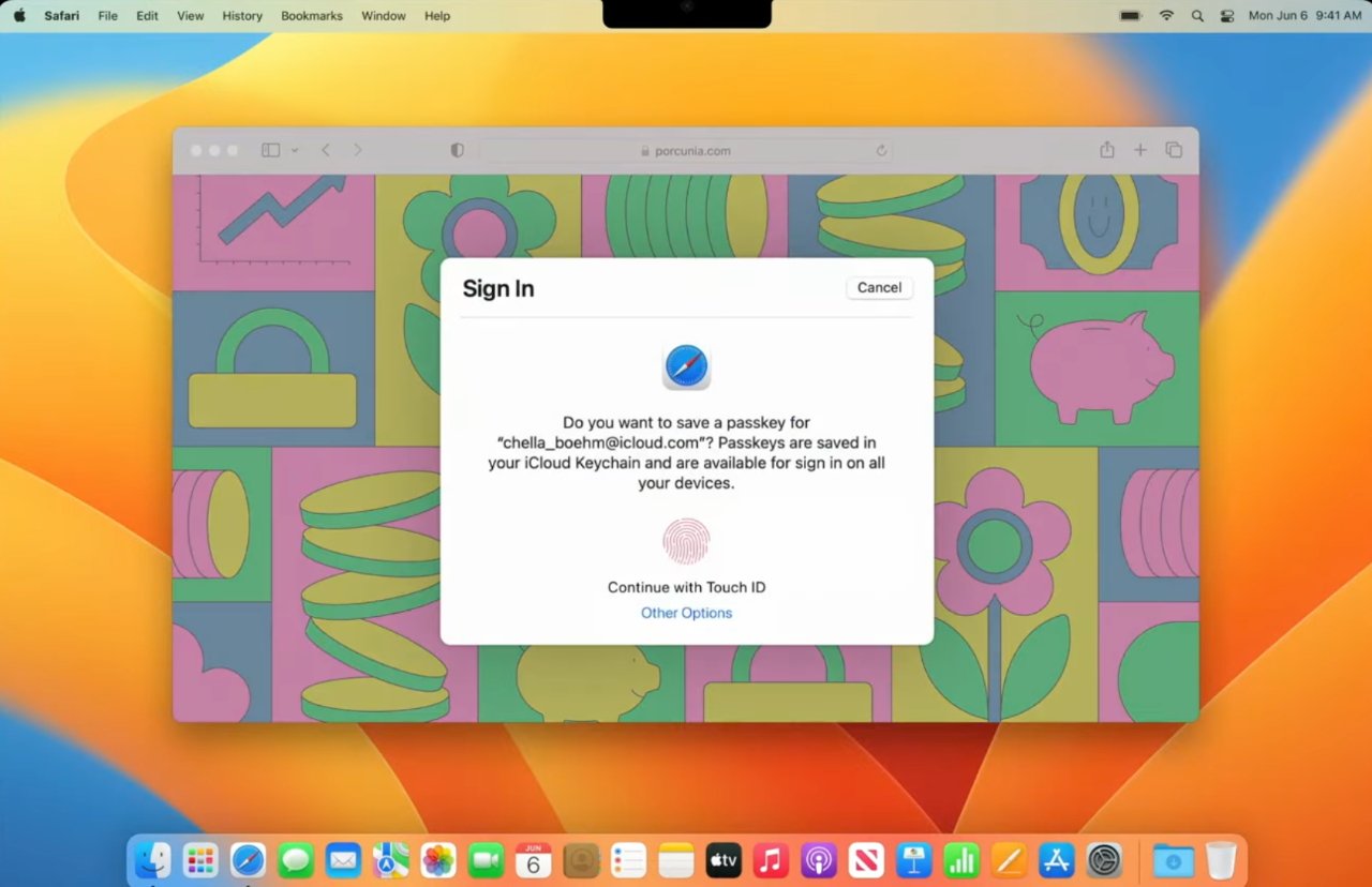
Apple wants biometric Passkeys to replace passwords
A Passkey relies on biometric verification. You sign in with Face ID, or Touch ID, and the system already knows you are you.
Or at least, it knows that the you signing in now with Face ID, is the same you who created the passkey.
In theory, this does totally remove the password. You have no password to store anywhere, no password to remember, and yet you get a way of accessing sites that manages to be simultaneously effortless and highly secure.
Only, Apple said this is the start of a journey toward replacing passwords, and hopefully it's a journey that will see a lot more thought first.
As Apple mentioned in its WWDC 2022 launch of macOS Ventura and Passkeys, it is a member of FIDO. Alongside Google, Microsoft and very many more, the Fast Identity Online alliance is working toward this passwordless future.
But FIDO is also quite clear about backup systems in case biometrics fail. If you can't log in with Face ID, Touch ID, or another company's equivalent, FIDO proposes that you can use a passcode.
This is exactly how Face ID works now on an iPhone. Whenever you restart your iPhone, you can't log in with Face ID, you have to tap in a four-digit or six-digit passcode instead.
So right now this passwordless future looks like yes, we'll have no passwords. It looks like yes, we'll have these fantastic biometric tools.
But it also looks like bad actors can rely on users choosing 1, 2, 3, 4 as their passcode.
Previously you could lock a note with a unique password. Now you can still do that, but you can also have it so that the locked notes use your main Mac login password instead.
So you can have one password that lets you in to all of your locked notes. Or, indeed, you can get in to them with Touch ID.
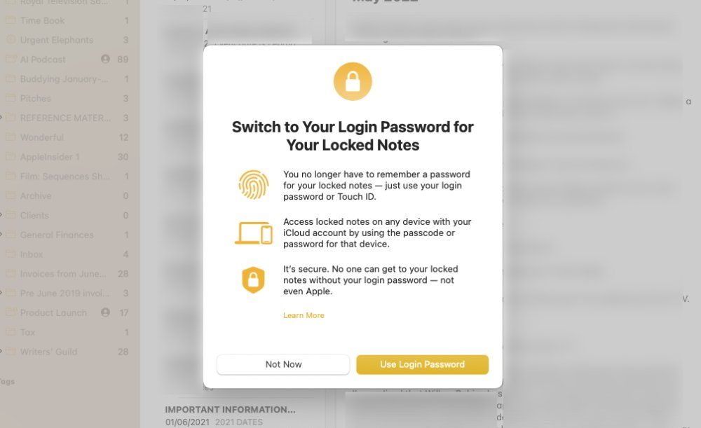
You can now lock a Note with just your regular Mac password or Touch ID
If you just need a little extra security, then this means your notes are as protected as your Mac. If you need more for any reason, you just continue creating unique passwords for particular notes.
It's not that likely that anyone will see your locked notes. Or at least it isn't as likely as it could be with photos.
Very commonly, you have photos of friends or family, and you want those people to be able to see those shots -- but no others. It needn't be that you're privately ashamed of how poor your landscape photography is, it can just be that these friends are only interested in the photos of you with them.
So now you can use iCloud Shared Photo Library. It's limited to the six people (including you) in your Family Sharing setup, though, so it's not great for work parties.
For those people in your Family Sharing group, though, you effectively have an album where any of you can share any photos you like. You can tap to select specific images from your Photo Library and send them to this shared album, for instance.
But you've been able to do something like this for quite a time. What macOS Ventura does is streamline the process, making it seamless to either manually choose images to share -- or automate it.
You can set iCloud Shared Photo Library to automatically include any photo that has you and specific other people in it, for instance.
It's called Copy Subject, and you choose it either from right-clicking on an image in Photos, or by choosing Edit, Copy Subject.
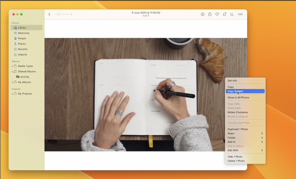
You can click Copy Subject and an image without the background will be placed on the Clipboard
Either way, the main subject of your photograph is then calculated, selected, and copied to the clipboard. If you go to an image editing app, or even something like Messages or Pages, you can then paste.
What you get is the photo's person, tree, cat, or whatever, pasted without any of the background. It's similar to Photoshop's tools, or the background removal in Pixelmator Pro.
At times, it can even be better than those tools. It's down to how well the subject can be identified in the image, and how similar colors are between subject and background.
So at times it isn't good at all, but usually it's good enough -- and sometimes it's remarkably great.
After Copy Subject, paste from the Clipboard into Pages, Messages or any other application
It's curious, though, how this feature is a clear step forward in convenience, but feels like a little step backward in operation. The fact that your isolated subject is copied to the clipboard and must be pasted somewhere before you can see it, is reminiscent of how Windows Paint works.
But then the idea is not that you will want to examine the isolated subject to confirm it's what you want. The idea is that it will always be what you want -- and you can therefore get on with sending this isolated image on to somewhere, or someone, else.
So maybe you do want to use this cutout image of a car in some Pixelmator Pro collage. But maybe you want to send it to someone in a Message or an email.
Specifically, Apple has made a big deal of how we do all make mistakes and send Messages or emails to the wrong person, or how we easily make typing errors. As Apple sees it, macOS Ventura fixes this by giving us a chance to put things right, but there are good and bad parts to this.
It shouldn't be that it's going to the right person but you've forgotten a promise attachment, though. Mail in macOS Ventura will spot that you've said something is attached, but haven't actually done it.
Similarly, it will spot when you haven't written a subject heading for the email, and it will prompt you to.
These are familiar features from Gmail, including the ten-second delay before sending, but they are nonetheless good and welcome here.
There are some default suggestions for when to schedule emails
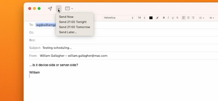
So is Mail's new scheduling feature, well-known to users of email services such as SaneBox. You can click to send an email right now as normal, or you can choose from a drop down menu offering different times the email should be sent.
As well as a couple of pre-baked options, you can use a date and time picker to select any moment you want the mail to go.
So maybe that work email is on your mind all evening, but you know that if you reply now, you'll end up in a long email conversation with your boss. Instead, you can write that reply to get off your back, but tell Mail to send it at 9am tomorrow.
Unfortunately, at least at present, this feature seems to be device-side -- the message stays on your Mac until it's time to send. It would be much better if it were server-side, if the email left your Mac but was held in your iCloud account until the time came to send it.
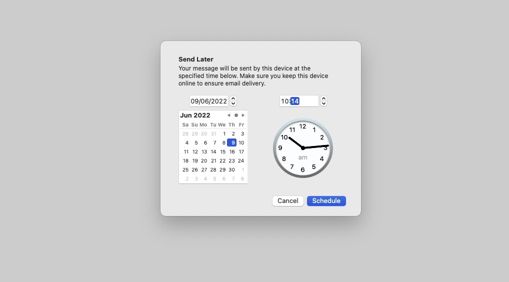
You can pick specific times and dates to schedule emails to send
For one consequence at the moment is that if you shut down your Mac early, the email won't send on time. Curiously, a second consequence is that if you then start up your Mac after the scheduled send time, it won't then send even though it can.
Instead, it remains in a new temporary Mail inbox called Send Later. That appears and disappears in the same way that the Outbox does, only available when you are sending an email.
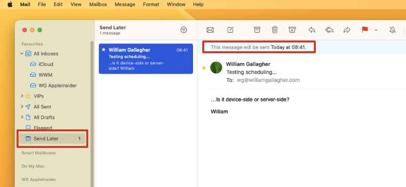
It wasn't sent at 08:31, though, because the Mac was off. Curiously, it then still didn't send after the Mac was back on.
Specifically, you have 15 minutes after sending in which to either "edit or recall" a message.
The problem is that if you take back a message, it's removed from your Messages thread -- and theirs. At present, it appears that if they are on macOS Ventura, or iOS 16, that message completely disappears.
You tap and hold on a Message you've just sent, and you get a menu that includes Unsend. Tap that and the Message vanishes from your conversation, and you get a small notice warning that your recipient may still be able to see it if they are on an older version of iOS.
You can unsend Messages
That's true, there's no difference for people not yet on iOS 16, the Message stays in their thread.
Only, it's too easy to imagine some quite foul situations once iOS 16 is on most iPhones. An abuser could seemingly bombard their victim with messages, then remove each one a few minutes after sending.
Presumably the only way the victim could show that they had been getting these message at all is to take screen grabs. That requires them to have presence of mind under pressure -- and screengrabs can be faked, so even they actually aren't proof.
It's so easy to imagine these situations that surely, surely Apple has imagined them. But so far, unlike the issue with AirTags and stalking, the company doesn't seem to have implemented any safeguards.
A solution to proving abuse, if unfortunately not stopping it, could be if Apple retained recalled Messages in the sender's iCloud history.

Unsend a message and you (briefly) see an exploding animation
Such as gaming. The new macOS Ventura brings features like MetalFX Upscaling, for instance, that will help game developers by speeding up the rendering of complex scenes.
It reportedly has overall performance improvements, too, but as users we won't see that until new games are shipping. Apple says that EA's GRID Legends and Capcom's Resident Evil Village, are among those due to take advantage of the new features.
We're also going to have to wait for Freeform. This brainstorming collaboration tool looks like it leverages everything from macOS's collaboration features, to SharePlay.
It's like a much more visual version of, say, Google Docs, in how everyone in a group can work on the same document at the same time. We won't know how well it does this, though, until some time after the launch of macOS Ventura.
In the meantime, we are at the very start of the beta process so there are certainly months before that launch. And there are quite possibly very many changes coming, too.
Yet for now, macOS Ventura with its very yellow wallpaper is already feeling like a robust start to the new operating system.
It includes 49 tools to find and delete invisible computer junk
It helps to tune up the Mac to run at its maximum speed
CleanMyMac X prevents a Mac from cluttering, lagging and slowing down
You can free up tons of space, so your Mac never runs into issues with storage
CleanMyMac X organizes disk space, showing your large hidden folders
It fights Mac-specific malware and adware and protects your computer
Read on AppleInsider
Announced at WWDC, macOS Ventura is the future of the Mac, at least for the next year. Even at this earliest developer beta stage, it looks like it has a rather good future.
Or at least it does if you're on Apple Silicon Macs.
To be clear, macOS Ventura does work on Intel Macs, but this year's minimum requirements have shut out more devices than usual. Apple is moving on, and macOS Ventura exploits the benefits of Apple Silicon.

That progression is far from surprising. Apple even said at the launch of Apple Silicon that it was doing the transition specifically to be able to take the Mac further.
What also shouldn't be surprising is that macOS Ventura isn't finished yet. Apple was up front about how features like the Freeform collaboration tool won't be released until later this year, and going through the beta you see other elements that aren't ready or complete.
It is a beta, though. It's a beta released in June when the final, shipping version of macOS Ventura won't be available until at least September.
So while this review does point out missing elements, rough edges, and some slight disappointments, all of it can be fixed by release date and at least most of it will.
There aren't the fundamental changes in macOS Ventura that we saw in Monterey and especially Big Sur, though. There isn't an equivalent of the Safari Tabs where the radical redesign got toned down over the beta process.
Nonetheless, with developers working on this beta, and later on members of the public -- perhaps foolishly -- trying it out too, there is the potential for a kind of sanding down of the macOS, getting it into shape.
There's plenty for developers and beta tests to see, too, as macOS Ventura does overhaul the Mac, it does bring in new features -- and it does bring in new standard apps.
First impressions of macOS Ventura
It's very yellow. Or if you have Dark Mode on, it's quite orange. Otherwise, macOS Ventura initially looks a lot like macOS Monterey.Apple's new macOS Ventura is yellow in light mode, blood orange in dark
As with every release the OS, other than the more radical macOS Big Sur, what happens on installation is that for a moment, you can't see the difference. If you use custom wallpaper, you don't even get the clue of how yellow the new design is.
Then you start using apps, you start using the Finder and system-wide tools, and you see small differences, small refinements. You get down to work in earnest and now you're seeing what seem like quite small but rather handy features.
Nothing stops you working, nothing gets in your way and makes you have to learn something new in order to get on with what you need to do.
But if you truly want to appreciate what you've got in a new macOS, you don't deep-dive into the really new features. Instead, after a few days of regular work, find a way to use a Mac with the previous version.
The benefits and the differences are really in how the myriad small changes add up, but then there are also very large and clear improvements. For instance, we'll remember that the new macOS Ventura is the version that brought us Stage Manager.
Stage Manager is the stand-out upgrade
There is a reason that Craig Federighi demonstrated Stage Manager on a MacBook Pro. It's a window and app manager that does have benefits on all Macs, but it's most useful on ones with small screens.L-R clicking on a recent app in the column makes the top window zoom out
On a 14-inch MacBook Pro, for instance, you can already have two, three, or as many apps open as you want, but the screen size better suits working in just one. What Stage Manager does it make it much faster, much easier, and much clearer how you can switch between apps.
Turn on Stage Manager in Control Center, and your screen is rearranged:
- The current app moves to the center
- All other recent apps move to a column on the left
- All desktop files are hidden
To switch to a different app -- that you've already got running -- you click on its Stack-like icon in the column on the left. Instantly, that app moves to center stage, and the previous one jumps over into the column.
You can't change the order of recent apps in this column and beyond half a dozen or so of them, the column starts to get cluttered.
L-R Dragging a window toward the left of the screen pushes the recent apps column away
To close one of these recent apps, you click to bring it center stage, then quit it as normal.
If you want to add an app to the column, you launch it as usual, and it becomes the main app. Click on the column to switch apps, and the new one instantly jumps over to the column.
It is instant and this part is smooth, even enjoyable. There are two points where it gets a little slower, either because it slows your working, or because Apple's animation isn't yet optimized.
The slower working process is the more important. Since Stage Manager hides all of your desktop files, it now takes a few steps to drag a document from the desktop into an app.
First you click somewhere on the apparently empty desktop. That really makes the Finder be the main active app and everything else is now immediately in the recent apps column.
With the Finder active, your desktop files are back. Click and drag on one, and then you can take it over to any of the recent apps in the column.
It then takes a beat before the app you hover over reacts. The app opens up center stage, and finally you can drop the file into it.
Right now it's hard to see how Apple could cut down the number of steps for that, but it might be that it at least speeds up the reaction time of the app as you hover over it.
Part 1 of exiting Stage Manager
Doubtlessly the final version of macOS Ventura will speed up the slow animation part of Stage Manager, though. This is when you resize the center app's window to fill more of the screen, or when you drag it close to the recent apps column.
The column disappears under the app's window, just as if, and just as quickly, as if you were merely dragging the window over a regular Finder desktop. But then when you move the window away again, the recent apps column rather judders back into view.
macOS Ventura's Stage Manager feels optimized for small screens
Run this Stage Manager on a MacBook Pro or MacBook Air and it's about as close to the old one-app-at-a-time of the iPad as the Mac can ever get. It's uncluttered, it's clear, it actually feels as if you're on top of all your work.Use it on a larger monitor, especially an ultrawide one, and it's a little different. By default, Stage Manager makes the main center app be quite skinny, and you see rather a lot of desktop wallpaper around it.
You can resize the center app and macOS Ventura does remember the size, though.
Plus if you drag on an app in the recent apps column, instead of clicking on it, then you pull out that other app and can have two on screen at once. Or three. Or four.
Part 2 of exiting Stage Manager
What's good is that macOS Ventura also remembers this pairing, or this trio, whatever it is. And it treats them as one set, so now you can easily switch between this group of apps, and another.
Perhaps even better is that really what's happening is that Stage Manager is remembering a window, not a whole app.
So if you have Pages, say, in your recent apps column, you might have half a dozen documents open in it, and you can see them all right there in the column. Clicking on Pages in the recent apps column brings the app center stage, but then rotates between the documents as you click.
Since it's treating each document, or each of Pages's windows, as a separate item, it means you can also deal with the documents separately. Drag one out of the column to join, say, Numbers, and now you have a pairing that is Numbers and this one Pages document.
Drag another Pages document out and you can pair it with Mail. It's a particularly handy boon of Stage Manager and can become quite addictive.
Although ultimately you can end up negating the whole value of Stage Manager by using it to group too many apps and documents together. It's easy to do that, it's very easy to start using Stage Manager -- and it's not quite so easy stopping.
Quitting Stage Manager
Part 3 of exiting Stage Manager, you're still not done
This is an awkward part of macOS Ventura and surely likely to change. To get into Stage Manager, you open Control Center, click the toggle button, and you're done.
But to get out of it, you open Control Center, click the toggle button -- and you're not done.
Instead of exiting Stage Manager, you get a second notification-style banner that includes a switch for turning it off and you have to click that, then click to dismiss the banner. It should surely, clearly be that the one toggle turns this on and off, and the reason it doesn't is that Apple wants to offer you an extra option.
In that notification-style banner, you also get to choose whether or not exiting Stage Manager hides your recent apps. Choose hide and when you come out, you've just got the main app in the foreground.
Choose not to hide them, and you get all of those recent apps on screen at once.
This is not something you're going to change your mind about every time you come in or out of Stage Manager. You're going to prefer one way or the other, so it should be a preference setting, it shouldn't slow down the quitting process every time.
Stage Manager could do a better job, too, when you've chosen to let it show all recent apps. Because, at least at present, macOS Ventura does not remember where all your apps were before you switched on Stage Manager.
Consequently, when you come out of it, the apps are all rather dumped in the middle of your screen. This tool for automatically organizing your app windows to avoid clutter, ends up creating a cluttered mess of app windows.
Even so, in the heat of a working day when you're trying to focus, you will reach for Stage Manager. It's the stand-out feature of macOS Ventura because it's the most visible change, plus it's the most immediately useful addition that applies across the whole Mac.
Most of the other changes and improvements are in individual different apps, but there are also some more system-wide updates. These are chiefly in the Finder and the new System Settings, but there is also one new Accessibility feature that could rival Stage Manager for being the most visual improvement to macOS.
Live Captions is coming to the Mac
Turn on Live Captions in macOS Ventura and whatever you're doing, whichever app you're in, you will get on-screen transcriptions of your conversations.It won't ever be perfect, it is a transcription after all, but it is an impressive addition. And in these days of constant Zoom calls, it is a deeply welcome new feature of the Mac.
However, although Live Captions is system-wide, don't expect it to be worldwide. Even after macOS Ventura is publicly released, too, this Live Captions element will continue to be listed as a beta for some unknown time.
Apple says that this Live Captions (Beta) will also be only available in English, and for solely users in the US and Canada. That's common for any of Apple's language work, and we can expect more countries to follow over the next year.
For now, even the beta macOS Ventura is geo-locked like this. If you are in the US or Canada, then going to System Settings, Accessibility, shows you an option for Live Captions (Beta).
The setting is entirely missing when you're a user anywhere outside the US or Canada.
The new System Settings
The Finder and System Settings
Wherever you are, though, Finder windows look the same as before. Although if you click to share something -- from a desktop window or within any app -- you will see a difference. The share extension has been redesigned.It's a small thing, and the chief difference is just that you will notice it looks neater and smaller. It's feels clearer and cleaner, but it also surfaces more detail -- you can send to particular contacts without first choosing Messages.
And on a bigger scale, that's the same with the new System Settings, it is cleaner and it offers more detail.
Until now, the more you worked across Mac and iPhone, the more often you would notice that iOS has Settings where macOS has System Preferences.
No longer. Now it's Settings on iOS and System Settings on the Mac.
It's a curious change. Making the two systems, iOS and macOS be the same makes sense, but this isn't the same. It's going from one difference to another difference, and since there's no benefit at all to keeping the word "System," it's a fair bet this will change.
Less curious, but possibly more controversial, is how the whole of System Settings itself has been changed to more resemble Settings in iOS. It's visually a much changed design and does take getting used to.
That's chiefly, though, less because of the visual changes and more because of the organizational ones. The new System Settings is very clear, arguably much clearer than the old collection of icons, but certain parts have been moved.
Login Items, for instance, used to be in a settings pane called Users & Groups, but now it's within General. No criticism here, if anything the new place makes more sense.
Only, when macOS Ventura is finally shipping, it is going to take longstanding Mac users time to find where everything is. And at the moment, in the beta, there are two issues that make this more frustrating than it should be.
The new, separate Wallpaper section in System Settings
One is that for some reason, macOS Ventura does not keep all of the login items, the startup apps or utilities, that were set under macOS Monterey. There's no obvious pattern to it, but in our testing, for example, it was as if Ventura forgot we had TextExpander -- and remembered we use Alfred 4.
Consequently, an early job in using macOS Ventura is putting back all of the missing login items. And consequently not being able to find the section in Users & Groups is a small annoyance.
The big annoyance, which will doubtlessly be fixed by release, is that the search feature in System Settings does not work at all. It will not return the right result if you search for "Login Items," it won't return any result.
Yet overall, the new System Settings is an improvement. Under the old System Preferences for instance, you could change your wallpaper but there wasn't actually a section called that.
You had to go into Desktop & Screen Saver, which doesn't sound arduous, yet even within that section, even though that was where you changed wallpaper, the word "wallpaper" was nowhere to be found.
Whereas now there is a section in System Settings that is just called Wallpaper.
There are many changes like this, surfacing common items better than before, making it clearer where everything is.
The new System Settings is good, it will just take time to get used to, the longer you've been working on Macs.
There has also been a question, though, over whether the redesign will prove to be a problem for AppleScript users. The old System Preferences supported scripting, it had an AppleScript dictionary so users could include changing settings in their scripts.
Apple hasn't commented on this yet, but it's probable that AppleScripts will continue to work as normal. It's possible that some will have to be rewritten, but the new System Settings does present the same AppleScript dictionary.
Plus although search within System Settings doesn't work, search outside it does. If you use Alfred 4, the Spotlight replacement, then you can type the name of a System Preference pane and it will open the correct part of the new System Settings.
That suggests that whatever the surface redesign is, the back end of System Settings remains the same. And so should remain as controllable by AppleScript.
Spotlight continues to offer quick access to searches
Speaking of Spotlight
Spotlight has long been an amazing tool on the Mac for finding anything, whether that means searching the Mac itself or online. It's not been quite so amazing, though, that there aren't reasons to use alternatives such as Alfred 4 or LaunchBar.The new macOS Ventura's Spotlight isn't going to pull fans of those third-party apps back into the Apple fold, but it is improved.
Visually, it now presents relevant photos in searches, and it's also more neatly designed overall. It's able to present long lists of results in a smaller space, while also appearing clearer.
Those results, too, are improved in how they can for instance include recent websites you've visited that are relevant to your search. Plus when you scroll down to a result, you can tap the space bar to get a Quick Look at the image, the document, and so on.
Spotlight now also does more in presenting information rather than showing links to webpages with what you want. So it will better show sports results right there in the search field, for instance.
But Spotlight is now neater, breaks down results better and (very bottom) includes relevant photos
It's also added the ability to perform actions such as setting timer. Although good luck figuring out what to type to get that to work.
You're better off holding down the Command key and the space bar, waiting a beat for Siri to appear, and then saying, "Hey, Siri, set a timer for ten minutes," or whatever you need.
You can now tap the Space Bar in Spotlight to get Quick Look
Added utilities
Although billed as being part of the Spotlight improvements, this timer feature really exists because Apple has brought its Clock app to the Mac.This mostly resembles the form and layout of Clock on iPadOS, but now does everything you could on either iPhone or iPad.
Similarly, Apple has finally brought over the Weather app from iOS, and it is very nicely done. All of the same clarity and simply gorgeous graphics from the iPhone Weather app are here, just arranged in a different order.
The new Clock app will be familiar to iPad users
Where you would scroll to see all of the elements of the Weather app on iPhone, for the Mac they are all presented in a kind of dashboard layout. See basic information at a glance, or click on an element to get more detail.
It's particularly well done how you can click and drag sliders to show, for instance, predicted rainfall at different times of the day.
Although it's currently less well done how you handle the weather for multiple locations. By default, you of course get the weather for where you are now, but you can add alternatives.
Only, there is a plus sign on the top of the Weather app's screen and it does not add an alternative city. It doesn't do anything, not at first.
Instead, you have to use the search field next to the plus sign. Find a city or other location you want, then as the Weather app displays data for there, now you can click that plus sign.
Once you've added more than one location, they are all available in a sidebar. This optionally pops out in exactly the same way that, for instance, you can get Preview to show you thumbnails, or Pages to show you a table of contents.
The new Weather app in macOS Ventura
Apps like Pages continue to have their impressive Continuity Camera feature, whereby your Mac can control your iPhone to take photos or scan documents. That Continuity Camera feature, though, has been radically extended to bring key iPhone features to the Mac.
Continuity Camera and Desk View
Apple tiptoed around this, but still came as close as it ever will to admitting that the Mac's built-in webcams are a bit rubbish compared to the iPhone's cameras. Now, you can use the iPhone's camera on your Mac.It's a little unwieldy, and physically looks more like a Rube Goldberg or Professor Branestawm invention. You mount your heavy iPhone atop your delicately slim MacBook Pro display, and hope it doesn't fall forward.
Physically it's unwieldy, but once the iPhone is mounted, Continuity Camera is great
Apple used what it implied were forthcoming mounts from Belkin, and plenty of users are already successfully trying to tape their iPhones to the screen. Just, you know, don't go slamming shut the lid.
If it's physically not wonderful, though, it is rather startlingly amazing in actual use. As long as you have an iPhone 11 or later, and it's running iOS 16, then simply being on the same Wi-Fi network, and logged in to the same Apple ID, is enough.
Your iPhone doesn't even have to be unlocked. The Mac still recognizes that it's near, turns on the iPhone's camera, and presents that as the webcam in FaceTime, Zoom, Teams, and even QuickTime Player.
With an iPhone and Continuity Camera, you get iPad-like benefits for the Mac. Specifically, you get Center Stage.
So just as with an iPad, you can move about in shot, or someone else can join you on your side of a video call, and the screen automatically re-frames the image to show you perfectly.
There is more, though. If you have an iPhone 12 or later, then you also get a feature called Studio Light.
FaceTime automatically uses your iPhone camera, wherever it's pointing
Turn this on, and the iPhone alters the image. It automatically dims the background and lightens your face, intelligently distinguishing between the two and creating a better image.
And if Stage Manager is the most visible improvement in macOS Ventura for all users, Continuity Camera is the wow moment -- for some users.
Note that being able to run iOS 16 on your iPhone is not enough. The second generation iPhone SE, for instance, is newer than the iPhone 11 and is officially supported by iOS 16 yet the new Continuity Camera features don't work on it.
So again just requiring an iPhone 11 or later, Continuity Camera on macOS Ventura and iOS 16 introduces Desk View. Without you doing anything to reposition that wobbly iPhone atop your Mac's screen, the lenses in it are able to simultaneously focus on you and your desk.
Have a search for craft planner videos on YouTube. Countless videos like this show an overhead view of a crafter working at his or her desk, demonstrating something.
That's what Continuity Camera with Desk View brings to everyone in a video call like FaceTime or Zoom.
What you see on the iPhone screen when it connects to Continuity Camera
Speaking of FaceTime
Continuity Camera with Desk View is the main new benefit that's come to FaceTime, but there is one more.As of macOS Ventura and iOS 16, FaceTime supports Apple's handoff feature. This is feature, previously seen in audio with the iPhone and the HomePod mini, where you can switch devices seamlessly.
In that audio example, you listen to music on your iPhone until you reach home, then you handoff that music to your HomePod mini, which then plays it.
Now you can be on a quick FaceTime call on your iPhone when you realise this conversation is going to take a lot longer than you expect, so you just hand it off to your Mac.
Without a moment's interruption to the call, you are now able to continue the video conversation on your Mac while you make coffee in the background.
And if you are at your Mac, you can of course do this the other way around, starting with the Mac and continuing on your iPhone as you head out to work.
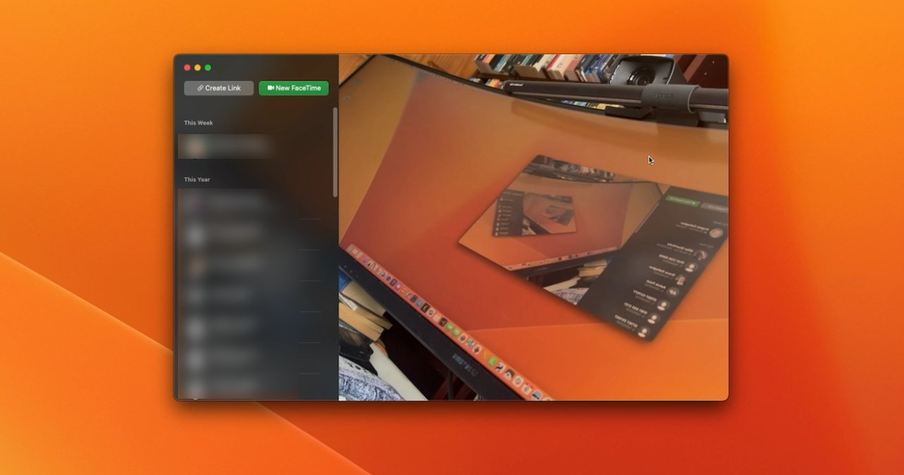
Only, if you're at your Mac, there is a new way to start a FaceTime call. You can do it as part of the improvements to Safari.
Safari on macOS Ventura
Safari has a Collaboration icon in the toolbar. Click on that and you can Message someone with the link, or you can start a FaceTime audio or video call.If you do this a lot with the same people, you are probably working together, or perhaps just plotting a trip together. In either case, you're likely to each be looking up websites -- and now you can better share what you're up to.
Since macOS Monterey, Safari has had Tab Groups and they are superb. With a couple of clicks, you can have every site you need for work open in a tab -- and not see any of your vacation-planning ones.
Or with the same clicks, dismiss all of your work tabs and only see that vacation one. Or only see your favorite news sites.
You can now share an entire Safari tab group
It's sometimes proved a little buggy, and the macOS Ventura beta oddly re-orders the list of your tab groups, but it is little short of fantastic for productivity.
Now, though, you can take one of your carefully curated tab groups and share it with colleagues, family, friends, basically anyone who needs it and will muck it up for you.
They mean well, though, and they're probably helpfully adding useful websites to your shared tab group.
There are people who do not mean well, though, and who have anything but your interests at heart -- and Safari is aiming to make things more difficult for them.
Introducing Passkeys
Apple will tell you that it stores passwords securely in the Mac's Keychain, and third-party apps like 1Password are equally strong on security. But it still remains the case that bad actors are very good at getting passwords, not least by conning us into revealing them.As long as there is an actual password that you can read out after a phishing attack, there is a risk. And as long as there are actual passwords stored on companies' servers that could be hacked, there's even more of a risk.
Apple, along with Microsoft, Google and very many more, wants to fix this by entirely eradicating the password. And macOS Ventura is beginning the job.
Under Ventura, you can create what Apple calls a Passkey instead of a password. Log in to a new site and where you would ordinarily be asked to create a password with so many letters, numbers and punctuation symbols, Safari will now offer to make a Passkey instead.
Apple wants biometric Passkeys to replace passwords
A Passkey relies on biometric verification. You sign in with Face ID, or Touch ID, and the system already knows you are you.
Or at least, it knows that the you signing in now with Face ID, is the same you who created the passkey.
In theory, this does totally remove the password. You have no password to store anywhere, no password to remember, and yet you get a way of accessing sites that manages to be simultaneously effortless and highly secure.
Only, Apple said this is the start of a journey toward replacing passwords, and hopefully it's a journey that will see a lot more thought first.
As Apple mentioned in its WWDC 2022 launch of macOS Ventura and Passkeys, it is a member of FIDO. Alongside Google, Microsoft and very many more, the Fast Identity Online alliance is working toward this passwordless future.
But FIDO is also quite clear about backup systems in case biometrics fail. If you can't log in with Face ID, Touch ID, or another company's equivalent, FIDO proposes that you can use a passcode.
This is exactly how Face ID works now on an iPhone. Whenever you restart your iPhone, you can't log in with Face ID, you have to tap in a four-digit or six-digit passcode instead.
So right now this passwordless future looks like yes, we'll have no passwords. It looks like yes, we'll have these fantastic biometric tools.
But it also looks like bad actors can rely on users choosing 1, 2, 3, 4 as their passcode.
Security in other apps
There are also a couple of extra security elements in the rest of macOS Ventura, including a small addition to Apple Notes.Previously you could lock a note with a unique password. Now you can still do that, but you can also have it so that the locked notes use your main Mac login password instead.
So you can have one password that lets you in to all of your locked notes. Or, indeed, you can get in to them with Touch ID.
You can now lock a Note with just your regular Mac password or Touch ID
If you just need a little extra security, then this means your notes are as protected as your Mac. If you need more for any reason, you just continue creating unique passwords for particular notes.
It's not that likely that anyone will see your locked notes. Or at least it isn't as likely as it could be with photos.
Very commonly, you have photos of friends or family, and you want those people to be able to see those shots -- but no others. It needn't be that you're privately ashamed of how poor your landscape photography is, it can just be that these friends are only interested in the photos of you with them.
So now you can use iCloud Shared Photo Library. It's limited to the six people (including you) in your Family Sharing setup, though, so it's not great for work parties.
For those people in your Family Sharing group, though, you effectively have an album where any of you can share any photos you like. You can tap to select specific images from your Photo Library and send them to this shared album, for instance.
But you've been able to do something like this for quite a time. What macOS Ventura does is streamline the process, making it seamless to either manually choose images to share -- or automate it.
You can set iCloud Shared Photo Library to automatically include any photo that has you and specific other people in it, for instance.
More Photo improvements
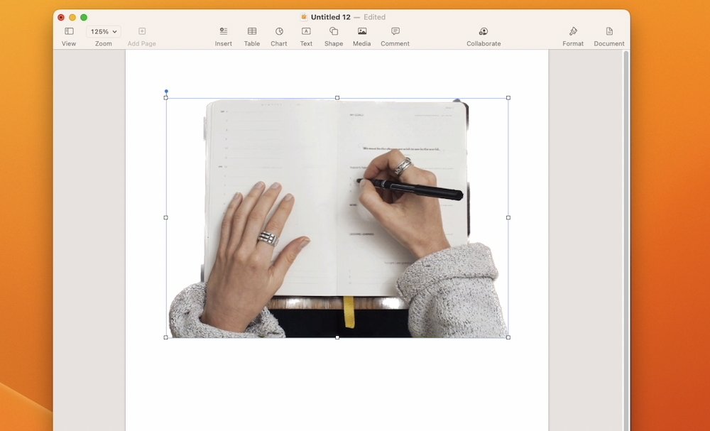
Maybe you want to be a bit more creative than just having your Mac or iPhone chuck every Thanksgiving photo around the group. Photos has added a small but extremely well done feature to give you a new editing option.It's called Copy Subject, and you choose it either from right-clicking on an image in Photos, or by choosing Edit, Copy Subject.
You can click Copy Subject and an image without the background will be placed on the Clipboard
Either way, the main subject of your photograph is then calculated, selected, and copied to the clipboard. If you go to an image editing app, or even something like Messages or Pages, you can then paste.
What you get is the photo's person, tree, cat, or whatever, pasted without any of the background. It's similar to Photoshop's tools, or the background removal in Pixelmator Pro.
At times, it can even be better than those tools. It's down to how well the subject can be identified in the image, and how similar colors are between subject and background.
So at times it isn't good at all, but usually it's good enough -- and sometimes it's remarkably great.
After Copy Subject, paste from the Clipboard into Pages, Messages or any other application
It's curious, though, how this feature is a clear step forward in convenience, but feels like a little step backward in operation. The fact that your isolated subject is copied to the clipboard and must be pasted somewhere before you can see it, is reminiscent of how Windows Paint works.
But then the idea is not that you will want to examine the isolated subject to confirm it's what you want. The idea is that it will always be what you want -- and you can therefore get on with sending this isolated image on to somewhere, or someone, else.
So maybe you do want to use this cutout image of a car in some Pixelmator Pro collage. But maybe you want to send it to someone in a Message or an email.
Mail and Message improvements
Both Messages and Mail have seen improvements in macOS Ventura. Just as with Passkeys, though, you have to hope certain parts get thought through.Specifically, Apple has made a big deal of how we do all make mistakes and send Messages or emails to the wrong person, or how we easily make typing errors. As Apple sees it, macOS Ventura fixes this by giving us a chance to put things right, but there are good and bad parts to this.
The good improvements
So with Mail, for instance, you have 10 seconds between pressing Send and it actually being sent. That's 10 seconds in which you can wince at your mistake and stop the email going out to the wrong person.It shouldn't be that it's going to the right person but you've forgotten a promise attachment, though. Mail in macOS Ventura will spot that you've said something is attached, but haven't actually done it.
Similarly, it will spot when you haven't written a subject heading for the email, and it will prompt you to.
These are familiar features from Gmail, including the ten-second delay before sending, but they are nonetheless good and welcome here.
There are some default suggestions for when to schedule emails
So is Mail's new scheduling feature, well-known to users of email services such as SaneBox. You can click to send an email right now as normal, or you can choose from a drop down menu offering different times the email should be sent.
As well as a couple of pre-baked options, you can use a date and time picker to select any moment you want the mail to go.
So maybe that work email is on your mind all evening, but you know that if you reply now, you'll end up in a long email conversation with your boss. Instead, you can write that reply to get off your back, but tell Mail to send it at 9am tomorrow.
Unfortunately, at least at present, this feature seems to be device-side -- the message stays on your Mac until it's time to send. It would be much better if it were server-side, if the email left your Mac but was held in your iCloud account until the time came to send it.
You can pick specific times and dates to schedule emails to send
For one consequence at the moment is that if you shut down your Mac early, the email won't send on time. Curiously, a second consequence is that if you then start up your Mac after the scheduled send time, it won't then send even though it can.
Instead, it remains in a new temporary Mail inbox called Send Later. That appears and disappears in the same way that the Outbox does, only available when you are sending an email.
It wasn't sent at 08:31, though, because the Mac was off. Curiously, it then still didn't send after the Mac was back on.
The potentially bad "improvements"
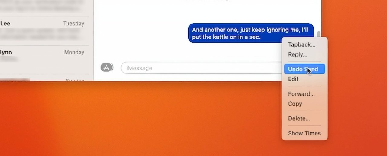
Right alongside these features in Mail, Messages also gives you similar abilities to change your mind. You can edit a message you've sent, within limits, and you can even un-send them.Specifically, you have 15 minutes after sending in which to either "edit or recall" a message.
The problem is that if you take back a message, it's removed from your Messages thread -- and theirs. At present, it appears that if they are on macOS Ventura, or iOS 16, that message completely disappears.
You tap and hold on a Message you've just sent, and you get a menu that includes Unsend. Tap that and the Message vanishes from your conversation, and you get a small notice warning that your recipient may still be able to see it if they are on an older version of iOS.
You can unsend Messages
That's true, there's no difference for people not yet on iOS 16, the Message stays in their thread.
Only, it's too easy to imagine some quite foul situations once iOS 16 is on most iPhones. An abuser could seemingly bombard their victim with messages, then remove each one a few minutes after sending.
Presumably the only way the victim could show that they had been getting these message at all is to take screen grabs. That requires them to have presence of mind under pressure -- and screengrabs can be faked, so even they actually aren't proof.
It's so easy to imagine these situations that surely, surely Apple has imagined them. But so far, unlike the issue with AirTags and stalking, the company doesn't seem to have implemented any safeguards.
A solution to proving abuse, if unfortunately not stopping it, could be if Apple retained recalled Messages in the sender's iCloud history.
Unsend a message and you (briefly) see an exploding animation
Still more work to be done
From a straight usability perspective, this issue of potential abuse is the biggest thing that needs to be resolved in macOS Ventura, and iOS 16, before they ship. But there are of course other technical issues being worked on, and there are some that we won't really know more about for months.Such as gaming. The new macOS Ventura brings features like MetalFX Upscaling, for instance, that will help game developers by speeding up the rendering of complex scenes.
It reportedly has overall performance improvements, too, but as users we won't see that until new games are shipping. Apple says that EA's GRID Legends and Capcom's Resident Evil Village, are among those due to take advantage of the new features.
We're also going to have to wait for Freeform. This brainstorming collaboration tool looks like it leverages everything from macOS's collaboration features, to SharePlay.
It's like a much more visual version of, say, Google Docs, in how everyone in a group can work on the same document at the same time. We won't know how well it does this, though, until some time after the launch of macOS Ventura.
In the meantime, we are at the very start of the beta process so there are certainly months before that launch. And there are quite possibly very many changes coming, too.
Yet for now, macOS Ventura with its very yellow wallpaper is already feeling like a robust start to the new operating system.
Pros and Cons
Pros:- Stage Manager helps with handling multiple apps and windows
- Continuity Camera with Desk View will be remarkable
- System Settings is significantly clearer
- Mail and Messages gain opportunities to correct mistakes
- Photos can now be automatically shared with a family group
- Photos also gains the ability to copy a subject out from the background
- Live Captions promises to be a boon
- Spotlight redesign is clearer, plus it gains Quick Look
- Mac now has a Clock app
- And also a particularly good Weather app
- FaceTime gains handoff to let you swap between devices mid-call
- Safari's Tab Groups can now be shared
- Apple has begun the move to Passkeys instead of passwords
- If you're not a developer, it's too risky to use beta software
- Mail and Messages "unsend" features are too open to abuse in their current state
- Exiting Stage Manager is unnecessarily clunky
- Spotlight still won't replace LaunchBar or Alfred 4 alternatives
- At present, search does not work in the redesigned System Settings
- Continuty Camera does not presently work with the iPhone SE 2nd generation
- Currently, macOS Ventura forgets certain login items
- Minimum requirements are more stringent than usual, shutting out some recent Intel models
It includes 49 tools to find and delete invisible computer junk
It helps to tune up the Mac to run at its maximum speed
CleanMyMac X prevents a Mac from cluttering, lagging and slowing down
You can free up tons of space, so your Mac never runs into issues with storage
CleanMyMac X organizes disk space, showing your large hidden folders
It fights Mac-specific malware and adware and protects your computer
Read on AppleInsider

Comments
(no portrait or center stage though because "old" processor and no ultra wide camera)
On the face of it that sounds like a potential security vulnerability. A Mac will recognize a nearby iPhone on the same network and access the camera even if the phone is locked. I’m admittedly a bit paranoid about security but that sounds kinda’ sketchy.
About in the 2010 time frame, Apple had several OS X UI patents which describes a UI where UI elements were aligned along the walls of a 3D perspective. When I saw that, it was basically WTF. How could it work? Well, lo and behold shrinkydink and Stage Manager. That's what those patents were all about.
It's basically a dock for spaces, though it appears shrinkydink had a separate perspective dock for windows within an app. So docks for everything and they used a perspective skew to communicate that it's a dock.
I've tried Spaces on macOS (what you call multiple desktops), and it's just not my thing. I ultimately only like a limited amount of apps running, and will hide apps, close apps, close documents and views when it gets too much. When I want to switch to a different document, I employ mission control, popup menus from the dock, pull down menus from the Menu Bar, and alt+'. And it's all ok.
Stage Manager is basically an enhanced single app mode. It's a combination of Spaces in a dock combined with a view mode where only 4 apps or document views - I don't know which - can be live at the same time. Then, there's no word yet if infinite background multi-tasking is possible. I assume that it will be possible for 4 apps per display will be able to run ad infinitum now, but nobody has said it.
If infinite background multitasking was available, Apple would have been fine with Split View and an extended display with Split View, and an running app dock or list. Really no need for Stage Manager, which is really a rather constrained multitasking UI. Some people are going to really hate it. They really want to protect their beginner and novice users, barring the usual imperfect UI implementations.
Regarding Continuity Camera, one problem it does not address is authentication when in clamshell mode. The FaceID sensor is pointed the wrong way. Can you use the front camera in Continuity?
In that Mail on iOS retains very little local emails and agressively frees up space on device. But now Macs and iOS devices have the same level of storage on device. Mac's can be constrained IPads can have lots. Neither device do I want to waste it on old mail.
Any signs in Mail it now can clear house like iOS yet still search old email like iOS?