macOS Ventura review: Great features & promise, but not all here yet

There is much to like in macOS Ventura and many reasons to upgrade, but there are still some oddly rough edges and not all of the new features live up to promises.
Where macOS Big Sur was bold and brash in 2020, macOS Monterey was more muted and mature in 2021. Now the new macOS Ventura has made a move back toward the garish.
Consequently, the first thing you see when you upgrade is a lot of yellow and orange. And as with almost all macOS updates, that can very well be all you notice at first.
Invariably, the way to spot what's really different with a new macOS is to use it for a few weeks, then try going back to the previous one. This year's release has few big changes, but the all-round improvements and alterations are enough to make macOS Monterey seem old-fashioned.

Overall, it's a good update and is a pleasure to use, but one of its most visible changes beyond the wallpaper is going to divide people -- and another may end up being totally ignored. The divisive one is the redesign to System Preferences, and the one that might get ignored is Stage Manager.
There is also a sense this time that macOS Ventura is not as finished as its predecessors were at time of launch. That's not fair because the OS keeps evolving and there are always issues, but even toward the end of the beta process, there were also problems that seemed pretty basic.
So it isn't some root-and-branch reworking of the Mac's settings, there don't appear to be many internal changes. App launchers, not yet updated for Ventura, remain able to open specific settings panes, for instance.
Similarly, all signs so far are that existing AppleScripts that utilize the old System Preferences are not having to be reworked for the new System Settings.
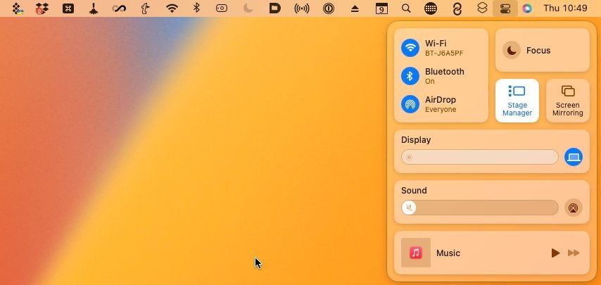
Getting out of Stage Manager is now as easy as getting in to it
It feels as if the visual change to System Settings was hurried. That's impossible to know, yet there were other signs of Ventura's development not being very smooth.
Such as a persistent bug that saw apps having to repeatedly ask for permissions that users had already given, and that System Settings agreed they already had.
Worryingly, that bug lasted all the way up to the Thursday of the week before release - and then it was broken again on the Friday. It's things like this that make macOS Ventura feel a bit less smooth, a bit less finished, than normal.
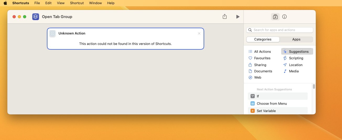
But before going in to all of the good parts, there are still some more poorer ones. Such as the way that Shortcuts for the Mac won't let you manipulate Tab Groups in Safari -- even though iOS 16 and iPadOS 16 both do.
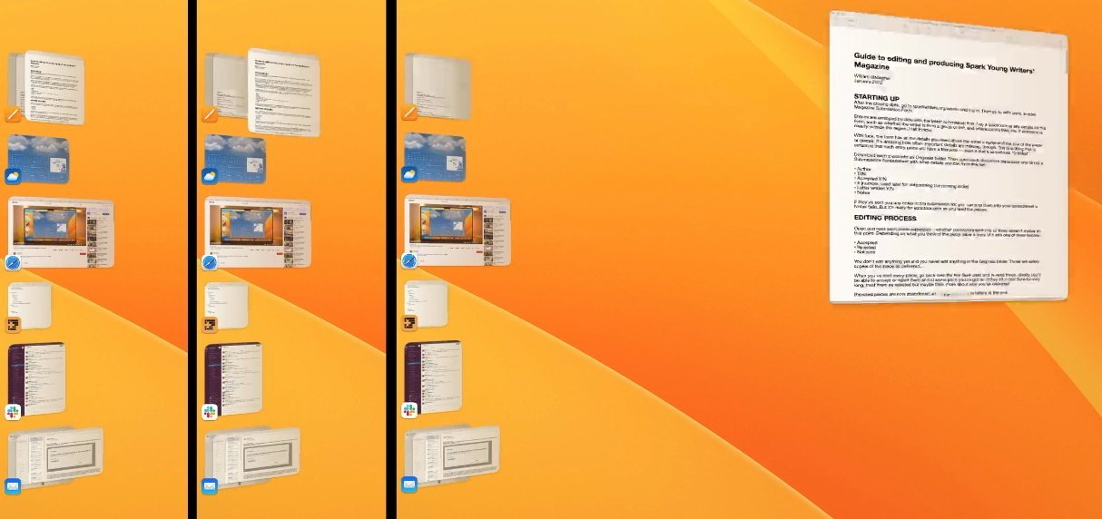
And speaking of Tab Groups, they are a reason why you should not upgrade any Mac to macOS Ventura until you are ready to upgrade all of them.
The new macOS Ventura builds on its Safari Tab Groups feature by making it possible to share them. If you have a set of a dozen websites that your company uses, and you get a new colleague, you can share your Tab Groups with them.
Then in if in their keen way, they find new sites that are good for the company, they can share their set of tabs back.
Unless either of you are on macOS Monterey.
This is poor. When you set up a Shared Tab Group in Safari on macOS Ventura, it just sets them up without any warning. And you need a warning.
Shortcuts let you switch quickly between Safari Tab Groups -- except on the Mac, where you most want to
For once you have made a Tab Group be shared in Safari on macOS Ventura, that entire group is unavailable on macOS Monterey or earlier. It isn't that the group isn't shared, it's that you personally are locked out of your own tab group on anything but Ventura.
Safari will tell you this when you next try to open that Tab Group of yours on macOS Monterey. But it will not tell you in Ventura when you start sharing the groups, it doesn't at any point warn you that it's incompatible with the older OS.
Then just to round off persistent irritations, there is the issue of Mail's new Follow Up feature, which is on both Mac and iOS. If you don't get a reply to an email, Mail pops your sent one into your inbox and puts it at the top so you can see and be reminded to do something about.
It's a very good idea, and it's been successfully done before by third-party email services, but the theory is better than the execution. You cannot nominate an email to follow up later, Mail decides for you what's important -- and it gets it wrong.

Mail just can't parse an email well enough for Machine Learning to be sure about what you do or don't need to be prompted to follow up. So routinely you will be prompted about emails that simply do not warrant a reply or a follow up reaction.
These are irritations in Ventura, but they also point to an overall feel that the new macOS doesn't always seem to have the visual polish or quite the attention to detail you'd expect.
This is all a very visual update, though, and parts of that are very good.
Apple seems to have half-heartedly compromised on the new name, though. The Mac's "System Preferences" are gone, but we don't quite get the iPhone's plain old "Settings," either.
Instead, we get "System Settings." That just feels like a compromise that helps no one -- it's neither hanging on to the Mac's familiar naming, nor does it adopt the iPhone's name for the same functions.
Where Apple has adopted the iPhone's behavior, though, is in the design and the labelling of settings. This is where it works well and is worth the upgrade -- Apple has now surfaced more settings, making them easier and more obvious to find.
There's finally a Wallpaper setting, for instance. Previously that wasn't just hidden, there literally was no setting that was called or referred to wallpapers. You had to know just where to go in the old System Preferences.
That knowledge, perhaps learned over many years, is the real stumbling block to adapting to the new design. It's just going to take time to get used to where everything is, and what everything is called now.
But while it perhaps seems fussier than the old design, with its many more options and toggles, it's ultimately going to prove to be much clearer than its predecessor.
When used in practice over several months, it turned out to be mostly useful for other people. You could easily see how it would help some people, and especially those new to the Mac, but it doesn't seem to be as much use to you as expected.
That's perhaps because it is designed to make it easy to concentrate on your current task, then fast for you to switch to another task, or back again. With Stage Manager turned on, your current app sits center screen, and recent ones are shown in a columnar dock to the left.
Click on an app in that column and it springs forward, while the previous center-stage app goes into the column. It needn't be just one app that swaps in and out, though, as it can be small groups of apps working together -- or a mix of apps and documents.
You must try Stage Manager in person just to see how smooth these animations are when they're moving
If you are a longtime Mac user, you've hit the problems that Stage Manager wants to solve, but you've also probably hit the solutions. There are many different Mac utilities, for instance, that let you open a group of apps together, or so many apps and so many documents.
Then there are even more that let you rearrange your open windows to help avoid distractions, including Apple's own Full Screen and Split View.
Stage Manager could be the best example of a macOS Ventura feature being improved because of the beta process, though. Originally it was easy to switch on Stage Manager, yet took unnecessary extra clicks to turn off.
And then when you did turn it off, Stage Manager used to dump all of your windows and apps in the middle of your screen. That was unlike just about every third-party window management app, which generally all remember how you had things and reset to that.
But now closing Stage Manager takes a single click in Control Center, just as getting in to it does. And exiting Stage Manager sees your windows return to how you had them before.
Those are two small changes, but the original way was clunky enough that it could put you off using Stage Manager. If you did use it during the beta process and found it wasn't for you, try it again now that macOS Ventura is out properly.
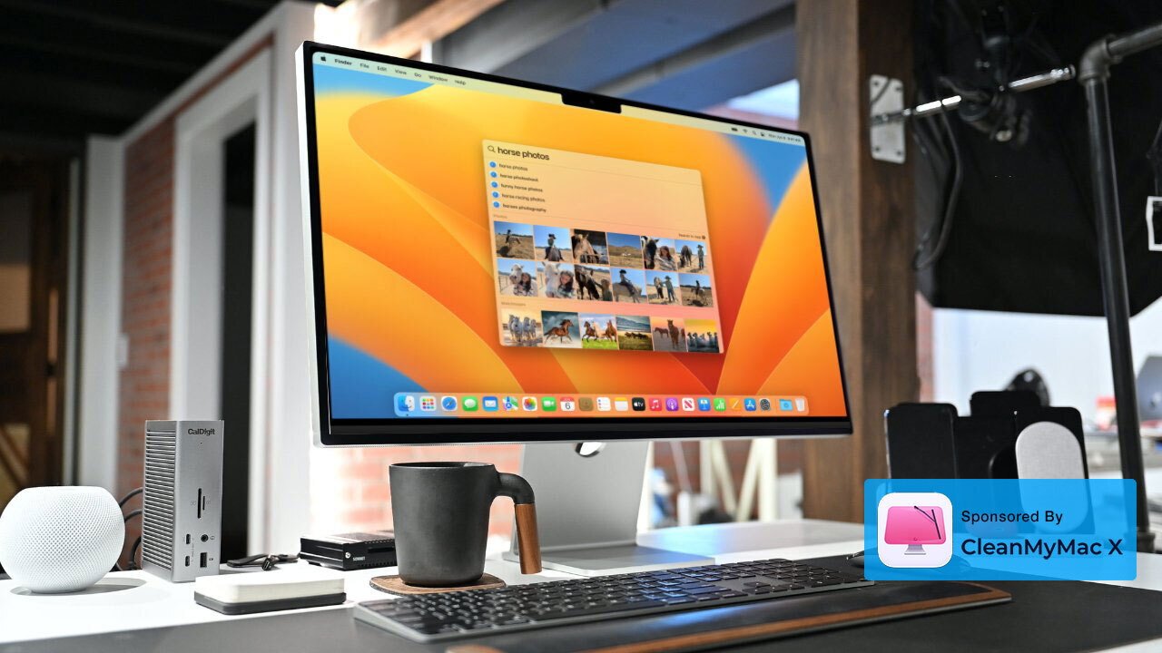
Spotlight has long been able to respond to search requests with a lot of relevant detail, and the new version includes photo results in that detail. What's most significant, though, is that Apple has found a way to present more information in a smaller space.
The updated Spotlight is neater, and it feels more responsive because it's both more visual and because its increased results mean you feel it's quicker to find what you need.
Spotlight finds more details, and also displays them more compactly
Since Spotlight does so much and is a part of macOS, its improvements are going to be noticed and appreciated over time. Users of launcher apps like Alfred 5 and LaunchBar 6 don't have reason to revert to Spotlight, but for everyone else it's an immediate win.
Open any kind of video conferencing app on your Mac while your iPhone is nearby, and you will hear a ping from the phone. Without your doing anything else, that iPhone can now be a webcam for your Mac -- and all it takes is for you to tap a button to confirm it.
That's actually sometimes a bit of a pain as you'll hear the iPhone bleep and only slowly realise that it has become your webcam. It won't show any images until you confirm, but still you can be left poking about your original webcam settings trying to figure out why they're not showing your face in a conference.
If you dismiss the prompt on the iPhone, that problem goes away and your Mac reverts to whatever webcam you were using before. If you accept the iPhone as a webcam, though, then two excellent things happen.
The first is that the image quality you show other people on the call is exceptionally improved. It's a good enough difference that once you've tried it, it's hard to go back to a MacBook Pro's softer, lower-resolution cameras.
Plus while you are on a call using your iPhone as the Mac's webcam, there is a button in Control Center that gives you some options. Click in to Control Center and you see a section called Video Effects.
Within that, you can turn on Studio Lighting. In software, the Mac will then brighten your face while dimming the background, and do so just subtly enough that it simply looks like you've got a better lighting setup than you have.
And then there is Desk View, which is also in Control Center, and also only available during a call. You can't change the laws of physics, but with Desk View, apparently Apple can do something about Optics.
During the video call, click on Desk View in Control Center and the image you are sending out in a video conference splits in two. One half remains your face, as it was, looking at the other people on the call.
And the other shows them your desk.
There's no extra setting up to do, no rearranging the iPhone or bringing in a second one on a vertical mount, there is just your one iPhone and this split view. It works by the iPhone utilizing its wide lenses to see wide and far around it, then in software interpreting its image and presenting us with the result.
The result looks like a straight overhead shot of whatever is on your desk. Perhaps for most people, this means needing to tidy their desk. But for demonstrators, crafters, and cooks, it can be an amazing boon.
It is just that the word really is "amazing." You've got to try this out even if you never intend to demonstrate anything on your desk.
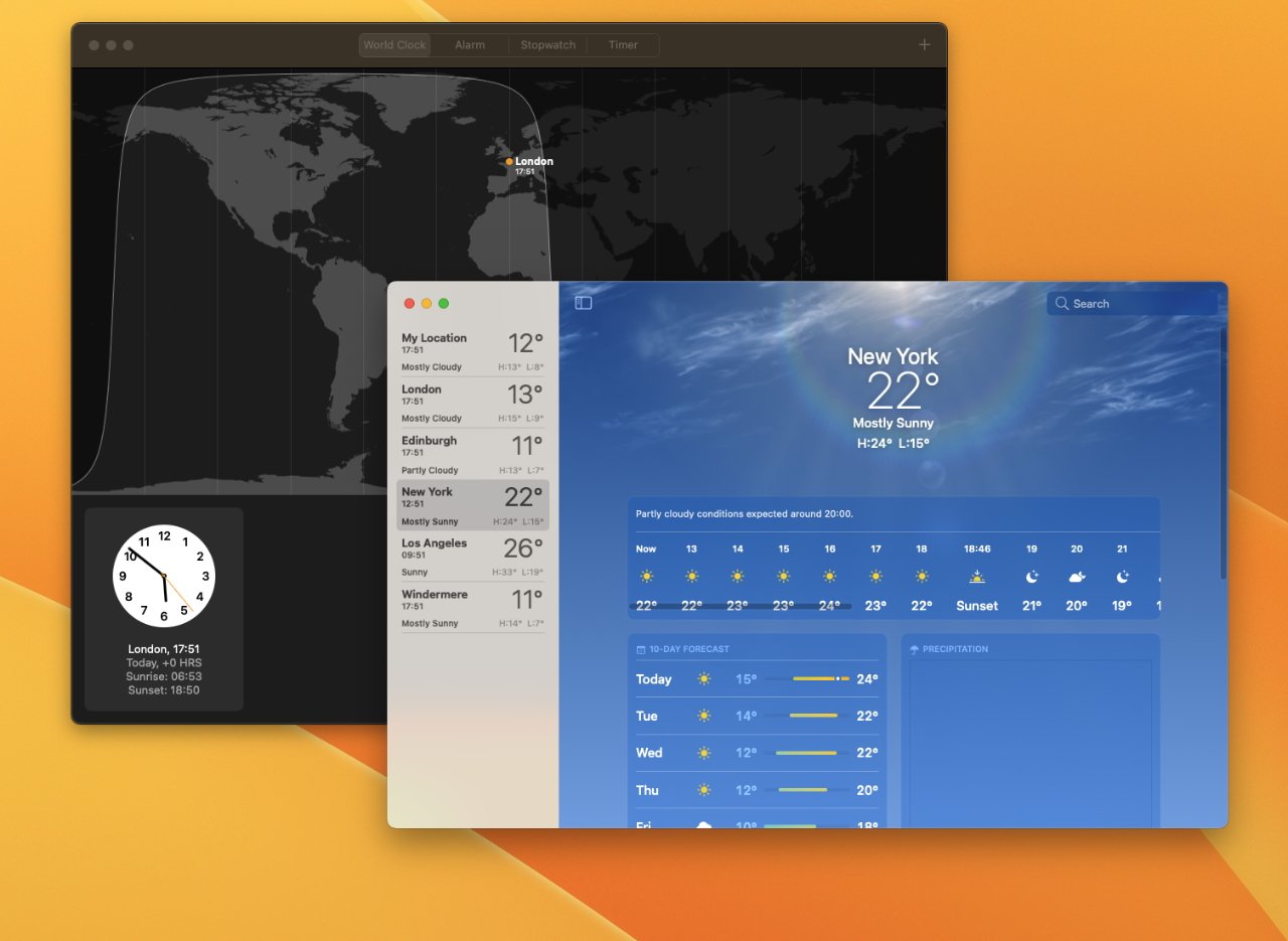
We've had them for years on iPad and iPhone, but Weather and Clock are good additions to the Mac
And the major improvement to Photos is one that while visual, is really meant to speed up sharing images and messages. It's smoother on the iPhone under iOS 16 where you just press and hold on a photo, but the Mac now lets you right-click on one and get the option to Copy Subject.
Choose that and you can then pretty much immediately paste the Photos image into another app -- and it will appear without the background. Automatic background removal used to require an app like Photoshop or Pixelmator Pro, and here's Apple doing it instantly and -- almost always -- marvellously well.
There is one advantage to the Mac's version of this under macOS Ventura, compared to iOS 16. With the iPhone, the resulting images are small -- they are meant for use in Messages, and maybe Mail.
It's really the iOS 16 feature brought to the Mac, though, and that makes it just one iPhone capability that has made the journey this time. Alongside new iPhone-like features in System Settings, and in Photos, macOS Ventura also adds two completely new apps to the Mac.
They're just very old and familiar ones, if you've used an iPhone or an iPad. The Mac now gets a Clock app and a Weather one, and they work precisely the way their iOS and iPadOS versions do.
But it's not as if that's it, that macOS Ventura is even feature-complete. There's the entire Freeform app still to come, and there is the major iCloud Shared Photo Library that won't be in Ventura until later in 2022.
Nor will the new ability to use SharePlay in a game, or new Game Center features.
Then, too, macOS Ventura is just the start for Apple's plans to move us away from passwords and on to using what it says are more reliable Passkeys.
So the Mac is continuing to improve and iterate, with macOS Ventura's first official release being just the next step in that. Despite the odd clunky parts, and elements that just don't seem as finished as usual, macOS Ventura is a strong update and it does make macOS Monterey seem so last year.
Read on AppleInsider
Where macOS Big Sur was bold and brash in 2020, macOS Monterey was more muted and mature in 2021. Now the new macOS Ventura has made a move back toward the garish.
Consequently, the first thing you see when you upgrade is a lot of yellow and orange. And as with almost all macOS updates, that can very well be all you notice at first.
Invariably, the way to spot what's really different with a new macOS is to use it for a few weeks, then try going back to the previous one. This year's release has few big changes, but the all-round improvements and alterations are enough to make macOS Monterey seem old-fashioned.

Overall, it's a good update and is a pleasure to use, but one of its most visible changes beyond the wallpaper is going to divide people -- and another may end up being totally ignored. The divisive one is the redesign to System Preferences, and the one that might get ignored is Stage Manager.
There is also a sense this time that macOS Ventura is not as finished as its predecessors were at time of launch. That's not fair because the OS keeps evolving and there are always issues, but even toward the end of the beta process, there were also problems that seemed pretty basic.
Lasting problems
That new System Settings is going to be an issue for many users, just for how extensive the redesign is visually. But it also had many problems during the beta and while the recurring ones have been fixed, it's concerning that they were there at all because the redesign is solely about how settings are displayed.So it isn't some root-and-branch reworking of the Mac's settings, there don't appear to be many internal changes. App launchers, not yet updated for Ventura, remain able to open specific settings panes, for instance.
Similarly, all signs so far are that existing AppleScripts that utilize the old System Preferences are not having to be reworked for the new System Settings.
Getting out of Stage Manager is now as easy as getting in to it
It feels as if the visual change to System Settings was hurried. That's impossible to know, yet there were other signs of Ventura's development not being very smooth.
Such as a persistent bug that saw apps having to repeatedly ask for permissions that users had already given, and that System Settings agreed they already had.
Worryingly, that bug lasted all the way up to the Thursday of the week before release - and then it was broken again on the Friday. It's things like this that make macOS Ventura feel a bit less smooth, a bit less finished, than normal.
Assorted other issues
Again, macOS Ventura is good and, at least a few days or weeks after its initial release, all Mac users should upgrade to it. If your Mac can run macOS Ventura, upgrade for the security and the new features.But before going in to all of the good parts, there are still some more poorer ones. Such as the way that Shortcuts for the Mac won't let you manipulate Tab Groups in Safari -- even though iOS 16 and iPadOS 16 both do.
And speaking of Tab Groups, they are a reason why you should not upgrade any Mac to macOS Ventura until you are ready to upgrade all of them.
The new macOS Ventura builds on its Safari Tab Groups feature by making it possible to share them. If you have a set of a dozen websites that your company uses, and you get a new colleague, you can share your Tab Groups with them.
Then in if in their keen way, they find new sites that are good for the company, they can share their set of tabs back.
Unless either of you are on macOS Monterey.
This is poor. When you set up a Shared Tab Group in Safari on macOS Ventura, it just sets them up without any warning. And you need a warning.
Shortcuts let you switch quickly between Safari Tab Groups -- except on the Mac, where you most want to
For once you have made a Tab Group be shared in Safari on macOS Ventura, that entire group is unavailable on macOS Monterey or earlier. It isn't that the group isn't shared, it's that you personally are locked out of your own tab group on anything but Ventura.
Safari will tell you this when you next try to open that Tab Group of yours on macOS Monterey. But it will not tell you in Ventura when you start sharing the groups, it doesn't at any point warn you that it's incompatible with the older OS.
Then just to round off persistent irritations, there is the issue of Mail's new Follow Up feature, which is on both Mac and iOS. If you don't get a reply to an email, Mail pops your sent one into your inbox and puts it at the top so you can see and be reminded to do something about.
It's a very good idea, and it's been successfully done before by third-party email services, but the theory is better than the execution. You cannot nominate an email to follow up later, Mail decides for you what's important -- and it gets it wrong.
Mail just can't parse an email well enough for Machine Learning to be sure about what you do or don't need to be prompted to follow up. So routinely you will be prompted about emails that simply do not warrant a reply or a follow up reaction.
These are irritations in Ventura, but they also point to an overall feel that the new macOS doesn't always seem to have the visual polish or quite the attention to detail you'd expect.
This is all a very visual update, though, and parts of that are very good.
System Settings
Despite the issues with permissions in System Settings, the actual controls themselves have had a dramatic -- and good -- overhaul.Apple seems to have half-heartedly compromised on the new name, though. The Mac's "System Preferences" are gone, but we don't quite get the iPhone's plain old "Settings," either.
Instead, we get "System Settings." That just feels like a compromise that helps no one -- it's neither hanging on to the Mac's familiar naming, nor does it adopt the iPhone's name for the same functions.
Where Apple has adopted the iPhone's behavior, though, is in the design and the labelling of settings. This is where it works well and is worth the upgrade -- Apple has now surfaced more settings, making them easier and more obvious to find.
There's finally a Wallpaper setting, for instance. Previously that wasn't just hidden, there literally was no setting that was called or referred to wallpapers. You had to know just where to go in the old System Preferences.
That knowledge, perhaps learned over many years, is the real stumbling block to adapting to the new design. It's just going to take time to get used to where everything is, and what everything is called now.
But while it perhaps seems fussier than the old design, with its many more options and toggles, it's ultimately going to prove to be much clearer than its predecessor.
Stage Manager
Speaking of visual changes, Stage Manager began life as this lively new way to manage multiple files and windows on your Mac. When demonstrated at WWDC 2022, it wasn't a wow moment, but it looked very good.When used in practice over several months, it turned out to be mostly useful for other people. You could easily see how it would help some people, and especially those new to the Mac, but it doesn't seem to be as much use to you as expected.
That's perhaps because it is designed to make it easy to concentrate on your current task, then fast for you to switch to another task, or back again. With Stage Manager turned on, your current app sits center screen, and recent ones are shown in a columnar dock to the left.
Click on an app in that column and it springs forward, while the previous center-stage app goes into the column. It needn't be just one app that swaps in and out, though, as it can be small groups of apps working together -- or a mix of apps and documents.
You must try Stage Manager in person just to see how smooth these animations are when they're moving
If you are a longtime Mac user, you've hit the problems that Stage Manager wants to solve, but you've also probably hit the solutions. There are many different Mac utilities, for instance, that let you open a group of apps together, or so many apps and so many documents.
Then there are even more that let you rearrange your open windows to help avoid distractions, including Apple's own Full Screen and Split View.
Stage Manager could be the best example of a macOS Ventura feature being improved because of the beta process, though. Originally it was easy to switch on Stage Manager, yet took unnecessary extra clicks to turn off.
And then when you did turn it off, Stage Manager used to dump all of your windows and apps in the middle of your screen. That was unlike just about every third-party window management app, which generally all remember how you had things and reset to that.
But now closing Stage Manager takes a single click in Control Center, just as getting in to it does. And exiting Stage Manager sees your windows return to how you had them before.
Those are two small changes, but the original way was clunky enough that it could put you off using Stage Manager. If you did use it during the beta process and found it wasn't for you, try it again now that macOS Ventura is out properly.
Spotlight gets ever better
The thing with major operating system updates is that you very quickly forget what's new, and what's always been there. Stage Manager is likely to feel like that over time, but then it's also over time that Spotlight's improvements will impress.Spotlight has long been able to respond to search requests with a lot of relevant detail, and the new version includes photo results in that detail. What's most significant, though, is that Apple has found a way to present more information in a smaller space.
The updated Spotlight is neater, and it feels more responsive because it's both more visual and because its increased results mean you feel it's quicker to find what you need.
Spotlight finds more details, and also displays them more compactly
Since Spotlight does so much and is a part of macOS, its improvements are going to be noticed and appreciated over time. Users of launcher apps like Alfred 5 and LaunchBar 6 don't have reason to revert to Spotlight, but for everyone else it's an immediate win.
Niche but so impressive
Whereas it's going to be just a subset of Mac users who take advantage of the new Continuity Camera and Desk View. These two related features may have names you'll struggle to even remember, but where Stage Manager wasn't a wow moment at WWDC 2022, this is.Open any kind of video conferencing app on your Mac while your iPhone is nearby, and you will hear a ping from the phone. Without your doing anything else, that iPhone can now be a webcam for your Mac -- and all it takes is for you to tap a button to confirm it.
That's actually sometimes a bit of a pain as you'll hear the iPhone bleep and only slowly realise that it has become your webcam. It won't show any images until you confirm, but still you can be left poking about your original webcam settings trying to figure out why they're not showing your face in a conference.
If you dismiss the prompt on the iPhone, that problem goes away and your Mac reverts to whatever webcam you were using before. If you accept the iPhone as a webcam, though, then two excellent things happen.
The first is that the image quality you show other people on the call is exceptionally improved. It's a good enough difference that once you've tried it, it's hard to go back to a MacBook Pro's softer, lower-resolution cameras.
Plus while you are on a call using your iPhone as the Mac's webcam, there is a button in Control Center that gives you some options. Click in to Control Center and you see a section called Video Effects.
Within that, you can turn on Studio Lighting. In software, the Mac will then brighten your face while dimming the background, and do so just subtly enough that it simply looks like you've got a better lighting setup than you have.
And then there is Desk View, which is also in Control Center, and also only available during a call. You can't change the laws of physics, but with Desk View, apparently Apple can do something about Optics.
During the video call, click on Desk View in Control Center and the image you are sending out in a video conference splits in two. One half remains your face, as it was, looking at the other people on the call.
And the other shows them your desk.
There's no extra setting up to do, no rearranging the iPhone or bringing in a second one on a vertical mount, there is just your one iPhone and this split view. It works by the iPhone utilizing its wide lenses to see wide and far around it, then in software interpreting its image and presenting us with the result.
The result looks like a straight overhead shot of whatever is on your desk. Perhaps for most people, this means needing to tidy their desk. But for demonstrators, crafters, and cooks, it can be an amazing boon.
It is just that the word really is "amazing." You've got to try this out even if you never intend to demonstrate anything on your desk.
We've had them for years on iPad and iPhone, but Weather and Clock are good additions to the Mac
Photos and new Mac apps
Ultimately, macOS Ventura does feel as if it's about visual changes, but they're also useful ones. Desk View is a great effect, but very soon crafters on YouTube are just going to use it for the benefit of being able to better present.And the major improvement to Photos is one that while visual, is really meant to speed up sharing images and messages. It's smoother on the iPhone under iOS 16 where you just press and hold on a photo, but the Mac now lets you right-click on one and get the option to Copy Subject.
Choose that and you can then pretty much immediately paste the Photos image into another app -- and it will appear without the background. Automatic background removal used to require an app like Photoshop or Pixelmator Pro, and here's Apple doing it instantly and -- almost always -- marvellously well.
There is one advantage to the Mac's version of this under macOS Ventura, compared to iOS 16. With the iPhone, the resulting images are small -- they are meant for use in Messages, and maybe Mail.
It's really the iOS 16 feature brought to the Mac, though, and that makes it just one iPhone capability that has made the journey this time. Alongside new iPhone-like features in System Settings, and in Photos, macOS Ventura also adds two completely new apps to the Mac.
They're just very old and familiar ones, if you've used an iPhone or an iPad. The Mac now gets a Clock app and a Weather one, and they work precisely the way their iOS and iPadOS versions do.
It's not over yet
Now that macOS Ventura is out, users can enjoy the new features once they're sure all of their apps have been updated first. And when they're sure that all of their Macs can be upgrade to Ventura at the same time.But it's not as if that's it, that macOS Ventura is even feature-complete. There's the entire Freeform app still to come, and there is the major iCloud Shared Photo Library that won't be in Ventura until later in 2022.
Nor will the new ability to use SharePlay in a game, or new Game Center features.
Then, too, macOS Ventura is just the start for Apple's plans to move us away from passwords and on to using what it says are more reliable Passkeys.
So the Mac is continuing to improve and iterate, with macOS Ventura's first official release being just the next step in that. Despite the odd clunky parts, and elements that just don't seem as finished as usual, macOS Ventura is a strong update and it does make macOS Monterey seem so last year.
macOS Ventura - Pros
- Desk View is amazing
- Using the iPhone as a camera is excellent
- Clock and Weather apps finally come to the Mac
- Photos introduces automatic background removal
- System Settings are clearer
- Safari's Shared Tab Groups
- Stage Manager will be a boon for some users
macOS Ventura -Cons
- Stage Manager will not be a boon for all users
- Some elements, including Stage Manager, feel a little clunky
- Shared Tab Groups lock non-Ventura users out of those tabs
- Some promised features are not being released at first
Read on AppleInsider
Comments
My Mac is quite old and the last time I checked, is on the hairy bottom end of the ones able to take Ventura. I’ve generally found that if you are on the ragged edge of compatibility, you’ll likely have a bad experience (learned this with both Windows and MacOS). So I’ll likely wait and upgrade to a new machine in the new year.
To make matters worse, the app-modal window that pops up does not close when you press the Escape key, or any other key that I can determine. There's also no close button. You have to click the mouse on the weather app's main window outside of the popup to escape out of the popup. If you drag the app window when the popup is up it sometimes disappears, but not always. This is not a showstopper, but it's rather odd, unless my expectations regarding the Escape key and closing popups no longer apply.
Could this be a new UX paradigm?
And when clicking the Schedule... button, you see this...
Are you sure it's truly gone?
Notifications can be hidden and revealed, but are frozen, do not respond to mouse clicks and cannot be dismissed.
Is it just me?
I did run into one potential issue that I’m not 100% sure about and unfortunately it’s looks like it’s yet another Spawn of MobileMe ass-bite. Some of us poor souls who were dumb enough to subscribe MobileMe ended up with two Apple IDs when iCloud came along. These two Apple ID accounts can never be merged, or at least cannot be merged without someone opening up the nuclear football that follows the president around that may contain the codes for merging Apple IDs. I’ve been told that not even Tim Cook can perform a merge operation. For all we know the Apple ID merge codes may not be in the football and may have been buried with Steve’s remains or shot into a black hole.
Anyway, I have a mix of purchased content like Apps and media that was purchased under different Apple IDs. No problem though, because my iCloud info on my Mac shows two AppleIds, on for iCloud and another (spawn of MobileMe based one) for media, apps, and other content. No biggy, I could still download apps and stuff purchased under my MobileMe Apple ID - well, until Ventura. Ventura moved the “apps” category over to the other Apple ID and I have no apparent way to get at my MobileMe Apple ID content other than signing out of one Apple ID on my Mac and signing into my other Apple ID on my Mac. This usually results in mass chaos with things being deleted and needing to be re-synched.
The end result was that my non-subscription version of 1Password showed up as expired and I had no way to redownload it. I threw in the towel and signed up for a subscription and now I’ll have to eat cat food and Raman noodles to make ends meet - just kidding. It’s a nice app and now works on Windows too. But this is still a tenuous position to be in because the only way Apple was able to get everything working up to now was to make my MobileMe Apple ID a family member of my other Apple ID while still recognizing a separation between what content and subscription are associated with which accounts in Settings. If they move the media (iTunes) related stuff over to the other Apple ID I’m not sure what I’ll do. Buy more cat food I suppose.