Liquid Glass is more than skin deep on macOS Tahoe

Jump to First Reply
Posted:
in macOS edited June 11

It's true that the Liquid Glass redesign is less than revolutionary, but at least with macOS 26, with it, Apple is making users be more productive.

Smiling abstract two-tone face icon with a blue and white gradient background.
There is more to macOS Tahoe than a face change since macOS Sequoia


Maybe it's just because it is ridiculous how quickly you get used to a new macOS. But a couple of days after Apple made it sound incredibly new and different, macOS Tahoe visual differences seem small, yet still useful.

Just as with iOS 26, it's possible to say that the Liquid Glass redesign is putting a new surface on the Mac without fundamentally changing anything. Yet the visual design is deeply part of what productivity benefits have come with macOS Tahoe.

For instance, Apple has had practically 30 years to introduce a clipboard manager, but instead left that to third-party apps because it was also leaving it to power users. Apple always focuses on the casual or light users that make up most of its customers, but now it believes it's time to give those the ability to paste from their clipboard history.

And it's done so by taking the familiar Spotlight and breaking it out visually. As long as you know to press Command-Space to call up Spotlight, you now immediately see the new option.

Two spotlight search bars; the top with a blue gradient background, the bottom on a beige background with four icon buttons beside the search bar.
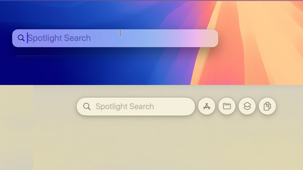
Top: the old Spotlight. Bottom: the new Spotlight with its much clearer options


Really what you see is that there are options, and while they are right there in your face, they are also not in the way. A Liquid Glass look, together with well-chosen separation of Spotlight tools, means that it's easier for users to find this feature.

Then when you are using features where it may not be so obvious where you find a control, Liquid Glass has made it more obvious. In any media player, for instance, the previously small position icon in the slider has been replaced by a much more prominent, elongated one that's hard to miss.

Content comes first


It's a funny thing, but all of the new and flashy glossiness of the Mac's controls is intended to help hide those same controls. Apple wants our content, the work we're doing, and the media we're using to be the most prominent thing.

That's immediately apparent if you try to find a route to somewhere in Apple Maps. It used to be that you would enter one place in the search box at top left, then click on the found place in the map itself.

Then there would be a pop up that you had to fill in with the starting place, or the end if you were planning a route from here. It was fine, but it was a bit clunky and easy to dismiss the route-finding dialog.

Map interface showing a route to The New Art Gallery in Walsall, England, with text details, reviews, and two route options.
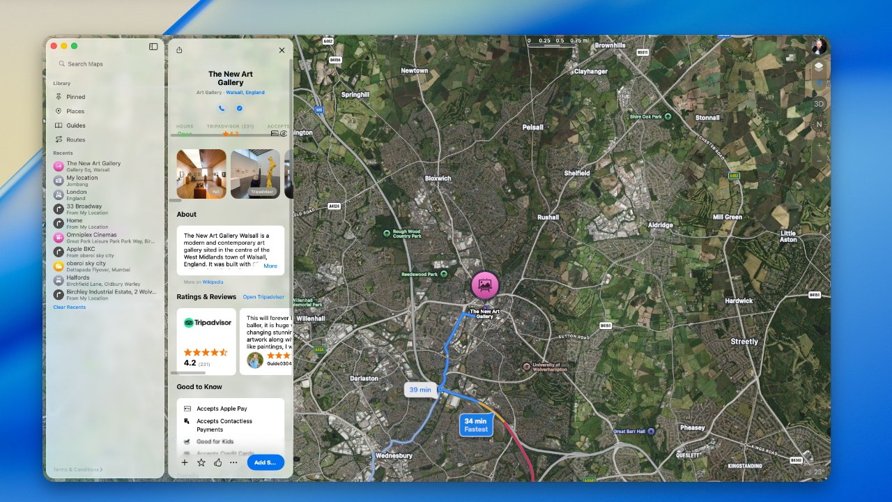
Apple Maps now keeps its direction-searching element out of the way of the map itself


Now you type into the search bar in the lefthand column as before, but when you do, an equal-sized column appears to spring out of it. You go back and forth between these two columns and it just feels like a more natural, even professional way to do what you need.

Seeing clearly


The best and most extreme example of making content take priority this is just how transparent -- or really the word is translucent -- the Mac's on-screen furniture can now be. The menu bar is invisible by default, which Apple says means you see more of your work.

The Dock has at least elements of this glassy invisibility, but it can also be pretty much entirely turned off. The Dock can be set so that all of its app icons are glass.

Two horizontal rows of computer application icons on a blue background, with various app symbols including calendar, mail, and messaging.
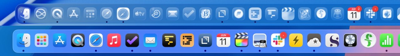
You don't have to have a transparent Dock (top) but now you can


So with a glass Dock, an invisible menu bar, and also widgets that display as transparent glass, the Mac's screen can appear to be all our content.

At the moment, with the very first developer beta, the effect is spoiled by how some apps don't play nice. Their full-color icons shine out of the glass Dock like a grinning mouth with a single tooth.

But those apps will come around once developers have had more than 20 minutes to work on their apps. So it will get better, it will get that the illusion of our work filling the entire screen, is improved.

Computer screen toolbar with various icons and symbols representing applications, followed by time and date displayed as Wed 11 Jun 13:03.
The Mac menubar is now invisible and you can't change that.


It's a laudable aim and, since you don't have to go so far as to have everything invisible, it's a little customizable.

Readability


The one area where all of this transparency or translucency falters, though, is in readability. If you can't read what you need or you can't find the app you want, Liquid Glass would be sap productivity.

And it's possible to get into just that situation. Since menus and dialog boxes now let you see more of the background through them, there are combinations of colors that do not work.

That shouldn't be the case, because the color effect on any Mac menu or dialog is supposed to be calculated to be clear against whatever the background is. Maybe this is something that will develop and evolve as Apple goes through the beta process.

It's hard to see how the Dock would change, though. And at present if you do have it set to show glassy icons, it takes a lot of getting used to.

Row of seven blue app icons on a blue background, including a calendar showing June 11 with a notification badge and various other symbolic designs.
Some new Dock icons are slightly inset -- while others are not yet transparent.


That's because as well as having all colors changed to various degrees of transparency, the app icons are slightly inset into a square-ish frame. It means that the app icons are fractionally smaller, even though they are taking up the same space in the dock.

Consequently you lose being able to spot the colors, and you lose being able to spot the icon shape quite so readily. You do still have muscle memory of where the app is in your Dock, though.

Form follows function


There's nothing wrong with macOS being scrubbed up visually, and it does contribute to a sense that you have a new Mac. But the visuals have to perform a function, they have to provide a benefit.

Much of what macOS Tahoe does is around this business of keeping your focus on your work. But there are also smaller touches that aren't flashy, but are part of the design -- and simply make sense.

As of macOS Tahoe, if you change the volume on your Mac, the visual confirmation comes with a small, wide icon showing a slider. That icon, though, is positioned up toward the top right of the screen instead of being the large graphic toward the lower middle of the display.

Volume control interface with speaker icon, sound waves, and slider against a colorful background. Audio output set to Mac Studio Speakers. Taskbar with various icons visible.
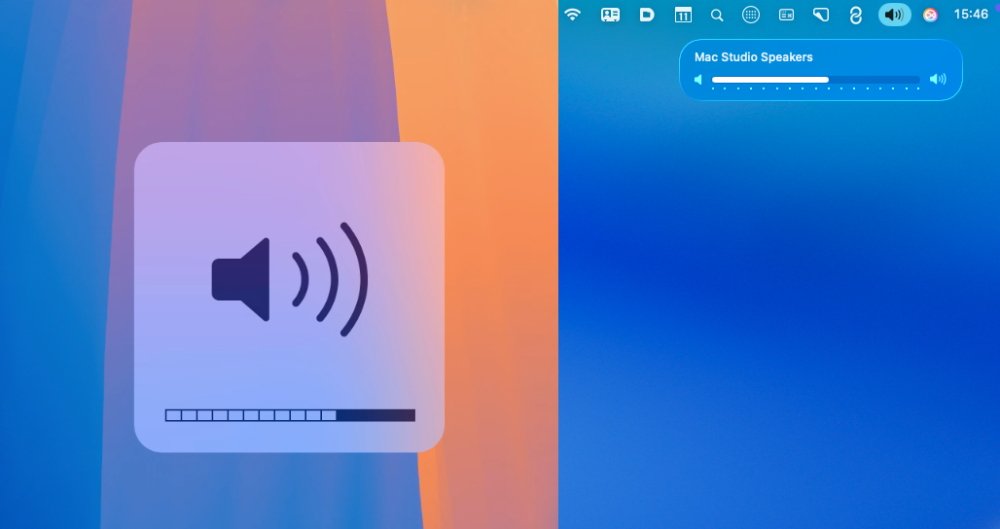
The old volume indicator (left) and the new (right)


That's immediately better if you've ever had to restart a screen recording because you leant on the volume button. But it's also better because it means information is being displayed right where all Mac notifications go.

Especially for new users, it is reinforcing where to look to find out what you need.

Although, curiously, Apple has also moved something in practically the opposite way.

In macOS Sequoia, if you have Shortcuts in your menubar, clicking on its icon gives you a dropdown menu. Whereas, in macOS Tahoe, it instead presents a dialog box roughly in the center of your display.

Colorful split screen displaying task lists with icons, text on left in a large rectangular window, right shows a smaller scrollable menu with 'Run' and 'Cancel' buttons.
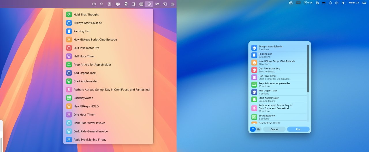
Shortcuts in the menu bar used to be a dropdown menu (left)


The new macOS Tahoe way does have a benefit that as well as the Shortcut titles that were always displayed, it now includes a little extra detail about each one. They're just not terribly useful details -- most of the time it says how many actions or steps there are in the Shortcut.

There's also an inconsistency here. In this example, it's possible to use the keyboard to hit Return on a Shortcut and so run it. But in similar dialogs you create with Shortcuts, you have to use a mouse or trackpad.

Small changes can mean a lot


It was overblown of Apple to make this sound like a transformation of the Mac. But it did look like one when they showed it, and it did still look like a bit of one when you first start using the betas.

You do still, though, get used to all that's new. You get used to it pretty much immediately.

And if examining Liquid Glass in detail means thinking less and less of its scope and innovation, there is still this. Spend an hour on macOS Tahoe and last year's macOS Sequoia looks and feels so old.


Read on AppleInsider

«1

Comments

  • Reply 1 of 27
    tobiantobian Posts: 162member
    I would welcome old style Mac OS X System Preferences. iOS style with Mac related prefs is still confusing for me, have to use search for panes everytime.
    williamlondonyyzguyjeffharrisPenzidiman80libertyandfreeappleinsiderusermacgui
     7Likes 1Dislike 0Informatives
  • Reply 2 of 27
    CheeseFreezecheesefreeze Posts: 1,432member
    tobian said:
    I would welcome old style Mac OS X System Preferences. iOS style with Mac related prefs is still confusing for me, have to use search for panes everytime.
    The old style wouldn’t have scaled well with the amount of options available. I understand the change. And aren’t we mostly using the search bar there anyway? 
    thtdewmetiredskillstobianlibertyandfree
     3Likes 2Dislikes 0Informatives
  • Reply 3 of 27
    blastdoorblastdoor Posts: 3,836member
    On net, I find I typically end up liking these overhauls after gaining some experience with them, and I'm sure this will be the same. 
    williamlondon
     1Like 0Dislikes 0Informatives
  • Reply 4 of 27
    I had a hard time reading this article. The captions below the pictures are repeated (sometimes more than once) nor do they make sense (for instance: "The old volume indicator (right) and the new" was repeated 4 times, and the new was on the right and the old was on the left; the way the sentence is structured, it sounds like the old was on the right). Right now, I am depending on articles like these to get myself prepared for what to expect with the new releases. Some checking of the articles before posting them would be greatly appreciated.
    edited June 11
    yyzguyheadfull0wineStrangeDayshubbaxAlex1NM68000libertyandfreemacgui
     8Likes 0Dislikes 0Informatives
  • Reply 5 of 27
    yyzguyyyzguy Posts: 72member
    tobian said:
    I would welcome old style Mac OS X System Preferences. iOS style with Mac related prefs is still confusing for me, have to use search for panes everytime.
    I thought it was just me 
    williamlondonjeffharristobianmacgui
     3Likes 1Dislike 0Informatives
  • Reply 6 of 27
    yyzguyyyzguy Posts: 72member

    I had a hard time reading this article. The captions below the pictures are repeated (sometimes more than once) nor do they make sense (for instance: "The old volume indicator (right) and the new" was repeated 4 times, and the new was on the right and the old was on the left; the way the sentence is structured, it sounds like the old was on the right). Right now, I am depending on articles like these to get myself prepared for what to expect with the new releases. Some checking of the articles before posting them would be greatly appreciated.
    Agree!  The captions are a mess.  Clearly the author was in too much of a hurry to get this out without proofreading.
    williamlondonAlex1Ndiman80
     2Likes 1Dislike 0Informatives
  • Reply 7 of 27
    Wesley_Hilliardwesley_hilliard Posts: 598member, administrator, moderator, editor
    Might have been a bug, thanks for pointing out the captions issue.
    Alex1N
     1Like 0Dislikes 0Informatives
  • Reply 8 of 27
    StrangeDaysstrangedays Posts: 13,214member
    Might have been a bug, thanks for pointing out the captions issue.
    The volume caption is still backwards tho
     0Likes 0Dislikes 0Informatives
  • Reply 9 of 27
    9secondkox29secondkox2 Posts: 3,657member
    I like just about everything. but one aspect bothers me quite a bit. The glass UI is really sharp, not just the way it looks, but the way it performs. but at the top of finder windows at others, the top navigation bar area really took a backwards step. Look horrid. Like an 8th grade art project, completed with both outlines AND massive drop shadows. almost amateurish. It's in stark contrast to the refined elegance of he rest of the UI. Looks like Anfroid material design slapped on top of Liquid Glass at the last minute. Hopefully that changes by launch. 
    libertyandfree
     1Like 0Dislikes 0Informatives
  • Reply 10 of 27
    twolf2919twolf2919 Posts: 182member
    Readability in Safari has hit a new low with macOS 26.  By letting web pages affect the color of the bookmark bar, address bar, and tab bar, it's become pretty much impossible to find the active tab when the web page has dark/black background and it's impossible to read bookmark labels when the web page has a white background.  Maybe it's only because of me using "dark mode"?  But if that's the case, don't Apple engineers test their sh1t in dark mode?  Utterly ridiculous.  I think Apple tried something similar in a previous release, where they let the web page "bleed through" to those areas when you scrolled - but at least then there was a way to turn that off.  I don't see any way of turning off this behavior this time.  Am I missing something?

    But overall I find macOS 26 much snappier than iOS 16 - and it's still in beta, so that's a good sign.
    williamlondonlibertyandfree
     1Like 1Dislike 0Informatives
  • Reply 11 of 27
    jeffharrisjeffharris Posts: 916member
    All this looks okay. We shall see when it finally ships.

    Are we ever going to get the ability to scale interface elements, like the menu bar, for high resolution 4K (and beyond) monitors?

    williamlondonAlex1N9secondkox2
     2Likes 1Dislike 0Informatives
  • Reply 12 of 27
    anonymouseanonymouse Posts: 7,122member
    So, AI's writers seem to be having trouble distinguishing what is Liquid Glass and what is not. Liquid Glass is specifically a full cosmetic makeover, including some changes in the way UI elements behave and react, that is being applied simultaneously to all of Apple's OSs. The Spotlight changes — e.g., a clipboard manager — you reference above, apart from the appearance and behavioral changes in the controls themselves, are not part of Liquid Glass.

    Likewise, not every enhancement to every OS is necessarily related to Liquid Glass. Yes, these new features do appear with Liquid Glass UI elements, but that doesn't mean they depend on Liquid Glass to exist. Apple could have added a clipboard manager even if they had not included Liquid Glass in this release. So, basically, if you are looking at enhancements that are, "more than skin deep," they are probably not part of Liquid Glass, even if you have never seen them using any other "skin".
    diman80MplsP
     2Likes 0Dislikes 0Informatives
  • Reply 13 of 27
    MplsPmplsp Posts: 4,177member
    This article repeatedly conflates interface design and function with appearance. They are, of course, related but they are not the same. 'liquid glass' is the appearance. Virtually all of the design and function changes could have been made with the liquid glass visuals. 

    The dock is a great example. Sequoia can be set to automatically hide the dock. Giving you full use of the screen real estate, or show the dock full time. The liquid glass dock in Tahoe seems to be the worst of both worlds - it's less obtrusive but still obscures what's underneath while at the same time removing the colors makes it harder to see and identify specific apps, making it harder to use. The end result is minimal benefit with decreased ease of use.

    My first reaction to the menu bar is the same - it doesn't really add any useful screen real estate but the reduced contrast makes it harder to identify the icons.
    edited June 11
    williamlondonlibertyandfreeappleinsideruser
     2Likes 1Dislike 0Informatives
  • Reply 14 of 27
    William Gallagher: I watch your videos and read your comments here. You are excellent and I appreciate you!.
    9secondkox2
     1Like 0Dislikes 0Informatives
  • Reply 15 of 27
    M68000m68000 Posts: 950member
    Can we get easier to use slider bars on the right side of windows?  It is very often challenging and annoying trying to grab the slider bar with mouse to scroll vertically in the finder and other app windows.  I’m frankly amazed that the people who make the GUI like how the window scrolling is.
    williamlondonlibertyandfree
     1Like 1Dislike 0Informatives
  • Reply 16 of 27
    Penzipenzi Posts: 58member
    tobian said:
    I would welcome old style Mac OS X System Preferences. iOS style with Mac related prefs is still confusing for me, have to use search for panes everytime.
    The old style wouldn’t have scaled well with the amount of options available. I understand the change. And aren’t we mostly using the search bar there anyway? 
    Nonsense. I have dual 32” monitors. Shrinking and turning functions into a list is annoying. Totally kills things. And no, I rarely use search, although more now that the system preferences pane is designed by a child with an iPhone. 

    Edit: having the choice would be optimal. If you prefer the new way, great! It’s a Mac; the horsepower for choice exists… 
    edited June 12
    williamlondon
     0Likes 1Dislike 0Informatives
  • Reply 17 of 27
    seneca72seneca72 Posts: 47member
    twolf2919 said:
    By letting web pages affect the color of the bookmark bar, address bar, and tab bar, it's become pretty much impossible to find the active tab when the web page has dark/black background and it's impossible to read bookmark labels when the web page has a white background. 
    I agree.  To someone with less than perfect eyesight tranlucency is an abomination.  Readability depends largely on contrast between the elements and having the background intrude lessens this, unless the degree of translucency can be varied to near zero.  

    It works with the Vison Pro since you are dealing with two realities: the real and the virtual.  For a computer screen it's like reading a book with the reverse page showing through.  

    Unfortunately I guess we're going to be stuck with it.  

    edited June 12
    williamlondonlibertyandfreeMplsP
     2Likes 1Dislike 0Informatives
  • Reply 18 of 27
    It is such a perplexing choice they have made with the amount of transperency. Their design MO has always been to be clear and concise and this direction is the complete opposite of opposite of that. I can only hope it is toned down and/or we are given options to change the transparency considerably.
    diman80williamlondonlibertyandfree
     2Likes 1Dislike 0Informatives
  • Reply 19 of 27
    diman80diman80 Posts: 44member
    So, AI's writers seem to be having trouble distinguishing what is Liquid Glass and what is not. Liquid Glass is specifically a full cosmetic makeover, including some changes in the way UI elements behave and react, that is being applied simultaneously to all of Apple's OSs. The Spotlight changes — e.g., a clipboard manager — you reference above, apart from the appearance and behavioral changes in the controls themselves, are not part of Liquid Glass.

    Likewise, not every enhancement to every OS is necessarily related to Liquid Glass. Yes, these new features do appear with Liquid Glass UI elements, but that doesn't mean they depend on Liquid Glass to exist. Apple could have added a clipboard manager even if they had not included Liquid Glass in this release. So, basically, if you are looking at enhancements that are, "more than skin deep," they are probably not part of Liquid Glass, even if you have never seen them using any other "skin".
    100%. Liquid glass (cosmetic transparency and effects) has nothing to do with utility and usability. In fact, usability is sometimes way worse when the upper layer you look at is muddy and text on it becomes hard to read when something from the layer behind it is visible.
    williamlondonmacgui
     1Like 1Dislike 0Informatives
  • Reply 20 of 27
    diman80diman80 Posts: 44member
    debonbon said:
    It is such a perplexing choice they have made with the amount of transperency. Their design MO has always been to be clear and concise and this direction is the complete opposite of opposite of that. I can only hope it is toned down and/or we are given options to change the transparency considerably.
    Hope they fire this guy, no fresh ideas (hello, parallax) and this gummy bear transparency looks horrible and more like from 25 years ago. No premium look and no clarity at all.
    williamlondon
     0Likes 1Dislike 0Informatives
Sign In or Register to comment.