Files iPadOS 26 vs iPadOS 18: Refinements & speed improvements make Files actually usable

The Files app on iPadOS 26 transfers data faster, and has other changes that all add up to a massive improvement over the version in iPadOS 18. It's actually usable now.
The Files app on has changes that all add up to a massive improvement over the version in iPadOS 18. It's actually usable now.
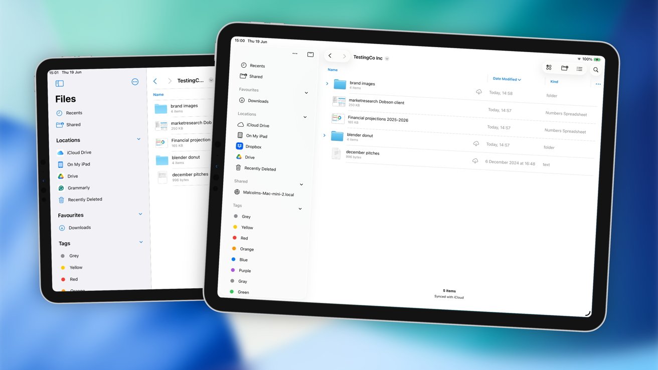
Files in iPadOS 18 [left], Files in iPadOS 26 [right]
Apple's refresh of iPadOS 26 made a lot of changes to the interface across multiple apps. As part of the update, many apps got a facelift, with Files one of the most important apps in that group.
Intended as a way for users to manage their documents and folders on an iPad, it was always an app that did the job, but not without some effort. While Finder in macOS is easy and fairly intuitive, Files was usable but with many shortcomings.
As part of a general initiative to make iPadOS more productive, Apple incorporated many elements that could be considered Mac-like in nature. They are small changes, but they do all add up.
Here is what has changed in Files 26 over Files in iPadOS 18, and how it could make your iPad workflow better.
Files iPadOS 26 vs Files iPadOS 18 - Appearance
Opening up the Files app in both operating systems, there's not really much structural difference between the two. There are differences in appearance, certainly, but they are still both apps with a sidebar full of locations to store and access documents, and a large section showing the contents of folders.
Aesthetically speaking, there are refinements, driven by Apple's Liquid Glass design concept. The light grey/blue of Files 18 is replaced by light floating blob layers and little in the way of color.
The sidebar hasn't changed that much, except for a minor reordering of elements, and the loss of the Files name in the new app. The new version doesn't self-identify, since that takes up precious sidebar space.
The UI tweaks make Files in iPadOS 26 much cleaner.
The top row is a little bit emptier in iPadOS 26, with submenus under the icons that remain doing more of the heavy lifting than the previous version.
A big thing in Files for iPadOS 26 is the ability to use a menubar. Visible with a swipe down, it provides access to all of the features of the Files app, in a very Mac way.
This, at least, will make Files far more useful for a Mac user who has to get to grips with document management without using Finder.
Files iPadOS 26 vs Files iPadOS 18 - Navigating folders
A key thing about using Files is having to navigate nests of folders. In iPadOS 18, this was handled very poorly.
In Icons and List View, you tap the folder to open it, but if you want to go to the parent folder again, you had to tap the back button at the top of the screen. This was less of an issue in Column view since you would see the parent folders too.
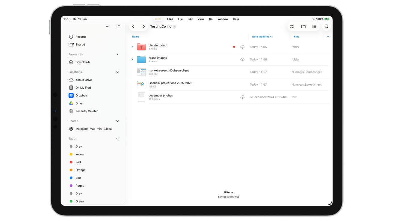
This is still the case in Files for iPadOS 26, at least for the Icon and Columns views. If you're using List View, you can now take advantage of a small arrow next to the folder, which then brings up the folder's contents as a drop-down list.
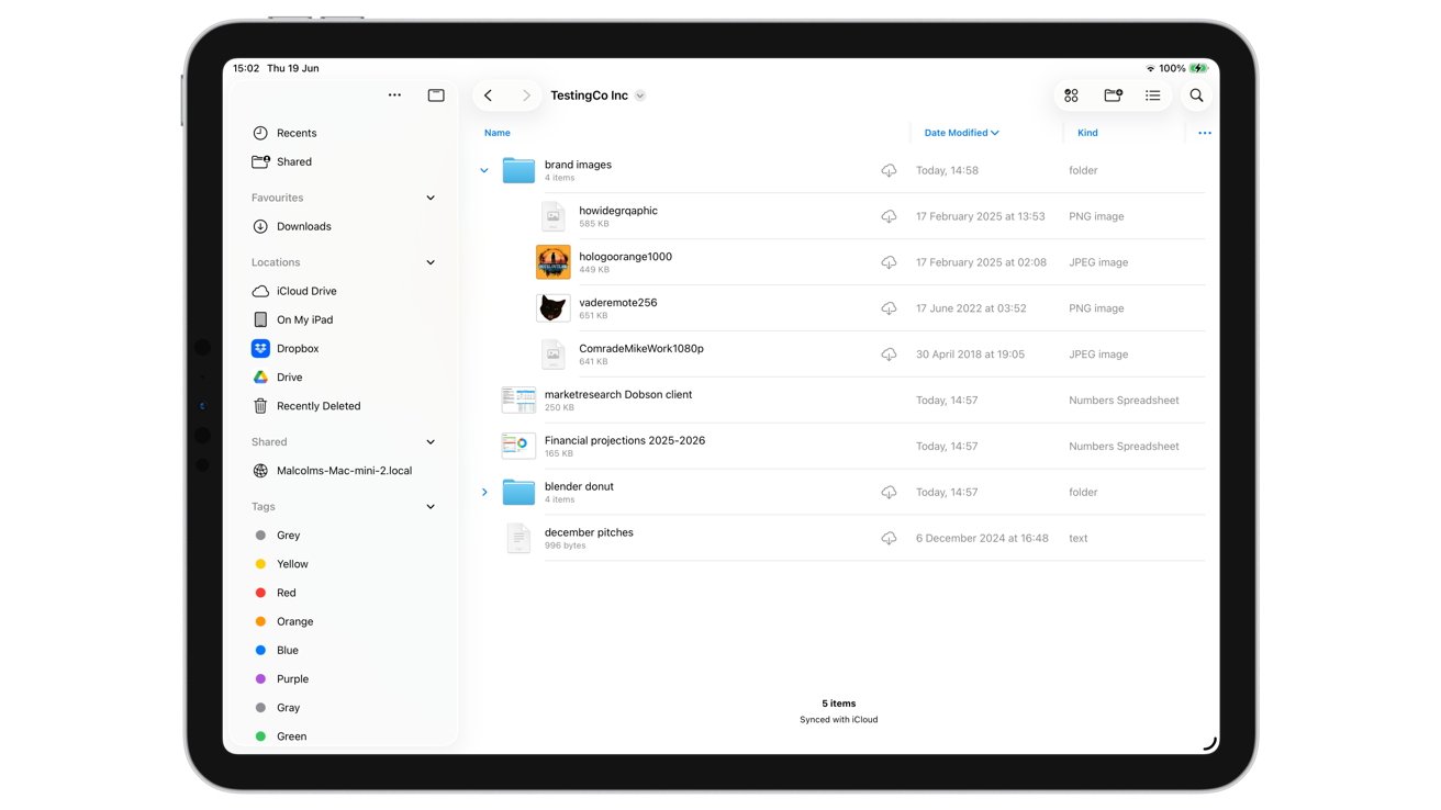
Nested folders in List View is a big productivity update in Files for iPadOS 26
Crucially, you can see and access the files within this dropdown folder contents, without actually navigating to the folder beforehand. You're still able to stay within the parent folder throughout this.
This may sound like a small change to some, but to avid Files users who have to keep navigating forward and back between folders, this is a massive improvement.
Files iPadOS 26 vs Files iPadOS 18 - List View Columns
Continuing the theme of List View, another problem Files had was that it was quite restrictive in terms of what you can view.
You could sort the list by various ways, but the columns would include the Name and either the Date, Size, or Kind of item it is. You certainly couldn't view both the date and size of a file in separate columns.
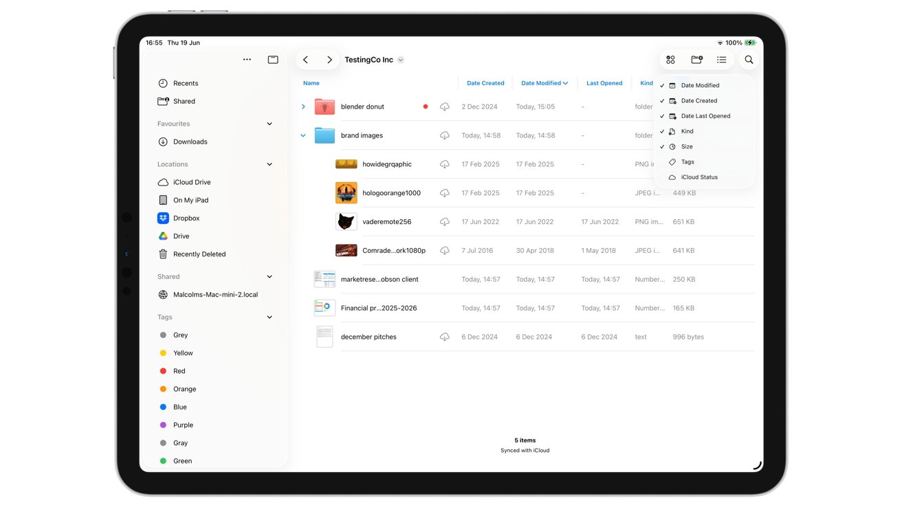
Adding more columns and resizing them in List View in iPadOS 26's Files app
You also had no control over the size of the columns either, which rubbed salt in the wounds of anyone who wanted to see more information at the same time.
In iPadOS 26, Files has mercifully changed this to be a lot more flexible. First, you could add a lot more columns to the view, so you could see how big the file is and when it was made at the same time.
The list of columns also increased, so you can see the date a file was created, last modified, last opened, Kind, Size, Tags, and iCloud Status. While you would see the last two as icons next to the folder or document normally, it is nice to have the option to give them a separate column that you can also sort by.
You can enable all of the columns if you really want to, and if it overfills the screen, you can simply scroll sideways to see the ones that go off the side. Even better, you can change the width of a column, adjusting the level of detail offered in it at the same time.
If you don't like the order of the columns, you can also change them by long-pressing and dragging the column title left or right.
Users of Files will want the most flexibility in how they view the hierarchy and file details. At least in iPadOS 26, Files finally does just that.
Files iPadOS 26 vs Files iPadOS 18 - Folders
Apple has long allowed users to take advantage of tags in macOS and iPadOS, as a way to more easily identify folders. However, a colored dot next to a folder wan't really that inspiring.
Under iPadOS 26, this has been significantly updated so that the folder icon itself is changed. You still get the colored dot, but the folder icon now exhibits more personality, making it a lot more recognisable.
While a long press on a folder will include an option for "Tags" in iPadOS 18, resulting in a simple popup for tag selection, iPadOS 26 does a lot more with its "Customize Folder & Tags" function.
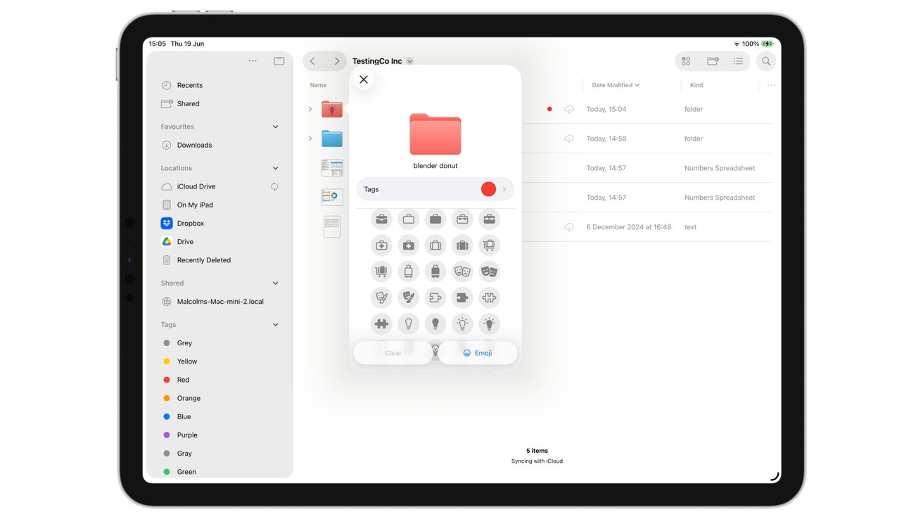
Files in iPadOS 26 lets you do a bit more customization to your folders than adding a colored dot.
The new pop-up has a larger preview of the folder icon, and an immediate option to select the tag. Tapping it lets you select the tag and relevant color, but it turns the entire folder icon that hue this time around.
Further down the popup, you can add an icon to the folder's front for more distinct identification. If the list doesn't have an icon you want to use, you can use emoji instead.
Just like tags before, these customizations to the folder also synchronize with counterparts on your other devices. That red folder with a lightbulb buried in iCloud Drive will look the same in macOS too.
You can also put that folder into the Dock if you want, so you can access its contents quickly from anywhere. Apple says that you can drag the folder from Files directly to the dock, but in our testing, we could only add it by long-pressing the folder in Files then selecting Add To followed by Dock.
Either way, it's a nice addition.
Files iPadOS 26 vs Files iPadOS 18 - Server connections
The ability to connect to cloud storage and servers hasn't changed that much between the two versions, but there is a bit of a change.
Adding an online cloud storage service is unchanged, with the instructions tending to involve the app associated with the service and it appearing to the Locations list. Similarly, if you have an Apple Account, you'll see iCloud Drive appear here too.
Both are capable of connecting to servers on a network, with the right credentials.
When you're transferring files with servers and cloud services to and from your iPad, that's where there's a small change.
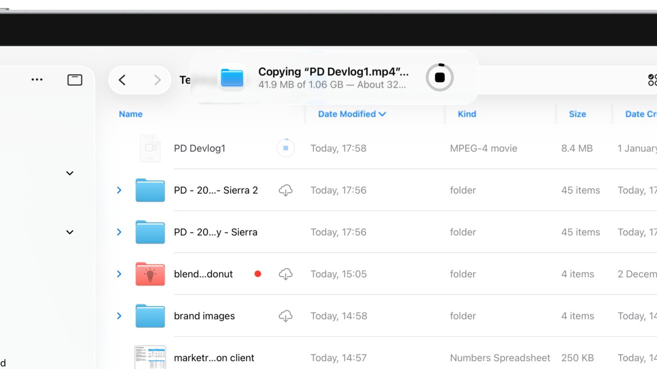
Indicators for file transfers over the network in Files for iPadOS 26
In both generations, you will see a small circular indicator next to the file, showing progress for an upload or a download. In iPadOS 26, there's a secondary large indicator at the top of the screen, which we have found appears for very large transfers over the local network.
Files iPadOS 26 vs Files iPadOS 18 - Transfer tests
To check to see if there are any other practical benefits to using Files in iPadOS 26, we conducted some timed tests. We used an 11-inch M2 iPad Pro running iPadOS 26 alongside a 13-inch M2 iPad Pro running iPadOS 18.
The first test was a transfer of a large 4.13GB file from local iPad storage to an external drive. Both iPads used a Lexar Professional Go Portable SSD, which connects at 10Gbps.
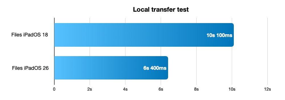
Testing a 4.13GB file transfer to an external USB-C drive
The result was surprising, as the iPadOS 18 Files app finished its transfer in an admirable 10.1 seconds. However, the iPadOS 26 version did the same thing in just 6.4 seconds.
Since the iPads are functionally similar for their USB Type-C connectivity and processing, and the external drive is the same, the difference could be down to either improvements in iPadOS itself or in the Files app.
The second test was a transfer over Wi-Fi of the same file, to a server. The two networks are fairly comparable, but the iPadOS 18 iPad is on a 600Mbps connection while the iPadOS 26 one was on a 450Mbps network.
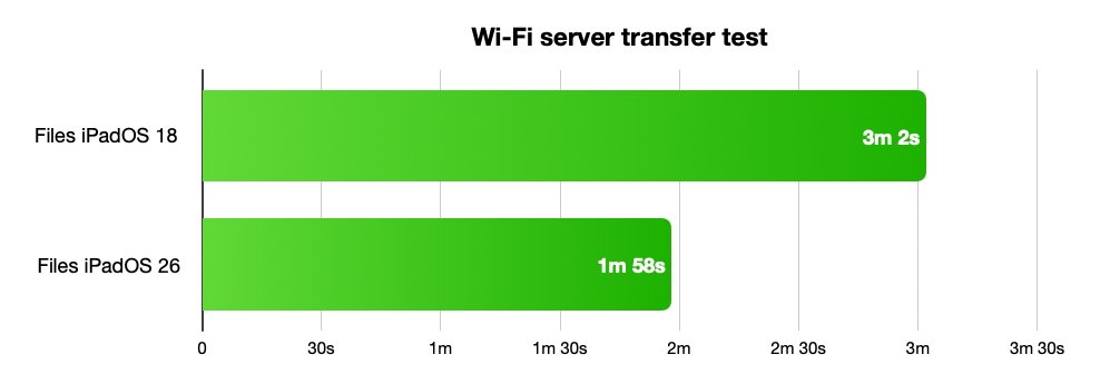
A test of a 4.13GB file transfer to a local server over Wi-Fi.
Despite the disparity in Wi-Fi, iPadOS 26 won again with a time of 1 minute 58 seconds versus just over three minutes.
Admittedly, this second test has a few more variables than we like, conducted on different Wi-Fi networks in different work spaces. But, despite having the better connection, the iPadOS 18 transfer was notably slower.
For people who do lots of large file transfers, such as content creators, this could be a very useful discovery, and more impetus to make the OS upgrade.
Files iPadOS 26 vs Files iPadOS 18 - Small, yet massive, changes
The Files app has always been derided as being shown functionality by the development team, but not actually getting any of that actually implemented. It was (barely) useful enough to allow people to access files in different folders, or in cloud storage, but without the finesse of the macOS Finder.
It just didn't work well. It hampered external storage, and was generally annoying.
Going from iPadOS 18 to iPadOS 26, Files has learned more tricks from Finder and implemented them well. The issues have been excised for the most part, making it a far more useful tool for productive users.
It's a big step for Files, and in many respects, it's now much closer to being the ideal equivalent to Finder, but on iPad.
Read on AppleInsider

Comments
we can continue to expect some people to find something to complain about, but they really did change most everything. Here we go already - I can’t wait to see what they do next year.
I would assume keyboard shortcuts are not customizable this round. Hmm, is there a globe key on the onscreen keyboard?
None of this is a dealbreakers, but it's not a step forward, IMO.
Showing ALL ever-opened thumbnails there is a silly artefact of the era where they needed to create impression of a larger RAM (like, look ma, everything fits).
These days, it is a Total Recall-like exposé of things you done in far past, and a betrayal of the WYSIWYG principle.
Have you actually tried it yet rather than deciding based on screenshots which are then filtered through your own monitor? It’s not as bad as some are complaining about. It’s just different and I’ll bet Apple will modify it over the life of the betas, as they always do. Transparency can be changer in Accessibility.