Has anyone ever encountered a counterfit bill? Not just a display one but had one actually passed to you in a transaction.
I'll bet we all have. And we've probably all passed them, too. I've never known I had one, though.
I had a very odd $1 bill once, about 20 years ago. One side was fine, but the other was off-center in a weird way. The white border seemed completely correct (not too wide or narrow) except at one edge, where it was missing (no border at all). Looking at the "weird" side of the bill, you would swear it was cutoff on one edge. And yet, the other side looked perfect. I spent it anyway.
i cant wait until they produce bills that talk to you, imagine jefferson's head turning towards you as you purchase a pack of cigarettes (not that i smoke), and say in the best rendition of his voice: The surgeon general...
The 500 kroner ($70-80) bill have always been the best looking across all series. The current one looks like this:
In the new serie of bills the security measures (microprint, threads, watermarks and other stuff) have been integrated very beautiful into the design, so our national bank have avoided bright misplaced colours. A good example of how NOT to design a bill is our old 100 kroner bill:
It just screams "security" without any aestics.
Bonus points to the person who knows who the man with the pipe is.
I've always liked foreign currency because it was always so colorful, like artwork. Makes you actually think it's worth something more than paper, I've always thought that it was stupid that paper rectangles with bland green ink on them could be worth so much just because it was said to be true. I am glad though, that they're the same size, because if they were not it would bug me that the money in my wallet was not all even.
Strange to see the currencies of the two exact nations that have not entered the monetary union. Do you people not yearn for the feel of a sturdy and worldly euro now and then? If it comes to artwork on a bill, I kind of miss the old 1000 Belgian francs notes. Respectable stuff.
BTW, Hungaria (not in the union) has already earned itself the reputation of best Euro-forging nation. Guess Hungarians will be paying for their bread and goulash with mock-euros soon...
One thing I never liked about the American currency was how the bills are all the same colour and size... makes it hard to tell them apart.
Actually, I really liked the monchrome American currency. It's always struck me as the sort of last outward vestige of neo-classical sensibility that's latent in our culture. Despite my personal tastes, I also liked how symmetrical it was too.
Strange to see the currencies of the two exact nations that have not entered the monetary union. Do you people not yearn for the feel of a sturdy and worldly euro now and then?
Our currency is so tightly bound to the euro so it doesn´t make that big a difference. And our economy is much better than that of euroland, not to speak about that of Germany. So noone would dare speculate against it right now.
The $100 note features world-renowned soprano, Dame Nellie Melba (1861-1931), and the distinguished soldier, engineer and administrator, General Sir John Monash (1865-1931).
The $50 note features David Unaipon (1872-1967), Aboriginal writer and inventor, and Edith Cowan (1861-1932), Australia?s first female parliamentarian.
The $20 note features the founder of the world?s first aerial medical service, the Royal Flying Doctor Service, the Reverend John Flynn (1880-1951), and Mary Reibey (1777-1855), who arrived in Australia as a convict in 1792 and went on to become a successful shipping magnate and philanthropist.
The $10 note features the poets A. B. (Banjo) Paterson (1864-1941) and Dame Mary Gilmore (1865-1962). This note incorporates micro-printed excerpts of Paterson's and Gilmore's work (this is my favourite note).
The new $5 Federation note, features Henry Parks (our racist founder).
They are all made of polymer, with a transparent patch and symbol. Apparently they are among the most secure notes in the world.
I very much like the Mary Gilmore poem on the $10 note, "No Foe Shall Gather Our Harvest". Unfortunatly, I can't seem to find a text of it on the internet.
I'm sorry guys, I simply must fall back onto the term "monopoly money" to describe all of these images. Regardless of how (strikingly) beautiful some of these currency bills' designs are, they don't look like the real stuff.
Of course, we're all going to like our own money...right?
It's just, if you ever see somebody handing somebody else a suitcase full of money...it's going to be packed with REAL MONEY.....U.S. Greenbacks.
It is a subtle hint for American tourists by the Chretien govt as to which way they should vote in 2004.
As for drewprops comment that a person will like his own currency best, I must disagree. I think most of the other bills here are vastly more appealing than either the new school twenty or any of the current currency we have. Well, other than that hockey note which seems a bit cheesy- sorry JMO- and that one Aussie note that is a bit too strong of a red for my taste. I was hoping for much stronger coloring in the new bills but no luck there it seems.
Comments
Originally posted by Outsider
Has anyone ever encountered a counterfit bill? Not just a display one but had one actually passed to you in a transaction.
I'll bet we all have. And we've probably all passed them, too. I've never known I had one, though.
I had a very odd $1 bill once, about 20 years ago. One side was fine, but the other was off-center in a weird way. The white border seemed completely correct (not too wide or narrow) except at one edge, where it was missing (no border at all). Looking at the "weird" side of the bill, you would swear it was cutoff on one edge. And yet, the other side looked perfect. I spent it anyway.
Originally posted by Mac OS X Addict
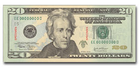
The new $20 bill does look a lot better than its predecessor. I still like the Canadian $5 as it reflects our society quite well.
wait. they play winter sport in canada!
Originally posted by BuonRotto
I'm partial for the 10 Franc Swiss note:
j/k buddy
In the new serie of bills the security measures (microprint, threads, watermarks and other stuff) have been integrated very beautiful into the design, so our national bank have avoided bright misplaced colours. A good example of how NOT to design a bill is our old 100 kroner bill:
It just screams "security" without any aestics.
Bonus points to the person who knows who the man with the pipe is.
I quite like ours (England):
Front:
Back:
Compare this to the £10 note - totally different colour and size, so you're unlikely to mistake them:
Amorya
BTW, Hungaria (not in the union) has already earned itself the reputation of best Euro-forging nation. Guess Hungarians will be paying for their bread and goulash with mock-euros soon...
Originally posted by Amorya
One thing I never liked about the American currency was how the bills are all the same colour and size... makes it hard to tell them apart.
Actually, I really liked the monchrome American currency. It's always struck me as the sort of last outward vestige of neo-classical sensibility that's latent in our culture. Despite my personal tastes, I also liked how symmetrical it was too.
Originally posted by der Kopf
Strange to see the currencies of the two exact nations that have not entered the monetary union. Do you people not yearn for the feel of a sturdy and worldly euro now and then?
Our currency is so tightly bound to the euro so it doesn´t make that big a difference. And our economy is much better than that of euroland, not to speak about that of Germany. So noone would dare speculate against it right now.
The $100 note features world-renowned soprano, Dame Nellie Melba (1861-1931), and the distinguished soldier, engineer and administrator, General Sir John Monash (1865-1931).
The $50 note features David Unaipon (1872-1967), Aboriginal writer and inventor, and Edith Cowan (1861-1932), Australia?s first female parliamentarian.
The $20 note features the founder of the world?s first aerial medical service, the Royal Flying Doctor Service, the Reverend John Flynn (1880-1951), and Mary Reibey (1777-1855), who arrived in Australia as a convict in 1792 and went on to become a successful shipping magnate and philanthropist.
The $10 note features the poets A. B. (Banjo) Paterson (1864-1941) and Dame Mary Gilmore (1865-1962). This note incorporates micro-printed excerpts of Paterson's and Gilmore's work (this is my favourite note).
The new $5 Federation note, features Henry Parks (our racist founder).
They are all made of polymer, with a transparent patch and symbol. Apparently they are among the most secure notes in the world.
I very much like the Mary Gilmore poem on the $10 note, "No Foe Shall Gather Our Harvest". Unfortunatly, I can't seem to find a text of it on the internet.
Barto
Of course, we're all going to like our own money...right?
It's just, if you ever see somebody handing somebody else a suitcase full of money...it's going to be packed with REAL MONEY.....U.S. Greenbacks.
Or at least it was.
Originally posted by Mac OS X Addict
Here's some other bills.......
Why do you have Liebermann on your five dollar note?
As for drewprops comment that a person will like his own currency best, I must disagree. I think most of the other bills here are vastly more appealing than either the new school twenty or any of the current currency we have. Well, other than that hockey note which seems a bit cheesy- sorry JMO- and that one Aussie note that is a bit too strong of a red for my taste. I was hoping for much stronger coloring in the new bills but no luck there it seems.