One Picture a Day: Revisited
Seeing as the old thread kinda died away... and that it's full of posts with defunct links to pics, I thought we should have a brand new spankin' thread for pics.
So, post away!
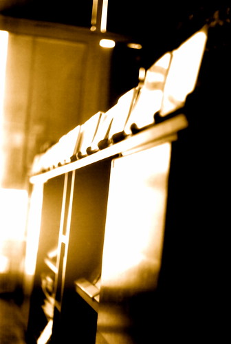
This is a picture taken with an old Russian camera. I don't remember the name of it - but I really liked its look and feel. It was a nice camera too, it produced some really sharp pics.
For a larger version, go here.
So, post away!
This is a picture taken with an old Russian camera. I don't remember the name of it - but I really liked its look and feel. It was a nice camera too, it produced some really sharp pics.
For a larger version, go here.
Comments
(with apologies to Georgia O'Keefe)
[full size]
*Runs away screaming arms in air*
A 2/14 themed image.
Here's one for today:
photo page
Originally posted by Ebby
OK, calm now. I should probably make a contribution since I made a stink.
A 2/14 themed image.
How did you stage it? The offwhite background is nice.. I like it.
I had 4 roses in a vase and staged them in different positions. I took about 20 photos at various angles. By far the hardest thing was controlling the lighting. I don't have a studio setup so I had to make do with halogen lamps and LED flashlights.
Boy was that fun.
A quick shot of the three flowers I got for my wife this valentine's day (my mom wanted to see them).
Also, this is my recently purchased XBox opened up for hard drive replacement (~2 hours after I dropped $130 on it!)
Originally posted by Ebby
I actually got that tip (reducing the luminance of the background and avoiding pure-white splotches around the borders) from one of my photography instructors a year ago. Sometimes these simple tips cam make all the difference.
Care to share?
For best composition, try to line up objects in your image according to 4 invisible lines. Divide the image into 3 vertical sections and 3 horizontal to find these lines. Now, if you try to do that with my image, it won't work because I cropped it down to screen resolution. The original does adhere to this.
Tip #2) Avoid brights around the edges
If you have bright sections next to the border of your image, it will draw your eye away from the main subject. This tip was passed from Ansel Adams to a great instructor I had and now from me to you.
ORIGINAL
EDITED
Tip #3) Depth of field
Depth of field is important especially for macro photography. You need to highlight what your viewer should see and place emphasis on subjects in your image. The way to control this is to change the iris size. The smaller the iris, the sharper and longer the depth of field. This is done through f-stops, and the larger the number (22) the smaller the iris.
Tip #4) Feel the curves
Pure white should be avoided. A printer can not print pure white and our eyes perceive this as a loss of information. With a white point around 95% of full, we still see it as white, but information is still there which make the image more pleasing to look at.
Advanced tip:
If you are working in 16-bit images, but may convert them to 8-but later, use curves to select the blackest black and whitest white of your photograph. This calibrates the image to use the full gamut spectrum before you convert and loose information. "But that makes my image look fake!" you say? Use an adjustment layer to restore settings if you like. What this does is protect you if you work in 8-bit with photoshop 7 like me and minimized combing effects.
There are perfectly good exceptions to all of these in the name of art so experiment with some images. I'm in LA right now, but I'll try to post some before and after images of another photo I did when I can.
I added the rule of thirds lines and you will notice how nicely two of the flowers fit into the corners. The top flower, though not centered on a line, has the edge of the petal follow the line down. That also counts.
I didn't notice this before, but the vase holding the flowers is perfectly centered between the two lines.
There is also a small depth of field blur in the table and background that keeps focus on the flowers themselves.
The only suggestion I would have is to darken the table down a little to make it grey. That should shift the "weight" of the image more center.
I wish I had a little more room on the bottom. Too much lens.
Originally posted by Ebby
Tip #1) The Rule of thirds
For best composition, try to line up objects in your image according to 4 invisible lines. Divide the image into 3 vertical sections and 3 horizontal to find these lines. Now, if you try to do that with my image, it won't work because I cropped it down to screen resolution. The original does adhere to this.
I've never used this rule, but it does make sense. Thanks for your time and effort explaining this Ebby.
Here's one more from me: a public phone in one of the (almost-destructing) train stations of Chicago. I used some Photoshop filters to make it more film noir but in color...
Originally posted by Cato988
how do i put a photograph in my post?
Host the image somewhere else (like www.flickr.com) for free
when you post here, click on the "image" button below the window where you type your message and paste in the url of your image into the window that opens up.
Originally posted by Gene Clean
I've never used this rule, but it does make sense. Thanks for your time and effort explaining this Ebby.
Here's one more from me: a public phone in one of the (almost-destructing) train stations of Chicago. I used some Photoshop filters to make it more film noir but in color...
Which stop? Looks like the Blue Line.