Video: One week using Apple's iPhone X vs. iPhone 8 Plus

There are benchmarks and specs -- and then there are actual use cases that may differ between the iPhone 8 Plus and iPhone X. AppleInsider has spent over a week with the iPhone X now, and here's what we think about it, versus the iPhone 8 Plus.
For reviews, news, tips, features and more, subscribe to AppleInsider on YouTube.

Video transcript:
I've been using the iPhone X since it launched a week ago, and in this video I want to talk to you about how it compares to the iPhone 8 Plus. This isn't a full comparison --- and I'm not going to cover every new detail, for that, see our full review.
I want to get away from the spec sheets and benchmarks and just talk about the user experience. Was it worth switching over? What really surprised me, and what I've been disappointed with.
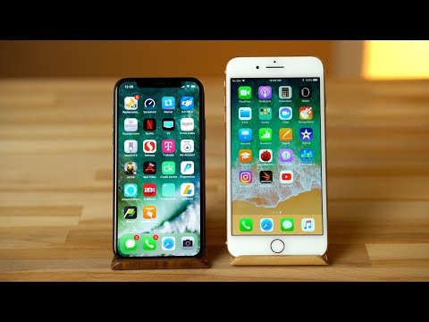
One of the biggest changes is obviously the display, and I have to admit I was a bit disappointed at first. I'm not talking about the brightness, colors, or contrast which are all fantastic. My disappointments came from the size. Even though the iPhone X is rated at 5.8 inches compared to 5.5 inches of the iPhone 8 Plus, the actual surface area of the display is slightly smaller and that's if you're using the full display. This difference is definitely noticeable when you use the X for a bit.
If you're in an app that hasn't been updated or watching video without the annoying notch getting in the way you'll be viewing a 4.96 inch display, so very close to the regular 4.7-inch iPhone 8 which explains why the display feels so small. This may not be a big deal to everyone but I love large high quality displays, in fact I didn't even buy an iPhone until the 6 Plus was released since the screens were in my opinion too small.
After a week of use, I've gotten used to the phone and a few more apps have been updated to the use the full display and honestly I don't mind it as much. Yes I do miss the larger display at times but using the iPhone 8 Plus again I realized that I'd much rather have the narrower display for day to day use that fits so well in the hand, especially if Apple does a few software tweaks for video.
With that let's move to the notch, I'm not a fan, but I'll have to deal with it. As both a content creator one who watches a ton of video I have to say that notch does not disappear for me. Whats even worse is the full screen crop. Apple and Google only give us one option, view a smaller screen which isn't the end of the world or go fullscreen and deal with an ugly cutout and cutting off heads. The director, filmmaker, or content creator who made that video you're watching likely likely framed that video a specific way, and with the crop you're losing a part of that.
This is an easy software fix, I'd love to be able to adjust the zoom when going fullscreen to avoid that notch but get a larger display, or at least adjust the video vertically. For those that view a lot of 16-by-9 content, the iPhone 8 Plus is still king with a noticeably larger display and no cutouts to deal with.
With all of that out of the way, Touch ID is dead. Yes Face ID has limitations, at times it's slower than touch ID, and I have to enter my passcode manual more often than before but it's well worth it. Most of the time it's quick enough that I don't notice it and the being able to log into secure apps automatically and use the safari autofill without having to move my hands or even think about it is glorious. We have a few video on that which you can check out by clicking the card above. After a week there's no way I'd want to go back to using touch ID, The convenience is too great and few limitations it has will be improved over time. The sensor array also provides for incredible facial tracking for things like animoji which I've only used a few times, and selfie portrait mode. The latter hasn't been optimized yet and is experiencing similar issues like too much blur and messy edges that we got when the rear facing portrait mode launched, so I'm avoiding it for now.
Now let's talk about the other big change we have from of the removal of Touch ID, the gestures.
Swiping up to go home has become the new normal but isn't really any better than using the home button. On the other hand I really like the quick app switcher at the bottom of the screen. As someone who multi tasks often this has been amazing and I still get a bit excited every time I swipe through apps. The regular app switcher has taken a big step backwards. Not only does it take longer to open it and sometimes requires a few tried, you now have to hold down the app until an icon shows up to close it. Once again if you don't hold it long enough and swipe you'll have to re-do the process. Some say Apple wants to discourage people from habitually closing apps, but there are certain apps like navigation, music, or youtube, where it was much faster to double tap and swipe to close than go into the app and stop what it's doing, and then have it annoyingly auto resume when you get in your car or connect to a bluetooth device. Apple, I can deal with the the drag and hold but at least let us quickly swipe to close.
My other complain is the control center. Unlike the iPhone 8 where you swipe up from the bottom to access now you have to wipe up from the top right which is much less comfortable. Swiping from the bottom right would be easier, or at least let us swipe dow along the right side of the display. I understand Apple doesn't want to confuse you since you swiping up is now the home button, but swiping we now have three swipe down commands. From the top middle or left for notifications, right for control center, and anywhere below that for siri search. Yes you can enable reachability for another swipe down gesture, but that makes control center a two step command with a lot of thumb movement where on the iPhone 8 it was much quicker and easier.
Overall the iPhone 8's familiar commands are more efficient, and the best new gesture, quick app switching. could easily be added to older iphones.
The other last noticeable change I want to touch on is the the telephoto camera. Its slightly faster and now features optical image stabilization and the difference is huge. For handheld videos we have much smoother footage and for photos the iPhone can now use slower shutter speeds resulting in a lot less noise and the ability to use portrait mode in darker environments.
Those are really the biggest changes I noticed. Yes, the OLED display has amazing contrast and is brighter but the iPhone 8 Plus has arguably the best LCD display in a phone so the difference isn't huge. The speakers are now more balanced but the 8's are also one of the best on the market. Most of the internals are are identical so the performance is on par, both being excellent. Battery life is similar, and both feature wireless charging.
So was it worth switching to the iPhone X? For me, yes, but i'm a techie and a bit addicted to having the latest and greatest. The display and notch is a downgrade for video, but the dual stabilization is a big upgrade and that matters since I take a lot of portrait mode photos and video. And lastly after getting used to the smaller size the 8 plus feels unwieldy.
If you're contemplating upgrading to the iPhone X, but are OK with the size of your phone and watch a lot of video I'd say stick it out another year. Sure, Face ID is cool, but If you can wait we should see some good improvements and tweaks with the second generation versions of everything that is new this year.

For reviews, news, tips, features and more, subscribe to AppleInsider on YouTube.
Video transcript:
I've been using the iPhone X since it launched a week ago, and in this video I want to talk to you about how it compares to the iPhone 8 Plus. This isn't a full comparison --- and I'm not going to cover every new detail, for that, see our full review.
I want to get away from the spec sheets and benchmarks and just talk about the user experience. Was it worth switching over? What really surprised me, and what I've been disappointed with.
One of the biggest changes is obviously the display, and I have to admit I was a bit disappointed at first. I'm not talking about the brightness, colors, or contrast which are all fantastic. My disappointments came from the size. Even though the iPhone X is rated at 5.8 inches compared to 5.5 inches of the iPhone 8 Plus, the actual surface area of the display is slightly smaller and that's if you're using the full display. This difference is definitely noticeable when you use the X for a bit.
If you're in an app that hasn't been updated or watching video without the annoying notch getting in the way you'll be viewing a 4.96 inch display, so very close to the regular 4.7-inch iPhone 8 which explains why the display feels so small. This may not be a big deal to everyone but I love large high quality displays, in fact I didn't even buy an iPhone until the 6 Plus was released since the screens were in my opinion too small.
After a week of use, I've gotten used to the phone and a few more apps have been updated to the use the full display and honestly I don't mind it as much. Yes I do miss the larger display at times but using the iPhone 8 Plus again I realized that I'd much rather have the narrower display for day to day use that fits so well in the hand, especially if Apple does a few software tweaks for video.
With that let's move to the notch, I'm not a fan, but I'll have to deal with it. As both a content creator one who watches a ton of video I have to say that notch does not disappear for me. Whats even worse is the full screen crop. Apple and Google only give us one option, view a smaller screen which isn't the end of the world or go fullscreen and deal with an ugly cutout and cutting off heads. The director, filmmaker, or content creator who made that video you're watching likely likely framed that video a specific way, and with the crop you're losing a part of that.
This is an easy software fix, I'd love to be able to adjust the zoom when going fullscreen to avoid that notch but get a larger display, or at least adjust the video vertically. For those that view a lot of 16-by-9 content, the iPhone 8 Plus is still king with a noticeably larger display and no cutouts to deal with.
With all of that out of the way, Touch ID is dead. Yes Face ID has limitations, at times it's slower than touch ID, and I have to enter my passcode manual more often than before but it's well worth it. Most of the time it's quick enough that I don't notice it and the being able to log into secure apps automatically and use the safari autofill without having to move my hands or even think about it is glorious. We have a few video on that which you can check out by clicking the card above. After a week there's no way I'd want to go back to using touch ID, The convenience is too great and few limitations it has will be improved over time. The sensor array also provides for incredible facial tracking for things like animoji which I've only used a few times, and selfie portrait mode. The latter hasn't been optimized yet and is experiencing similar issues like too much blur and messy edges that we got when the rear facing portrait mode launched, so I'm avoiding it for now.
Now let's talk about the other big change we have from of the removal of Touch ID, the gestures.
Swiping up to go home has become the new normal but isn't really any better than using the home button. On the other hand I really like the quick app switcher at the bottom of the screen. As someone who multi tasks often this has been amazing and I still get a bit excited every time I swipe through apps. The regular app switcher has taken a big step backwards. Not only does it take longer to open it and sometimes requires a few tried, you now have to hold down the app until an icon shows up to close it. Once again if you don't hold it long enough and swipe you'll have to re-do the process. Some say Apple wants to discourage people from habitually closing apps, but there are certain apps like navigation, music, or youtube, where it was much faster to double tap and swipe to close than go into the app and stop what it's doing, and then have it annoyingly auto resume when you get in your car or connect to a bluetooth device. Apple, I can deal with the the drag and hold but at least let us quickly swipe to close.
My other complain is the control center. Unlike the iPhone 8 where you swipe up from the bottom to access now you have to wipe up from the top right which is much less comfortable. Swiping from the bottom right would be easier, or at least let us swipe dow along the right side of the display. I understand Apple doesn't want to confuse you since you swiping up is now the home button, but swiping we now have three swipe down commands. From the top middle or left for notifications, right for control center, and anywhere below that for siri search. Yes you can enable reachability for another swipe down gesture, but that makes control center a two step command with a lot of thumb movement where on the iPhone 8 it was much quicker and easier.
Overall the iPhone 8's familiar commands are more efficient, and the best new gesture, quick app switching. could easily be added to older iphones.
The other last noticeable change I want to touch on is the the telephoto camera. Its slightly faster and now features optical image stabilization and the difference is huge. For handheld videos we have much smoother footage and for photos the iPhone can now use slower shutter speeds resulting in a lot less noise and the ability to use portrait mode in darker environments.
Those are really the biggest changes I noticed. Yes, the OLED display has amazing contrast and is brighter but the iPhone 8 Plus has arguably the best LCD display in a phone so the difference isn't huge. The speakers are now more balanced but the 8's are also one of the best on the market. Most of the internals are are identical so the performance is on par, both being excellent. Battery life is similar, and both feature wireless charging.
So was it worth switching to the iPhone X? For me, yes, but i'm a techie and a bit addicted to having the latest and greatest. The display and notch is a downgrade for video, but the dual stabilization is a big upgrade and that matters since I take a lot of portrait mode photos and video. And lastly after getting used to the smaller size the 8 plus feels unwieldy.
If you're contemplating upgrading to the iPhone X, but are OK with the size of your phone and watch a lot of video I'd say stick it out another year. Sure, Face ID is cool, but If you can wait we should see some good improvements and tweaks with the second generation versions of everything that is new this year.
Comments
Lastly, you can swipe app cards up, just like you do on other iPhones to kill apps, except it does nothing on the X. That's maybe a sign that the current behavior is a bug that will soon kill apps like it should.
(If I was an iOS developer, I'd be cursing Apple over this display.)
Cpsro wrote: "Lastly, you can swipe app cards up, just like you do on other iPhones to kill apps, except it does nothing on the X. That's maybe a sign that the current behavior is a bug that will soon kill apps like it should."
It does if you wait for the minus sign to appear first. Once the minus sign(s) appear, you can quit an app by touching the minus sign OR swiping up on the app card.
Furthermore, I don't believe I've ever accidentally killed an app while merely trying to switch. On the X, swiping into card mode doesn't let the user swipe a card up in the same motion--it's necessary to lift the finger from the display. In other words, accidentally killing is still very difficult. And accidentally killing beyond the first app would be ridiculously difficult.
And i am surprised that Max wasn’t attacked by DED for having some issues with the interface.
X is easy to use and ive had zero issues with it.
yes, you are correct. we now have to tap and hold for half a second to generate the minus sign in order to log out of the app when swiping up. otherwise it doesn't log out.
LOL it's not a bug just because you didn't expect the behavior 'unexpected behavior'
"because swiping up on every other iOS device kills the app" welcome to the iPhone X (and the future of an all screen iOS). no more home button means a rethinking of how to interact with the device.
It is weird to swipe up app cards to see them disappear, only to find out later that none of the apps were killed. It's rather akin to the iOS 11 behavior of "turning off" Bluetooth or Wi-Fi in Control Center, when it doesn't actually turn off BT or Wi-Fi, it only disconnects them. Except in the case of the app cards, swiping up seems to do absolutely nothing. And if it does nothing, why is Apple playing a game of letting users swipe up to see the cards disappear? My guess is it's another inside joke at Apple, because they're so heartbroken about users killing apps because it wastes energy (in their opinion).
Just for fun, I'll conjecture that the limited-functionality Bluetooth and Wi-Fi controls in Control Center and the fake killing of apps (on the iPhone X) are intended to allow tracking of users to continue when it otherwise wouldn't if the controls worked absolutely and if apps were actually killed.
Fact is we live in the Twitter generation where few people in the 20's and 30's know how to read past a single paragraph. I remember the good old days back in the 1980's when my monthly issues of Mac User magazine arrived and it took many many days to blow through each. We had amazing product reviews with loads of geeky details that would go on page after page. I loved it then and still would love it today too if tech media would publish lengthy articles. Sometimes you can find them online, but they are somewhat uncommon. But at the same time, I still like AppleInsider and appreciate both their videos and their articles. I long for the past, but AppleInsider still mostly satisfies my cravings for info on all things Apple. I can't help but appreciate the good people that keep it going.
Maybe we need an AppleInsider editorial about how Apple could possibly eliminate that hideous notch with more modern tech that still allows the screen to span the entire width and height of the front of the iPhone. That would be the be-all, end-all iPhone!
While I agree with you about swiping up not "killing" the app is weird (even I'm used to that on my iPad...swiping up ought to kill the app)...but I think dropping the "bug" word is something you should refrain from doing. A few people have pointed out that, for now, that *is* behavior on the iPhone X...that swiping up won't kill the app. And I liked what someone else above said that Apple is going you make you do things differently going forward. So for now, just accept it. You'll get used to the new way...and I have no doubt in the future there may be a new setting that allows you to adjust this behavior to suit your preference.
Regardless, my point is using "bug" is not something you should do if not necessary. While I am not a developer or programmer, I know reporting "defects" can very much affective their performance reviews, raises and promotions, and in some severe cases even cause a programmer to be terminated.
Because iPhoneX users are now swiping up to get to the home screen, it makes sense to use the same action to return to the home screen from the app switcher. This stops people from accidentally killing running apps when they just wanted to get back to the home screen from the app switcher. Since it’s only the OCD crowd that constantly feel the need to kill apps because they read some blog that told them they have to, Apple decided it was okay to move it because it’s only needed when an app becomes unresponsive.
This is is basically a change in behaviour, something that we developers are familiar with. You’re simply telling yourself it’s a bug because you lack the ability to adapt to change. It’s probably best not to count developers as folk who think like that.
I like the guys work. And his name is appleinsider staff?
come on. Give credit where it’s due. Stay classy appleinsider.