Apple revamps App Store Preview web interface with iOS 11 aesthetic

Apple on Thursday issued a redesign for the App Store web interface, with app searches on Safari, Chrome and other browsers now rendering a bold design aesthetic and elements borrowed from the iOS 11 App Store app.
Seen above, Apple's App Store Preview web interface has been revamped to match that of the iOS 11 App Store, complete with prominent icons, larger preview images and a clean page layout.
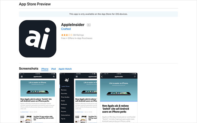
At the top of every page is an oversized app icon that sits next to an app's name, developer, star rating and purchasing information, similar to past App Store Preview iterations. Here users can see an app's price and whether the title offers in-app purchases.
Below the main banner are app screenshots arranged by device. For example, the newly redesigned AppleInsider app contains assets for iPhone (including iPhone X), iPad and Apple Watch. Previously, this space was occupied by an app's description, but that changed with the App Store's redesign in iOS 11.
Instead, an app's description is now displayed below the screenshot module, meaning most users will need to scroll down the page to access the informational text. As usual, the description is collapsed into a single paragraph or sentence, though customers can click on "more" to view the entire text block.
A "What's New" section complete with version history logs is positioned below the description, followed by customer reviews, detailed app information like file size and supported languages, Family Sharing support and a "You May Also Like" section dedicated to similar apps.
Apple debuted web previews in 2010, allowing customers to browse mobile apps on a desktop without going through iTunes. Though the online interface has seen updates over the ensuing years, today's change marks the largest shift in presentation and content.
The new App Store Preview design arrives months after Apple removed App Store listings from iTunes last year in ongoing attempts to de-bloating the media management software.
Seen above, Apple's App Store Preview web interface has been revamped to match that of the iOS 11 App Store, complete with prominent icons, larger preview images and a clean page layout.
At the top of every page is an oversized app icon that sits next to an app's name, developer, star rating and purchasing information, similar to past App Store Preview iterations. Here users can see an app's price and whether the title offers in-app purchases.
Below the main banner are app screenshots arranged by device. For example, the newly redesigned AppleInsider app contains assets for iPhone (including iPhone X), iPad and Apple Watch. Previously, this space was occupied by an app's description, but that changed with the App Store's redesign in iOS 11.
Instead, an app's description is now displayed below the screenshot module, meaning most users will need to scroll down the page to access the informational text. As usual, the description is collapsed into a single paragraph or sentence, though customers can click on "more" to view the entire text block.
A "What's New" section complete with version history logs is positioned below the description, followed by customer reviews, detailed app information like file size and supported languages, Family Sharing support and a "You May Also Like" section dedicated to similar apps.
Apple debuted web previews in 2010, allowing customers to browse mobile apps on a desktop without going through iTunes. Though the online interface has seen updates over the ensuing years, today's change marks the largest shift in presentation and content.
The new App Store Preview design arrives months after Apple removed App Store listings from iTunes last year in ongoing attempts to de-bloating the media management software.
Comments
The worst you've seen? Really? Depending on which view I'm in, I can see 2-6 at a time, on my iPhone. I think it's a huge improvement over previous iterations, in multiple ways. I like their curated focus on groups of apps as well.
I’d love to walk into a supermarket and have all the stuff I’m looking for stacked near the front door, to be honest.
Every year, we have a music festival nearby, so every year, tens of thousands of teenagers invade the town for three days. Rather than have the great, adolescent unwashed trail mud around their floors looking for stuff, the local shops have learned to stack only three items at the entrance: beer, toilet paper and condoms. At Easter, they stack chocolate eggs near the entrance, at Valentine they stack cards…
Good UI design involves examining how people will use the app, not looking for a real world example and trying to shoehorn it to fit.
Well, if you’re that worried you should buy a non-Apple phone.
Hey that’s actually a brilliant idea... put device code into AppleInsider so that if someone comes in on an Android phone they get redirected to a Reddit forum called “Whiney Losers”.