How to get more from Mojave's updated Dock or learn how to replace it entirely

Now that Apple has updated the Dock in macOS Mojave, it's time to look at it again -- even if you then decide to ditch it in favor of third-party alternatives.
You know that the giant majority of Mac users have never thought to change anything about their Dock. It's still at the bottom of the screen as nature and Apple intended, and they may not even have dragged to rearrange the order.
Then much more experienced Mac users may well have dispensed with the Dock entirely and not thought about it since.
There's nothing wrong with either. However, among Mojave's changes to macOS come an alteration in how the Dock works. If you do still have it displayed then you'll have seen extra icons appear in it. And if you're proudly Dockless then you haven't -- but you could be missing out.
For alongside the new Mojave development, there are options to keep the Dock available to you yet less distracting. There are also alternatives from third parties and if you can't get enough of the Dock, there's an app that will give you many, many more of them.
That's fine, except if you were using them a lot, you'd have them in your regular dock. If they're ones you use once in a blue moon, you're not going to need them again for quite a while. So they're taking up space and, depending on how many other apps you have in it, they're also causing the Dock to shrink in size.
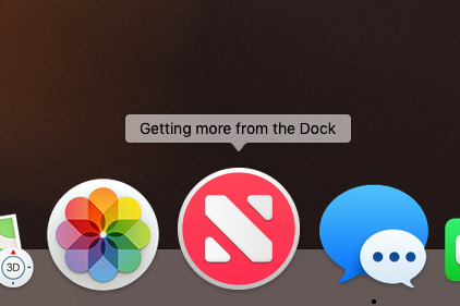
Plus it's just confusing. Apple's documentation says that the Dock will show three recent apps but right now you would believe we have four.
Top: Apple's documentation about three recently used apps. Bottom: our Dock apparently showing four.
That's because the section of the Dock that Apple says is for Recent Apps does more than advertised. When you launch any app that isn't already in your Dock, it will open up with its icon in this Recent Apps section and that's straightforward enough.
Except that all apps you open do this. You aren't limited to three, you aren't limited at all.
What Apple means by three recent apps is that it will keep icons for the last three apps that you opened -and also closed again.
Oddly, this feels like a feature that is present in the Dock yet would mostly help people who don't use the Dock.
If you like the recent apps feature, you can leave it right there. However, if you want rid of it, go to System Preferences and choose Dock. The very last option on the window that appears is Show recent applications in Dock and you can untick it.
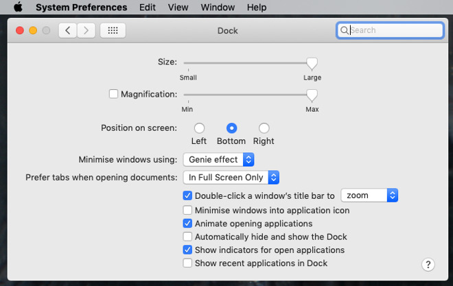
The Dock pane in System Preferences
The top third covers the size of the Dock plus just how much a icon is magnified when you pass your cursor over it. It's personal taste and preference how much you want the magnification but altering it can make the difference between a Dock that's easy to use and one that gets in the way of your work too much.
Similarly, there's then also there's a significant option to do with where exactly the Dock appears on your screen. You can choose between Left, Bottom and Right. You can't add the Dock to the top of the screen using the regular macOS controls.
That said, you can also move the Dock between the Left, Bottom and Right without using these controls either. Instead, shift-click on one of the divisor lines in the Dock, such as those either side of the Recent Applications section. Hold the mouse or trackpad down and drag the Dock to its new position.
Curiously -- and unlike when you're moving a window -- you won't see the Dock moving with you. Rather, you have to click and hold, then drag to the Left, Right or Bottom and let go. Only when you've done that will the Dock will spring to its new position.
Of the rest of the options, it's Automatically hide and show the Dock that will make the biggest difference to how much of your monitor you have for your apps. It'll either be the blessing you've always longed for, or it will hugely irritate you.
When this option is ticked, the Dock disappears from your Mac's screen. Whatever position it was in, it disappears. And then it reappears only when you move your cursor over it.
Whether it slides up from the bottom or the side, it's equal parts handy and distracting. It's at least as likely that you will accidentally call up the Dock whether it's on the left of your screen or the bottom. That's because your working apps' document windows and where you type in them is most typically at the left of the screen.
So if you put your Dock onto the right side, you'll have fewer occasions when you are trying to select text and instead call up the Dock.
And then you can use other ways to open your apps.
The number and of course type of apps that you use depends on you but the odds are that neither changes a great deal. There's a set list of apps you tend to use and that's it.
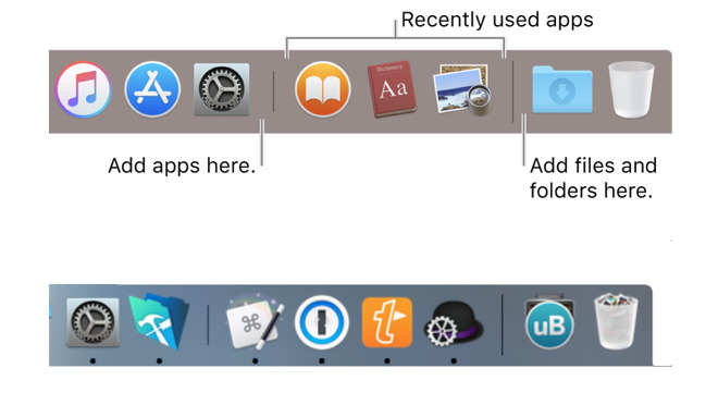
Add apps to automatically open when you start up your Mac
If it's a small set and you use them all the time, you can have them launch automatically whenever you start your Mac.
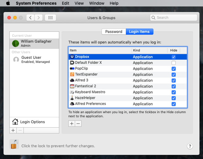
Go to System Preferences and then Users & Groups. Click the padlock to log in, then click on Login Items at the top of the screen.
You'll see a list of items that automatically open whenever you start the Mac or log in to your account. It's possible that the list is empty but if you've ever right-clicked on an app in the Dock and chosen Options, Open at Login, then that app will be in this list.
Don't go crazy with this because if you add very many apps then any time you've got problems and have to keep restarting, it is a royal pain. Either you end up waiting for them to load or you're using Force Quit to kill them before they get started. Sure, you can restart in safe mode and not launch any apps, but otherwise you're darting along the Dock option-clicking and choosing Force Quit like you're playing Whac-A-Mole.
Even when you don't have any problems and you're fine drinking a coffee while all the apps load up, it's still messy. Your screen fills with blank documents, sign-in pages, splash screens and invocations to update.
Unless it's an app that you are definitely going to use first thing and all the time, tick the Hide box in your Login Items list. The app still loads at launch, it just doesn't show on screen until you switch to it later. To stop an app loading at launch, click to select it on the list and then click on the minus sign.
Using Spotlight (top) or Alfred (bottom) to launch apps
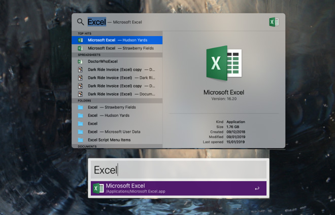
Tapping Command-Spacebar brings up Spotlight and you know that you can search for apps just as easily as you can search for documents or online. However, you don't have to be too exact in your search. To open Excel, for instance, you can just start typing e-x-c and it'll probably work.
If it doesn't autocomplete to Excel and then immediately find the app for you, the most you have to do is finish typing the word. You don't have know that the file is really called Microsoft Excel.
Spotlight is also handy because it learns what you search for and then open. So if you have similarly-named apps such as several older versions of one, it shows you the lot and comes to put the one you actually use at the top of the list.
The third-party app Alfred does the same thing and if you're a power user eschewing the Dock, it does much more to save you time such as being a clipboard manager.
When it doesn't do that, it's because your Mac doesn't know what app to open it with.
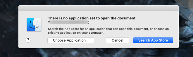
You can usually double-click on a document to open its app.
Click on Choose Application. You'll be shown a list of all your apps that could conceivably open this document. Pick one -- and you've just picked it for all other documents of that type.
Alternatively, you can select a document in the Finder, right-click or use the window's cog icon to bring up a menu and then choose Get Info. There's a section called Open with in the pane that appears and there's a dropdown listing apps you've got that can open this.
Yet the idea of having apps, documents and downloads all in one place for you to open with a single click is useful. So useful that there are other companies that make apps that offer you a kind of Dock-plus experience.
One of them is Keyboard Maestro which is better known for speeding up repetitive tasks on your Mac. Among simply myriad functions, it has three separate ones for handling the opening of apps.
Two are for actually opening them and the other is for just switching to a currently-running one. That last is a straight replacement for macOS's Command-Tab function which shows you all the open apps in a line. Keyboard Maestro's version does precisely the same thing -- but it shows the apps in several lines. Rather than having what looks like a thin snake of a Dock in the middle of your screen, you get three, four or more lines of apps with icons at their full size.
Then there's also Keyboard Maestro's little known Application Launcher. This is a cross between an over-sized Command-Tab and the old Cover Flow. It shows all of your apps, whether open or not, in a gallery of icons that you can swipe between.
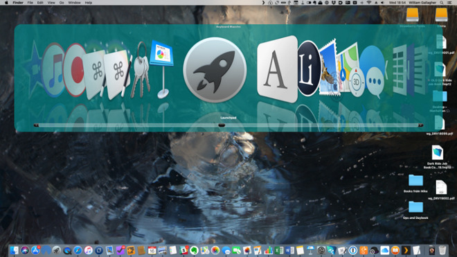
Keyboard Maestro's Cover Flow-like Application Launcher
Then lastly in Keyboard Maestro, there is the Application Palette. You have to turn this on via the app's Preferences where it's a tick box marked Show Applications Palette.
When you do that, you get what looks just like a slim version of the macOS Dock down the right side of your screen. Unlike the Dock, however, you can drag it to any position across your screen. So if you're using a wide monitor and a Dock hidden to the left or right is just too far away, you can position this one next to your current app.
For that, you need Dockshelf. This is a $5 Mac app that gives you a Dock on the side of your screen and then, if you want, another one. And another.
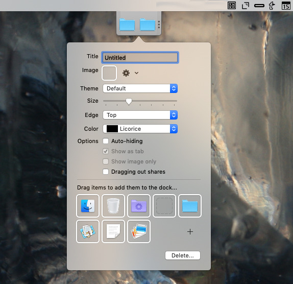
Adding a Dockshelf Dock to the top of the screen
Most notably, it can give you a dock on the top of the screen, too. It won't hide itself away as the macOS Dock can at the bottom or sides, but you can place apps and documents there for fast access.
Alternatively, there is uBar. This is a $30 app that really makes the macOS feel more like the status bar Windows but if doesn't seem Mac-like, it is space efficient and speedy.
Maybe you'll decide to go dockless, maybe you'll end up adding more docks. Knowing what's possible and taking a moment to try out the options will pay you back later by speeding up how you use your Mac.
Keep up with AppleInsider by downloading the AppleInsider app for iOS, and follow us on YouTube, Twitter @appleinsider and Facebook for live, late-breaking coverage. You can also check out our official Instagram account for exclusive photos.
You know that the giant majority of Mac users have never thought to change anything about their Dock. It's still at the bottom of the screen as nature and Apple intended, and they may not even have dragged to rearrange the order.
Then much more experienced Mac users may well have dispensed with the Dock entirely and not thought about it since.
There's nothing wrong with either. However, among Mojave's changes to macOS come an alteration in how the Dock works. If you do still have it displayed then you'll have seen extra icons appear in it. And if you're proudly Dockless then you haven't -- but you could be missing out.
For alongside the new Mojave development, there are options to keep the Dock available to you yet less distracting. There are also alternatives from third parties and if you can't get enough of the Dock, there's an app that will give you many, many more of them.
Mojave
Apple's macOS Mojave added a feature called Recent Apps to your Dock -- and it's not as useful as it sounds. According to Apple, the Dock will now show the last three apps you launched so that you can go quickly back into them.That's fine, except if you were using them a lot, you'd have them in your regular dock. If they're ones you use once in a blue moon, you're not going to need them again for quite a while. So they're taking up space and, depending on how many other apps you have in it, they're also causing the Dock to shrink in size.
Plus it's just confusing. Apple's documentation says that the Dock will show three recent apps but right now you would believe we have four.
Top: Apple's documentation about three recently used apps. Bottom: our Dock apparently showing four.
That's because the section of the Dock that Apple says is for Recent Apps does more than advertised. When you launch any app that isn't already in your Dock, it will open up with its icon in this Recent Apps section and that's straightforward enough.
Except that all apps you open do this. You aren't limited to three, you aren't limited at all.
What Apple means by three recent apps is that it will keep icons for the last three apps that you opened -and also closed again.
Oddly, this feels like a feature that is present in the Dock yet would mostly help people who don't use the Dock.
If you like the recent apps feature, you can leave it right there. However, if you want rid of it, go to System Preferences and choose Dock. The very last option on the window that appears is Show recent applications in Dock and you can untick it.
While you're there
This might not be then most regularly-visited section of System Preferences but it contains a dozen options for making the Dock more useful for you.The Dock pane in System Preferences
The top third covers the size of the Dock plus just how much a icon is magnified when you pass your cursor over it. It's personal taste and preference how much you want the magnification but altering it can make the difference between a Dock that's easy to use and one that gets in the way of your work too much.
Similarly, there's then also there's a significant option to do with where exactly the Dock appears on your screen. You can choose between Left, Bottom and Right. You can't add the Dock to the top of the screen using the regular macOS controls.
That said, you can also move the Dock between the Left, Bottom and Right without using these controls either. Instead, shift-click on one of the divisor lines in the Dock, such as those either side of the Recent Applications section. Hold the mouse or trackpad down and drag the Dock to its new position.
Curiously -- and unlike when you're moving a window -- you won't see the Dock moving with you. Rather, you have to click and hold, then drag to the Left, Right or Bottom and let go. Only when you've done that will the Dock will spring to its new position.
Of the rest of the options, it's Automatically hide and show the Dock that will make the biggest difference to how much of your monitor you have for your apps. It'll either be the blessing you've always longed for, or it will hugely irritate you.
When this option is ticked, the Dock disappears from your Mac's screen. Whatever position it was in, it disappears. And then it reappears only when you move your cursor over it.
Whether it slides up from the bottom or the side, it's equal parts handy and distracting. It's at least as likely that you will accidentally call up the Dock whether it's on the left of your screen or the bottom. That's because your working apps' document windows and where you type in them is most typically at the left of the screen.
So if you put your Dock onto the right side, you'll have fewer occasions when you are trying to select text and instead call up the Dock.
Get rid of it
If the Dock is really getting in your way, though, ditch it. You can't actually remove or disable the Dock but you can turn it to Small, position it to the Right and turn on Automatically hide and show the Dock.And then you can use other ways to open your apps.
The number and of course type of apps that you use depends on you but the odds are that neither changes a great deal. There's a set list of apps you tend to use and that's it.
Add apps to automatically open when you start up your Mac
If it's a small set and you use them all the time, you can have them launch automatically whenever you start your Mac.
Go to System Preferences and then Users & Groups. Click the padlock to log in, then click on Login Items at the top of the screen.
You'll see a list of items that automatically open whenever you start the Mac or log in to your account. It's possible that the list is empty but if you've ever right-clicked on an app in the Dock and chosen Options, Open at Login, then that app will be in this list.
Adding to Startup Items
To add to it, click the plus sign at bottom left and you'll navigate through a regular Open dialog box to the Applications folder. You can only pick one at a time, but ultimately you can have as many apps opening at launch as you have on your Mac.Don't go crazy with this because if you add very many apps then any time you've got problems and have to keep restarting, it is a royal pain. Either you end up waiting for them to load or you're using Force Quit to kill them before they get started. Sure, you can restart in safe mode and not launch any apps, but otherwise you're darting along the Dock option-clicking and choosing Force Quit like you're playing Whac-A-Mole.
Even when you don't have any problems and you're fine drinking a coffee while all the apps load up, it's still messy. Your screen fills with blank documents, sign-in pages, splash screens and invocations to update.
Unless it's an app that you are definitely going to use first thing and all the time, tick the Hide box in your Login Items list. The app still loads at launch, it just doesn't show on screen until you switch to it later. To stop an app loading at launch, click to select it on the list and then click on the minus sign.
Alternatives to the Dock
If having the apps you use most start up automatically doesn't appeal, you could try having no apps starting up at all. Just let the Finder begin at launch - and then when it's open, use Spotlight.Using Spotlight (top) or Alfred (bottom) to launch apps
Tapping Command-Spacebar brings up Spotlight and you know that you can search for apps just as easily as you can search for documents or online. However, you don't have to be too exact in your search. To open Excel, for instance, you can just start typing e-x-c and it'll probably work.
If it doesn't autocomplete to Excel and then immediately find the app for you, the most you have to do is finish typing the word. You don't have know that the file is really called Microsoft Excel.
Spotlight is also handy because it learns what you search for and then open. So if you have similarly-named apps such as several older versions of one, it shows you the lot and comes to put the one you actually use at the top of the list.
The third-party app Alfred does the same thing and if you're a power user eschewing the Dock, it does much more to save you time such as being a clipboard manager.
Document-based
There is one last way to never need the Dock and that's to just always use the Finder. Open a Finder window, go to the document you want and double-click it. Most of the time, your Mac will open up the app you want and then load the document into it.When it doesn't do that, it's because your Mac doesn't know what app to open it with.
You can usually double-click on a document to open its app.
Click on Choose Application. You'll be shown a list of all your apps that could conceivably open this document. Pick one -- and you've just picked it for all other documents of that type.
Alternatively, you can select a document in the Finder, right-click or use the window's cog icon to bring up a menu and then choose Get Info. There's a section called Open with in the pane that appears and there's a dropdown listing apps you've got that can open this.
Bring back the Dock
All of this works and all of this means that if personal preference or just a need for the most screen real estate means you don't want the Dock, you don't have to use it.Yet the idea of having apps, documents and downloads all in one place for you to open with a single click is useful. So useful that there are other companies that make apps that offer you a kind of Dock-plus experience.
One of them is Keyboard Maestro which is better known for speeding up repetitive tasks on your Mac. Among simply myriad functions, it has three separate ones for handling the opening of apps.
Two are for actually opening them and the other is for just switching to a currently-running one. That last is a straight replacement for macOS's Command-Tab function which shows you all the open apps in a line. Keyboard Maestro's version does precisely the same thing -- but it shows the apps in several lines. Rather than having what looks like a thin snake of a Dock in the middle of your screen, you get three, four or more lines of apps with icons at their full size.
Then there's also Keyboard Maestro's little known Application Launcher. This is a cross between an over-sized Command-Tab and the old Cover Flow. It shows all of your apps, whether open or not, in a gallery of icons that you can swipe between.
Keyboard Maestro's Cover Flow-like Application Launcher
Then lastly in Keyboard Maestro, there is the Application Palette. You have to turn this on via the app's Preferences where it's a tick box marked Show Applications Palette.
When you do that, you get what looks just like a slim version of the macOS Dock down the right side of your screen. Unlike the Dock, however, you can drag it to any position across your screen. So if you're using a wide monitor and a Dock hidden to the left or right is just too far away, you can position this one next to your current app.
Docks upon docks
You can drag that Applications Palette anywhere across the screen but you can't change it from vertical to horizontal and you can't have it appear at the top or bottom of the screen.For that, you need Dockshelf. This is a $5 Mac app that gives you a Dock on the side of your screen and then, if you want, another one. And another.
Adding a Dockshelf Dock to the top of the screen
Most notably, it can give you a dock on the top of the screen, too. It won't hide itself away as the macOS Dock can at the bottom or sides, but you can place apps and documents there for fast access.
Alternatively, there is uBar. This is a $30 app that really makes the macOS feel more like the status bar Windows but if doesn't seem Mac-like, it is space efficient and speedy.
Not just preference
If you like the Dock, fine. If you loath it, fine. It's just that now as Mojave revisited the idea and gave the Dock an update, this is the time to see if your choice is doing what you need.Maybe you'll decide to go dockless, maybe you'll end up adding more docks. Knowing what's possible and taking a moment to try out the options will pay you back later by speeding up how you use your Mac.
Keep up with AppleInsider by downloading the AppleInsider app for iOS, and follow us on YouTube, Twitter @appleinsider and Facebook for live, late-breaking coverage. You can also check out our official Instagram account for exclusive photos.
Comments
Also, (absent any data) I'd dispute this assertion: "You know that the giant majority of Mac users have never thought to change anything about their Dock." I'm pretty sure that almost every Mac user has at least thought about changing something about the dock. Moreover, I would be surprised if most haven't twiddled with those preferences at some point. But maybe I'm wrong. Perhaps new people to the Mac are soulless schlubs who don't poke around to see what they can do with their new toys. Maybe they are too busy watching cat videos on YouTube.
As far as the most recently used (MRU) region is concerned, it’s okay, but is still a little buggy. In my opinion, the MRU list should never contain an app icon for an app that is already in the dock. The dock is a de facto most frequently used (MFU) list predefined by the user. Showing the same app in both MRU and MFU lists is confusing, but it does this with the VNC Viewer app. I strongly suspect the dock MRU list logic gets tripped up by multi-instance apps and by apps that spawn child instances, like VNC Viewer does. For example, if you launch multiple instances of the same app from the terminal you will get a separate app icon for each instance in the MRU list. However, once the multiple app instances are closed, clicking on more than one of the multiple app icons in the MRU list does not relaunch multiple instances of the app. Only one instance is relaunched and subsequent clicks on the additional app icons in the MRU list do nothing. Not a big deal though.
In fact, the whole rationale for MRU and MFU context is far more useful for helping users manage user generated content/documents/files rather than application launching shortcuts and application launching history. The dock doesn’t really do a whole heck of a lot when you really think about it. A document centric dock/MRU/MFU capability would probably be a lot more useful. Finding apps in a predominantly flat list is trivial compared to finding a specific document that you worked on two weeks ago buried deep in a file hierarchy.
What do you mean by "at the top of the finder"? Do you mean you had an icon for the application sitting on your Desktop?
Any app that's staying in the Dock can be burned off by:
- Right-click, Option-click, or press-and-hold on the icon in the Dock.
- Choose Options >.
- De-select "Keep in Dock".
If the icon refuses to go away even after doing that, make sure the application is not running, and you may need to restart.Install DragThing and set it up to come to the front with a specific key command:
Use BetterTouchTool to map that key command to a specific touchpad gesture (I use the four finger tap)
Now a four finger tap brings DragThing front and center - nice on any system, but very useful on a larger screen.
What app is this?
The Desktop is in the Finder.