Prepear revises logo to settle Apple trademark dispute

Prepear, which has been embroiled in a trademark dispute with Apple for nearly six months, on Tuesday said it settled the issue by changing the shape of a leaf in its logo.
Company co-founder and COO Russ Monson in a statement to iPhone in Canada said it had "amicably resolved its trademark issue with Apple." Monson said the company will "make a small change to our logo in the coming weeks," adding that Prepear is "happy" with the settlement terms.
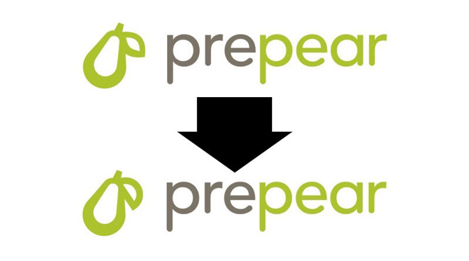
The remedy, it seems, is a slightly tweaked logo. Prepear has adjusted the shape of a leaf in its pear emblem to make it visually distinct from Apple's iconic mark. The developer will use the revised symbol in its logo and app icon.
Apple first aired grievances over the app's logo when it formally objected to a trademark application from meal planning firm Super Healthy Kids last August. The mark is a simple outline of a pear with a singular almond-shaped leaf. Apple argued the design too closely resembled its "famous Apple Logo" and "creates a similar commercial impression."
Prepear later accused Apple of engaging in "bullying" tactics that cost the company "many thousands of dollars" and resulted in the layoff of at least one employee. Monson appealed to the public with a petition to "save the pear" and "end Apple's aggressive opposition of businesses with fruit logos."
"Apple has been opposing small businesses with fruit-related logos by starting expensive legal action even when those logos don't look anything like Apple's logo, or aren't in the same line of business as Apple at all," the petition read.
In December, Apple and Prepear entered settlement negotiations in the U.S.
Company co-founder and COO Russ Monson in a statement to iPhone in Canada said it had "amicably resolved its trademark issue with Apple." Monson said the company will "make a small change to our logo in the coming weeks," adding that Prepear is "happy" with the settlement terms.
The remedy, it seems, is a slightly tweaked logo. Prepear has adjusted the shape of a leaf in its pear emblem to make it visually distinct from Apple's iconic mark. The developer will use the revised symbol in its logo and app icon.
Apple first aired grievances over the app's logo when it formally objected to a trademark application from meal planning firm Super Healthy Kids last August. The mark is a simple outline of a pear with a singular almond-shaped leaf. Apple argued the design too closely resembled its "famous Apple Logo" and "creates a similar commercial impression."
Prepear later accused Apple of engaging in "bullying" tactics that cost the company "many thousands of dollars" and resulted in the layoff of at least one employee. Monson appealed to the public with a petition to "save the pear" and "end Apple's aggressive opposition of businesses with fruit logos."
"Apple has been opposing small businesses with fruit-related logos by starting expensive legal action even when those logos don't look anything like Apple's logo, or aren't in the same line of business as Apple at all," the petition read.
In December, Apple and Prepear entered settlement negotiations in the U.S.
Comments
Sure, Apple was a bit overzealous about it, but that's kind of par for the course for a billion-dollar company. If it was resolved amicably, that kind of lays the “bullying” angle to rest, now, doesn't it? The guys at Prepear were throwing a tantrum, IMHO. Especially considering how, yes, they are a tech company (if they were, say, some random agricultural business I could see how Apple might be overreaching to branches of business their own Nice classification codes likely don't even cover, except Prepear has… apps. In App Stores).
No, really. What's more, I actually like the revised version better. The contrast between the more continuous contour of the pair and the leaf is starker, and the latter's half-circle shape not only pairs better with the tops and bottoms of the pear, but it also somewhat echoes the counter-shape (or the “eye”) of the lowercase “e” in their logo.
TL;DR: Not only did they not lose an expensive lawsuit, Apple actually forced them to better their own design and, as someone else said, this actually brought them some publicity. Win-win, if you ask me.