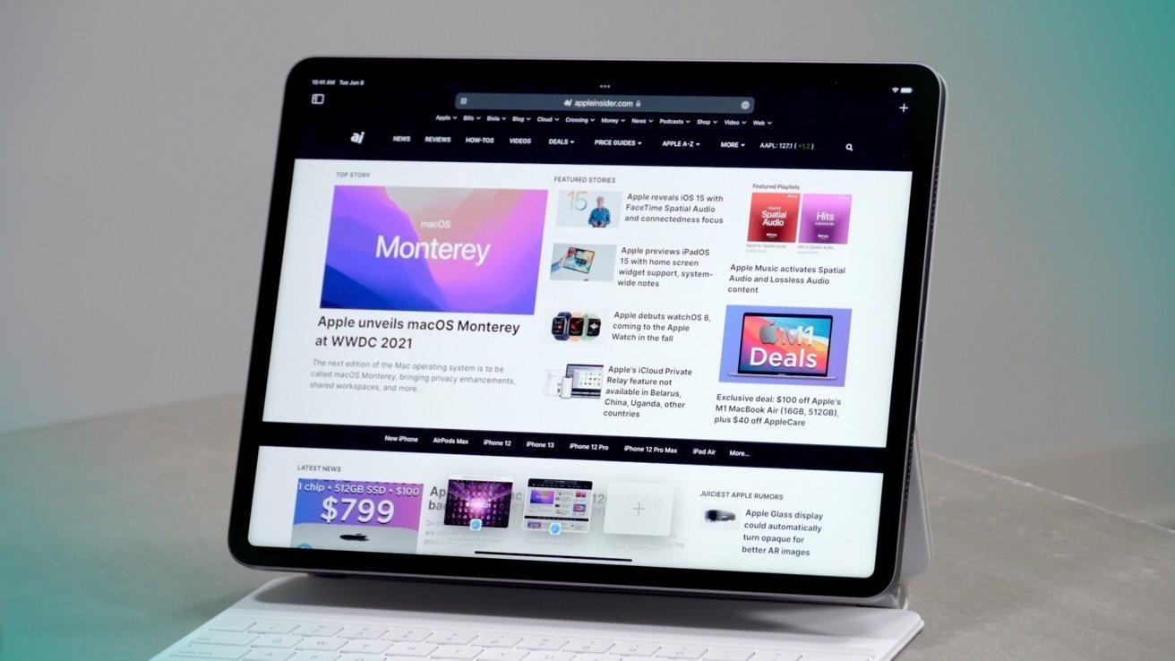
Apple execs say iPadOS 15 helps users to multitask with UI changes
The multitasking changes to iPadOS 15 made it easier for users to understand they could multitask in the first place, a post-WWDC interview with Apple VP of worldwide product marketing Bob Borchers and VP of intelligent system experience Sebastien Marineau-Mes reveals.

Following the keynote of WWDC, executives at Apple surface in extensive interviews to promote the changes launched at the developer conference. In one interview with Borchers and Marineau-Mes focusing on iPadOS 15, the executives cover the multitasking alterations and keyboard shortcuts, as well as other alterations.
Speaking to TechCrunch, Borchers agrees with the sentiment that there was a much-needed change in the way users interacted with multitasking features, referred to as spatial gymnastics.
"The way that we think about this is that the step forward and multitasking makes it easier discover, easier to use even more powerful," said Borchers. "And, while pros I think were the ones who were using multitasking in the past, we really want to take it more broadly because we think there's applicability to many, many folks."
Marineau-Mes jumped in to say one of the goals was to make the spatial model more explicit. "For example, if you've got a split view, and you're replacing one of the windows, we kind of open the curtain and tuck the other app to the side, you can see it -- it's not a hidden mental model, it's one that's very explicit," he said.
As part of the changes this time, affordances to provide users with the knowledge multitasking was an option at all was required. Consistency was a key metric, with the same Slide Over appearance in all views, for example.
"I think we believe strongly in building a mental model where people know where things are [on iPad]," said Marineau-Mes. "And I think you're right when it comes persistence I think it also applies to, for example, home screen. People have a very strong mental model of where things are in the home screen as well as all of the apps that they've configured. And so we try to maintain a well maintained that mental model, and also allow people to reorganize again in the switcher."
Another goal for iPadOS 15 was to make everything navigable from a keyboard, Marineau-Mes added. "All of the new multitasking affordances and features, you can do through the keyboard shortcuts."
He continues "You've got the new keyboard shortcut menu bar where you can see all the shortcuts that are available. It's great for discoverability. You can search them and we even, you know, and this is a subtle point, but we even made a very conscious effort to rationalize the shortcuts across Mac and iPadOS."
Boucher and Marineau-Mes also touched upon the general discoverability of features, Universal Control, and how the Quick Note feature "permeates the system and is easily accessible from everywhere."
Stay on top of all Apple news right from your HomePod. Say, "Hey, Siri, play AppleInsider," and you'll get latest AppleInsider Podcast. Or ask your HomePod mini for "AppleInsider Daily" instead and you'll hear a fast update direct from our news team. And, if you're interested in Apple-centric home automation, say "Hey, Siri, play HomeKit Insider," and you'll be listening to our newest specialized podcast in moments.


Comments
Spatial is Apple’s word of the year, isn’t it? 😂
Two different settings: Allow Multiple Apps and Gestures. Just turn them off.
Apple's job is to keep it straightforward for novice users yet have the system allow complexity as a user's expertise grows. Tough job. They have not abandoned any principles. Intuitive as a word describing easy to use UI isn't really appropriate imo. There isn't anything instinctive with computers. Id, there is nothing intuitive about it. It's all learned behaviors. They need to strike a balance for the users, and they have been doing that, and with iPad, they definitely have been keeping it on simpler or limited side of the spectrum. If I would criticize them for something, it's they aren't using the advertising power to educate their buyers on how to use their hardware. They really need to run commercials and advertisements that just show people how to use the UI.
I don't think there is a way around it. To enable people to do more and more complex things, there has to be knowledge imparted on those who don't have the time or don't want to learn how to use things. I'm not talking about people as in you or an individual, but the mass market of hundreds of millions of users and potential buyers. This is true of every single machine on the mass market. Microwave? People probably only know how to use 1% of the functions. Toaster oven? 5%? People probably don't even bother to change the temperature from out of the box settings on their refrigerators.
The answer isn't to limit the functionality. It's to design the UI to scale with a user's expertise, and to educate users so they can grow their expertise. Apple's done pretty good at the former imo, with them definitely leaning towards keeping complex things of the iPad. They really have done much education on how to use their devices since the iPhone introduction.
All these inconsistent features make the whole thing a bit of a kludge, and make it just as frustrating as using a desktop OS on a tablet.
Ah, the "Things used to be better!" trope. Yeah and things used to be much, much less capable. Do you want to go back to the original Macintosh? iPhone OS? The first iPad? Not me, I like the added functionality. Thankfully, not every user has to be a power user or use every feature.
Also, Apple isn't responsible for the industry-wide issue of not understanding the difference between click & double-click.
Thankfully, you can. You never checked the settings or searched for this? I turned it off for users like my mother, she's not a power user and doesn't need them.
Nah, it really isn't that complicated. Split screen is easy to understand, just like on Goldeneye and Mario Cart. The hardest part was getting apps into it, and it looks like they've made this easier.
If your finger has lingered on a hot link, and it has popped into a mini-view (or thumbnail view), and you lift your finger of the mini-view while close fo the edge of the display, it will put it into a Slide Over view or a Split View depending on close to the edge your finger got. If you see the mini-view pop up beneath your finger, you can drag it towards the center of the screen. The mini-view will turn into a box of the text of the hot link. Once you see that, that means cancel the action and you can lift year finger.
The app switcher is a drag-n-drop UI where you are dragging an app to hot zones. The app switcher itself is basically an object that is being selected (lifted), dragged to a hot zone, released (lifting your finger), and the hot zone will determine what app switching action is being done. When sliding from the bottom edge up, what you are doing isn't entering a gesture, but lifting the app switcher, and depending on where you lift your finger, will execute an action: 1) first inch is for the dock, 2) first inch or so and slide right and left goes to the last app, 3) slide up to the center of the screen is the thumbnail view, 4) slide all the way to near the top is going to home screen, and 5) going back to the bottom edge cancels.
I think what would prevent the accidental "long press and slide into Split View or Slide Over" actions is to move the hot zones towards the top edge. Make it so the user has to drag a long way to instantiate an app switcher action. The iOS 15 UI changes won't prevent this accidental input I think as it has preserved the drag-n-drop app switching actions, I think.
Apple still has a lot of work to do to automatically make apps that don't support Split View or Slide Over support a multi-view environment though.
It's not a simple problem to scale a computer from novice to expert, and Apple basically gave up trying with macOS if you recall. Way back when, Mac OS X had a single application mode. There is also a "child" mode where it simplifies the UI too. It's interesting that these are never discussed. It could be testament to iPhones and iPads, basically single application UI devices, having obviated the need for them in macOS, and they are now either deprecated or left unchanged or to slowly wither away on macOS.