Apple delivers Safari 15.1 beta for macOS Big Sur and Catalina

Apple this week issued a beta version of Safari 15.1 for macOS Big Sur and Catalina for testing ahead of a launch to macOS Monterey this fall.
Release notes accompanying the Safari 15.1 beta, which was pushed out on Thursday, largely repeat disclosures issued with Safari 15 in September.
Refinements and feature additions might be added at a later date in subsequent beta releases prior to public availability.
While Apple fails to specify what improvements are contained in the new beta, MacRumors notes a fix for an issue that would crash the browser when bookmarking a YouTube page.
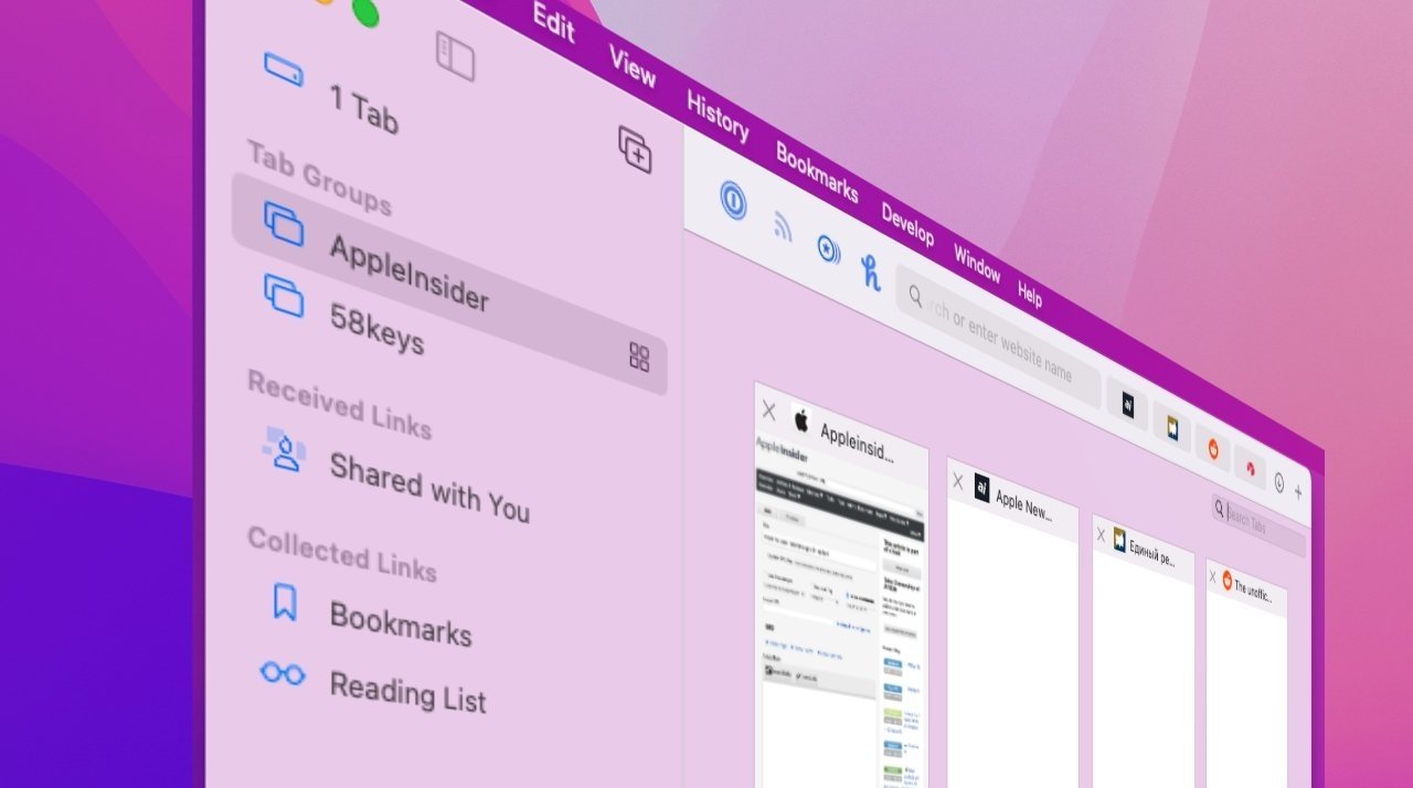
Designed to complement Safari on iOS 15 and iPadOS 15, Safari 15 for Mac delivers a refreshed user interface with a few controversial elements including a "Compact" layout that merges navigation controls, tabs and the Smart Search field (URL field) into one line. The change was implemented to afford more space for webpages, but the design has proved confusing and Apple now offers an option to return the browser to a more traditional view.
Also new are Tab Groups for organizing open tabs, up-to-date security and privacy tools, performance enhancements and UI tweaks.
The redesigned Safari will be included with macOS Monterey this fall.
Developers can download the Safari 15.1 beta from Apple's developer website.
Read on AppleInsider
Release notes accompanying the Safari 15.1 beta, which was pushed out on Thursday, largely repeat disclosures issued with Safari 15 in September.
Refinements and feature additions might be added at a later date in subsequent beta releases prior to public availability.
While Apple fails to specify what improvements are contained in the new beta, MacRumors notes a fix for an issue that would crash the browser when bookmarking a YouTube page.
Designed to complement Safari on iOS 15 and iPadOS 15, Safari 15 for Mac delivers a refreshed user interface with a few controversial elements including a "Compact" layout that merges navigation controls, tabs and the Smart Search field (URL field) into one line. The change was implemented to afford more space for webpages, but the design has proved confusing and Apple now offers an option to return the browser to a more traditional view.
Also new are Tab Groups for organizing open tabs, up-to-date security and privacy tools, performance enhancements and UI tweaks.
The redesigned Safari will be included with macOS Monterey this fall.
Developers can download the Safari 15.1 beta from Apple's developer website.
Read on AppleInsider
Comments
That and the "tabs" are glitchy as fuck now — sometimes they mysteriously disappear and are replaced by a big gap between other tabs, dragging tabs into a window with another set of tabs or just between tabs in the same window often causes giant gaps and other irregularities.
And oh boy, is it fun trying to train muscle memory that's had me clicking on favicons to drag them around, when the favicons are cleverly hiding the close buttons that only appear on hover now.
What a shit show.
This release should never have made it past quality control. It shouldn’t even have reached that department in the first place.
Separate mode is THE WORST! But I need an always visible address bar. But after A WEEK in separate mode I STILL keep clicking on the tab to edit the URL instead off the address bar. That’s because the address bar is STILL small for no good reason. It’s also extremely faint. Zero contrast. And narrow. Why is it so narrow?! Why isn’t it full width?! But if you only have one tab open the tab IS full width?! And it’s an ugly mid grey that my brain keeps reading as “address bar”. I click on the active tab a dozen times day mistaking it for an address bar even though the actual address bar is always visible. Even after a week I haven’t gotten used to it. I keep clicking on the tab to edit the address. It’s brutally confusing and ugly.
I also still can’t figure out how to drag a tab into my favourites. Or how to drag it into a favourites folder.
I’ve also had it crash numerous times when dragging a tab out to its own window.
IMHO, Safari 15 is a disaster.
Onward ho!
This is trolling of the worst kind.