Apps can use full screen area around new MacBook Pro's camera notch

Following the unveiling of its revamped 14- and 16-inch MacBook Pro models on Monday, Apple released new Human Interface Guidelines detailing how developers can best to utilize the laptops' expanded screen real estate.
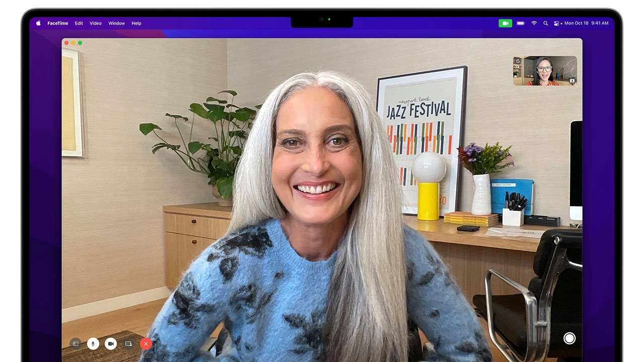
Apple caused a bit of a stir with its decision to slim down MacBook Pro's display bezels to the point where a "notch" is needed to house the machine's front-facing camera, a design language borrowed from iPhone and affordances made for that device's TrueDepth array. As the company explains, however, developers can choose to include a black bar at the top of the screen to hide the cutout -- aping the design of past MacBook Pro generations -- or take full advantage of the extra space with a new compatibility mode.
According to newly published HIG documents, MacBooks that include a camera housing in the screen bezel provide a special operating mode that prevents full screen apps from placing content under the notch. When active, compatibility mode automatically changes the active area of the system's display to avoid the housing cutout, ensuring that content is not obscured.
Developers can opt for a custom full-screen experience, but they will need to define safe areas in their code using new tools. For example, app makers can specify a large safe area with an inset at the top of the screen that leaves the entirety of the app unobscured. Alternatively, new properties can be set to identify rectangular portions of screen to the right and left of the notch, areas that will be earmarked for active content.
Apple made little mention of the camera housing in its presentation of the new MacBook Pro line on Monday, save for an aside on the laptops' 1080p camera. Marketing materials shown off during the "Unleashed" keynote, and later posted online, show a number of first- and third-party apps running in full screen without compatibility mode active. In such situations, apps default to displaying in a safe area that sits below the aforementioned black bar, effectively hiding the unsightly cutout from view. It remains unclear if Apple's apps can also operate in compatibility mode, as the option can be toggled on and off with proper API support.
Apple's MacBook Pro models were introduced at a special event today. Along with new mini-LED displays, the laptops feature a fresh redesign, powerful and efficient Apple Silicon chips, an improved keyboard with function keys, MagSafe, enhanced audio and more.
Read on AppleInsider
Comments
But the notch is a non-issue, like it is on the iPhone. I guess everyone forget we used to have an Apple logo smack in the middle of the menubar.
3840 by 2160 + a menu / notch
It seems so close to 4K with all that GPU power...?
Perhaps that is next year's 17" mbp upgrade... : )
Pretty, but with little practical functionality. The notch is the new Touch Bar.
(I'm not saying it was a mistake. I wish developers would design around it, but why would they bother when they can ignore it?)
Do you think it would make sense to lower a car's windshield down, rather than have the rearview mirror cut into the windshield glass? Because that's what you're saying -- you'd prefer a smaller screen with a bezel above it.
You've just added a forehead along the top, reducing usable screen space. Why do that? If you just want it to look seamless, use the dark mode. I'd rather have more screen than less screen.