How Apple's logo started out as the 'most expensive,' and became the most iconic

From its very first beginnings as an over-elaborate illustration, to its familiar and distinctive shape today, Apple's logo has reflected its company's aims from the start.
There was no Apple logo when Steve Wozniak built the Apple-I, or when Steve Jobs sold it. But there was when Apple was officially founded on April 1, 1976.
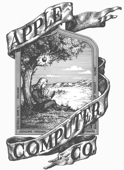
It was designed by Apple's third founder, Ron Wayne, whose logo didn't last a great deal longer than he did. Wayne exited the company merely days after it was founded, and his original logo was replaced within a year.
That original doesn't feel as if it belongs in the same reality as today's stylized, monochrome apple symbol with a bite out of it. The original logo belongs as a woodcut illustration in some Victorian novel, and the text around it wasn't much more modern.
"Newton," it says, naming the man drawn in the center of the logo, sitting in a pose very much like the one Amazon would later use for Kindle. "A mind forever voyaging through strange seas of thought alone," it continued.
The text is a truncated quotation from William Wordsworth's "The Prelude," written in 1850, or 126 years before Wayne borrowed it.
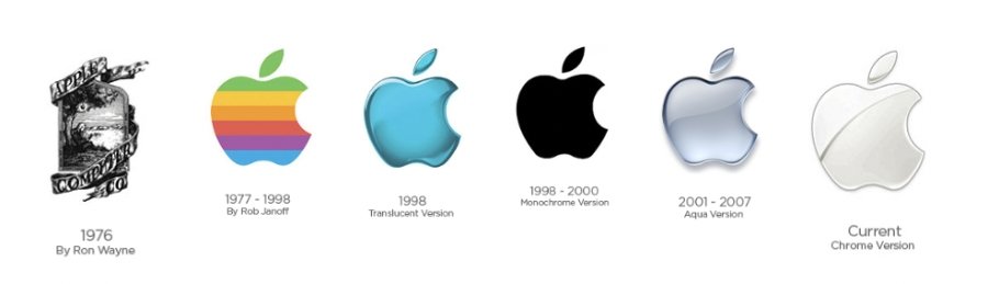
The original Apple logo
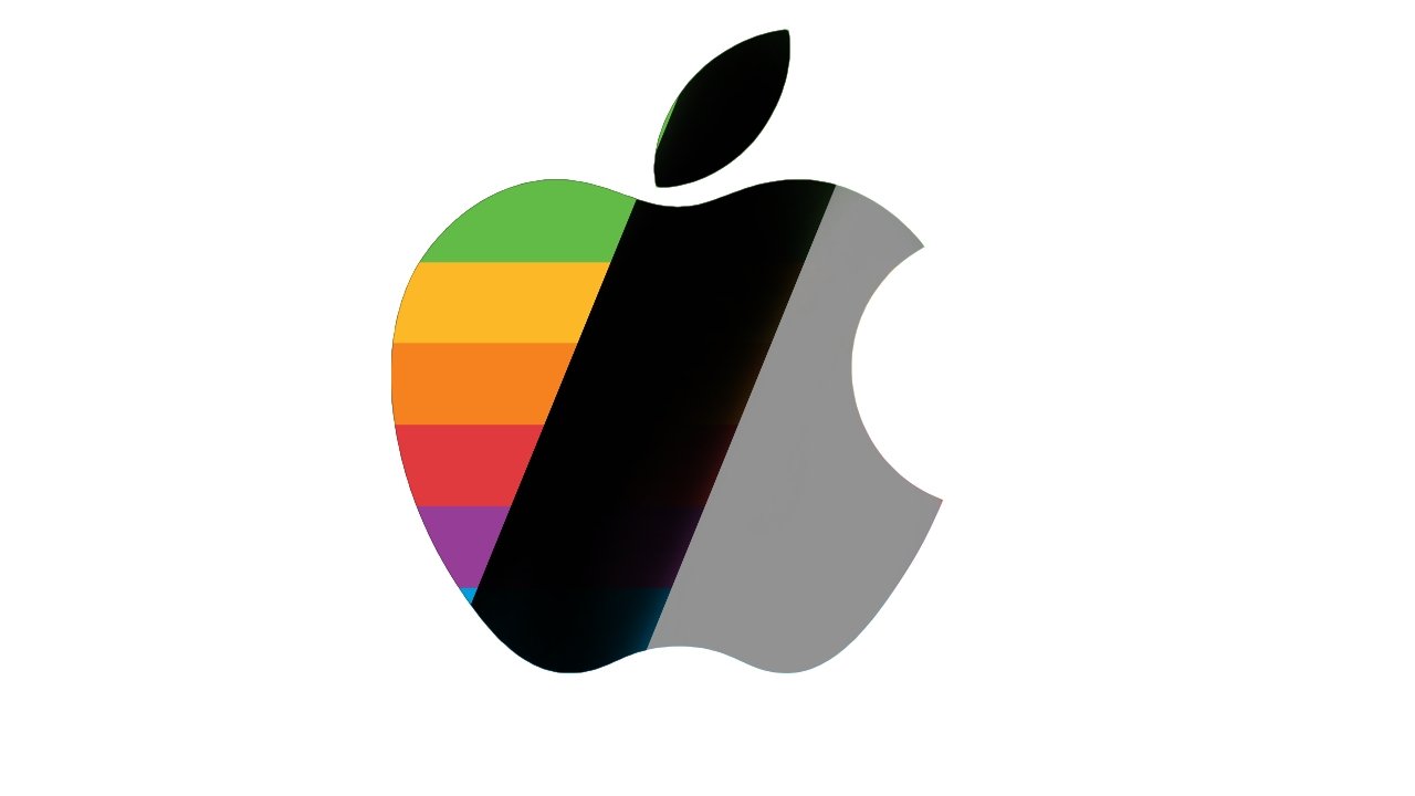
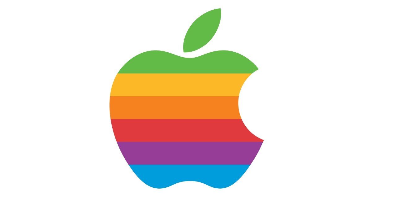
What Janoff designed was the shape of the Apple logo, which remains to this day, including the bite taken out of the side. He also filled it with stripes, the famous six colors of the Apple logo.
"It was very simple really," Janoff said in an interview preserved on the Revert To Saved website. "I just bought a bunch of apples, put them in a bowl, and drew them for a week or so to simplify the shape."
He says the whole process from briefing to delivery was about two weeks, and the commission was to create a logo in time for the April 1977 launch of the Apple II.
"I didn't have much of a formal brief on the logo assignment, other than 'don't make it cute'," continues Janoff. "But I did know the selling points of the Apple Computer [at that time], and one of the biggest was colour capability."
"To me, that looked like colour bars on a monitor, which became the stripes in the logo," he said. "The order of the stripes, I'm sorry to say, had no particular grand plan other than I liked them that way."
Janoff himself says that of his original version, "of course, the green stripe would be at the top where the leaf [of an apple] is."
While it's no longer clear where ex-Apple executive Jean-Louis Gassee originally spoke about the logo, he is repeatedly quoted as saying it fitted Apple well.
"One of the deep mysteries to me is our logo," he said, "the symbol of lust and knowledge, bitten into, all crossed with the colors of the rainbow in the wrong order."
"You couldn't dream a more appropriate logo: lust, knowledge, hope and anarchy," he continued.
It's certain, though, that it was Jobs who was stubborn about keeping one element of Janoff's design, even though it made the logo enormously more costly. It was typical then to have what was called four-color printing, so requiring six was immediately more expensive - and that wasn't the problem.
The problem was that Jobs is said to have been intractable about how the six colors must not be separated out by lines. Lines would make it easier to print without the colors ever overlapping, because the lines would give room for any registration or movement errors during printing.
Jobs wouldn't allow lines, so printing would always require a precision that added more cost to the already expensive six colors. Or almost always.
Even in its earliest days, the Apple logo shape was sometimes printed in a solid color, typically when the company's full name and address were given. In those cases, the words "apple computer inc" were shown in lowercase, with the initial "a" fitting into the bite out of the apple.
Nonetheless, it was the six-color version that appeared in all advertising - and was famously included inset into Macintosh computers.
Consequently, Michael Scott, who was Apple's CEO from 1977 to 1981, consequently referred to the Apple symbol as, "the most expensive bloody logo ever designed."
Designed by Rob Janoff in 1977
A year before it ceased being used, though, the familiar-shape logo was turned into an all-white version that featured on the case of the PowerBook G3. The shipping box featured both all-white and all-black logos.
Then in 1998, the all-black version began appearing as Apple's official logo.
Yet the rest of the logo, the immensely recognizable and familar shape, didn't leave then - and has never left.
In recent years, Apple has played with the form in its event invitations, but always with the knowledge that everyone knows what the real logo looks like.
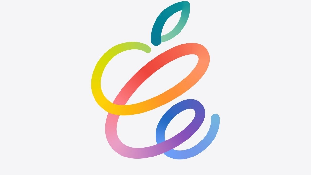
Apple can now trade on how familiar its logo is and play around with it, as in this 2021 event invitation logo
From 1998 to the present day, there have been many further versions of the Apple logo, but with each varying only in color and visual texture.
Rather than leveraging the Apple II's color capabilities as a whole, this first revision since the 1970s exploited how the iMac was literally a colorful machine.
Similarly, as the iMacs and the iBooks came out in more colors, the Apple logo on them changed to match. PowerBooks kept their white, backlit logos on the casing.
But again, only on them: aside from its brief moment in the spotlight, the Bondi Blue version didn't catch on as Apple's official logo for long.
Instead, the all-black version continued and dominated, but only on any printed material. Mac OS 8 continued to feature a rainbow-colored logo on screen in the Apple menu, and "About This Computer."
That changed when OS X was introduced in 2001, when the Apple menu adopted the operating system's Aqua look. It resembled the iMac's Bondi Blue logo, including a 3D effect.
But at the same time, iTunes, for example, featured an all-black Apple logo.
At this time, the early 2000s, there was little consistency over the color of the logo. The shape might as well have been set in stone, but the color varied.
Until 2007 - when the iPhone was launched.
It still kept Janoff's outline design, but it replaced one more element that had been seen since the Bondi Blue edition. In all the forms of the log that were to have a 3D effect, that had been achieved in part by having a subtle, swooping line across the top third of the apple.
Source: designer Rob Janoff's site
Less a clear line and more a divider between two different shades of the main color, it was replaced by a much clearer arc in 2007.
Known as the Chrome look, this new version of the logo was intended to look like the one on the back of an iPhone.
As iOS took on a much more flattened design, so did the logo. It wasn't entirely a return to the black silhouette, though.
Instead, Apple's logo tended to be a kind of silver grey. Today it can be that, or it can be fully black, depending on how it's being used.
And just occasionally, Apple does give a nod to history and reuse the six-color Apple logo. It's just that the six colors are different -- they match the 24-inch iMac colors.

"[Although] the logo has changed over the years, it's still the same basic shape and concept I designed," he said. "I feel incredibly lucky to have crossed paths with Steve Jobs when I did."
"It's kind of like watching your kids grow up and do really well," he continued. "I'm incredibly proud of my kids -- and the logo too."
Read on AppleInsider
There was no Apple logo when Steve Wozniak built the Apple-I, or when Steve Jobs sold it. But there was when Apple was officially founded on April 1, 1976.
It was designed by Apple's third founder, Ron Wayne, whose logo didn't last a great deal longer than he did. Wayne exited the company merely days after it was founded, and his original logo was replaced within a year.
That original doesn't feel as if it belongs in the same reality as today's stylized, monochrome apple symbol with a bite out of it. The original logo belongs as a woodcut illustration in some Victorian novel, and the text around it wasn't much more modern.
"Newton," it says, naming the man drawn in the center of the logo, sitting in a pose very much like the one Amazon would later use for Kindle. "A mind forever voyaging through strange seas of thought alone," it continued.
The text is a truncated quotation from William Wordsworth's "The Prelude," written in 1850, or 126 years before Wayne borrowed it.
The original Apple logo
Six colors, but not as you know them
Wayne's hand-drawn illustrative logo was replaced in 1977 by the work of designer Rob Janoff. (Some sources spell his surname as Janov, others mistakenly call him Job instead of Rob, but his official site confirms the correct spelling.)What Janoff designed was the shape of the Apple logo, which remains to this day, including the bite taken out of the side. He also filled it with stripes, the famous six colors of the Apple logo.
"It was very simple really," Janoff said in an interview preserved on the Revert To Saved website. "I just bought a bunch of apples, put them in a bowl, and drew them for a week or so to simplify the shape."
He says the whole process from briefing to delivery was about two weeks, and the commission was to create a logo in time for the April 1977 launch of the Apple II.
"I didn't have much of a formal brief on the logo assignment, other than 'don't make it cute'," continues Janoff. "But I did know the selling points of the Apple Computer [at that time], and one of the biggest was colour capability."
"To me, that looked like colour bars on a monitor, which became the stripes in the logo," he said. "The order of the stripes, I'm sorry to say, had no particular grand plan other than I liked them that way."
Steve Jobs and the six-color logo
Some sources claim that, unlike the familiar final version, Janoff's design had the darker colors at the top, lighter ones at the bottom. And it was Steve Jobs who apparently insisted on reversing that.Janoff himself says that of his original version, "of course, the green stripe would be at the top where the leaf [of an apple] is."
While it's no longer clear where ex-Apple executive Jean-Louis Gassee originally spoke about the logo, he is repeatedly quoted as saying it fitted Apple well.
"One of the deep mysteries to me is our logo," he said, "the symbol of lust and knowledge, bitten into, all crossed with the colors of the rainbow in the wrong order."
"You couldn't dream a more appropriate logo: lust, knowledge, hope and anarchy," he continued.
It's certain, though, that it was Jobs who was stubborn about keeping one element of Janoff's design, even though it made the logo enormously more costly. It was typical then to have what was called four-color printing, so requiring six was immediately more expensive - and that wasn't the problem.
The problem was that Jobs is said to have been intractable about how the six colors must not be separated out by lines. Lines would make it easier to print without the colors ever overlapping, because the lines would give room for any registration or movement errors during printing.
Jobs wouldn't allow lines, so printing would always require a precision that added more cost to the already expensive six colors. Or almost always.
Even in its earliest days, the Apple logo shape was sometimes printed in a solid color, typically when the company's full name and address were given. In those cases, the words "apple computer inc" were shown in lowercase, with the initial "a" fitting into the bite out of the apple.
Nonetheless, it was the six-color version that appeared in all advertising - and was famously included inset into Macintosh computers.
Consequently, Michael Scott, who was Apple's CEO from 1977 to 1981, consequently referred to the Apple symbol as, "the most expensive bloody logo ever designed."
Designed by Rob Janoff in 1977
Built to last
It was Steve Jobs who wanted that logo, and ultimately it was also Steve Jobs who wanted to replace it - when he returned to take over Apple in the 1990s. Janoff's six color logo lasted from 1977 to 1998, a total of 21 years.A year before it ceased being used, though, the familiar-shape logo was turned into an all-white version that featured on the case of the PowerBook G3. The shipping box featured both all-white and all-black logos.
Then in 1998, the all-black version began appearing as Apple's official logo.
Yet the rest of the logo, the immensely recognizable and familar shape, didn't leave then - and has never left.
In recent years, Apple has played with the form in its event invitations, but always with the knowledge that everyone knows what the real logo looks like.
Apple can now trade on how familiar its logo is and play around with it, as in this 2021 event invitation logo
From 1998 to the present day, there have been many further versions of the Apple logo, but with each varying only in color and visual texture.
Monochrome Apple
In 1998 Apple did also briefly change its logo to accompany the rather triumphant launch of the iMac. The color was now a translucent Bondi Blue, familiar from the first iMacs, and it was also rendered in a subtly 3D embossed way.Rather than leveraging the Apple II's color capabilities as a whole, this first revision since the 1970s exploited how the iMac was literally a colorful machine.
Similarly, as the iMacs and the iBooks came out in more colors, the Apple logo on them changed to match. PowerBooks kept their white, backlit logos on the casing.
But again, only on them: aside from its brief moment in the spotlight, the Bondi Blue version didn't catch on as Apple's official logo for long.
Instead, the all-black version continued and dominated, but only on any printed material. Mac OS 8 continued to feature a rainbow-colored logo on screen in the Apple menu, and "About This Computer."
That changed when OS X was introduced in 2001, when the Apple menu adopted the operating system's Aqua look. It resembled the iMac's Bondi Blue logo, including a 3D effect.
But at the same time, iTunes, for example, featured an all-black Apple logo.
At this time, the early 2000s, there was little consistency over the color of the logo. The shape might as well have been set in stone, but the color varied.
Until 2007 - when the iPhone was launched.
Fitting in with iPhone
This was the year when Apple Computer was renamed to just Apple, the better to reflect its new, broader focus on consumer technology. And with its new focus on the iPhone, Apple again went monochrome, it again went 3D.It still kept Janoff's outline design, but it replaced one more element that had been seen since the Bondi Blue edition. In all the forms of the log that were to have a 3D effect, that had been achieved in part by having a subtle, swooping line across the top third of the apple.
Source: designer Rob Janoff's site
Less a clear line and more a divider between two different shades of the main color, it was replaced by a much clearer arc in 2007.
Known as the Chrome look, this new version of the logo was intended to look like the one on the back of an iPhone.
Still fitting in with iPhone
Then in 2013, iOS underwent its most radical redesign since the start. Gone were all the 3D effects - and so the 3D logo was out, too.As iOS took on a much more flattened design, so did the logo. It wasn't entirely a return to the black silhouette, though.
Instead, Apple's logo tended to be a kind of silver grey. Today it can be that, or it can be fully black, depending on how it's being used.
And just occasionally, Apple does give a nod to history and reuse the six-color Apple logo. It's just that the six colors are different -- they match the 24-inch iMac colors.

A logo that has lasted almost half a century
Original designer Janoff was asked how he feels about his original being so little changed since he drew it in 1977."[Although] the logo has changed over the years, it's still the same basic shape and concept I designed," he said. "I feel incredibly lucky to have crossed paths with Steve Jobs when I did."
"It's kind of like watching your kids grow up and do really well," he continued. "I'm incredibly proud of my kids -- and the logo too."
Read on AppleInsider
Comments
what an absolute clown
All these have logos that is recognized all over the World. Logos that are just symbols that don't require the person looking at it to read any lettering or even know an alphabet, to instantly recognize what company or who that symbol represents. Considering how many companies there are in the World, there aren't really a lot of companies with such logos, that are easily recognizable around the World. You probably know what these companies logos are without even trying in remembering them.
Anyone driving down a freeway in any country that is foreign to them, would know it's a McDonald's when they see the oversize yellow "golden arches" formed by the "M" in McDonald's, off to the side of the road. Even going 60mph.
A person walking down the computer isle of a BestBuy, that don't speak a word of English or know the English alphabet, would know instantly which electronic product was made by Apple, just by seeing the Apple logo on the packaging.
When you see the Playboy Bunny logo on any product, you know that that product pertains to "Playboy", without ever seeing the word "Playboy" on it.
A well design logo is like nations flags. String up the easily recognizable and unique flags from the US, U.K., Canada, Israel, China, Japan, Switzerland, Denmark and the old U.S.S.R, up flagpoles and nearly everyone on the ground will recognize which country each flag represents without needing any other hint.
String up the very simple flags from Italy, Mexico, France, Germany, Chad, Bolivia, India, Hungary and Ireland and people on the ground would have a hard time trying to remember which country each flag represents.
Take the original Apple logo and show it to 1000 people walking by on the street and you'll be lucky if a handful of people recognize which company it might represent, even after carefully examining it over. Take that same original logo and replace the apple in it with the Apple logo (with the byte taken out of it) and only a handful of people would not know that the logo represent Apple.
Use a banana with a bite taken out of it as a logo for your company specializing in banana cream pies and most consumers would assume your company might have something to do with Apple, Inc. That's how powerful and recognizable the simple Apple logo (the one with the byte taken out) has become. (And why it would be a trademark infringement if you did.)
I too like the six color Apple logo. But too many consumers had already assisted that logo with "computers". When Apple Computer began marketing other products beside computers, they changed their name to Apple,Inc and came up a new look for their logo that was still easily recognized as for the same company, but no longer "Apple Computers". It's the "byte" taken out of the apple, that makes the Apple logo iconic, not the color or colors.
The best companies logos are the ones that are as simple as possible and still be able to easily convey their brand to the consumers seeing the logo (even if out of the corner of one's eye), and not any simpler.