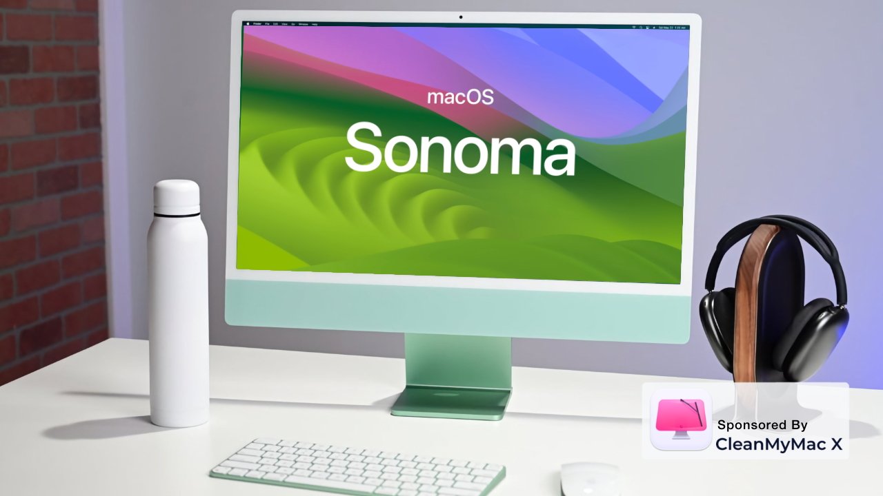
macOS Sonoma beta review: Few major updates, but very welcome

In its initial beta version, the new macOS Sonoma only presents a few significant features -- such as Presenter Overlay, and desktop widgets -- but they're well done and they will make you want to update.
Just don't update your macOS yet. As well as Apple making the new macOS 14 seem like the best thing in the world ever, it has also this year made it much easier to get an early copy.
Really, seriously, do not do it. What's new with this beta release is that Apple has opened up the developer beta much wider than before. Much wider.
Hopefully that's a sign of Apple's confidence in even this first beta release, but that's nice for them. Statistically, it's always unlikely that you will totally brick your Mac by using an early beta release, but let Apple play the statistics: you only need betas to go wrong once for it be a big problem.

So this wider release than usual is new, but what remains the same with Apple and every other beta release of anything at all, is that there is a cycle. There will be multiple iterations of the macOS Sonoma beta over the next few months, and then there will be an official release.
When that happens and you either update an old Mac, or you buy a new one that comes with it, you're going to like macOS Sonoma -- it might just take a little while.
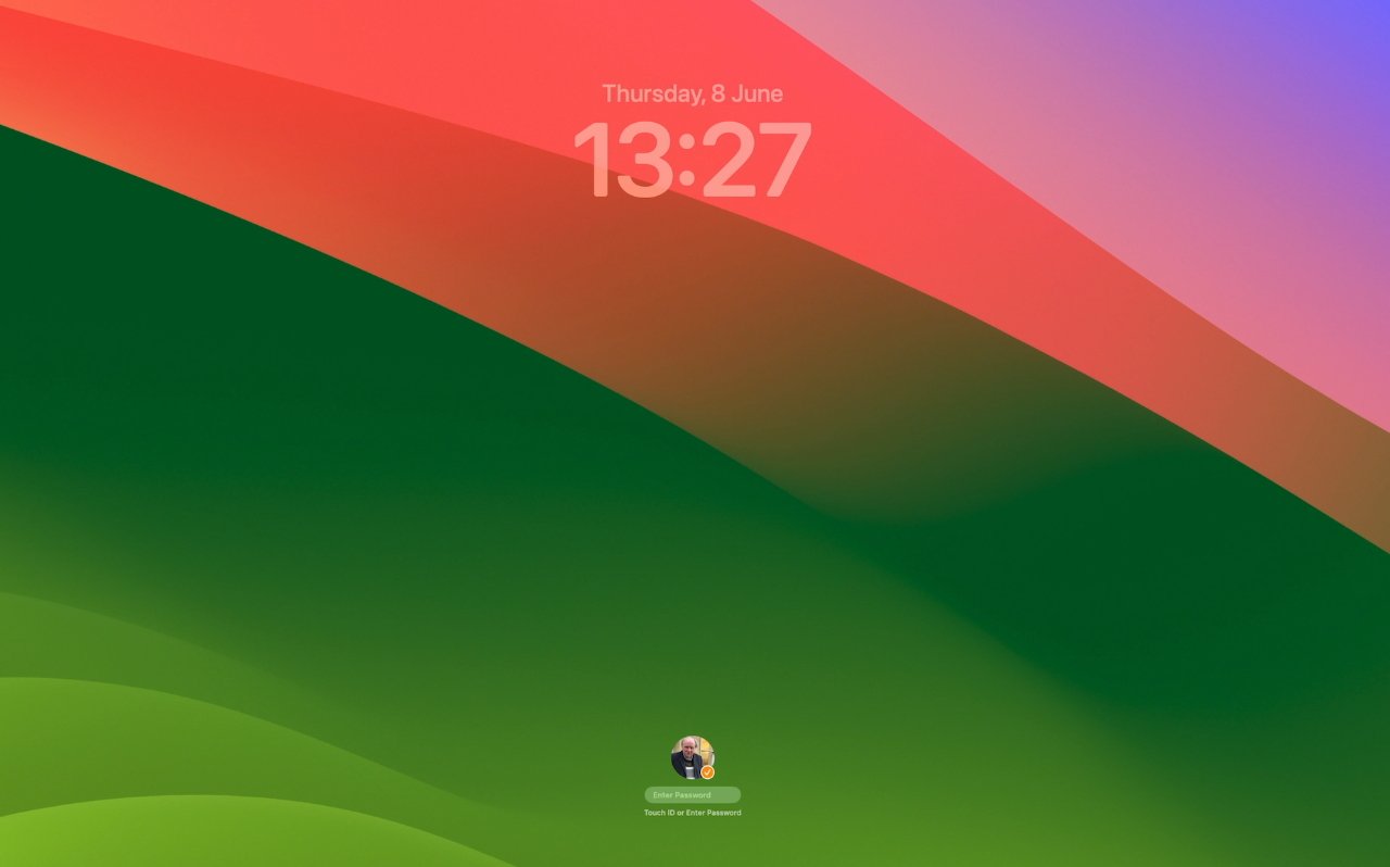
The new lock screen has a clock and is mostly very green
You won't want to go back
Except when macOS Big Sur came along and changed just about everything, macOS releases always appear only subtly different at first. Routinely, you will install the new macOS and apart from a dramatically different wallpaper, there won't be an obvious change.

That wallpaper, incidentally, is now very green in macOS Sonoma, compared to being very yellow in macOS Ventura. When Apple announced the name, though, the animated wallpaper graphic it used made it look a lot like the famous Windows grass.
In person, it's somehow lost that PC similarity and is just very, very green.
Unless you have strong feelings about yellow or green, however, macOS Sonoma initially appears to be just a different wallpaper. As with every macOS release, though, once you've started using it, things change.
Mostly, it's that as you work, you find pleasing little touches like the way that Mail now surfaces travel-related emails as the date of a trip nears.
Next thing you know, the last macOS suddenly seems very old. For AppleInsider, switching back and forth between macOS Sonoma and macOS Ventura, it took less than an hour before we wanted to stay in Sonoma.
In our case, it was widgets on the desktop and also turning websites into apps that sold us on macOS Sonoma. Once you've used those, it's not just that they are good things to have, they become the way it always should have been.
Apple does talk up its new macOS features at launch, but in use, it tends to leave you to find things by yourself. That's good because it means you don't have to learn anything before you can carry on with your work.
But of course it means you can miss out on features because there's no obvious way to use them.
Visually obvious changes
Once you've updated and are using macOS Sonoma, the first thing you see every day is the new lock screen. You may not have thought that the lock screen needed any improvement, but you'll see that it's had some, and it's good.
Just as before, the lock screen shows a macOS background and there is a space for you to type your password to unlock it.
However, that space is now at the foot of the screen and nearer the top is a clock. It's the simplest of changes, yet it makes that lock screen useful.
Then also new is what happens when you have two or more users of the same Mac. Now the most recent one is shown prominently with an image of them, or an avatar they chose, in a circle, and any others are in smaller circle that briefly pop out and disappear.
It's meant to show you that there are multiple users and if you click on the front one, the view switches to a column of all users' names and avatars.
Click on the right user, and you can log in.
Screensavers and the lock screen
Apple made a big deal about the screensavers in macOS during the keynote launch. It was the very first thing Craig Federighi showed us, and that was an peculiar choice since that seemed to confirm rumors that nothing new was coming to macOS.
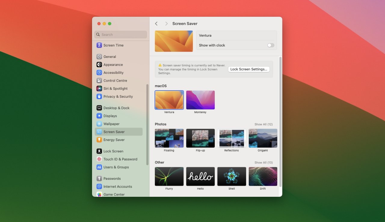
The beta release doesn't have the new screensavers yet
Nonetheless, screensavers have been improved in such a way that they are noticeably better -- or they will be later on in the beta. Federighi showed off moving screensavers that are clearly inspired by the rightly popular ones on Apple TV, but they're not here yet.
At present, none of the rather gorgeous photography we saw has been included in the screensaver's section of System Settings. You can use a range of older macOS system images, such as the wallpaper for Ventura, or your own photography.
What has been included is the mechanics of how screensavers work now. The best element is how when you click to end a screensaver and get back to work, the image transitions to your desktop beautifully.
At present, it's not so gorgeous going the other way. When your screensaver automatically kicks in after a few minutes, there's a judder to black before the animated image starts.
It's enough that you think your monitor has just switched off.
Just as with the new lock screen, there is an optional clock in view when a screensaver is running. That's again useful, but it isn't presented as well as the lock screen version.
Instead of being prominent at the top of the screen, it appears that the screensaver clock slots in to different points depending on the screensaver. It never seems part of that screensaver, it always seems a separate overlay, and isn't as aesthetically well done.
Note that there were no clocks in view in the examples that Federighi showed, and you're likely to switch it off too.
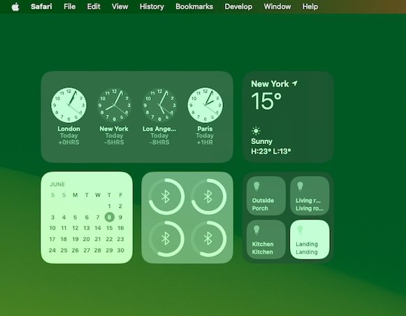
Widgets on the desktop
Maybe most of us fill up our Mac screens with windows and documents, but then maybe the new widgets will make us want to be tidier. Instead of living in a pop-out side bar that means you rarely use them, widgets can now be left permanently on the desktop.
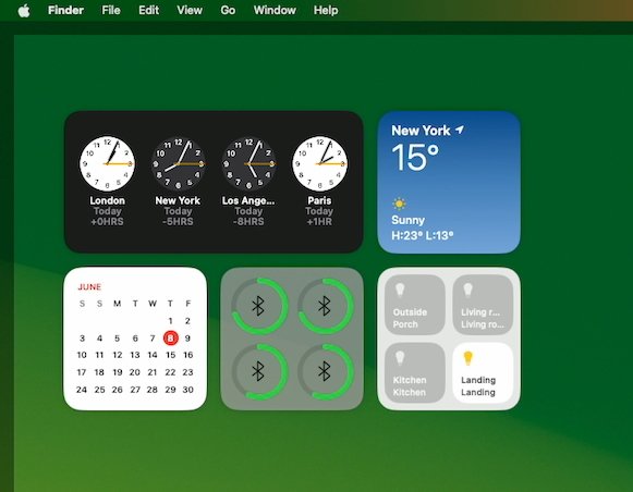
Widgets are shown clearly when you're in the Finder.
Just as with iOS 17, too, the new desktop widgets are interactive. Previously they displayed information and if you clicked or tapped, you were taken through to the widgets' parent application.
Now you can have a Home app widget and, for instance, just click in the widget to turn lights on or off. All there in the widget itself, with no opening or closing of the Home app.
It would be good to be able to resize widgets, but you can place them anywhere you want, and Apple has worked to both stop them being distracting, and for them to look good on the screen.
Widgets are dimmed when you're in an application
By right-clicking on the desktop, you get the option to see and edit widgets. You can still tug in from the side of the screen and, once you have the column of widgets, click on Edit at the bottom.
In either case, you end up with a widget panel that seems to pop up out of the Dock. It looks oddly squat, as if its animated move didn't quite finish, but it contains all the widgets available to you on your Mac.
Click to select one and you can drag it out onto the desktop.
There is seemingly no limit on how many widgets you can have, and there definitely is no constraint on where they can go. But there are guides.
Especially as you drag a second widget out, you will notice a white outline appears where Apple thinks you should place it. That's a nice touch, because it means it's easy to drag a widget and have it neatly lined up next to, below, or above the first one.
Choosing from Apple's pop-up panel is the most efficient because it shows you everything, including widgets from your iPhone if that is nearby. But if you already use and like the existing widget bar on macOS Ventura, the odds are that you've previously chosen the widgets you want.
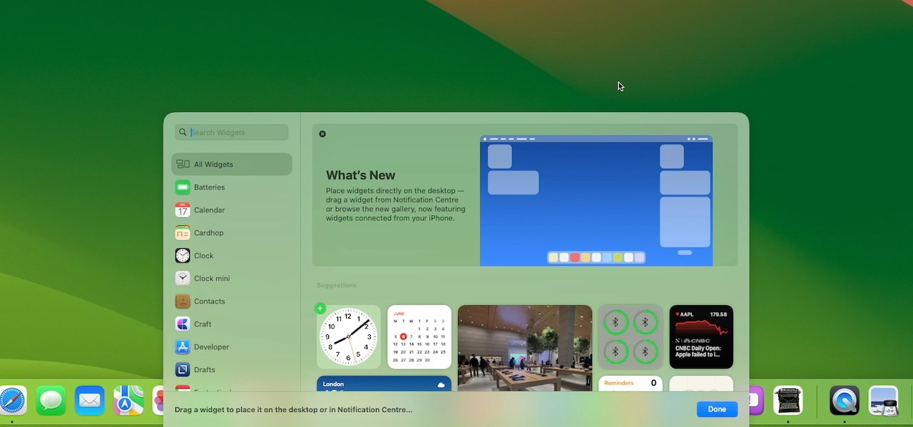
Widgets can be dragged from the sidebar or chosen from the new widget picker
In which case, you may prefer to open that side widget bar and just drag off what you need onto the desktop.
Whichever you do, those widgets then stay on the desktop as if they were part of it, and they also update live. So the Apple News+ widget, for instance, will show headlines and those will change throughout the day.
In testing, those headlines didn't seem to change very often, however. It isn't like a ticker update app where new headlines are added and shown all the time.
Maybe it's been a series of slow news days, or maybe Apple is limiting how distracting a news widget can be.
Apple has definitely worked on making widgets prominent yet not overwhelming. Obviously if you drag a document window over the widget, that widget is no longer visible.
But if you open a document near your widgets, if you are concentrating on some work, then the widgets subtly fade into the background. It's not that they become ghost widgets, they are still clear enough that you can read the information on them, but they are blended more into the background.
That means that, as with the Mac's menu bar, the widgets appear transparent. They're also dimmed, and the combination is almost always effective.
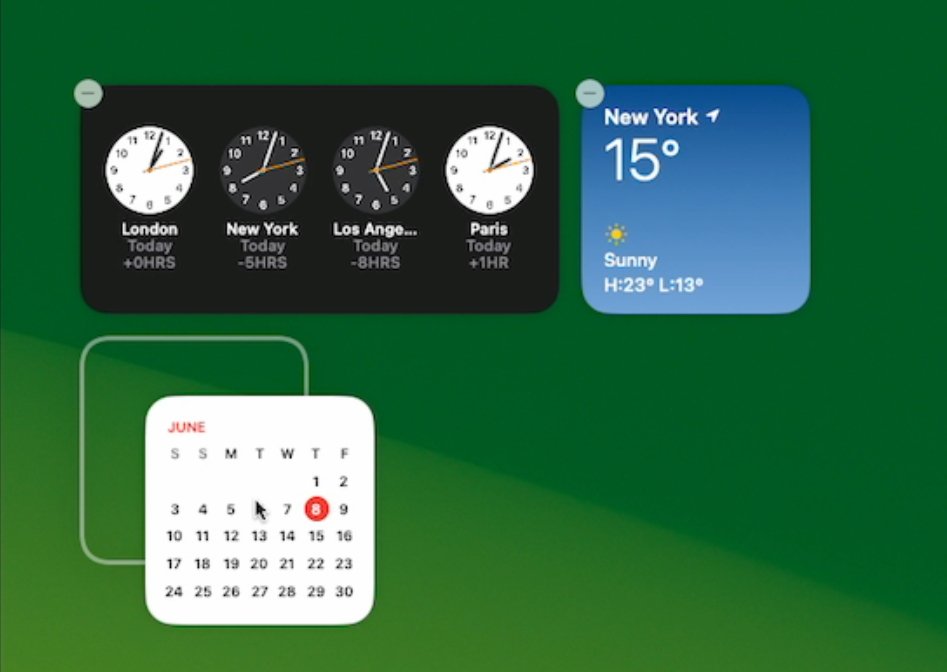
As you drag widgets, Apple provides highlighted guidelines
With just a glance at even the dimmed transparent widgets, you can read what you need. The one exception so far appears to be with certain analog clock widgets where it is possible to see the hands, but not very clearly.
Nonetheless, you will be tempted to arrange widgets where you can see them all day. But if you for some reason feel absolutely the opposite about them, you can flick a System Settings toggle and completely turn them off.
In this first beta, though, there are some issues with System Settings.
System Settings and the desktop
One of the persistent frustrations with last year's macOS Ventura beta was in System Settings. Behind the scenes, all of the old System Preferences worked exactly as they did -- Shortcuts and AppleScripts could address them unchanged -- but the visual look was changed.
It was a change for the better with settings grouped intelligently, and with commonly-used ones surfaced far better. But over and over, there were bugs -- and there's one in macOS Sonoma.
If you select any section in System Settings, then come out of it and launch Settings again, a different section is selected.
Currently, it also appears that some System Settings controls simply don't work. In Desktop & Dock, there are options, for instance, for turning desktop widgets on or off, and for showing or not showing items on the desktop.
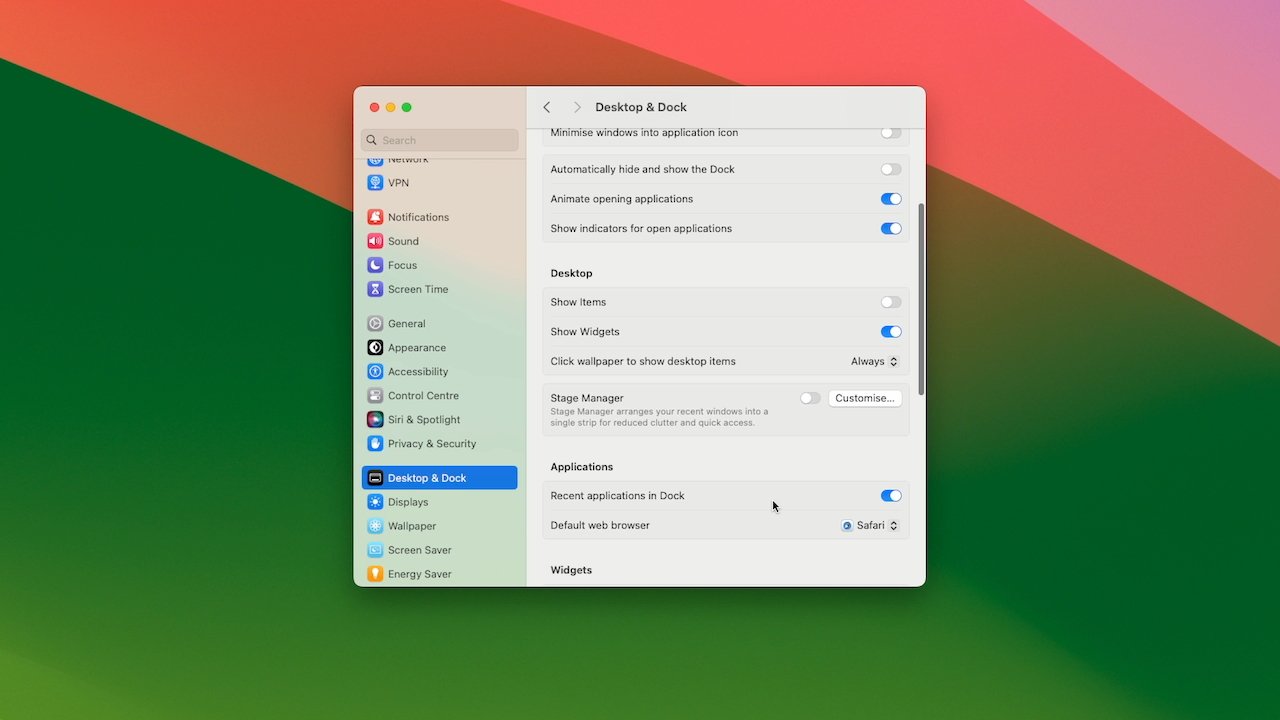
Widgets and showing desktop items in System Settings
Back in 2001 when the classic Mac OS was replaced by what was then OS X, a complaint was that the desktop no longer showed icons for hard drives. Following complaints, Apple brought those icons back, but made them optional.
Over the years since, enough people have elected to hide those drives that it's noticeable how macOS Sonoma shows them again by default.
This is one of those settings where you are so used to the way you have it set that you can't remember what was your choice and what was the default. But if you do want to hide the drives, the way you do it has changed.
In Desktop & Dock, and under the heading Desktop, turn off Show Items and the drives are gone.
However, so is everything else. Previously you either needed to use a Terminal command, or a third-party app such as CleanShot X or ScreenFlow to hide desktop icons.
Or from macOS Ventura, your mess on the desktop would be automatically hidden when you used Stage Manager. If you used Stage Manager.
Now when you've chosen not to show items, the way you temporarily change that to see them again, is to click on the desktop. You do then get to see your drives, plus any folders or documents on the desktop, but it's as if you chose to use Mission Control.
On a Mac, Mission Control is the name for several gestures and effects, but one is for showing the desktop. Spreading four fingers out on a trackpad sends all of your application windows off screen, with just a shading around the border to show they ever existed.
That's what happens now when you click on the desktop, having chosen in System Settings to hide items.
Otherwise, you can't see items on the desktop and while that can be appealing for hiding the mess, currently it is a pain. For normally if you actually have an empty desktop, the way you open a new window is to click on the Finder icon in the Dock -- and now you can't.
Or rather, if you do, you get an error bleep and you do not get a window. To open a Finder window in this situation, you have to right-click on the Dock icon and choose a window from the list that appears.
Choose any window, it opens, and then you can navigate through it to wherever you need.
It feels like an attempt to make Stage Manager more a part of the Mac instead of a separate feature that you can choose to use or not.
Currently, this is all more of an irritation than it should be, though, because there is another bug in System Settings. Once you've turned on this option to hide items, you seemingly can't turn it off.
You should be able to. There is a toggle for turning this feature on or off, and right next to it is one for turning desktop widgets on or off -- and neither work.
Or at least, once you've turned on the option to hide items, the toggles for that and widgets react, but have no effect.
Doubtlessly, this will be fixed before the final release and that does appear to be just minor a kind of fit-and-finish job.
At this early stage in the beta testing, it's fair to assume Apple is concentrating on the major features instead of making the last 1% perfect. And there is one major feature that is very visible -- to everyone but you.
Video conferencing
It's not in your face, it isn't there unless you want it, but the updated video conferencing features are dramatically improved with Presenter Overlay. This is the feature that works with services like Zoom to let you combine slides and yourself in the same view.
From everyone else's perspective on the video call, your slides or anything else you want are full screen. Then if you choose, your head and shoulders can be inserted as a small live image to one side of the screen.
Or you can have it so that you are approximately the same size and position in the frame as you were on the regular call, but standing in front of your slides.
It's very good from everyone else's perspective. From yours, it's takes some setting up and it's also a little glitchy so far.
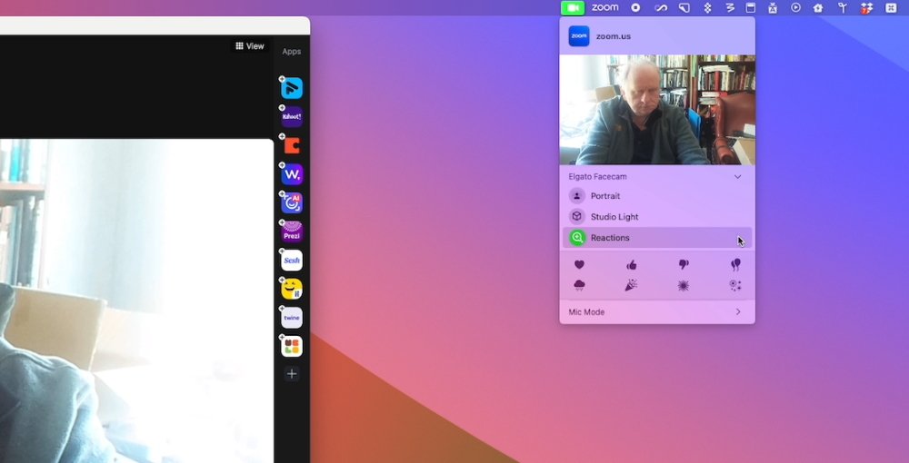
This menubar app changes depending on the app, but with Zoom, it offers Reactions in a panel at the bottom
You do it via a new menubar app that macOS Sonoma adds if there is a compatible app running. The icon for the menubar changes, showing a green camera when you're in apps such as Zoom, or a yellow microphone when another app is using, or could be using, the mic.
That can be a distraction -- it will even appear if you are not running an app, but you do have its helper app working in the background.
If you're a ScreenFlow user, for instance, even when you are not actively using that screen recording app, the new menubar item is there. Distractingly, it's also highlighted.
It's highlighted so that you know there is something running, and seemingly in the case of the ScreenFlow helper app, it's that your Mac wants you to set options for the microphone. A Mic Mode option is in the menubar app, offering Standard and Voice Isolation.
However, it's when you intentionally launch an app like Zoom -- and are in a call -- that this menubar feature becomes useful.
During any Zoom call, a Reactions option appears in that menubar app. You can choose from a range of reactions, such as some kind of happy congratulations, and when you do, a bunch of balloons appears to float behind you.
Reaching up for a menubar app, then moving the cursor down to a Reactions panel, and then choosing one of the quite similar-looking white-on-black icons isn't the fastest thing you can do.
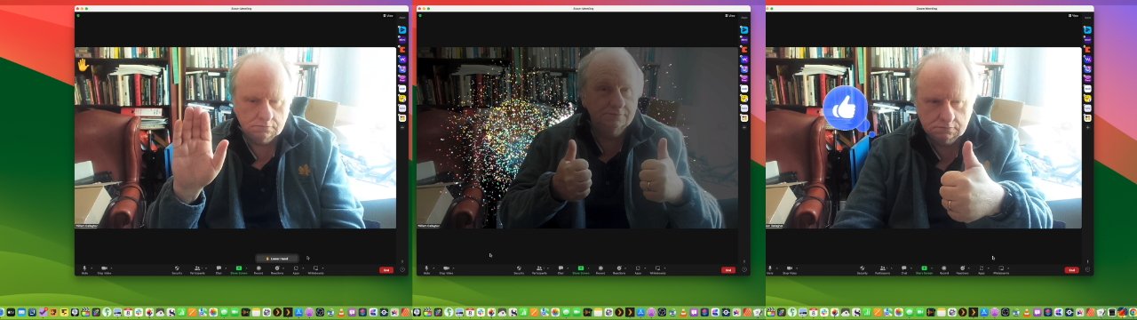
Just raise your hand, your thumbs, or one thumb and Zoom automatically reacts - after a moment
But just gesticulating with two thumbs up is. During a call, you can simply do gestures like that, and after a beat where you feel a little foolish, starburst explosions will happen behind you.
Presenting in video conferences
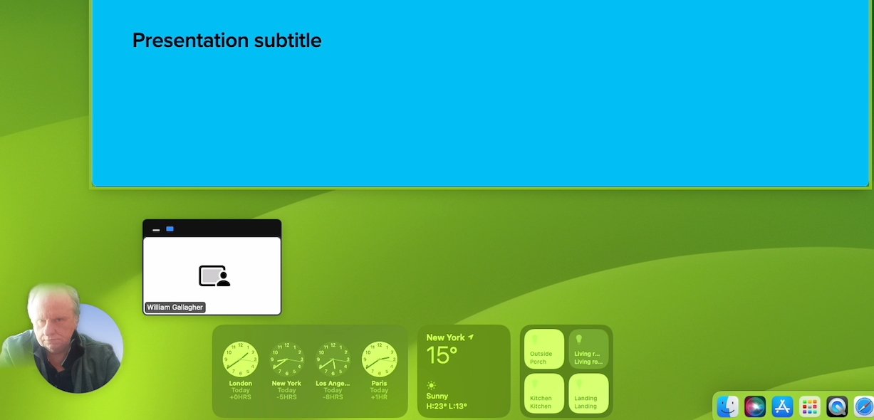
If instead of whooping at someone else, you are presenting slides in a Zoom call, you first share your screen as you always would. Then that same menubar app changes to offer you Presenter Overlay.
You can choose off, Small, or Large. The small version is the little inset of your face over the slide, while the Large one is turning you into a weather presenter with slides behind you.
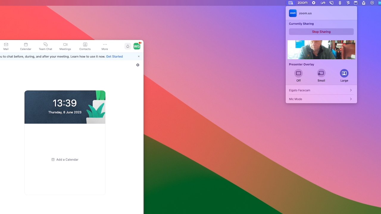
However, when you choose Screen Sharing in Zoom, it always removes the main view that you see in a regular call. Your face is moved to a small window off to the side so that you can see whatever it is on your screen that you're sharing.
This is the small Presenter Overlay but it's glitchy so far -- and larger than the Large one
Which means that you alone don't get to see the full effect of Presenter Overlay.
In the present beta, there's also a difference in what you do see, and how well it appears to work, when you chose between the Small and Large options.
If you select Small in a Zoom call, then at present you get a very little preview to one side of your screen, showing the slide and your inserted image. If you choose the large one, then Zoom's normal small window attempts to show you how you appear to other callers, but it's flickery.
It looks like when someone uses Zoom's own background replacement feature, and it vanishes as someone moves around.
The large Presenter Overlay is not that large for you
So that's something else that will improve as the beta cycle progresses. When it's ready, it's a feature that will only be used by a portion of the Mac user base, but they will use it to death.
Whereas the new features in Safari are going to potentially be a boon for an enormous number of Mac users.
Safari
Safari is of course Apple's web browser app, but it's also deeply integral to macOS. And there are no macOS releases that don't feature several improvements to Safari.
This time out, the key developments are in webapps, profiles, and passwords.
Webapps
A webapp is not a new idea. For years, you've been able to get third-party apps that would take a website and create a kind of app out of it.
Such a webapp could be put in your Dock, and launched by itself. Rather than launching Safari and being one window or one tab amongst others, a webapp is on its own.
When you use particular sites a lot, turning them into a webapp could be handy enough that it was worth doing. But it wasn't handy enough that they became commonly used.
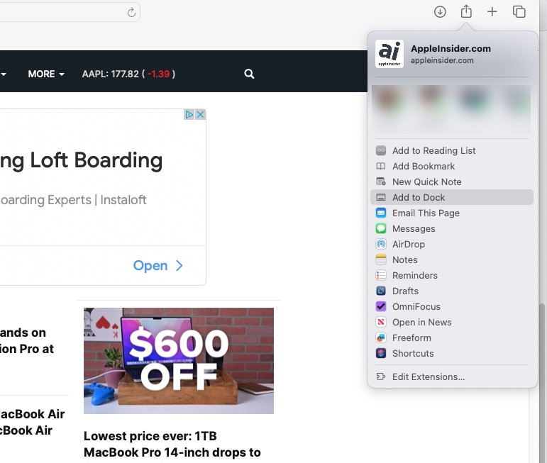
Apple has added webapps and made them clearer, too, with "Add to Dock"
Now Apple has included it in Safari and you create a webapp just by choosing that new option in the Share menu. What's more, Apple only uses the term "web app" when you are in the middle of creating it -- until then, the term used is "Add to Dock."
More people will find this, and more people will immediately understand what it means, so more people will use it. Plus under Apple's approach, the whole thing is typically simple and, so far, reliable.
If you choose to create a webapp out of a site, you click on that option in Share and then get the ability to name it. So rather than a site's full title, which is the default, you can choose any shorter name.
So far you can't, though, choose the icon. The webapp gets saved into your Dock with whatever favicon the site uses, which can be fine.
But also can be a pain if, for instance, you end up with a row of webapps and each one has the same Google icon.
Profiles
Curiously, Safari's second new feature is all about distinguishing between different uses of the browser. Profiles is an optional new feature that lets you separate work from leisure or home use of Safari, if you need.
It's already possible to have tab groups that mean with a click or two, you are looking at all the sites you need for work -- and none that you use at home. Or vice versa.
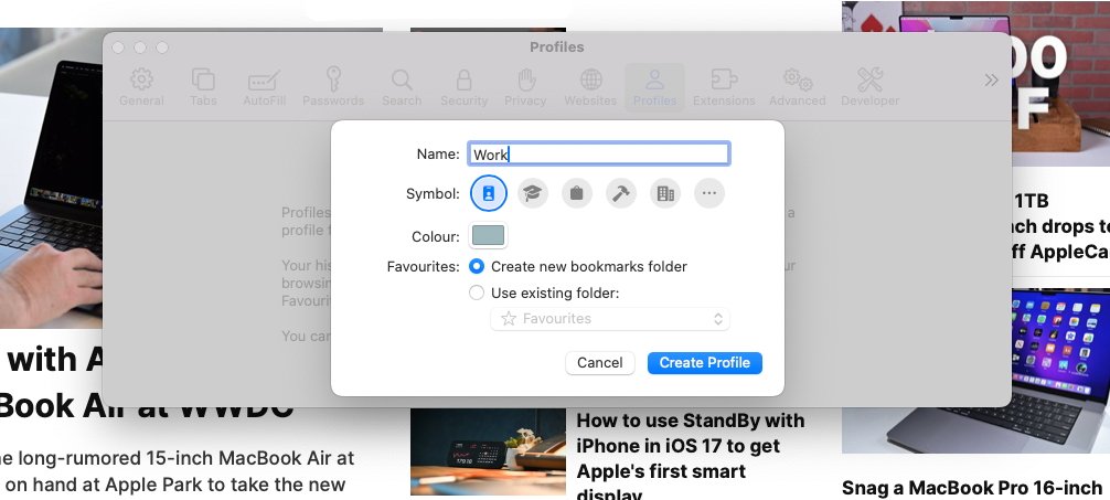
Safari lets you separate work from home tabs and even extensions
But with Profiles, you can elect to have a a deeper separation of Church and state. Set up one Profile for work and one for Home, and not only can the tab groups be different, but your browser history will be.
So, too, will bookmark favorites, cookies -- and even extensions. It doesn't appear that you can also have different sets of passwords, but then macOS Sonoma is more about sharing passwords than hiding them.
Sharing passwords
The line between Safari's own password manager and third-party ones continues to blur to the point of invisibility. It's still the case that if you use multiple browsers, you need a third-party password manager, but it used to be that this was also true when you had a team using the same websites.
Third-party password managers like 1Password even have Teams subscriptions that let a group share the same central database of accounts and passwords. Now while not yet as thorough as that, Safari has introduced group password -- and passkey -- sharing.
You can set up a group, saying which of your contacts are in it, and which website or other accounts they can see. Then when you change a password for a site everyone uses, everyone immediately gets the new password and probably never even notices.
In Safari's Settings, the existing Passwords pane now includes Family Passwords. In a similar way to all of Apple's collaboration features, you then get to pick your "trusted contacts," and then "choose what to share."
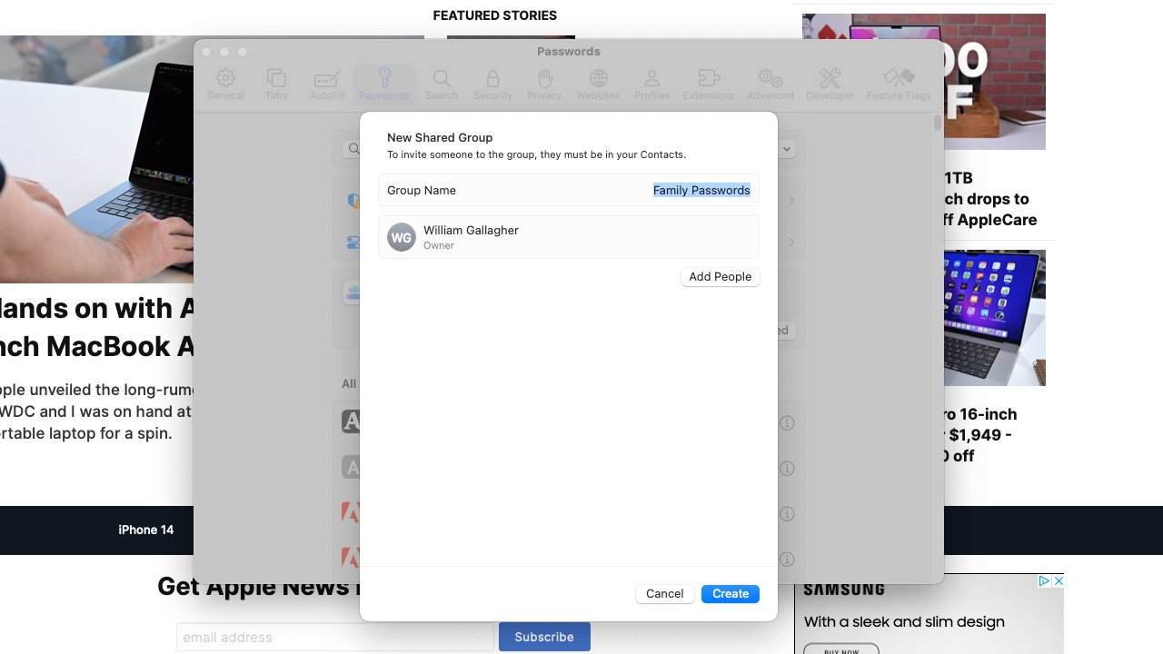
You can now share Safari passwords with friends and family
Messages, stickers and autocorrect
For a release that rather resembles the way OS X Leopard was followed by a lower-key, practically maintenance update with OS X Snow Leopard, macOS Sonoma has a lot going on. It's like Apple went over every possible pixel of macOS Ventura, it just then chose to add only minor updates across it all.
They're minor compared to the introduction of, say, Continuity Camera, but if you use them in your daily work and life, they are significant.
Such as the annual expansion of Messages, this time with what Apple cals an "all-new stickers experience."
To anyone who doesn't use Messages, or doesn't use these features, the all-new experience looks very much like the old one. But stickers are now held together with Memoji in a new stickers drawer, meaning you have one place to go to, or one place to completely ignore.
There are more updates to Messages than just the ability to send icons instead of text, however. If you come late to a long Messages conversation, you can tap a "catch-up arrow" and be taken to the first message you've yet to read.
Searching for messages is also improved by gaining some of the same search features that Mail has. So now you can combine searches, looking for a particular person and when they sent a message from a particular place, for instance.

Here macOS is offering to complete that last word. It should also do sentences but so far it's completed a couple of words at most.
And when you are writing in Messages, or at present in any Apple app, you get a new autocorrection and autcompletion feature. It's intended to work on whole sentences, both by offering you the next word and by examining grammar.
As you type, macOS Sonoma offers what it thinks the rest of the current word should be. That suggestion is in grey, and if you like it, you can tap the space bar to accept and move on.
If you don't like what the Mac is suggesting, you just keep typing.
That sounds like a chore, like you have to read the suggestion and consider what you think. But in practice, it feels very natural to tap the spacebar to accept, or carry on tapping any other key to dismiss the suggestion.
Lastly for Messages and anywhere you can write, there's a caps lock indicator. Unlike the autocompletion, this appears to already be working in more than just Apple's apps.
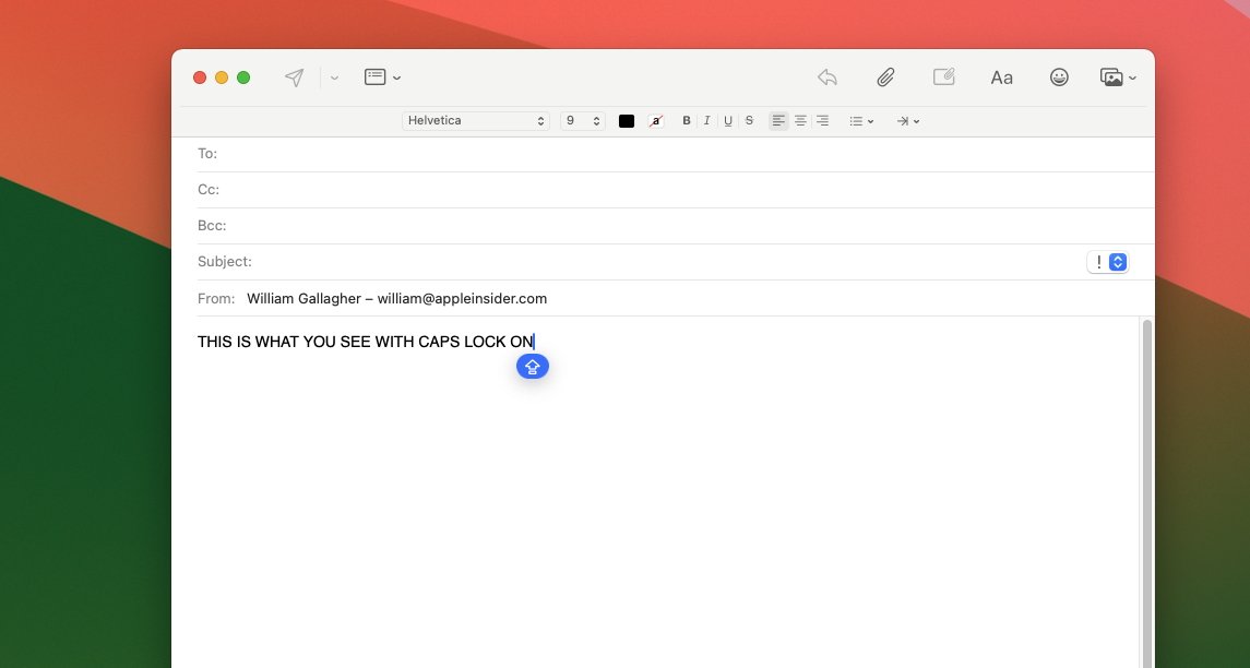
You can no longer miss when you've got Caps Lock on
Wherever it does work, when you click into a text field while caps lock is on, you get a blue warning icon that replaces your cursor. If you ignore it and keep typing anyway, the warning icon moves along with you.
Privacy and sharing
Doubtlessly, Apple does that work of checking your caps lock is on or not, without calling out across the internet to some caps lock security server. The new macOS continues Apple's on-device stance where, whenever possible, what you do and see on your Mac is protected locally.
Such as now with Communication Safety. New to macOS Sonoma, Communication Safety detects what Apple euphemistically calls sensitive videos and photos. This appears to be coming later in the beta cycle, but Apple says that images of, for instance, naked people, can be blurred out if you choose.
So if you've elected to turn this feature on and you get sent such an image, you will instead see a chiefly grey box with "This may be sensitive" written in it. There'll be a "Show" button you can click if you want to.
Helping you get your work done
Much of macOS Sonoma is about how you communicate with the rest of the world. So as well as this blurring of unwanted images you're sent, Apple has also added collaboration to working on PDFs in Notes, for instance.
But macOS 14 is also about you and how you work for yourself, how you concentrate on doing what you need to do. So the new PDF features in Notes also improve how you can read and annotate them.
Notes now recognizes when a PDF is actually a form, and it makes it easier to click to enter text into its sections.
Or if you have the right Mac, or the right AirPods Pro, you can now just say "Siri," instead of "Hey, Siri." That doesn't sound like it will save a lot of time, but saying "hey" doesn't come naturally to everyone, so it is an improvement.
That "Siri" improvement requires you to have either the second-generation AirPods Pro, however, or a Mac with Apple Silicon.
Apple has said which Macs the new macOS will work on, but inevitably it's going to be that not all of its features will work on all apparently compatible Macs.
Compatibility
The Macs confirmed by Apple to be able to run the new OS are:
- iMac 2019 or later
- iMac Pro
- MacBook Air 2018 or later
- MacBook Pro 2018 or later
- Mac Pro 2019 or later
- Mac Studio
- Mac mini 2018 or later
Many or most of those Macs are Intel-based rather than using Apple silicon. That's significant because it's already clear that Intel Macs that can run macOS Sonoma at all, will not have certain key features.
As well as them still requiring "Hey, Siri," Intel Macs will not get the Presenter Overlay feature. Nor a new Game Mode, which on Apple silicon will improve gaming performance.
This is all a shame if you love games and have an Intel Mac, but it's inevitable -- and a reason why Apple made the switch to Apple silicon. The Mac is now capable of much more than it was with Intel processors, and Apple is rightly making the most of it.
It's great that Apple is still supporting older machines, but the combination of Apple silicon and macOS Sonoma is night and day compared to what the Mac was just a couple of years ago.
macOS Sonoma - Pros
- Presenter Overlay is superb
- Reactions in videoconferencing work well
- Safari makes webapps easy and useful
- Widgets on the desktop -- and now interactive
- PDFs handled better in Notes
- Messages gains useful improvements, and more stickers
macOS Sonoma - Cons
- It cuts out some older Macs than macOS Ventura did
- Some features won't work on Intel Macs
- Not as significant an update as recent macOS versions
Score: 4 out of 5
Read on AppleInsider
Comments
I think these things, very important ones, can be reviewed when the Release Candidate is available or, better still, the final shipped version.
Of course, there are plenty of websites that haven't taken the simple step of letting businesses create business accounts that can have multiple sub users each with their own login, so I see why people still do it. Still a major problem in many ways!
id be curious to hear about people’s use cases and workflows around widgets.
As someone who only uses their Desktop as a temporary working location for files it’s almost always empty or nearly empty, so people who have hundreds of unorganized files on their desktop may not like the new setup, but I love it.