How Control Center's new design in iOS 18 makes it faster to use and customize

You still swipe down from the top right on iPhone to get Control Center in iOS 18, but after that, it's a whole new design and how you edit has completely changed.
Now every control in Control Center can be removed, rearranged, or resized
There was always a kind of mental disconnect between Control Center with its rows of icons, and the straight list of options for it in Settings. In Settings, you could drag an option up and down, but the result was the control moved up, down, left, or right depending on where it was.
That meant that you tended to drag up and down the list, then have to go into Control Center to really see the effect.
This has entirely gone in iOS 18. There is still a Control Center section in Settings, but now it's got a single option to do with whether you can swipe down for it when you're in an app.
You want that, and it's the default, so you may never again bother going into the Settings for this -- because everything you need is now in Control Center itself.
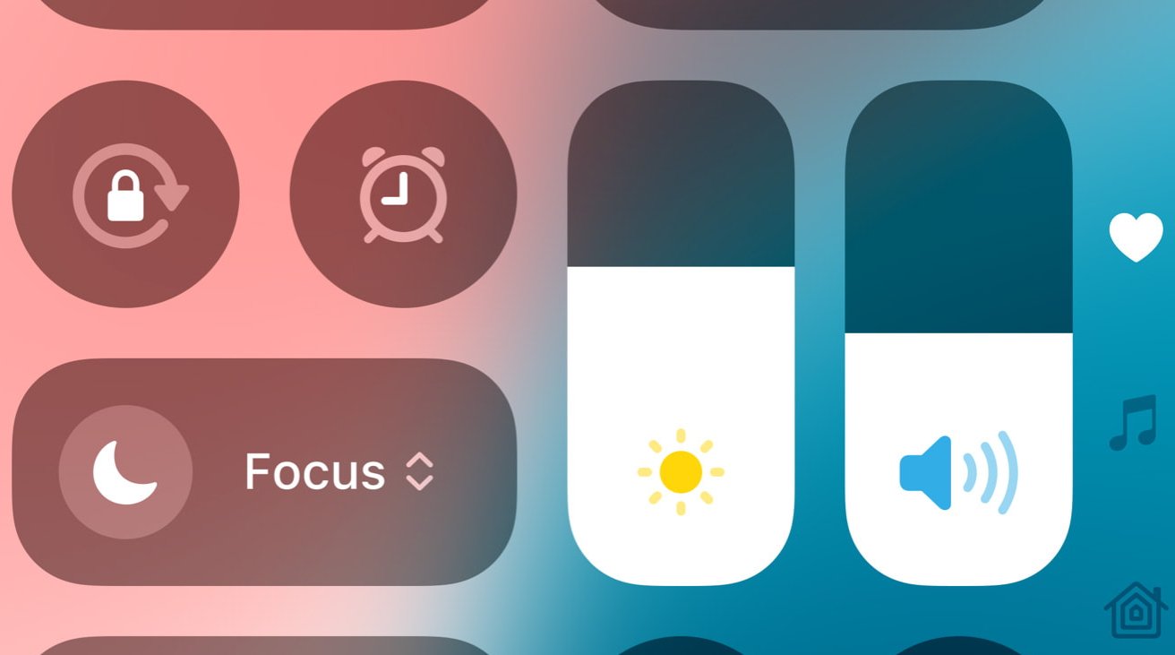
The new look Control Center
It's still a series of black buttons against a translucent background, but the buttons are now more rounded -- and there are fewer of them. There are fewer because now Control Center is not just one page, it's four.
That sounds counterproductive since the aim is to make it quicker to use, but it works. Rather than having a single page that is potentially so full of controls that you have to scroll to get to them all, you can instead scroll quickly to the page you want.
The pages are Favorites, Music, Home, and Connectivity, in that order. It takes a little getting used to, but as you swipe down to open Control Center, you can continue the same swipe to go straight to any of the pages.
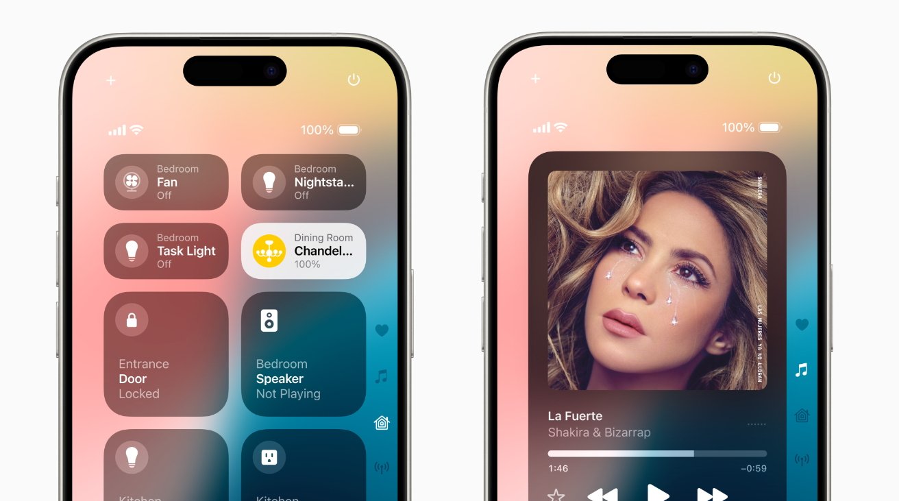
Control Center is now divided into screens including one for Home and one for Music controls
It's quite possible that you never will, though, as the initial Favorites page has the most common controls for each of the sections. And still there is room to add a few more controls to any page.
Or there is in theory. In practice there are some oddities, which may be down to this being a beta release.
Adding to Control Center
On each page of Control Center, there is now a plus icon at the top left. You can either tap that, or just any blank spot on the screen, to start customizing Control Center.
It's curious that the control to enter this editing mode is a plus sign, yet to actually add something you then have to press a further button labelled Add a Control. There's also no X or similar button to end editing, you again have to tap on any blank part of the screen.
But if you do tap Add a Control, you get a far longer list of options than you did before. There are page after page of possible controls, arranged alphabetically by type.
Tap on any of them, and that control is added to the Favorites, Music or whatever screen you're on. Or it is usually.
There is a problem first that there's no indication whether a control has already been added, so it's easy to double up.
It's also easy, though, to add a control and then be left wondering where it is. That's especially so on the Music page, which by default is already filled with a large playback control that includes album or podcast artwork.
If you are on this page when you add a control, it automatically bumps down to the next page. It's also the same on any page if that screen is already full, including the last one.
Adding a further control to the last page actually creates a fifth Control Center screen.
Removing and rearranging controls
While you're in the editing mode -- so having tapped the plus sign -- every existing control on the screen gains a minus sign icon. Tapping that removes the control from the screen.
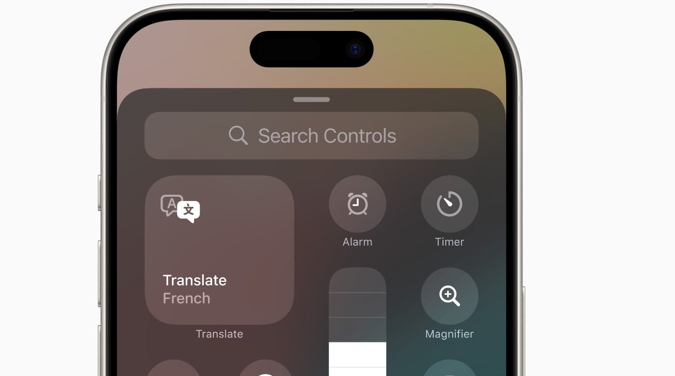
There are very many more possible controls in Control Center now, but you can also search for what you need
For the first time, this applies to everything. Previously the top half of the Control Center screen would permanently show various controls like the music player and Wi-Fi connectivity section.
Now you can remove anything, and also add anything to any of the pages.
Also new is that you can resize elements. So if it was annoying that the pre-iOS 17 Screen Mirroring button was reduced down to an icon, you can now drag it out to regain the label.
Note that you can drag to elongate a control, but it will snap back to its original small size. The only option for a larger control is to drag it out to become a square roughly the size of four smaller controls.
Resizing some controls is more useful than others. You can expand the Flashlight control, for instance, but that chiefly just changes it from an icon to the same icon in a much bigger, blank space.
In that example, you do also get the words "Flashlight Off," or "Flashlight On." But just as with the original smaller icon, the black control turns white when the flashlight is on.
Also, if you do resize controls, other ones are pushed out of the way, and that includes putting them on to a new extra page. Changing the size back to its original form does not bring the moved controls back.
Early days in the beta
Given all this, it can seem that while we've gained a lot of customizability, it isn't yet as smooth as it could be. And if the aim was to stop us having to scroll when we have a lot of controls, that still needs some refining.
But the ability to edit, add, and rearrange controls in situ instead of having to go off to a separate Settings section is excellent.
Then even without any customizing, the default Control Center is now clearer and feels easier to use.
Read on AppleInsider
Comments