How to perfect your home screen with iPadOS 18 customization options
Apple has made it easier to customize and arrange your iPad home screen, with iPadOS 18 letting you rearrange icons and even tint them. Here's how to do it.
iPadOS 18
Apple has gradually given more control to users about what items they can put onto the home screens of their devices. With Apple's latest update, there's even more options available to make your iPad screen as perfect as possible.
Icon arrangement
For years, iPad users have had to deal with Apple's icon arrangement rules. Filling in row by row, icons gravitate to the top left, with the last appearing in the bottom right.
While orderly, it does mean that part of the wallpaper will be covered up, and there was little you can do about it.
In iPadOS 18, you can select to move an icon as normal with a long press until the menu option Edit Home Screen appears, or until all of the icons start jiggling as normal.

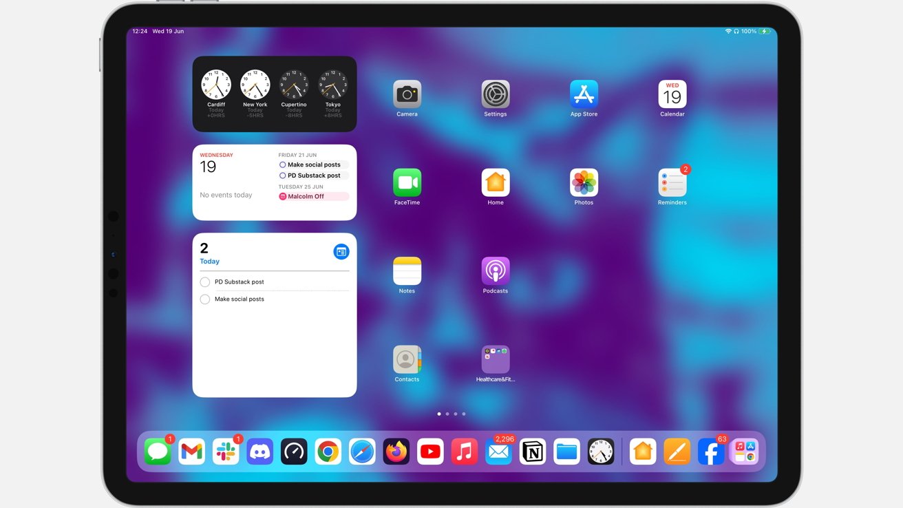
You can now position apps in iPadOS 18 to leave gaps in the grid.
Now, if you drag an icon to an empty part of the screen, the app will stay in that part of the grid instead of snapping to its usual place. This change also applies to widgets, which can be placed anywhere within the grid.
This arrangement is great if you have a wallpaper with elements you want to keep visible. For example, you could frame a subject with icons, turning the home screen into a form of window.
Icon customization
No only can you affect how icons are placed on the home screen, but you can also change how they appear.
A long press of the background followed by a tap of the top-left Edit button brings up a new Customize button. Selecting it brings up a new pop-up section specifically affecting icons.
The new pop-up gives users a few more options affecting the appearance of icons.
For a start, the Small-Large toggle will change the size of the icons in the grid. The size change makes them easier to see and to press, as well as filling up more of the screen itself.
However, be aware that using large icons with this toggle removes the visible names of the icons. If you rely on needing to read the names of apps, you should stick to the small option.
Below that are options that affect the appearance of Apple-produced app icons. Much like there are dark and light modes for the user interface as a whole, this concept now applies to app icons and widgets too.
Normally apps are classed as being in light mode for their typical appearance. Dark mode makes changes, turning black app icon backgrounds white, and sometimes making larger changes, such as inverting the green-colored sections of FaceTime so the camera itself is green.
You can also set the icons to automatically reflect whether iPadOS is in light or dark mode. Just as the original implementation, when the sun sets or rises, the mode flips, and so do the icons.
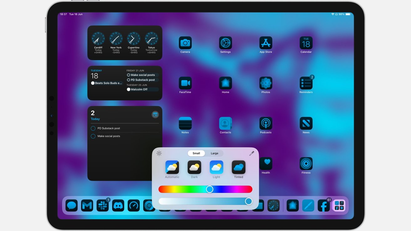
The last icon option is Tinted. This acts in a similar way to dark mode icons, but with the exception of black and white, all other colors are changed to just one.

An example of iPadOS 18 app icon tinting.
The idea of this feature is that users can select what that color is. This allows for the icons to match the background for a more cohesive design, or to be any color of the user's preference.
Two sliders at the bottom of the interface can be used to select the hue, as well as the lightness of the color.
If you can't quite select your preferred hue and shade, you can still have the icons match your backdrop. An eyedropper tool lets you select colors from the background.
The tool handily zooms in, showing individual pixels for you to select, which are instantly used to tint the icons.
Read on AppleInsider

Comments
Definitely something I’ll use in night mode On the phone.