iOS 26 vs iOS 18: Is Apple's 'Liquid Glass' a true redesign?

Jump to First Reply
Posted:
in iOS

With iOS 26, Apple unveiled a unified design language with translucent elements that mimic the look of real-world glass. Here's how it compares to iOS 18.

Two smartphones side by side, displaying home screens with colorful app icons and digital clock widgets showing different times against gradient backgrounds.
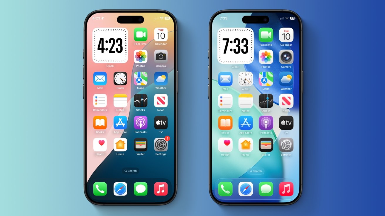
iOS 26 vs iOS 18: iOS 26 (right) features slightly larger icons compared to iOS 18 (left) -- but they both use the same color palette.


On June 9, at its annual Worldwide Developers' Conference, the iPhone maker finally unveiled the long-rumored visionOS-style redesign we were all waiting for. The company's latest operating systems all received a revamped user interface with a new material dubbed 'Liquid Glass.'

Apple says that Liquid Glass uses real-time rendering to imitate the way glass refracts light, and explains that the new material reacts to movement dynamically with specular highlights. It's used across various user interface elements, including buttons, switches, app icons, the Lock Screen, Control Center, and more.

The company called Liquid Glass its "broadest design update ever," but the claim is a bit of an exaggeration. Apple compared the redesign to iOS 7, saying that it "sets the stage for the next era" of its products, even though the change is nowhere near as drastic as it was back in 2013.

iOS 26 vs iOS 18: 'Liquid Glass' feels like a derivative change rather than a fresh new look


More than a decade ago, with the release of iOS 7, Apple phased out its iconic skeuomorphic design language. Gone were the hyper-realistic icons and app designs that mimicked real-world objects, most notably in iBooks and Calendar. The company switched it all out in favor of a flat design with bright colors and dynamic blur effects.

Two smartphones side by side, one smaller and older with a blue case, the other larger and more modern, both showing app icons on their screens.
iOS 26 vs iOS 18: Even though it was announced more than a decade later, iOS 26 (right) still resembles iOS 7 (left).


That design language stuck with iOS for the next eleven years, but its influence still lingers even in iOS 26. The operating system has retained the distinct color palette introduced with iOS 7, though its app icons have received a few visual tweaks. Even the all-new Liquid Glass material bears some resemblance to the blur effect introduced in iOS 7 and used through iOS 18.

The cross-platform design aspect of iOS 26 isn't anything new either -- Apple has tried to unify its operating system designs before. Years ago, iOS 7 and macOS 10.10 Yosemite were early incarnations of the company's design unification efforts.

macOS Big Sur is the most obvious example, as Apple's desktop operating system gained square app icons and a redesigned Dock, both reminiscent of iOS and iPadOS. Previous releases of macOS maintained a distinct set of icons and UI elements that set them apart from Apple's mobile OS releases.

Despite all the hype, other operating systems have used arguably similar glass-like transparency effects in the past. Windows Vista and Windows 7, for instance, featured a visually distinct Aero theme, which some users have compared to the newly announced iOS 26.

A smartphone with app icons is next to a computer screen showing a Windows Vista interface with the Start menu open.
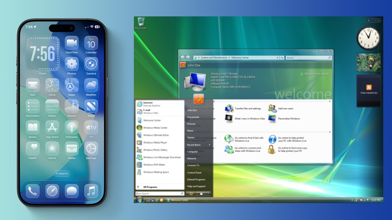
iOS 26 vs iOS 18: Apple's iOS 26 (left) looks somewhat similar to Microsoft's Aero theme, used in Windows 7 and Vista (right)


Microsoft phased out its iconic Aero interface with Windows 8, though, meaning that it hasn't been in use for over a decade. Relative to the Aero theme, Apple's implementation is much better at emulating real glass, as the Liquid Glass effects are dynamic rather than static.

Overall, Apple's latest Liquid Glass material arguably represents consistency rather than true innovation, given Apple's previous design unification efforts. It's in line with what Apple and other manufacturers have done in the past, rather than something that has never been done before. It may not be up to everyone's liking.

Though iOS 26 leaves a lot to be desired, the operating system does have a few areas where it truly stands out.

iOS 26 vs iOS 18: Where Apple's latest OS truly shines


iOS 26 introduces an entirely new "Clear" look that makes Home Screen apps fully transparent. It's an interesting choice, but not exactly groundbreaking either.

Two smartphones with different home screen themes, one dark with black icons, the other light with translucent icons, against a blue gradient background.
iOS 26 vs iOS 18: The newly announced iOS 26 (right) adds a Clear look for Home Screen icons.


It builds upon the customization options introduced with prior iOS versions, such as the Light, Dark, and Tinted options that were already available in iOS 18. One benefit of the new Clear look is that users no longer have to rely on jailbreak tweaks to achieve transparent Home Screen icons, as they once did with Cydia tweaks such as WinterBoard and similar tools.

Another key change with iOS 26 is the introduction of dynamic elements that can increase or decrease depending on the user's needs. These upgraded context menus and tab bars utilize Apple's new Liquid Glass look, replacing the rectangular and often white UI elements found in previous iOS releases.

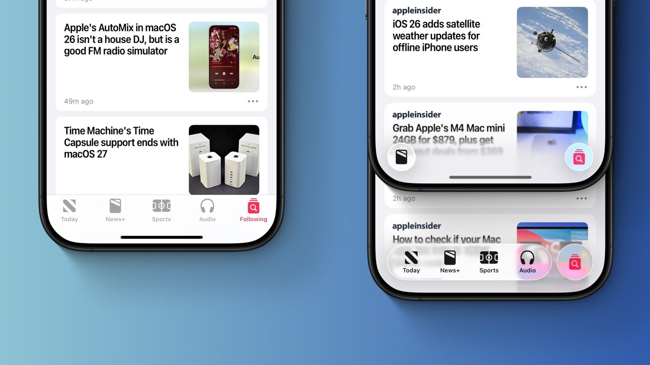
You'll notice the new UI elements across various system applications, including the App Store and Apple News. In the News app, for instance, the tab bar moves out of the way when you're scrolling, providing an almost full-screen experience that prioritizes the content you're trying to read. It's a neat change, overall.

The dynamic user interface elements allow for greater consistency across system applications and make navigation easier. Still, it's unlikely that the average user will notice the difference, given that iOS has been a mix of blur effects and rounded corners for years.

Close-up of two smartphone displays showing technology news headlines and app interface with icons for Today, News+, Sports, Audio, and Following on a light blue background.
iOS 26 vs iOS 18: Apple's iOS 26 (right) adds dynamic UI elements that move out of the way when you're scrolling, while iOS 18 (left) features a static tab bar.


The Liquid Glass material is also noticeable in the Safari app. The new material is used for the URL bar and back buttons.

The Camera app now has a simplified user interface, and its buttons feature rounded corners as well. It makes for a useful change, unlike most of the redesign-related alterations in iOS 26.

Even so, the new user interface elements wouldn't have looked out of place, even if they were added years ago. As for why this type of design wasn't implemented earlier, hardware limitations are a possible explanation.

Apple says that its Liquid Glass material was created through the close cooperation of its hardware and software teams. The software takes advantage of the improved hardware available in Apple's latest A18 and A18 Pro chips, which have the necessary processing power to achieve these glass-like effects.

Two smartphone screens displaying camera modes and settings, including flash, live, timer, exposure, filter, aspect, and night mode options.
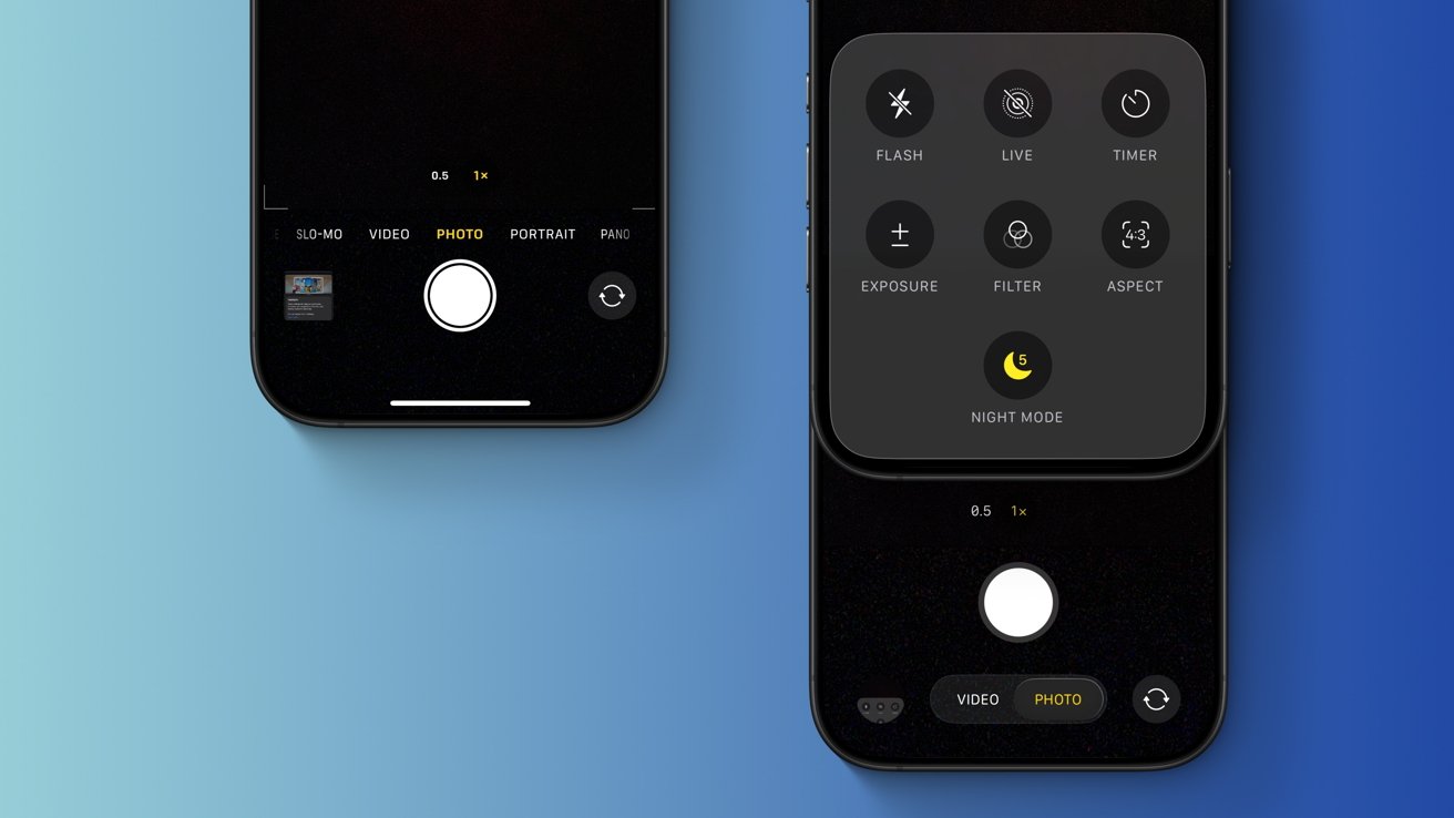
iOS 26 vs iOS 18: The new-and-improved iOS 26 (right) introduces a simplified user interface for the Camera app, which prioritizes certain options.


Older hardware would likely struggle with Liquid Glass, so it's not much of a surprise that iOS 26 dropped support for the 2018 iPhone XR and iPhone XS. Years ago, when the iPhone 4 received iOS 7, the device never got any of its impressive blur effects.

Enabling the blur effects through jailbreak tweaks revealed just how poorly the device performed, and a similar scenario likely would have affected 2018 iPhone models with iOS 26.

iOS 26 vs iOS 18: Why Apple may have opted for a redesign


Though rumors of an operating system redesign have been floating around for at least a year, Apple may have chosen 2025 for a specific reason. The redesign is little more than a fresh coat of paint, but the company may have used it to hide imperfections, so to speak.

Frosted glass-like icons on a reflective surface, featuring magnifying glass, speech bubble, and musical note symbols with a sleek, modern design.
iOS 26 vs iOS 18: Apple showed off various physical lenses during WWDC, as they were presumably used for Liquid Glass development. Image Credit: Apple.


To be more specific, Apple's iOS 26 redesign serves as the perfect distraction from its Apple Intelligence debacle. Siri still lacks the personal context and in-app awareness features that were promised a year ago at WWDC 2024, and this very issue is the subject of two separate lawsuits filed against the company.

In short, Apple over-promised and failed to deliver, and the company was reportedly embarrassed about it, behind closed doors. With that in mind, it's not much of a surprise that WWDC 2025 was relatively light in terms of Apple Intelligence features. Sure, there's a new Foundation Models framework and an improved Shortcuts app, but not much else.

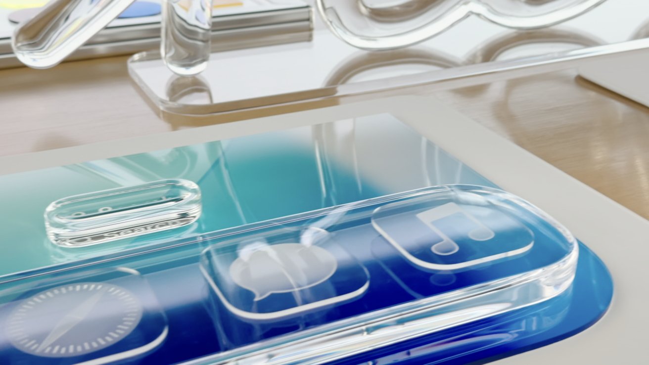
Apple may have wanted users to focus on the new glass-like design more than anything else, which is why it was featured at the beginning of the WWDC 2025 keynote. The company even went so far as to show off some of the tools presumably used during development -- physical lenses and magnifying glasses in the shape of iOS user interface elements.

Three smartphones displaying colorful abstract wallpapers and the time 7:43. The first screen is dark, the second blue, and the third light green and blue.
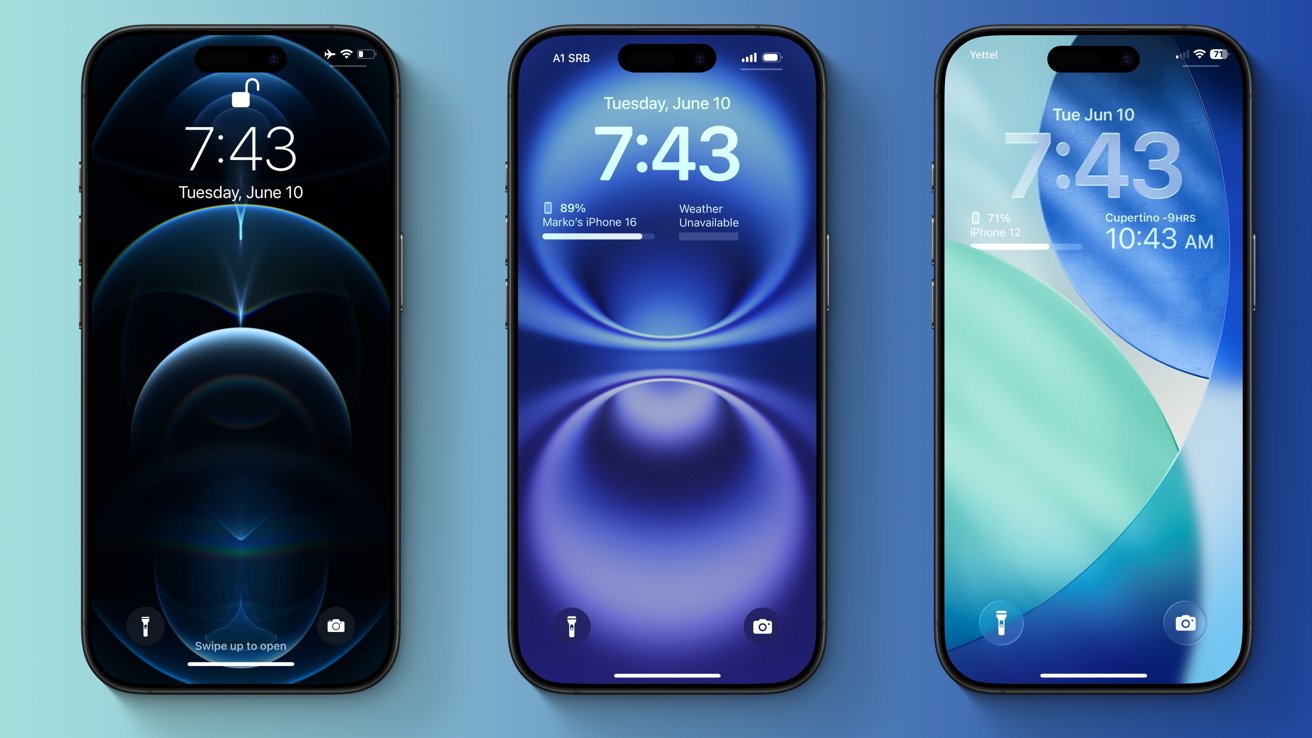
iOS 26 vs iOS 18: The iOS Lock Screen has changed over the past five years, but it has retained the same overall look. Left: iOS 14, Middle: iOS 18, Right: iOS 26


The distraction aspect alone, however, wouldn't have been enough to justify the redesign. During the keynote on June 9, Apple said that Liquid Glass would set the stage for future products, and the company may have had a specific device in mind. There have been rumors of an all-glass iPhone, with no display bezels, a curved frame, and no camera cutout.

It's been rumored that iOS 26 would serve as an indicator of what future products strive toward, that the operating system will influence the look of new hardware.

Specifically, the 20th anniversary iPhone is said to have the codename "Glasswing," referring to a type of butterfly with translucent wings. It's set to debut in 2027, so we'll know soon enough if Apple's software influenced its hardware, and to what extent.


Read on AppleInsider

proof143
«13

Comments

  • Reply 1 of 44
    CheeseFreezecheesefreeze Posts: 1,421member
    100% agree with this article. visionOS is a complete redesign because they had to rethink it from the ground up. With iOS this revision, unlike iOS 7, is a simple reskin. And in my opinion, a pretty bad one affecting readability and usability. 
    Not a good show for a company years behind on AI.
    proof143StrangeDayswilliamlondondebonbontiredskillsjeffharris
     2Likes 4Dislikes 0Informatives
  • Reply 2 of 44
    ad931ad931 Posts: 5member
    Honestly, I cannot understand what exactly you want from Apple, another article moaning and whinging & full of speculation 

    I think Apple “putting you  on froze” for a couple of months is just what the doctor ordered
    proof143entropysAfarstarStrangeDayswilliamlondonmr moedebonbonmattinoztiredskillsjeffharris
     7Likes 5Dislikes 0Informatives
  • Reply 3 of 44
    Been using it for a day. Ugly AF. Yuk.
    williamlondondebonbontiredskillsgrandact73
     3Likes 1Dislike 0Informatives
  • Reply 4 of 44
    Wesley_Hilliardwesley_hilliard Posts: 544member, administrator, moderator, editor
    Pretty happy with this redesign, personally. I think some of the more busy screenshots with readability issues are the exception, not the rule. It's been quite interesting and responsive in my use so far, though I'm sure some tweaks will be made through the summer.

    I take an opposite opinion. The content, like in Apple News or a social media app, isn't the "design." That's all going to looks relatively the same regardless of the window chrome. What changed was every aspect of how a user interacts with an app besides scrolling. Buttons, bars, tabs, and menus are all altered. I think it goes beyond a layer of paint.

    It isn't as dramatic as trading out the felt of a casino table for a plain white backdrop, but there's also a lot more OS chrome today than there was in iOS 7. The square footage of what was affected during the keynote yesterday was much much more than iOS 7, and I think people will notice.

    It is an opinionated design that users have the ability to walk back a bit with some toggles and customization. I'm happy that Apple has an opinion on design again -- things we're feeling a little too flat to the point that Android could easily skin and look like Apple's OS. This will be much harder to copy.
    StrangeDaysjeffharrisrandominternetpersongrandact73
     3Likes 1Dislike 0Informatives
  • Reply 5 of 44
    ramanpfafframanpfaff Posts: 173member
    I'll take iOS 6 over the rest. Sort of like OSX, 10.6 was the best. Both have been heading downhill ever since. I really don't see how this is considered a redesign, it's just lipstick on a pig as they say. 
    9secondkox2StrangeDayswilliamlondontiredskillsdanox
     0Likes 5Dislikes 0Informatives
  • Reply 6 of 44
    Pretty happy with this redesign, personally. I think some of the more busy screenshots with readability issues are the exception, not the rule. It's been quite interesting and responsive in my use so far, though I'm sure some tweaks will be made through the summer.

    I take an opposite opinion. The content, like in Apple News or a social media app, isn't the "design." That's all going to looks relatively the same regardless of the window chrome. What changed was every aspect of how a user interacts with an app besides scrolling. Buttons, bars, tabs, and menus are all altered. I think it goes beyond a layer of paint.

    It isn't as dramatic as trading out the felt of a casino table for a plain white backdrop, but there's also a lot more OS chrome today than there was in iOS 7. The square footage of what was affected during the keynote yesterday was much much more than iOS 7, and I think people will notice.

    It is an opinionated design that users have the ability to walk back a bit with some toggles and customization. I'm happy that Apple has an opinion on design again -- things we're feeling a little too flat to the point that Android could easily skin and look like Apple's OS. This will be much harder to copy.
    I couldn't agree more. The fact that the home screen doesn't look much different is besides the point. This is about how users engage with apps. From the keynote it's clear that there is a push for hiding unnecessary clutter by default and exposing it dynamically as needed. It's a cool trick if they can pull it off, but I expect they can. I look forward to watching the sessions about how to implement this in your apps. 
    williamlondontiredskillsmacgui
     3Likes 0Dislikes 0Informatives
  • Reply 7 of 44
    9secondkox29secondkox2 Posts: 3,544member
    It’s a comperehensove UI REDESIGN. 

    but only a partial UX redesign. 

    It’s enough to call it a full redesign. But it doesn’t fix what’s not broken. So in total, it’s a redesign done right. 
    AfarstarStrangeDaysmattinozjeffharrisrandominternetperson
     5Likes 0Dislikes 0Informatives
  • Reply 8 of 44
    9secondkox29secondkox2 Posts: 3,544member
    I'll take iOS 6 over the rest. Sort of like OSX, 10.6 was the best. Both have been heading downhill ever since. I really don't see how this is considered a redesign, it's just lipstick on a pig as they say. 
    I’d hardly call the best OS on the planet a pig. But it’s not quite the leap ios7 was. And really, it shouldn’t be. iOS is mostly perfect. So they enhance where they can. I inevitably, such a comprehensive approach will need reevaluation and tweaking and that’s what will get by ios27. 
    StrangeDaysjeffharris
     2Likes 0Dislikes 0Informatives
  • Reply 9 of 44
    So, here's the timeline as you see it:

    WWDC 24: Apple overpromises all this AI-New Siri stuff

    Time between WWDC 24 and WWDC 25: Apple doesn't deliver AI-New Siri stuff

    Also time between WWDC 24 and WWDC 25 but AFTER Apple doesn't "deliver": Apple decides to overhaul it's UI

    WWDC 25: Apple introduces the UI overhaul that they supposedly only began working on between WWDC 24 and WWDC 25. 

    So, within a year, Apple didn't promise AI-new Siri, decided to overhaul its UI, and have it ready for WWDC 25 to distract from the overpromising of AI-New Siri stuff. I mean, do you think they came up with the idea for this UI overhaul and created it in less than a year? 
    StrangeDayswilliamlondonmr moedebonbonmattinoz
     4Likes 1Dislike 0Informatives
  • Reply 10 of 44
    mpantonempantone Posts: 2,456member
    Been using it for a day. Ugly AF. Yuk.
    While I am still on iOS 17 and have no plans to upgrade to iOS 26 (iPadOS 26 or Mac OS 26 Tahoe) in the near future, I suggest you try reducing transparency effects to see if it makes a difference. On all flavors of Apple's iOS, iPadOS, Mac OS, it can be toggled on here:

    System Settings > Accessibility > Display > Reduce Transparency

    I enabled this setting many, many years ago on all of my Apple devices.

    Another related setting on the same panel is Increase Contrast. I have this enabled on my iPhone and iPad but not on my Mac. Both of these options make the display a little more utilitarian, gets rid of some of the "eye candy" effects.

    You are free to try out other settings as well in an effort to reduce the "glass" effects.

    I also have Reduce Motion enabled which also cleans up the UI a little bit.
    edited June 10
    debonbonwtxnitz
     2Likes 0Dislikes 0Informatives
  • Reply 11 of 44
    Wesley_Hilliardwesley_hilliard Posts: 544member, administrator, moderator, editor
    cajunreb said:
    So, here's the timeline as you see it:

    WWDC 24: Apple overpromises all this AI-New Siri stuff

    Time between WWDC 24 and WWDC 25: Apple doesn't deliver AI-New Siri stuff

    Also time between WWDC 24 and WWDC 25 but AFTER Apple doesn't "deliver": Apple decides to overhaul it's UI

    WWDC 25: Apple introduces the UI overhaul that they supposedly only began working on between WWDC 24 and WWDC 25. 

    So, within a year, Apple didn't promise AI-new Siri, decided to overhaul its UI, and have it ready for WWDC 25 to distract from the overpromising of AI-New Siri stuff. I mean, do you think they came up with the idea for this UI overhaul and created it in less than a year? 
    The Liquid Glass redesign has been worked on for multiple years and was meant to come out last year, but they pushed it back to focus on AI. And I expect we'll see Siri with App Intents before the end of the year, which still fits in Apple's original announced timeline and announced "delay."
    williamlondon
     1Like 0Dislikes 0Informatives
  • Reply 12 of 44
    mpantonempantone Posts: 2,456member
    cajunreb said:
    So, within a year, Apple didn't promise AI-new Siri, decided to overhaul its UI, and have it ready for WWDC 25 to distract from the overpromising of AI-New Siri stuff. I mean, do you think they came up with the idea for this UI overhaul and created it in less than a year? 
    That doesn't make sense. First of all the engineers working on Siri and Apple Intelligence aren't the same ones who work on UI elements of Apple's various operating systems. The latter is probably the domain of Core UI teams (for each platform OS) following the guidelines provided by Alan Dye (VP of Design). That's right, there are engineers who work on things like buttons, menu pulldown animations, progress menus, alert bubbles, animated backgrounds, etc. Hell, even the Spinning Beachball of Death was programmed by someone.

    It's likely that this Liquid Glass refresh has been in the works for several years. Remember that many of its elements debuted in visionOS so it's not like it was an afterthought at the end of 2024. Most likely Apple used visionOS as a test case for the new design because VR user interfaces inherently benefit greatly from passthrough visuals.

    It's not like Apple senior management writes down a bunch of ideas, tosses them into a fishbowl and pulls out a few during some beer bust in December to decide which features should be in the upcoming operating systems. Almost all of this stuff is planned years ahead of time. It's not like they say "Hey, let's give it to the interns and see what they come with."
    edited June 10
    williamlondonjeffharris
     2Likes 0Dislikes 0Informatives
  • Reply 13 of 44
    I only have one question: why? Why would you want your apps to be transparant? To see what’s behind them? Why would you want your screens to refract light? That’s what you want to diminish. What a waist of time and money for absolutely nothing, for something that a lot of users wil turn off, I’m sure. 
    citpekswilliamlondonmr moedebonbontiredskillsCheeseFreezewtxnitzmacguigrandact73
     7Likes 2Dislikes 0Informatives
  • Reply 14 of 44
    ad931 said:
    Honestly, I cannot understand what exactly you want from Apple, another article moaning and whinging & full of speculation 

    I think Apple “putting you  on froze” for a couple of months is just what the doctor ordered
    I agree, it’s amazing how many whiners there are on this forum … everyone definitely has a right to their own opinion, but maybe using the finished product for a period of time before condemning it might make more sense then using a video as the source to form an opinion.  
    StrangeDayswilliamlondonmr moedebonbontiredskillsdanoxrandominternetpersonmacguigrandact73coolfactor
     6Likes 4Dislikes 0Informatives
  • Reply 15 of 44
    entropysentropys Posts: 4,452member
    Modern Aqua.

    i like it. 

    Next step: Skeuomorphism!
    maltzwilliamlondonmacgui
     2Likes 1Dislike 0Informatives
  • Reply 16 of 44
    nubusnubus Posts: 863member

    Overall, Apple's latest Liquid Glass material arguably represents consistency rather than true innovation

    Why shouldn't Apple combine innovation and consistency? Perhaps the author meant "continuity"? Shouldn't Apple be allowed to innovate on an existing platform? What would the alternative be? Stale platforms? 

    I spoke to 3 UX'ers today. They're all "this will make content shine" while being worried that Figma isn't capable of building it. A discussion about the cost of development now that iOS and Android are clearly diverging. Worried how branding will work when colors are removed. There is so much we can discuss. But stating that Apple isn't innovating? This design will bridge car entertainment, computers, watches, TV... using one coherent language. To me it is innovation.
    tiredskillsjeffharrisrandominternetperson
     2Likes 1Dislike 0Informatives
  • Reply 17 of 44
    citpekscitpeks Posts: 264member
    schmrtzzz said:
    I only have one question: why? Why would you want your apps to be transparant? To see what’s behind them? Why would you want your screens to refract light? That’s what you want to diminish. What a waist of time and money for absolutely nothing, for something that a lot of users wil turn off, I’m sure. 

    I'd like to hear Apple executives' spin on this question.  I suspect their answer would be in the same vein as to why Apple neglected to give the iPad weather and calculator apps for the longest time.

    For VisionOS, and in the context of an AR environment, translucency makes logical sense, to give the user a more complete picture of their environment.  On your desktop and on your device?  Much less so.

    To be fair, this is not the finished product, but some of those PR shots, like the Safari address bar and the music player, look like readability, and thus usability, disasters.  And if history is any guide, Apple only manages to fix the most egregious missteps, not all of them, before shipping the final product.

    And calling it Aqua 2.0, or Aero 2.0 doesn't make it any better.  Those designs were hardly perfect, and recall that Jobs originally wanted a non-functional Apple logo centered in the middle of the menu bar, before common sense returned.

    So call a spade a spade and admit that these are mostly aesthetic, not functionally beneficial changes.  I can't imagine there are many users who think that making things harder to read is going to make them more productive, or the product easier to use.  But they are most certainly outnumbered by those more concerned with the sizzle, not the steak, and this will probably make them happy.  That's the culture we live in now, like those who think how their food looks is more important than how it tastes, and they must tell the world about it through apps like Instagram.
    williamlondonmr moedebonbonrandominternetpersonmacguicoolfactor
     2Likes 4Dislikes 0Informatives
  • Reply 18 of 44
    StrangeDaysstrangedays Posts: 13,197member
    mpantone said:
    cajunreb said:
    So, within a year, Apple didn't promise AI-new Siri, decided to overhaul its UI, and have it ready for WWDC 25 to distract from the overpromising of AI-New Siri stuff. I mean, do you think they came up with the idea for this UI overhaul and created it in less than a year? 
    That doesn't make sense. First of all the engineers working on Siri and Apple Intelligence aren't the same ones who work on UI elements of Apple's various operating systems. The latter is probably the domain of Core UI teams (for each platform OS) following the guidelines provided by Alan Dye (VP of Design). That's right, there are engineers who work on things like buttons, menu pulldown animations, progress menus, alert bubbles, animated backgrounds, etc. Hell, even the Spinning Beachball of Death was programmed by someone.

    It's likely that this Liquid Glass refresh has been in the works for several years. Remember that many of its elements debuted in visionOS so it's not like it was an afterthought at the end of 2024. Most likely Apple used visionOS as a test case for the new design because VR user interfaces inherently benefit greatly from passthrough visuals.

    It's not like Apple senior management writes down a bunch of ideas, tosses them into a fishbowl and pulls out a few during some beer bust in December to decide which features should be in the upcoming operating systems. Almost all of this stuff is planned years ahead of time. It's not like they say "Hey, let's give it to the interns and see what they come with."
    Right and that’s what Cajun is saying - the author’s claim that this was a misdirection for missed AI features doesn’t hold water because it takes a long time to build an overhaul like this, and thus could not have been a scramble in the past months to cover for late AI features. 
    williamlondonnubusmeterestnzcajunreb
     4Likes 0Dislikes 0Informatives
  • Reply 19 of 44
    maltzmaltz Posts: 547member
    entropys said:
    Modern Aqua.

    i like it. 

    Next step: Skeuomorphism!

    I had the same thought.  I was waiting for someone to describe it as "lickable".  lol
    williamlondonmr moedebonbondanoxmacgui
     3Likes 2Dislikes 0Informatives
  • Reply 20 of 44
    anonymouseanonymouse Posts: 7,114member
    You might as well have titled this article, 

    iOS 26 vs iOS 18: Is Apple's 'Liquid Glass' a true Scotsman?

     0Likes 0Dislikes 0Informatives
Sign In or Register to comment.