macOS 26 says goodbye to the classic hard drive icon

macOS Tahoe quietly retires the old Mac drive icon in favor of a sleeker, SSD-inspired design.
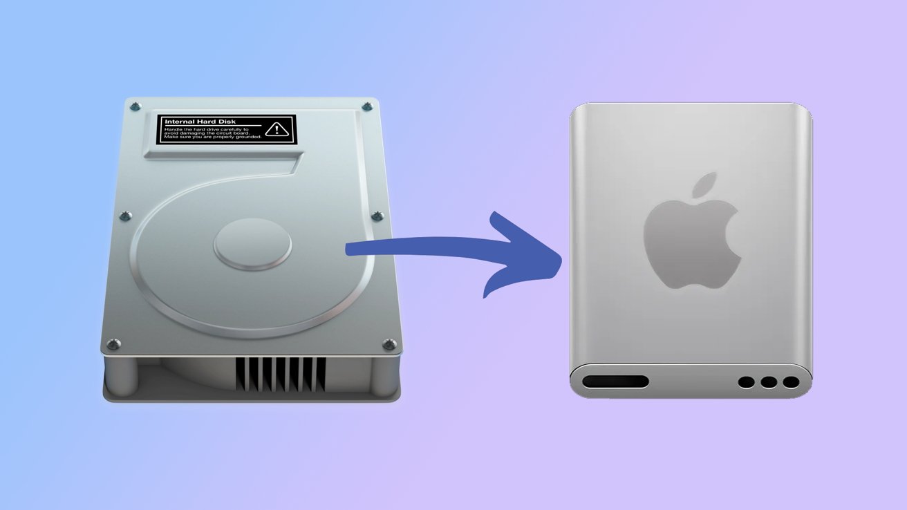
Swapping out the Mac HD icon for a new SSD-inspired one
Tuesday's developer beta release of macOS Tahoe 26 brought a bit of sad news. The old Macintosh HD icon is getting replaced.
The old icon depicted an actual hard drive -- it was a metal box that boasted screws, vents, and even a warning sticker. Impressive, considering Apple canned the practice of using hard drives over a decade ago.
The new icon, spotted by 9to5Mac, is based on the modern depiction of a solid-state drive. Between its rounded edges and the undeniable, large Apple logo in the front, it really does set itself apart from the old one.
The new design not only fits Apple's modern aesthetic but also feels more thematically appropriate. With any luck, it won't spark the same kind of backlash as the Finder icon redesign did.
Read on AppleInsider
Comments
There have been desktop icon packages, etc. for macOS/OS X for decades and for earlier Apple operating systems before that. I'm using some disk icon for my Macintosh HD boot drive that I found in 2011 when I yanked the factory Hitachi 2.5" HDD spinner from my Mac mini 2010 server and replaced it with a 120GB SSD from OCZ.
I think I found the one I'm currently using via an Internet search (yeah, I know many people online have seemed to have forgotten how to use search engines):
https://www.deviantart.com/sebster456/art/Apple-SSD-Icon-308840969
I just searched for "macos ssd icon" and switched to image results.
If you find a compatible icon, all you need to do is cut and paste via the Get Info window for that particular object rather than try to hack the entire operating system. It's way easier than the bad old days when mucking around with ResEdit was often required.
I still have a zillion icons in my old CandyBar (Panic software icon application) collection, which miraculously still runs in Sequoia!
That said, the world has changed including Apple hardware. Apple generally doesn't use discrete drive components like the 2.5" and 3.5" HDDs of yesteryear. Their SSDs today are largely NAND chips soldered to the motherboard, not even m.2 sticks. The best representation of an Apple internal SSD is really just a chip (or a group of them) rather than some silver, white, or black enclosure.
Curiously Apple's longtime external drive icon is typically yellow. I have never owned a metallic yellow drive enclosure nor do I recall Apple ever marketing any of them.
But yes the Icon Factory had great icons!
In particular the white ones.
The Apple logo is presented as though it is on a flat two-dimensional surface with no foreshortening. If you look at the traditional hard drive icon on the left, the circular spindle bulge is an oval.
Worse the "drive" on the right has parallel sides. The old HDD icon on the left has tapering sides, more properly depicted using vanishing perspective. Apple could have gotten away with the "flat" logo had they used proper perspective on the actual silver enclosure itself (like all the icons in the IconFactory window grab provided by theralsadurns.
The new and "improved" icon is an example of really poor draughtsmanship. Plus there's nothing that really says "I am a disk drive." It looks like it could be a (inept) sketch of the unreleased iPod shuffle 3.
Let's hope the rest of macOS 26 isn't full of equally bad design. Somewhere on this planet Jony Ive is silently smirking. And Steve never would have let this happen on his watch.
To which I may reply:
My gods it's so fraking hilarious seeing you chucklefck complain about something so stupid and mundane and completely irrelevant such as people not liking Tahoe's new drive icons.
QED
Actually my icon is a character icon of myself done years ago by an icon artist. I have thousands of great icons I have collected over the years. Thank you for reminding us of custom icons.