Apple simplified System Settings for macOS Ventura, moved many items

System Settings, the macOS Ventura replacement for System Preferences, more closely resembles Settings on iPhone and iPad, but as well as visual changes, it has also moved key elements.
As revealed right back at the WWDC 2022 keynote, macOS Ventura features a redesigned preferences pane, now retitled System Settings. Its visual change is marked, it's impossible not to see the similarities with iOS and iPadOS, but the alteration is more than skin deep.
System Settings in macOS Ventura includes new sections for:
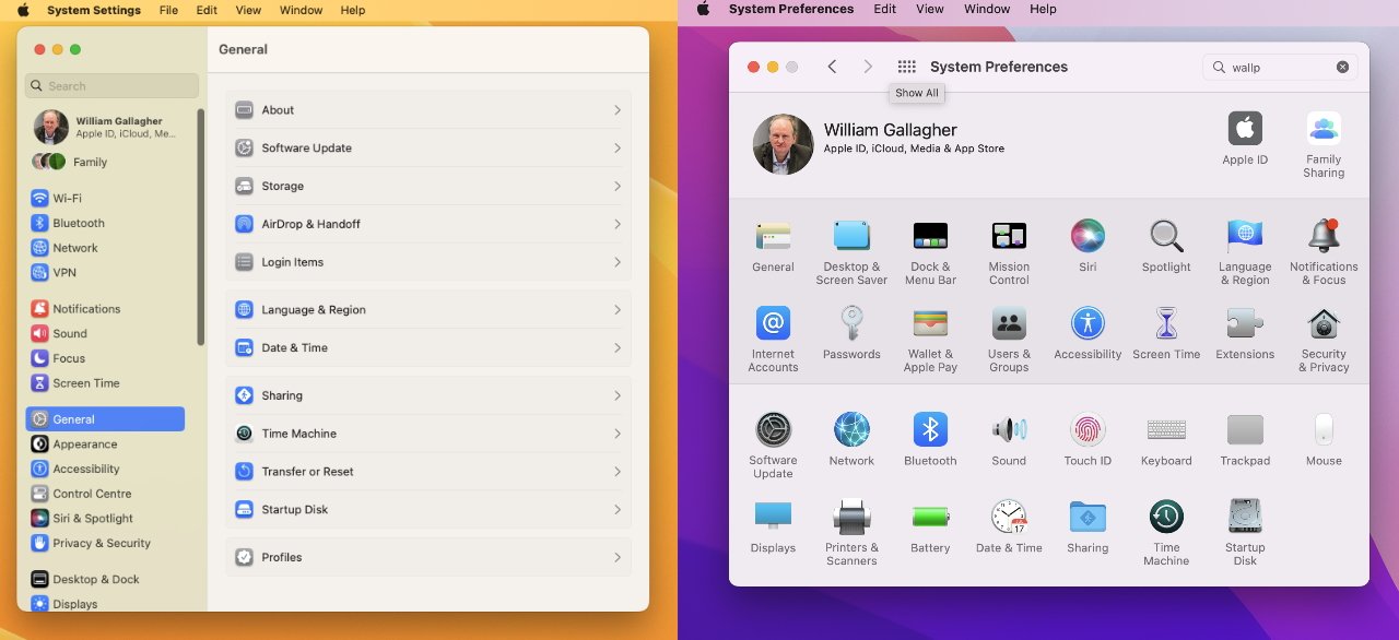
The new System Settings in macOS Ventura (left); System Preferences in macOS Monterey (right)
This does make it harder for long-time Mac users as they to unlearn where features are. There is still a search feature within System Settings, however.
And for new users, the redesign surfaces common sections more easily.
For instance, previously you could search for the word "Wallpaper," but you couldn't find such a section just from looking. The word "wallpaper" wasn't part of the "Desktop & Screen Saver" section it was in, nor was it even mentioned.
Read on AppleInsider
As revealed right back at the WWDC 2022 keynote, macOS Ventura features a redesigned preferences pane, now retitled System Settings. Its visual change is marked, it's impossible not to see the similarities with iOS and iPadOS, but the alteration is more than skin deep.
System Settings in macOS Ventura includes new sections for:
- Game Controllers
- Game Center
- Lock Screen (previously in Security & Privacy)
- Desktop & Dock (previously in Desktop & Screen Saver, and Dock & Menu Bar)
- Screen Saver (previously in Desktop & Screen Saver)
- Wallpaper (previously part of Desktop & Screen Saver)
The new System Settings in macOS Ventura (left); System Preferences in macOS Monterey (right)
This does make it harder for long-time Mac users as they to unlearn where features are. There is still a search feature within System Settings, however.
And for new users, the redesign surfaces common sections more easily.
For instance, previously you could search for the word "Wallpaper," but you couldn't find such a section just from looking. The word "wallpaper" wasn't part of the "Desktop & Screen Saver" section it was in, nor was it even mentioned.
Read on AppleInsider
Comments
From a GUI perspective, this is either great, or terrible, depending on the path people have taken to acquiring an Apple laptop or desktop product. For those of us who have spent years with a traditional Mac / Windows icon grid layout, the new interface can seem simplistic, or even patronizing. Instead of showing all of your top level options on one screen, it sacrifices this for the sake of showing more detailed "second level" options of whatever top level option is already selected. On a touch device with limited screen space, this of course makes more sense. But on a 4k -- let alone 6k -- monitor, it could be argued that it's a misuse or even waste of available desktop space. This sort of change can be seen by some as a "dumbing down" of technology, since it makes things more obvious at the expense of potentially being slower.
On the other hand, pre-computers, a list is a much more natural analog way to record or browse through anything, so scrolling through a list may be easier on the eyes / brain to sort through the top-level items anyway. Besides this, Apple kept shuffling and re-shuffling the categories, which made those of us who are "visual people" have a harder time with each OS to locate the desired item. Like I say, it's hard to know what's a good or bad design move anymore, as technology continues to evolve.
It'll be interesting to see the response to this by others as well.
I can never quickly find settings on the current Mac because my eye doesn't naturally find what I'm looking. Since the settings are not in alpha order, I always have to search. I would make the same statement about the iPhone -- I have to search because my eye just doesn't naturally scan long out-of-order lists very well.
So as long as search works, I'll be fine.
If memory serves, is it was with the initial introduction of Mac OS X that for whatever reason my ability to develop "muscle memory" for finding various settings seems to have diminished; every time I'm in the Preferences panel, it takes significant time to find the location of various controls — perhaps because they're not in alphabetical order (or in any order with a logic that I can discern) and because we don't tend to tweak those settings on a regular basis. It has definitely been a frustration.
We don't yet know whether the new System Settings design in Ventura is the best possible one … but this is an area in macOS that has been long overdue for improvement, in my view. I hope Apple keeps iterating on it.
The iOS way is simpler and it's easier to read descriptions.
The iOS way however has a byzantine way of assigning seemingly oft-needed tasks to layers within top levels that are not intuitive. Two different paths to increase text size... etc.
It does then mean that you will have three common devices - phone, tablet, computer - that agree on the style of preferences.
"I know engineers. They love to change things."
I don't need to make settings changes that often and I'd like it to be as painless as possible. Least amount of wasted time. Both platforms fail at that now, for me. I finally learn where a particular setting is, and then it moves or "disappears" (renamed to something else totally non obvious).
This redesign also makes macOS familiar to those that have used iOS for years before owning their first Mac. Smart.
I just don't want this. At all. YMMV, but don't tell me what I should or shouldn't be doing with my macs.
You are welcome to make your choices.