What Apple learned from skeuomorphism and why it still matters

Apple's focus on skeumorphism changed a decade ago in iOS 7. Here's why Apple started and stopped using it, how it evolved, and why it's still important to interface design.
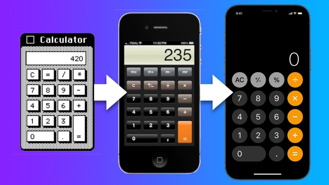
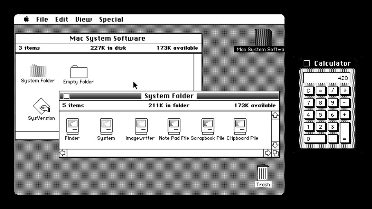
Apple's calculator has had a long history with skeuomorphism.
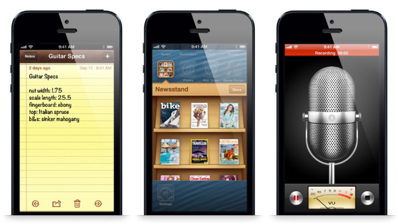
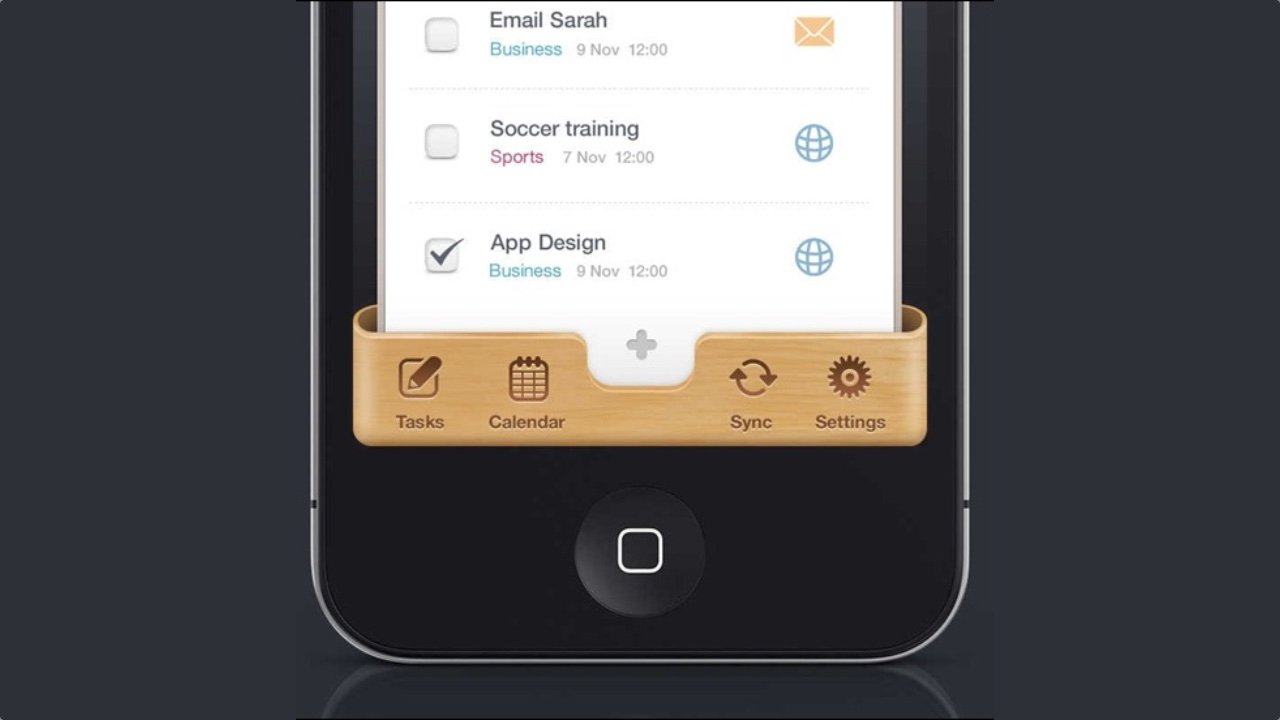
You might have heard the term "skeuomorphism" to describe Apple's iconic design style. About 10 years ago Apple's use of skeuomorphism was at its peak with iOS 6: the yellow, lined notepad paper in the Notes app, the bookshelf-like interface of the Newsstand app, the metallic look of the Voice Memos app microphone, and other life-like materials.
iOS 6 was the peak of Apple's realistic, skeuomorphic interfaces
At this time these and many other Apple-designed apps shared this style of design. As far back as the 1800s, "skeumorphism" has been used to describe a specific approach to design.
After doing it first with radio, television makers designed the sets with the same materials and look of furniture for decades. This helped consumers see the television fitting into a living room setting.
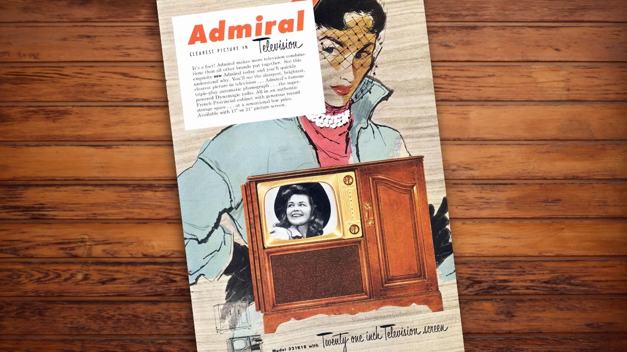
In the early days of TV, designing them to look like furniture was a skeuomorphism.
Another early example was the transition from horse-drawn carriages to cars. For people to understand the leap from one to the other the skeuomorphism began in the language used. It was better understood to refer to these 4-wheel contraptions as "horseless carriages".
Because of it, early cars were made to look like carriages. One designer even attached a dummy horse head to the car's front.
Jobs quickly saw the potential and Apple began building its own which would become the interface for the 1984 Macintosh.
The Macintosh showed clear and deliberate metaphors for the physical world. One of the fundamental metaphors still in use today is the desktop. A work area that can have files and objects laying on top of it-- the desktop was easily understood.
The trash can, folders, printers, and other icons were easily understood as well. The most basic skeuomorph was the button. The buttons on the Macintosh calculator appeared raised from the background suggesting the depth of a physical button.
The calculators' display was positioned above the buttons and contrasted with the background. The user instantly knew how to use it.
The 1984 Macintosh was one of the first graphical user interfaces.
This approach to graphical user interfaces caught hold across the entire computer industry. It continued to evolve as drop shadows, textures, and objects were given photo-like qualities so they might appear more like their real-world counterparts.
It wasn't just Apple skeuomorph-ifying everything. For years, designers everywhere had "copied Apple" and applied materials like leather and wood with embossed text on all kinds of interfaces. Designers didn't need a reason to use a metaphor as long as it looked cool.
The trend in 2012 was to use rich textures with embossed elements like this mockup from Matthias Mayr.
By 2014, this look was getting old for many users and even designers. That group included some people at Apple. Up to this point SVP of iOS, Scott Forstall had been Apple's chief skeuomorphism proponent next to the late Steve Jobs.
In 2012, Forstall was fired for a couple of major flops. Jony Ive and others took over the design of iOS who were not fans of continuing with skeuomorphism.
"When we sat down last November (to work on iOS 7), we understood that people had already become comfortable with touching glass, they didn't need physical buttons, they understood the benefits," Ive said to USA Today in 2013. "So there was an incredible liberty in not having to reference the physical world so literally. We were trying to create an environment that was less specific. It got design out of the way."
iOS 7 was born with its flat style and limited metaphors. Some textures were replaced with white while others with subtle punchy gradients. Buttons had backgrounds removed and given thin outlines. The icons were flat and lightweight. Depth was kept in some places with an occasional drop shadow.
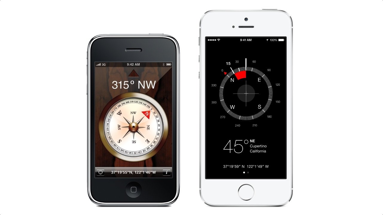
The compass app was one of the many drastic changes in UI from iOS 6 (left) to iOS 7 (right).
Some overlaying elements in iOS 7 such as the share sheet were given a translucent background depicting frosted glass. This particular choice showed the kinds of lessons Apple learned from their history with skeuomorphism.
A drop-shadow once was the obvious approach to mimic as literal as possible the real-world depth of objects. Now, designers began to find more elegant metaphors and use unrelated physical properties like frosted glass to convey the hierarchy between layers.
Whatever your preference was or is, Apple made the right call to evolve its approach to interface design. Once users understand a new design, skeuomorphism begins to lose its advantage.
By 2014, users were familiar enough with iPhone and smartphone interfaces that they didn't need to rely on so many metaphors for the physical world.
Luckily, we don't have to choose between skeuomorphism or flat design because they are not exclusive to each other. A design can be flat in appearance while also applying skeuomorphic attributes.
Since iOS 7 Apple's icons have appeared flat but many still have a metaphor for real-world objects. For example, the inbox list in Mail includes icons that look like the kind of physical inboxes you'd see sitting on a 1960s office desk.
Another example of how Apple continues to use skeuomorphism is the drawing tools in the Notes app. They are photo-realistic graphics of a pen, a highlighter, a marker, an eraser, and a ruler. Tapping on one activates that tool.
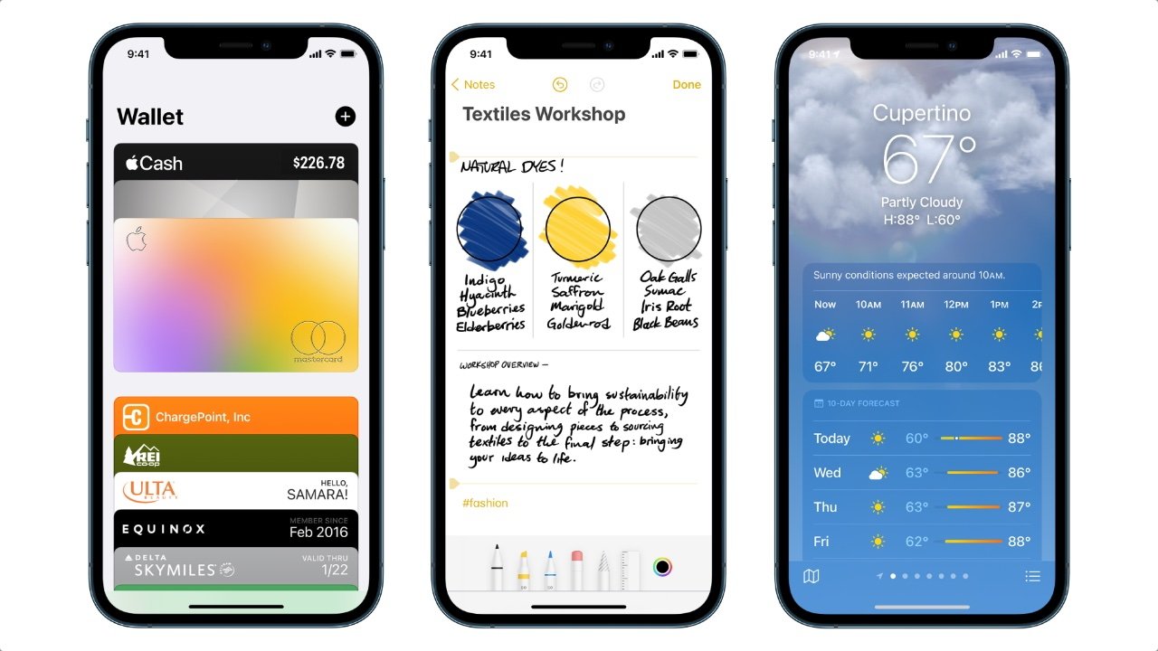
Apple has struck a balance in skeuomorphism in recent years. Wallet, Notes, and Weather apps are a few examples in iOS 15.
Real-world objects continue to get replaced with digital ones. Just as we saw the transition from horse-drawn carriages to horseless carriages, we are seeing a shift from human-driven cars to self-driving cars. Virtual reality is packed with real-world metaphors as that technology continues to evolve.
The principle of skeuomorphism is needed as much as it ever was. When the anticipated Apple car is released and the steering wheel is replaced with a digital one, what a throwback it would be if it was designed to look like black hand-stitched leather.
Read on AppleInsider
Apple's calculator has had a long history with skeuomorphism.
You might have heard the term "skeuomorphism" to describe Apple's iconic design style. About 10 years ago Apple's use of skeuomorphism was at its peak with iOS 6: the yellow, lined notepad paper in the Notes app, the bookshelf-like interface of the Newsstand app, the metallic look of the Voice Memos app microphone, and other life-like materials.
iOS 6 was the peak of Apple's realistic, skeuomorphic interfaces
At this time these and many other Apple-designed apps shared this style of design. As far back as the 1800s, "skeumorphism" has been used to describe a specific approach to design.
What is Skeuomorphism?
Skeuomorphism is used when a designer carries over elements from an original object into a new one. The purpose of retaining such elements can be purely aesthetic. Or it can provide the user familiarity and understanding of how the new object works -- assuming the user has previous experience with the original object.After doing it first with radio, television makers designed the sets with the same materials and look of furniture for decades. This helped consumers see the television fitting into a living room setting.
In the early days of TV, designing them to look like furniture was a skeuomorphism.
Another early example was the transition from horse-drawn carriages to cars. For people to understand the leap from one to the other the skeuomorphism began in the language used. It was better understood to refer to these 4-wheel contraptions as "horseless carriages".
Because of it, early cars were made to look like carriages. One designer even attached a dummy horse head to the car's front.
Graphical user interfaces mimic the real word
When the computer screen came along and we got to see what we were working on in real-time, the average consumer was not keen on the text-based interface or command line input. When Steve Jobs visited Xerox's R&D department in 1979, he was blown away by the basic graphical user-interface Xerox had been testing.Jobs quickly saw the potential and Apple began building its own which would become the interface for the 1984 Macintosh.
The Macintosh showed clear and deliberate metaphors for the physical world. One of the fundamental metaphors still in use today is the desktop. A work area that can have files and objects laying on top of it-- the desktop was easily understood.
The trash can, folders, printers, and other icons were easily understood as well. The most basic skeuomorph was the button. The buttons on the Macintosh calculator appeared raised from the background suggesting the depth of a physical button.
The calculators' display was positioned above the buttons and contrasted with the background. The user instantly knew how to use it.
The 1984 Macintosh was one of the first graphical user interfaces.
This approach to graphical user interfaces caught hold across the entire computer industry. It continued to evolve as drop shadows, textures, and objects were given photo-like qualities so they might appear more like their real-world counterparts.
iPhone design goes from photo-like to flat
In 2007, Apple launched iPhone. Naturally, iPhone's OS followed the skeuomorphic approach, but by this point, it probably was more of a design tradition than a tool to provide users with familiarity. By 2012, Apple had reached its skeuomorphism peak with iOS 6 and macOS Mountain Lion.It wasn't just Apple skeuomorph-ifying everything. For years, designers everywhere had "copied Apple" and applied materials like leather and wood with embossed text on all kinds of interfaces. Designers didn't need a reason to use a metaphor as long as it looked cool.
The trend in 2012 was to use rich textures with embossed elements like this mockup from Matthias Mayr.
By 2014, this look was getting old for many users and even designers. That group included some people at Apple. Up to this point SVP of iOS, Scott Forstall had been Apple's chief skeuomorphism proponent next to the late Steve Jobs.
In 2012, Forstall was fired for a couple of major flops. Jony Ive and others took over the design of iOS who were not fans of continuing with skeuomorphism.
"When we sat down last November (to work on iOS 7), we understood that people had already become comfortable with touching glass, they didn't need physical buttons, they understood the benefits," Ive said to USA Today in 2013. "So there was an incredible liberty in not having to reference the physical world so literally. We were trying to create an environment that was less specific. It got design out of the way."
iOS 7 was born with its flat style and limited metaphors. Some textures were replaced with white while others with subtle punchy gradients. Buttons had backgrounds removed and given thin outlines. The icons were flat and lightweight. Depth was kept in some places with an occasional drop shadow.
The compass app was one of the many drastic changes in UI from iOS 6 (left) to iOS 7 (right).
Some overlaying elements in iOS 7 such as the share sheet were given a translucent background depicting frosted glass. This particular choice showed the kinds of lessons Apple learned from their history with skeuomorphism.
A drop-shadow once was the obvious approach to mimic as literal as possible the real-world depth of objects. Now, designers began to find more elegant metaphors and use unrelated physical properties like frosted glass to convey the hierarchy between layers.
Skeuomorphism is often misunderstood
Apple's deliberate approach with skeuomorphism and sudden shift to flat design in iOS 7 gave many users whiplash. Many people felt like they had to pick a side as they wondered if maybe they missed the eye candy that was the microphone of the Voice Memos app, or the torn paper at the top of the macOS Mountain Lion's Calendar app, or Apple's photo-realistic app icons.Whatever your preference was or is, Apple made the right call to evolve its approach to interface design. Once users understand a new design, skeuomorphism begins to lose its advantage.
By 2014, users were familiar enough with iPhone and smartphone interfaces that they didn't need to rely on so many metaphors for the physical world.
Luckily, we don't have to choose between skeuomorphism or flat design because they are not exclusive to each other. A design can be flat in appearance while also applying skeuomorphic attributes.
Since iOS 7 Apple's icons have appeared flat but many still have a metaphor for real-world objects. For example, the inbox list in Mail includes icons that look like the kind of physical inboxes you'd see sitting on a 1960s office desk.
Another example of how Apple continues to use skeuomorphism is the drawing tools in the Notes app. They are photo-realistic graphics of a pen, a highlighter, a marker, an eraser, and a ruler. Tapping on one activates that tool.
Apple has struck a balance in skeuomorphism in recent years. Wallet, Notes, and Weather apps are a few examples in iOS 15.
Interfaces are ever-changing
Apple didn't invent skeuomorphism but it's hard to ignore the influence its exaggerated use of it had on the tech and design industries. Apple and many other companies continue to lead the way in how we interact with devices.Real-world objects continue to get replaced with digital ones. Just as we saw the transition from horse-drawn carriages to horseless carriages, we are seeing a shift from human-driven cars to self-driving cars. Virtual reality is packed with real-world metaphors as that technology continues to evolve.
The principle of skeuomorphism is needed as much as it ever was. When the anticipated Apple car is released and the steering wheel is replaced with a digital one, what a throwback it would be if it was designed to look like black hand-stitched leather.
Read on AppleInsider

Comments
Most Humans see in vivid color used it. However some males 8% are color blind and they might be fine with flat…..That might explain the horrible paint job in new housing developments after the first paint job wears off, 10-20 years later, and we all live near an example of that bad repaint.
Windows and Android took a flat (lazy) approach to UI design, Font design and WYSIWYG were also a part of Apple’s UI design philosophy which is still a iffy proposition in Windows and Android. And in addition Apple’s continued usage of 5k monitors also play a part in their design philosophy.
That said, I agree about the inconsistent mess with flat design on websites and many Android apps. A great big wild west of "designers" who mindlessly implement things the way they think works best without a thought about the function and purpose.
UI/UX design is a lot more difficult than people realize and is so much more than "look & feel." Everyone has their own particular likes and dislikes. My biggest bone of contention when it comes to UI/UX design is the ambiguity that some UIs present around the commitment (or application - i.e., the "apply" model) of controls on a form/card/dialog. In other words, when do the changes that you've entered actually take effect? Is it explicit where you have to specifically hit an "OK" or "Apply" button or is it implicit where the simple act of changing the focus away from a control or the form causes the change to take effect? Hmmm....
The fashionable trend in UI design over the past decade seems to lean more towards implicit commit. This often drives me crazy because you can end up with a partial or inconsistent commit, all due to the total confusion about when exactly the changes or entries you've made take effect. Nobody wants to be nagged by constant "Are you sure?" type of dialog, but being totally vague and mysterious about when your changes are committed is no better.
Apple's Calendar app is a serial offender in this department. When you create a new Calendar event and start filling in the various attributes of the event you get no feedback or assurance that what you've entered even makes sense or exactly how to tell the app "I'm done ... make sure I didn't enter anything stupid ... and save the event NOW to my calendar." Depending on where the selection is in the entry form, hitting the return key isn't even guaranteed to trigger a commit. If you're in a multiline text entry field when you hit the Return key it inserts a carriage return into the text field. Sometimes. Leaving the entry form by clicking outside of the form sometimes triggers the commit, but sometimes it just abandons the whole entry process.
Apple's UI designers obviously didn't want to enforce any kind of managed state machine or modality into the workflow. I don't know why. Rather than users learning how the process works and being prompted to complete the process correctly and verify their intent, it's a big loosey goosey convoluted mystery that sometimes works and sometimes doesn't. Barf.
Making the UI more pretty or subscribing to some new age UX enlightenment rained down from on high and blessed by Jony doesn't matter if the logic and consistency of the UI is confusing, unpredictable, or nondeterministic. I can forgive ugly, but I cannot forgive uncertainty or wasted effort trying to get the machine to do what I want it to do or bad UI induced failure.
Those pre-ios7 designs showed a lot of information on very small screens (all pre-iPhone 6).
Case in point is Calculator which is based on a specific physical model by a specific designer the Apple designers liked not actually the generic item.
Given extra space and push to look like the analogue thing.....
Why wasn't calculator based on mechanical calculator with a paper tape instead of a screen readout?
Windows Ribbons are another type of terrible UI design, the top down menu Mac UI just works better, Ribbons little icons at random in little windows everywhere just doesn’t work well. And when you combine it with flat UI it gets even worse.