Apple gives in on the End Call button position in latest iOS 17 beta

Posted:
in iOS edited August 2023

Apparently it's the very definition of a hot button topic -- the latest iOS 17 beta sees the iPhone's End Call moved back from its new position.

Apple has moved the End Call button back to the center, but keeps the rest of its call changes


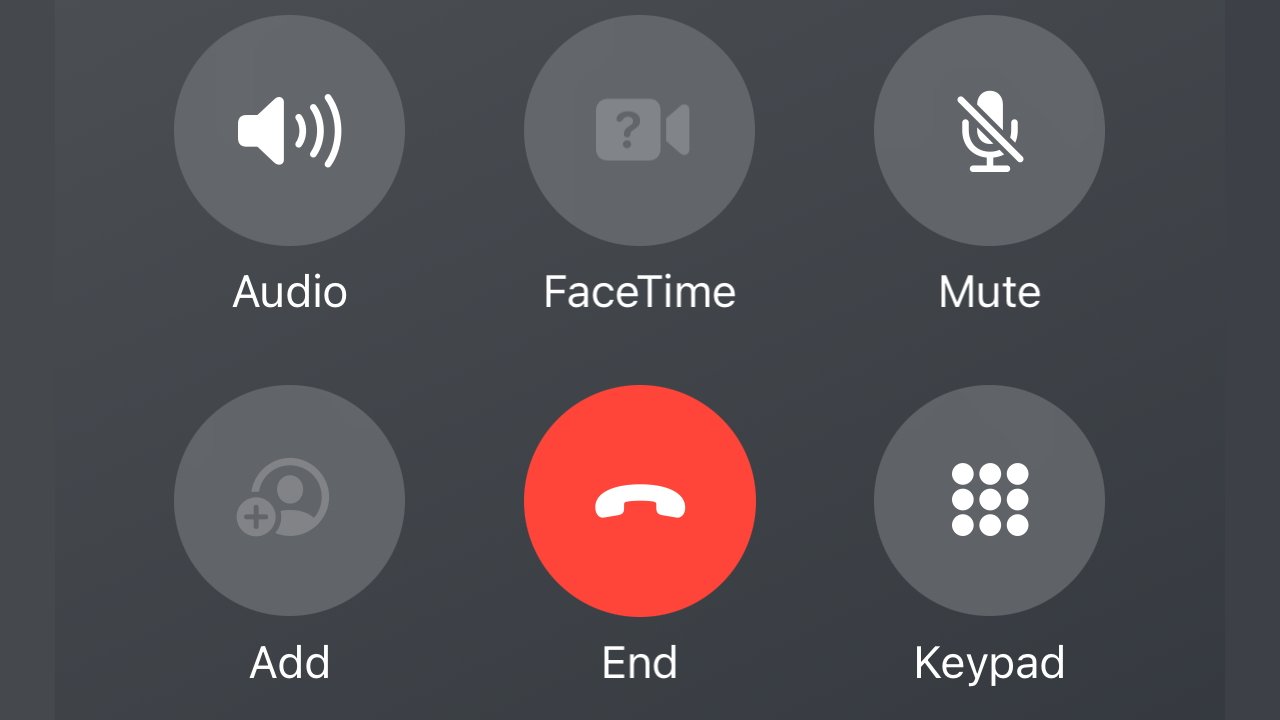
It took two months for anyone to notice, or at least for anyone who noticed to care, but iOS 17 moved the End Call button. Where it used to be centered at the bottom of the screen, and away from all other controls, it was moved to the right.

More, it was position as the bottom right button in a set of six controls. So it was a little less convenient to find, especially on a large iPhone screen, plus it was now conceivably easier to tap the wrong button.

Nobody mentioned it in June, nobody mentioned it in July, but come August, the moved End Call button was a calamity.

Now in the sixth and latest iOS 17 developer beta, the button has been moved back.

Or almost.

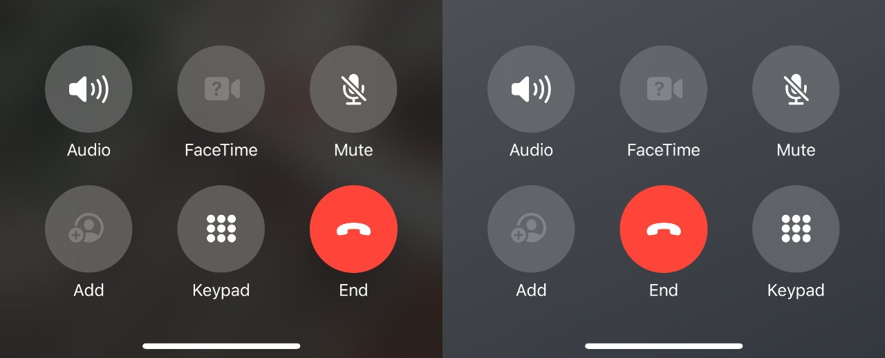
Spot the difference, and see if you care. Left: iOS 17's first betas. Right: the latest beta


It's again centered at the bottom of the screen, but all Apple has done is flip its position with another button in the group of six. It means the Keypad button is now bottom right instead of bottom center, but you don't see people complaining about that.

Yet.

The new position for the End Call button is likely to appear in a public beta shortly, before iOS 17 is officially launched in a few weeks.

Read on AppleInsider

Comments

  • Reply 1 of 12
    Why the heck did they move it? People have basically programmed motor responses by now. That is just bad UX. and lumping it in with a group of other functions? Very strange. 

    Love to hear the rationale. Hopefully none of this makes it to gold. 
    OferAlex1Nwatto_cobra
  • Reply 2 of 12
    That’s it I’m moving to android!
    right_said_fredwatto_cobra
  • Reply 3 of 12
    Yeah welp people at Apple need to justify their jobs and when you hit version 17 of a piece of software these are the kinds of things done to show progress.
    chadbagbyronlwilliamlondonAlex1Nwaveparticlewatto_cobra
  • Reply 4 of 12
    riverkoriverko Posts: 232member
    I didn’t care at all about the change. Simply the red button attracted my attention where to tap, not its position…
    MacProwonkothesanewilliamlondonAlex1NStrangeDaysroundaboutnowwatto_cobra
  • Reply 5 of 12
    Why the heck did they move it? People have basically programmed motor responses by now. That is just bad UX. and lumping it in with a group of other functions? Very strange. 

    Love to hear the rationale. Hopefully none of this makes it to gold. 
    This! the people at Apple must have no concept of muscle memory. SO MANY TIMES they have moved things around for no apparent reason other than to make it different. Highly frustrating for me.
    byronlOferright_said_fredwilliamlondonAlex1Nwatto_cobra
  • Reply 6 of 12
    Wow. People really need something to complain about.  I didn’t notice when it moved to the right and I didn’t notice today when it was back to center.  It’s a big red button and really hard to miss.  The only reason I know about it is this article. Relax people and find something better to complain about. Like the ever crashing Final Cut Pro for iPad ;)
    MacProwonkothesaneright_said_fredwilliamlondonAlex1NStrangeDayswatto_cobra
  • Reply 7 of 12
    chadbagchadbag Posts: 2,010member
    JamesCude said:
    Yeah welp people at Apple need to justify their jobs and when you hit version 17 of a piece of software these are the kinds of things done to show progress.
    Politicians, middle managers, long running software (developers).  Everyone needs to justify their existence.  I find it irritating that things are constantly changing for no real UX reason.   Sometimes I think it is that changes are not thought through.  

    MacOS (this may go back to OS9?) would not remove focus from an app automatically unless the system health required it.  Ie a system level issue that would damage the system or your data had happened and immediate attention was required.   Any other time a way was provided to notify the user of a change that needed attention.  Now any app can instigate system actions that grab focus.   Terrible experience.  I am typing in a window and all of a sudden so non essential service finished and grabs focus with some non essential dialog.  

    The red button, the thing I describe above , are all symptoms of the “make changes and don’t think them through and justify them” syndrome. 
    OferwilliamlondonAlex1NFileMakerFellerwatto_cobra
  • Reply 8 of 12
    UX over aesthetics, please...


    OferwilliamlondonAlex1Nwatto_cobra
  • Reply 9 of 12
    OferOfer Posts: 260unconfirmed, member
    chadbag said:
    JamesCude said:
    Yeah welp people at Apple need to justify their jobs and when you hit version 17 of a piece of software these are the kinds of things done to show progress.
    Politicians, middle managers, long running software (developers).  Everyone needs to justify their existence.  I find it irritating that things are constantly changing for no real UX reason.   Sometimes I think it is that changes are not thought through.  

    MacOS (this may go back to OS9?) would not remove focus from an app automatically unless the system health required it.  Ie a system level issue that would damage the system or your data had happened and immediate attention was required.   Any other time a way was provided to notify the user of a change that needed attention.  Now any app can instigate system actions that grab focus.   Terrible experience.  I am typing in a window and all of a sudden so non essential service finished and grabs focus with some non essential dialog.  

    The red button, the thing I describe above , are all symptoms of the “make changes and don’t think them through and justify them” syndrome. 
    Yup, agreed 100%! There’s no reason to move the end call button and it’s a bad UX move. Also agree on the issue of apps grabbing focus. The way it’s now handled is so counterproductive and disrupts my work on a regular basis.
    williamlondonAlex1Nwatto_cobra
  • Reply 10 of 12
    cpsrocpsro Posts: 3,212member
    I believe it's easier to tap in the center position, making accidental disconnects (disasters) more frequent.
    williamlondonAlex1Nwatto_cobra
  • Reply 11 of 12
    I honestly don't mind the end call button being in a corner of the screen. Really it just needs to be away from all the other buttons.  If going back to the iOS 16 design isn't possible bc of whatever they're trying to do aesthetically, then they're gonna have to be creative. Maybe put the lesser used call options under another button/menu however this adds an extra tap to do those tasks...
    williamlondonAlex1Nwatto_cobra
Sign In or Register to comment.