Hands on with the Apple TV app redesign in tvOS 17.2

The tvOS 17.2 beta included a redesigned Apple TV app emphasizing Channels and app navigation. Here's what changed.
Apple TV app redesign
The Apple TV hardware runs the Apple TV app, where the Apple TV+ service lives as a Channel. Until now, the Apple TV app was a mishmash of every piece of content available with minimal sorting options.
With tvOS 17.2, users get an all-new Apple TV app design. The primary Apple TV app experience remains mostly unchanged, but the top menu and navigation are much better thought out.
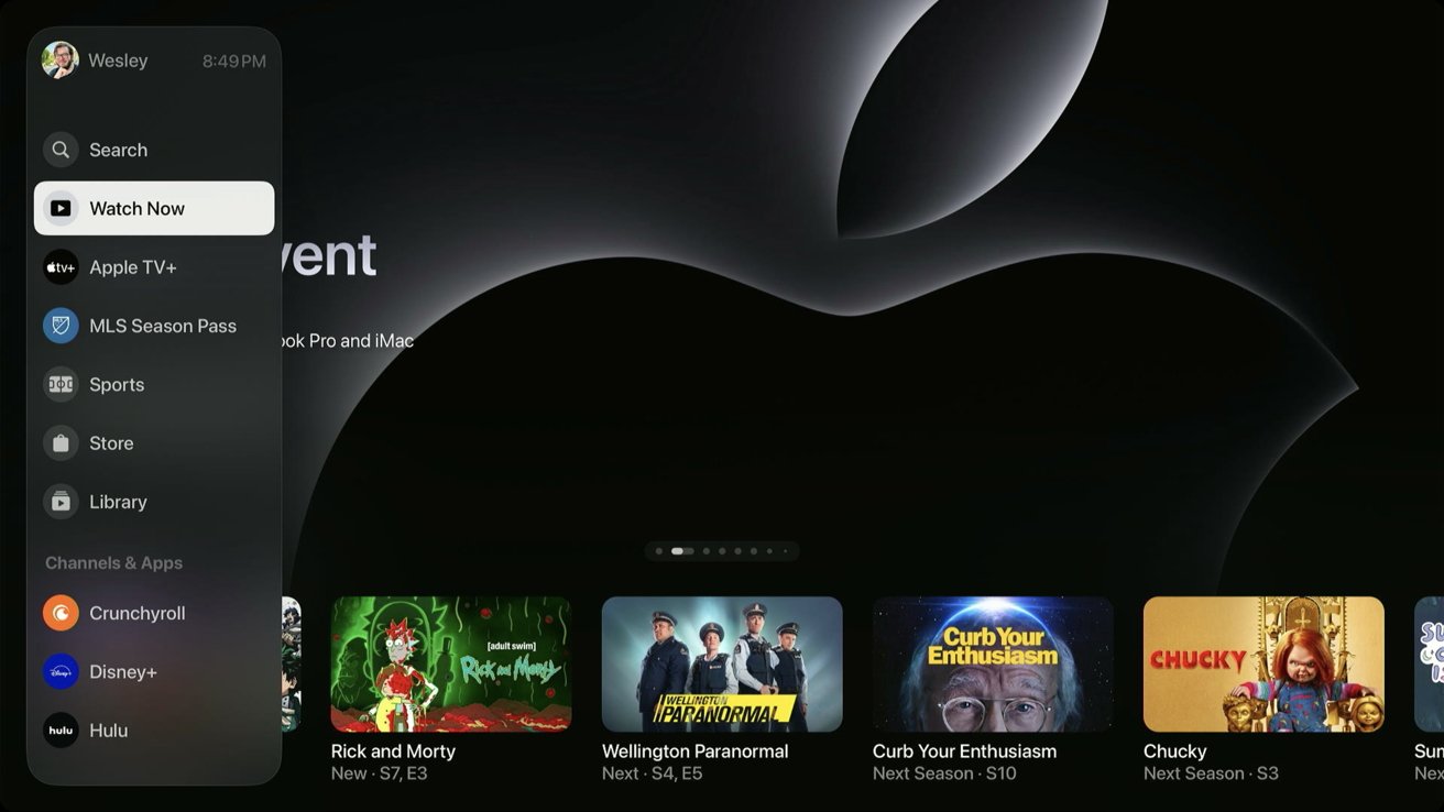
First, the top tab switcher has moved to a sidebar with many more options. The sidebar emphasizes available content sorted by Channels, but Apple TV, MLS, and iTunes content get the top spots.
And no, there isn't any way to remove the MLS Season Pass or Sports Channels. Apple will let you hide unwanted channels or apps but not any of its apps or services. (Coming to an antitrust case near you)
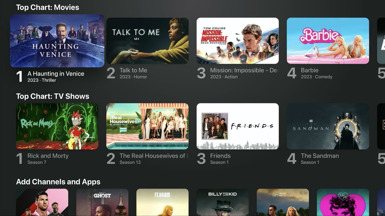
Watch Now is still a collection of any content enabled to populate the Apple TV app. The old circle icon Channels section is now "My TV" with square icons, which also merged with the apps section.
Select a Channel or app from My TV or the sidebar to jump to a dedicated page containing content just from that service. Channels have always had dedicated Up Next queues, but now so do apps.
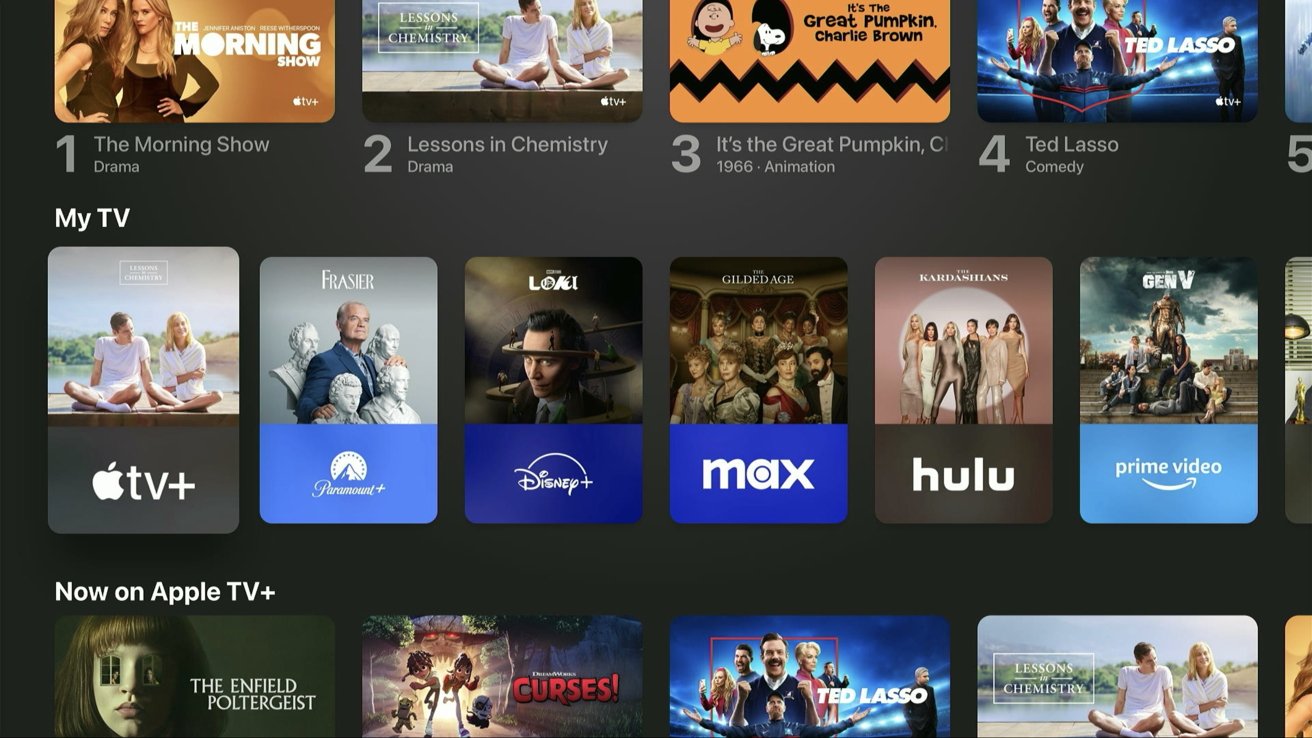
The new My TV section combines apps and Channels
There were so few premium Channels built into the Apple TV app that users likely never interacted with them outside of Paramount+. Now, apps like Disney+ and Max feel like they are part of the TV app in a way they never did before.
Netflix still isn't part of the Apple TV app or Up Next, and playing a video belonging to an app still launches the dedicated app to play it. However, the improved navigation of the sidebar and My TV sections makes everything much easier to navigate.
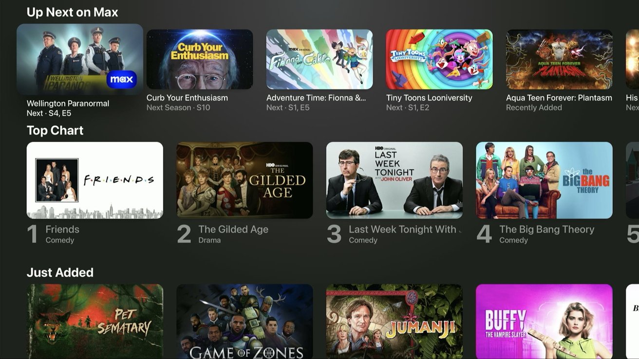
Max gets a dedicated Up Next section
As long as you're inside a dedicated Channel or app section, all the content presented is part of that service, with few exceptions. Apps like Amazon Prime will still fool you into believing a piece of content is available within the Amazon Prime app but then ask for a digital purchase.
The Library tab contains everything purchased from iTunes. The sorting between movies, TV, 4K titles, and genres is still available, but there's a new set of glyphs depicting each genre.
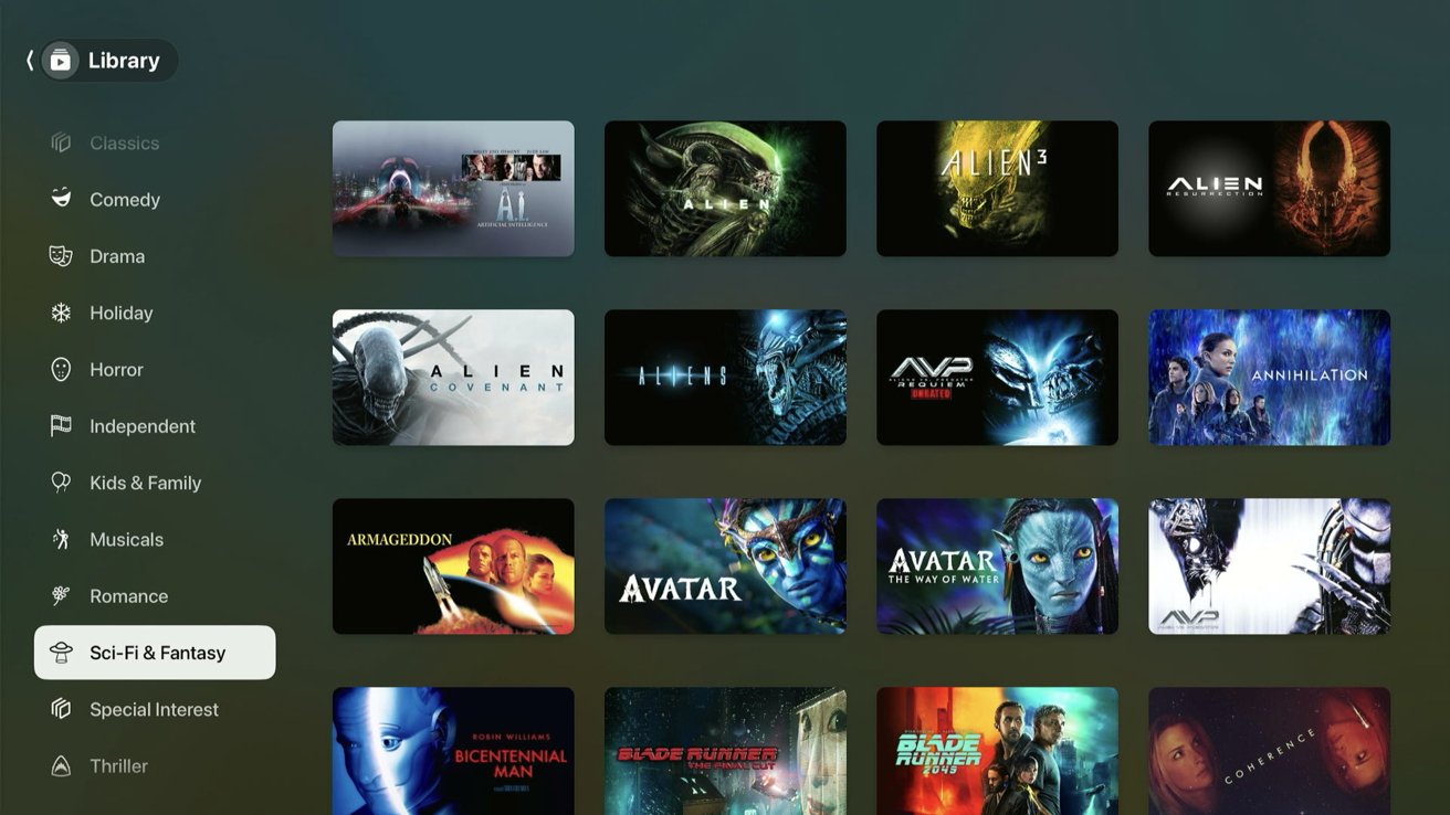
The Library tab gets new glyphs for the genres
The iTunes Store is still part of the Apple TV app but has combined the movie and TV sections. This streamlined experience is expected to replace the dedicated Movies and TV Shows apps on Apple TV, but they are still in tvOS 17.2.
The combined storefront still needs some work. It's mostly the movies view from before, but a few TV series options are intermixed.
iTunes combined movies and tv shows into one section
The updated Apple TV app interface might take some getting used to, but we expect it will be a big win for ease of use. It also acts as an excellent showcase for Apple to convince more apps to join Apple TV Channels so users don't need to launch a separate app.
While the Apple TV app isn't perfect, the latest redesign is a step in the right direction. We're not sure Apple will ever convince companies like Disney to join Channels, so this is the next best thing -- treating Channels and apps like equal services within the TV app.
Read on AppleInsider

Comments
So the list on the left is the individual services (except the first one which shows all), and selecting any of them will shows the shows that service offers without the need to open the Apps anymore. Consistent. Streamlined.
That is an annoyance in prime for example. It is good that purchases are still a seperate menu to ATV+, that is real bad in prime.
how would it look as an app on smart tvs I wonder? You would not have the other streaming services in the side bar I suppose.
I've got over 250 films and it a real hassle having to scroll through them all
Ultimately, the App is only as good as the Channels it shows. In the UK, it would have to offer BBC, ITV, Channel 4, NOW, SKY, etc as Chanels in the app, otherwise it is useless.
I’ve enjoyed the Apple TV app being a higher level indexing service since its inception. Whenever I get tired of digging through too many layers of menu hierarchy in what seems like an infinite loop I’ll summon Siri and sometimes that is the solution. But it’s too incomplete and comes down to how many streaming services are integrated with the TV app indexing and search capabilities. The more the better. Having the ability to globally search based on more general criteria like genre across all services would be great, as would the ability to specify additional search criteria, for example, “show me the Academy Award nominated movies from 2019,” or “show me all of the bass fishing videos from the past 30 years” would be awesome.
Anything that can minimize the amount of time I spend scrolling and navigating around an Apple TV with an Apple TV remote (of any generation) is a big quality of life improvement. Siri definitely helps, but it could be much better if more streaming services played along better with Apple’s services.
Back in the days of DVDs, the big-box stores loved to just dump a mishmash of everything into large bins, leaving the customer to literally dig around to find anything. Presumably this was a behavioral psychology trick to cause customers to linger and ultimately buy a bunch of crap they weren't looking for when they walked in the store. That works on some, but for others of us, that gets a f--- this noise and a lost customer. The Amazon video app is pretty much the digital version of that, especially as they've reduced the included-with-prime content and mixed it in with advertising-supported content.
The promise of the AppleTV app should be to filter and organize all those things, so it's not just a big-box DVD bin, something that is, in my mind at least, the antithesis of Apple's ethos. It's fine if browsing-for-whatever is one option, but if I'm looking for a particular type of content, I'd like to have that organized option right up front as well.
Watching movie trailers on Apple TV has always been such a pleasant experience. Tons of trailers for lots of different types of movies, all available to watch at your leisure on a big screen at home (or elsewhere).
Last week, I opened up the Trailers app on Apple TV, and I learned that the trailers had been integrated into the Apple TV+ app. I click the link, and I'm brought to a very discouraging place: There are a total of five trailers to watch but a ton off movies to pre-order. I supposed one can watch previews for movies for pre-order, but I hate this approach:
- As someone more interested in small-production films than in the big blockbusters, my inclination is to think that movies for pre-order aren't going to include movies I'd have seen trailers for otherwise;
- The intent with the change seems to be that you can watch trailers if you like, but the emphasis is on purchasing the movies.
It just completely turned me off and had me being very wistful for an Apple that just doesn't exist anymore.Apple in particular has an awful record in this regard. The original remote was as bad as their original iMac “puck” mouse. It’s finally been improved, but is still difficult to use. Navigating on screen without a cursor requires some other cue to make it clear just where you are. Currently the rounded rectangle icon you select doesn’t respond obviously enough to draw your eyes to it. It gets subtly larger—that’s supposed to get your attention. It needs more. Maybe a highlight around it or a jiggle. And then something nearly al such UI’s fail at is prioritizing shows according to your viewing habits. Shows that you watch regularly should appear up top next time you open the app, not go back to being buried in their categories! A “Continue Watching” feature should be square one.
My only issue are the designs of the individual apps (Netflix (buggy), Prime (ugly and clunky) whereas Hulu, Max and the AppleTV app itself are just fine.
But it certainly isn’t perfect. The hardware and software choices Apple makes (or doesn’t make) I think make the product less stellar than it could be.