What's new in iOS 26 beta 3: Wallpaper color options, stronger blur effects, and more

The third developer betas of iOS 26 and iPadOS 26 have arrived right on time, and sport a way to find the cursor on the iPad, an all-new set of wallpaper color options, along with a few visual tweaks and enhancements. Here's what's new.
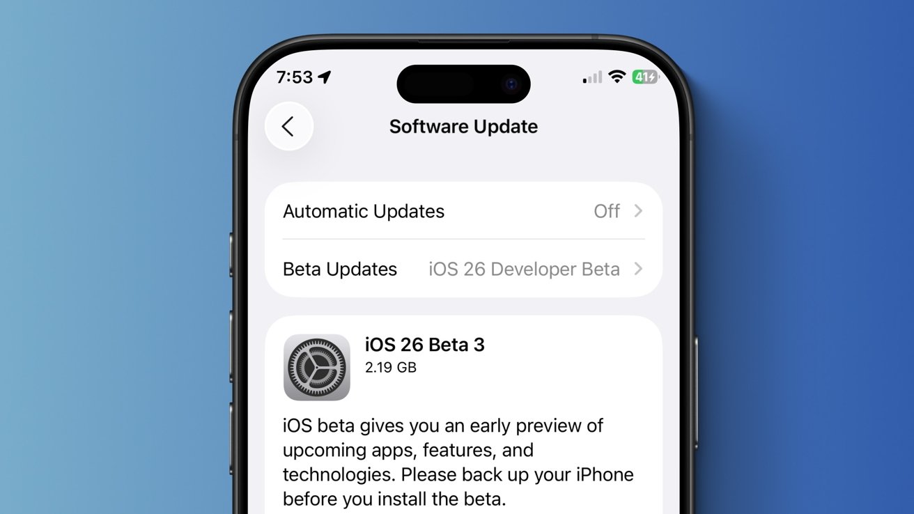
Apple has released the third developer beta of iOS 26.
On Monday, two weeks after the debut of the second developer beta, Apple released iOS 26 developer beta 3. The update increases the build number to 23A5287g, up from the previous 23A5276f.
While the preceding iOS 18 update focused largely on Apple Intelligence features, iOS 26 launched with Apple's "Liquid Glass" design language, which is used across all of the company's platforms. The software features dynamic user interface elements that mimic the look of real-world glass, replacing the flat aesthetic used from iOS 7 through iOS 18.
There's also a dedicated Games app, along with improvements to Image Playground, Shortcuts, and new features for the Messages and Phone apps. Additionally, Apple released a Foundation Models framework that enables developers to utilize Apple Intelligence tools in third-party apps, while Visual Intelligence now supports screenshots.
As a whole, the iOS 26 update contains a variety of changes. Some of the new features are ideal for creative work on iPhone, while others are arguably better for business users. iOS 26 developer beta 3 builds upon the design choices introduced with the second developer beta, primarily through tweaks that affect the Liquid Glass material.

New color options for the default wallpaper
iOS 26 introduced a distinct default wallpaper, with turquoise and lapis-colored circles that react to device movement. The third developer beta of iOS 26 brings three new color options for the stock wallpaper.
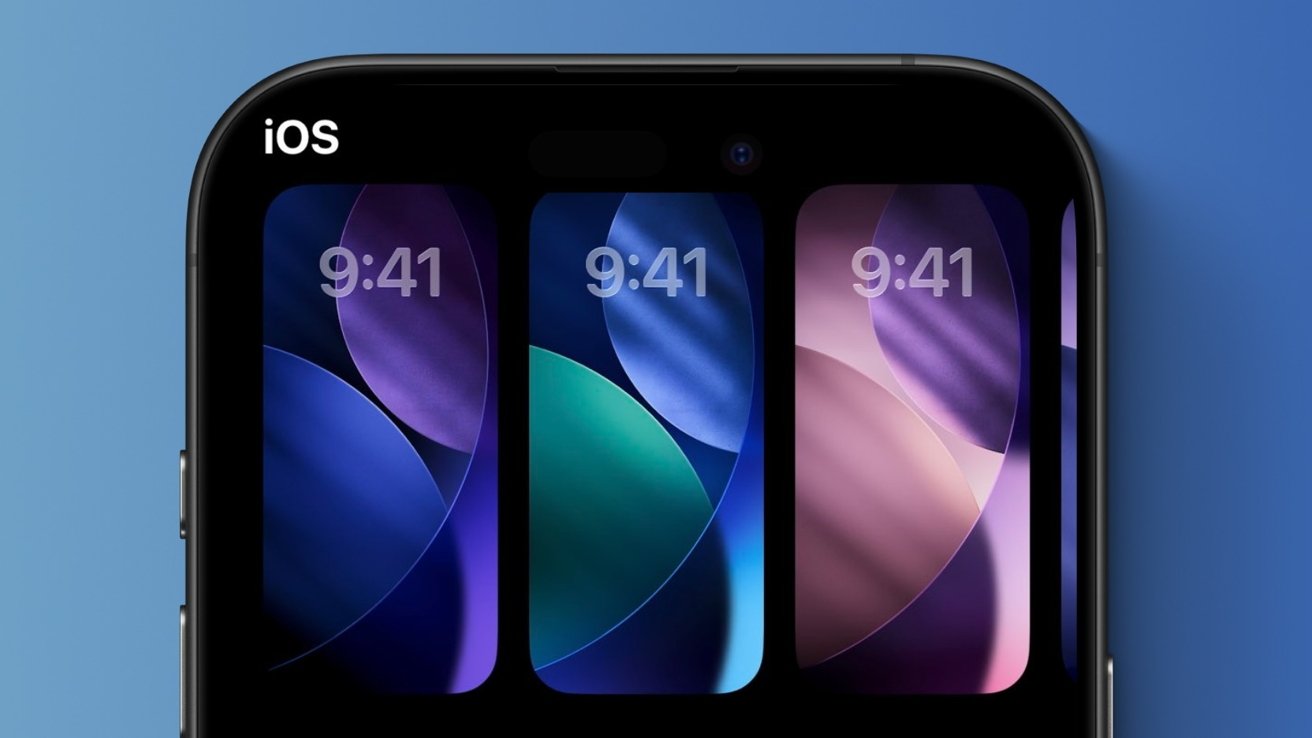
iOS 26 adds three new color options for the default iPhone wallpaper.
In total, iOS 26 now has four color options for the default wallpaper:
- Dusk
- Halo
- Shadow
- Sky
The most exciting of these is the Dusk color option, which, as its name implies, uses pink and purple for the Liquid Glass elements, rather than varying shades of blue, as is the case with Shadow and Halo. The wallpaper color variant that shipped with the first developer beta of iOS 26 is now known as Sky. macOS Tahoe also received a new screensaver and wallpaper with its third developer beta.
iOS 26 developer beta 2 noticeably toned down the transparency of the UI elements that use Apple's Liquid Glass material, while the third developer beta takes this even further. Many aspects of the operating system, such as the Control Center and the Tab Bar in certain apps, now have a more frosted look, echoing Apple's earlier operating system releases.
The third developer beta of iOS 26 also introduces a minor fix for the Home Screen. Specifically, beta 3 fixes the icon alignment in the Dock and makes it so that icons are once again centered, even when there are fewer than four of them. The Photos and Files app icons also received slight alterations.
As for iPadOS 26 developer beta 3, there's now an effect that makes the mouse cursor easier to locate. Shaking the cursor rapidly now makes it increase, as has been the case on macOS for years.
Overall, the third developer beta of iOS 26 is relatively light in terms of meaningful enhancements. While it does deliver new wallpaper color options and a couple of user interface tweaks, it doesn't contain any new features. Apple deploys new developer betas of iOS nearly every week or two, meaning that we'll likely see additional features and changes with subsequent software releases.
Read on AppleInsider
Comments