How to use the new Stacks feature in macOS Mojave

Apple is set to introduce a slew of new features to Mac when its next-generation macOS Mojave operating system sees release later this year. One of our favorite user interface tweaks is Stacks, a brand new way to organize files on your desktop.

An average user's desktop might be cluttered with files and folders collected the years and arranged in no particular order. Apple has set about to remedy this organizational nightmare with Stacks, a new Mac feature that automates file and folder collation in macOS 10.14 Mojave.
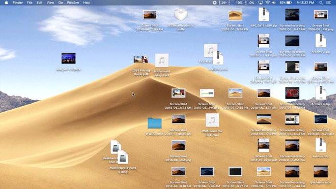
Clicking on Stacks in the View menu option instantly arranges a user's files into separate stacks. By default, the contents of each stack is organized by type, for example PDF Documents, Music, Movies and Screenshots. Everything else, including disk image and zip files, goes into a stack named Other. Folders, on the other hand, are kept separate and automatically sorted below created stacks.
When a new file is introduced onto the desktop, it is automatically tossed into the corresponding stack, unless it's the only one of its kind. For example, we added a JPG image and it went below the stacks because there were no other pictures on our desktop. If we add another one, a new Images stack is created and both image files go inside of it.
This works the same way for pretty much all file types, except for folders. Clicking on a stack expands it to reveal the files inside, which are directly accessible from the desktop. When you find the file you're looking for, you can easily drag and drop it anywhere in the OS, like an email message.
All of the stacks and folders that sit below an actively open stack are moved to separate columns so they don't get mixed up. You can even open all stacks at the same time.
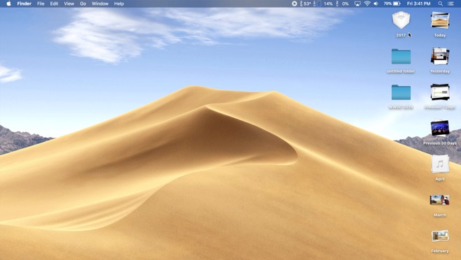
Right clicking on the desktop brings up options for arranging Stacks groupings. For example, selecting Date Created arranges stacks by top, with the most recent files sitting in the top-most stack. Grouping by Date Last Opened is also useful for easily accessing all of the files a user recently worked on. Stacks can also be configured by macOS tags.
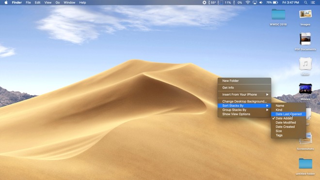
Mojave lets users apply additional filters to each stack. So if we sort a stack by date last opened, the most recently opened file will show up at the top of the list.
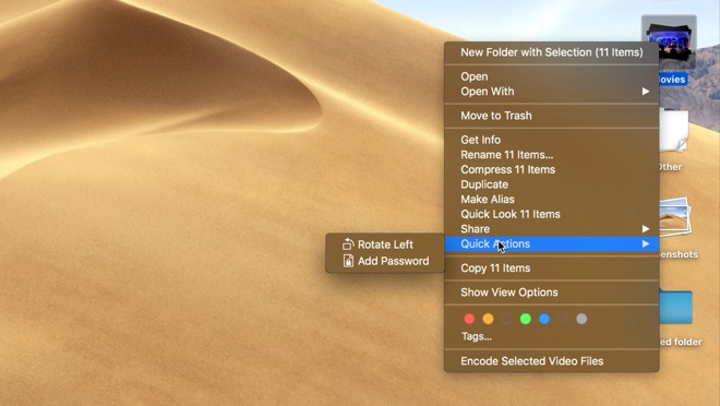
Right click on a stack to access to a list of actions, including new folder creation, sharing, copying or performing a set of Mojave's new Quick Actions.

An average user's desktop might be cluttered with files and folders collected the years and arranged in no particular order. Apple has set about to remedy this organizational nightmare with Stacks, a new Mac feature that automates file and folder collation in macOS 10.14 Mojave.
Clicking on Stacks in the View menu option instantly arranges a user's files into separate stacks. By default, the contents of each stack is organized by type, for example PDF Documents, Music, Movies and Screenshots. Everything else, including disk image and zip files, goes into a stack named Other. Folders, on the other hand, are kept separate and automatically sorted below created stacks.
When a new file is introduced onto the desktop, it is automatically tossed into the corresponding stack, unless it's the only one of its kind. For example, we added a JPG image and it went below the stacks because there were no other pictures on our desktop. If we add another one, a new Images stack is created and both image files go inside of it.
This works the same way for pretty much all file types, except for folders. Clicking on a stack expands it to reveal the files inside, which are directly accessible from the desktop. When you find the file you're looking for, you can easily drag and drop it anywhere in the OS, like an email message.
All of the stacks and folders that sit below an actively open stack are moved to separate columns so they don't get mixed up. You can even open all stacks at the same time.
Right clicking on the desktop brings up options for arranging Stacks groupings. For example, selecting Date Created arranges stacks by top, with the most recent files sitting in the top-most stack. Grouping by Date Last Opened is also useful for easily accessing all of the files a user recently worked on. Stacks can also be configured by macOS tags.
Mojave lets users apply additional filters to each stack. So if we sort a stack by date last opened, the most recently opened file will show up at the top of the list.
Right click on a stack to access to a list of actions, including new folder creation, sharing, copying or performing a set of Mojave's new Quick Actions.
Comments
I don't happen to be a desktop file hoarder but I do see the value in auto-organizing files using contextual clues and/or facets. Great idea. My perception though is that the Desktop metaphor is associated with a single, typically local machine while the greater potential for disorganization is with files stored in iCloud where they can be accessed from multiple desktops from a larger and more heterogeneous collection of devices. Yeah yeah, I know that you can mirror your Mac's Desktop folder to iCloud but that has always seemed like a clash of metaphors.
In summary, Stacks looks like a good feature for desktop file hoarders (who should clean up their Desktop anyway ;-) ) but it would be much more useful for addressing content management for iCloud and shared storage systems where the size, scope, and negative productivity impact of disorganization and disarray are potentially much worse. Having the scope of this feature bound to one machine's Desktop is okay for now but ultimately way too limited.
Stacks are a great idea. People often keep “working” files on the desktop, but forget to archive them. By changing the Stack by Date it would make them easy to organize and archive.
It’s nice to see Apple focusing on productivity and simplicity, rather than the feature boat of Windows. I’m a Windows user and dislike Windows 10... it’s a mess.
Well done Apple.
2) I don't think it acts like "just another folder." If you go into Finder under Desktop you won't see your stacked items listed as being in a folder, but each item listed individually. I think it acts more like each file literally stacked over each other, which I'd guess is taking up space in RAM like before, along with the stack data. Again, nothing to be alarmed about in 2018 in terms of memory usage.
Regarding this feature in general, I think people put files on their desktop because its instantly accessible, in two ways. The first way is that because it's on the desktop you don't have to drill down through folders. The second way is that it stays where you leave it so you can use muscle memory to remember that your expenses spreadsheet is always in the top right, your notes document is always in the bottom left, all your TODOs are roughly in the middle...
That is why I'm not sure this stacks feature will be generally popular, because while it looks very slick it sacrifices instant, muscle memory accessibility for the sake of tidiness, which is generally a bad trade. Unless you're someone who really, really values tidiness and is willing to hunt and peck each time in order to have that, in which case those people yes they will like it.
For me, (going clockwise) the upper-left is Dashboard (as an overlay), the lower-right is show Desktop, and the lower-left is Mission Control (which replaced Show All Windows), and the upper-right is the screensaver (which locks my Macs).
edit: It's probably easier to show in a screenshot:
By the way you were right about macOS staying a separate thing, Craig was clear on that. I thought they would add window/mouse support to iOS. So good call on your part.
2) While I can't see macOS and iOS merging (only getting more unified underpinnings for easier development), I can see a future where iOS will be usable with a trackpad/mouse in a limited fashion. While there's no reason to ever make it a Windowed OS there are plenty of areas, like text fields, where having something like an iPad Pro on a stand, connected to a keyboard and mouse could be useful, but I wouldn't expect to see any Right/Option clicking for contextual menus to appear unless it mirrors what we already see with iOS long-pressing on text and I'd expect to appear in the exact same way, not as a list like we see with macOS.
I'm also giving up on my wish for a "poison finger" trigger with Touch ID that would cause your device to not just lock, but require the full login password if ever invoked.
I think iOS 11 has got a duress code so don't give up, Mac might get it too!
Speaking of macOS desires (and this is a very minor request), I would love for the WiFi dropdown to not sure every SSID that exists in any area when you click on it. I'd like for it to only show the ones that you've previously connected to with the row at the bottom of that list with something like "Other WiFi Networks…" The list is just so long these days and SSIDs I've previously connected to aren't auto-displayed at the top but are often buried in a very long list.
PS: I tested out connecting to a previously unknown WiFi network via watchOS 5 today. Straightforward. Putting in the password was easy enough even with having to draw each letter for the password.
I have yet to test this with a protected WiFi network with a splash screen, but I'm hoping the inclusion of WebKit in watchOS 5 means this is possible. That said, I remember how slow companies were to respond with supporting WebKit and the 3.5" display of the highly popular iPhone which usually made authenticating at a hotel with your iPhone a chore and on rare occasions impossible. I'm assuming it'll be even worse for the Apple Watch in this regard.
I'd also like to see both VPN apps supported with the Apple Watch and the ability to tether to, say, a MBP if you have an Apple Watch with cellular, but these are probably a long time coming as I've seen no one else recommend those features but me.