Samsung's designers copying Apple again in Samsung Pass icons

Posted:
in General Discussion edited August 2020
Glance at that Face ID icon as your phone unlocks, and see if you can spot a similarity to what Samsung has revealed as the symbol for its new Samsung Pass.

Second icon from the left and straight on to the lawyers. (Photo: iMore)


Typically, when Samsung announces something new, there is at least a temptation to look up your iPhone to see whether Apple has done it before. This time, though, you just have to look at your iPhone.

While HS Kim, president and CEO of Consumer Electronics Division, Samsung Electronics, stood on stage and announced something or other about security, the audience in the room tried to peer around him. (Photo by iMore.)

It's Kim's speech writers you have to feel for. If anyone actually listened to him describe the new Samsung Pass, it was through politeness because they truly didn't need to. The writing was on the wall.

And that writing said Apple's Face ID. If you're a lawyer with a pixel-accurate ruler, you might disagree, but to anyone else in the world, Samsung has just taken Apple's icon.

To be fair, icons are meant to convey information quickly and you did instantly recognize everything Samsung Pass has to offer. You can't hurry icon design that's this rich and communicative.

All you can hope to do is copy a familiar idea and slap an extremely well-known icon on top of it.

And when we say well known, we don't just mean from this latest use by Apple. While that face with the cut-off rounded rectangle corners representing a target, is Face ID, the face itself goes back further.

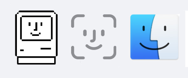
L-R: the original Mac, Face ID, and the Finder today


Face ID was announced by Apple in 2017, but the face in the center of that icon was created 20 years earlier. It's a version of the same two-face smiling Mac icon that Susan Kare drew for System 8 in 1997.

And that's pretty much a version of the one she drew for the original Mac in 1984.

There is an argument -- Samsung lawyers take note -- for when icons pass into general use. The familiar smiley face, for instance, was created by Harvey Ross Bell and you've not once paid him a cent for using it.

Or there are icons that are created in the hope that they will be copied so much that they become universal. Apple uses at least one of these that you'll recognize -- the Power/Standby icon. It's from a set created by the ISO.

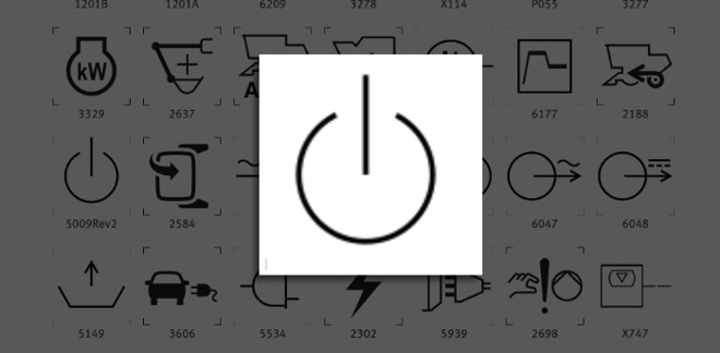
The familiar power/standby icon that Apple uses is actually one of a set by the ISO


Unfortunately for Samsung, Apple didn't elect to make its Face ID icon freely available. And -- Apple lawyers take note -- the company did remember to trademark it, too.
«13

Comments

  • Reply 1 of 44
    SoliSoli Posts: 10,035member
    While I think it's very likely that Samsung stole this icon from Apple as it seems to be in their nature, to me that icon also seems very obvious.
    watto_cobra
  • Reply 2 of 44
    netroxnetrox Posts: 1,422member
    Apple's Face ID icon is NOT obvious... no one would create that design except Apple. And anyone can easily design a different icon to represent facial recognition that does not resemble FaceID.
    cornchipbageljoeyStrangeDays13485magman1979netmageEsquireCatsanantksundaramredgeminipawatto_cobra
  • Reply 3 of 44
    hydrogenhydrogen Posts: 314member
    You have to see the positive side of this : Samsung users will have no problem to switch to Apple !
    GG1cornchipRayz2016magman1979netmageanantksundaramMissNomerredgeminipawatto_cobrajony0
  • Reply 4 of 44
    zimmiezimmie Posts: 651member
    Soli said:
    While I think it's very likely that Samsung stole this icon from Apple as it seems to be in their nature, to me that icon also seems very obvious.
    Obvious to a certain extent, perhaps. Same line weight, same corner radius, same spacing between the corners, same J nose, though? That's a bit much.

    They could have included hair.
    Or given their icon glasses.
    Or shown a whole head, not just a floating face.
    Or omitted the frame.
    Or even changed the nose to point the other direction!

    But they didn't.
    netroxcornchipentropysStrangeDaysmagman1979netmageradarthekatanantksundaramCarnageMissNomer
  • Reply 5 of 44
    Shamesung strikes again! What a pack of weasels. Zero honor.
    StrangeDaysmagman1979radarthekatolsMissNomerwatto_cobrajony0
  • Reply 6 of 44
    dewmedewme Posts: 5,372member
    Soli said:
    While I think it's very likely that Samsung stole this icon from Apple as it seems to be in their nature, to me that icon also seems very obvious.
    Copying is kind of sad but it is also one of the fundamental human behaviors that allows societies to advance and technical progress to move forward in a stepwise fashion. Once something is copied it can become a standard or archetype that establishes a distinct step along a path of progress for a given thing or technology. You could call copying a normalizing pattern that companies that desire to be good-enough can shoot for with their diminished expectations and desire to avoid the extra effort required to truly excel. Thankfully we have companies like Apple who aspire to higher goals and who are not content to just be good-enough, but rather, aspire to be better. So rack up another "participation trophy" for the fine folks at Samsung who are excelling at just showing up and occupying the one or two steps below Apple. To be a leader you need followers and Samsung is obviously content to play the follower role. Cue the golf clap.
    cornchipwatto_cobra
  • Reply 7 of 44
    AppleishAppleish Posts: 691member
    God does Samsung suck. We've been shopping for a house recently. The latests once we looked at was chock full of Samsung appliances. We've noticed that houses that are kinda crummy favor that brand. My guess is that builders/renovators get really good prices on their crap.
    cornchipmagman1979redgeminipawatto_cobra
  • Reply 8 of 44
    The law states that design elements be substantially different as to not cause mistaken association between them. Since it's an EXACT copy (rip-off), it is indisputably theft of intellectual property.
    StrangeDaysmagman1979radarthekatolsredgeminipawatto_cobra
  • Reply 9 of 44
    Rayz2016Rayz2016 Posts: 6,957member
    Soli said:
    While I think it's very likely that Samsung stole this icon from Apple as it seems to be in their nature, to me that icon also seems very obvious.
    Have to disagree.  This is pure theft. They could’ve added any number of variations to differentiate it. They chose not to. I’m starting to think that Samsung does this sort of thing to generate interest in their crappy products. 
    pscooter63entropysStrangeDayswonkothesanemagman1979netmageradarthekatolsgilly33watto_cobra
  • Reply 10 of 44
    bageljoeybageljoey Posts: 2,004member
    Soli said:
    While I think it's very likely that Samsung stole this icon from Apple as it seems to be in their nature, to me that icon also seems very obvious.
    I’m going to disagree. I think if you asked 100 designers to design a “simple face icon” I imagine you would get dozens of different designs. The corner outline + hook nose + vertical eyes is VERY distinctive and not at all obvious IMO. 
    StrangeDaysnetroxmagman1979netmagegilly33redgeminipawatto_cobrajony0
  • Reply 11 of 44
    StrangeDaysStrangeDays Posts: 12,881member
    Soli said:
    While I think it's very likely that Samsung stole this icon from Apple as it seems to be in their nature, to me that icon also seems very obvious.
    It’s obvious to use Susan Kare’s “happy mac” face, designed exclusively for the Macintosh? There are a million ways to draw a face, and that one was uniquely hers (Apple’s). 

    There’s nothing “likely” about it, they absolutely store the icon. No part of their icon is original or happenstance, somebody at Samsung chose to use the Apple one, and nobody successfully challenged them on it. 
    edited January 2020 wonkothesanemagman1979netmagelordjohnwhorfinpscooter63radarthekatgilly33watto_cobraitsmatthew.ca
  • Reply 12 of 44
    anonymouseanonymouse Posts: 6,860member
    Soli said:
    While I think it's very likely that Samsung stole this icon from Apple as it seems to be in their nature, to me that icon also seems very obvious.
    You're apparently confusing patent and trademark law, and perhaps the meaning of 'obvious'.
    wonkothesanenetmagepscooter63radarthekatRayz2016watto_cobra
  • Reply 13 of 44
    Seems like Samsung's "Touch ID" looks very similar to Apple's as well
    wonkothesanenetmagemagman1979StrangeDaysanantksundaramwatto_cobra
  • Reply 14 of 44
    fastasleepfastasleep Posts: 6,420member

    Typically, when Samsung announces something new, there is at least a temptation to look up your iPhone to see whether Apple has done it before. This time, though, you just have to look at your iPhone. 
    What. 
    edited January 2020 pscooter63latrelljenningswatto_cobra
  • Reply 15 of 44
    I’m not a design expert. Having said that the two stolen designs for FaceID and TouchID look significantly more “clean” and appealing than their own attempts at icons. They don’t even appear to me to speak a common design language. To revive good old Fawlty: “bloody amateurs.”
    netmagemagman1979lordjohnwhorfinpscooter63radarthekatapres587watto_cobra
  • Reply 16 of 44
    Appleish said:
    God does Samsung suck. We've been shopping for a house recently. The latests once we looked at was chock full of Samsung appliances. We've noticed that houses that are kinda crummy favor that brand. My guess is that builders/renovators get really good prices on their crap.
    What's wrong with exploding washing machines?
    StrangeDaysGG1watto_cobraitsmatthew.ca
  • Reply 17 of 44
    hexclockhexclock Posts: 1,256member
    The second from the right looks quite similar to AOL’s running man icon too. 
    llamawatto_cobra
  • Reply 18 of 44
    hexclock said:
    The second from the right looks quite similar to AOL’s running man icon too. 
    Looks like the icon is about to go full-bore Skanker Man:

    edited January 2020 hexclockwatto_cobra
  • Reply 19 of 44
    kevin keekevin kee Posts: 1,289member
    Soli said:
    While I think it's very likely that Samsung stole this icon from Apple as it seems to be in their nature, to me that icon also seems very obvious.
    Apple Face icon is too iconic and distinctive to be obvious. This is a deliberate copy, with an emphasize in 'deliberate'.
    StrangeDayswatto_cobra
  • Reply 20 of 44
    jungmarkjungmark Posts: 6,926member
    Why does "convergence of design" always leads to Apple designs? Samscum strikes again. 
    StrangeDaysgilly33pscooter63watto_cobra
Sign In or Register to comment.