Apple already included workaround for MacBook Pro notch
Even before some vocal users complained about the notch in the new 14-inch MacBook Pro and revised 16-inch MacBook Pro, Apple built in a workaround for them.

Apple has included a workaround for the notch, though it isn't available in all apps
The camera notch on the new MacBook Pro does not eat into the display as the one on the iPhone does. Instead, the display is raised up around it, so there is additional room, yet it's still not universally popular -- and Apple knew it wouldn't be.
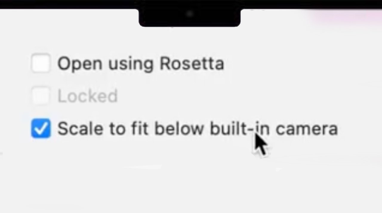
That lack of popularity isn't helped by how developers still need to accommodate the notch, and how it can cause issues with menu bar items being obscured by it. However, Apple has included an optional setting called "Scale to fit below built-in camera."
If selected, macOS shrinks the app down so that the menu bar is now below where the notch is. It's really reverting to how the app would have been displayed on previous MacBook Pro models, and that means it also shrinks in from the sides.
So as well as avoiding the notch, the workaround brings back thicker bezels. It's clearly not intended as anything but a sop to prevent complaints, although Apple has not publicized it.
The "Scale to Fit" workaround was first revealed in a new Apple support document. It adds that selecting this option for an app actually selects it for them all.
"If you turn on 'Scale to fit below built-in camera' for an app and the app has menu bar items or windows that would appear behind the camera housing," says Apple, "all open apps or apps that share the same space appear below the camera until you quit the app using the scaled setting."
It's not available, however, for every app. "If a developer updates their app for compatibility with your Mac, the 'Scale to fit below built-in camera' setting no longer appears," continues Apple.
Read on AppleInsider

Apple has included a workaround for the notch, though it isn't available in all apps
The camera notch on the new MacBook Pro does not eat into the display as the one on the iPhone does. Instead, the display is raised up around it, so there is additional room, yet it's still not universally popular -- and Apple knew it wouldn't be.
That lack of popularity isn't helped by how developers still need to accommodate the notch, and how it can cause issues with menu bar items being obscured by it. However, Apple has included an optional setting called "Scale to fit below built-in camera."
Good news for notch haters! If you've got an app (or apps) with menus that collide with the notch, just Get Info on the app, and enable "Scale to fit below built-in camera".
While the app is running (even in the bg), your display is scaled.#Apple #M1Pro #M1Max #MacBookPro2021 pic.twitter.com/nlGqkFkXAH-- Joseph from Sketch (@Jatodaro)
If selected, macOS shrinks the app down so that the menu bar is now below where the notch is. It's really reverting to how the app would have been displayed on previous MacBook Pro models, and that means it also shrinks in from the sides.
So as well as avoiding the notch, the workaround brings back thicker bezels. It's clearly not intended as anything but a sop to prevent complaints, although Apple has not publicized it.
The "Scale to Fit" workaround was first revealed in a new Apple support document. It adds that selecting this option for an app actually selects it for them all.
"If you turn on 'Scale to fit below built-in camera' for an app and the app has menu bar items or windows that would appear behind the camera housing," says Apple, "all open apps or apps that share the same space appear below the camera until you quit the app using the scaled setting."
It's not available, however, for every app. "If a developer updates their app for compatibility with your Mac, the 'Scale to fit below built-in camera' setting no longer appears," continues Apple.
Read on AppleInsider

Comments
The proper way to handle this is, that the code which draws the menu bar, simply makes that unavailable. Very few apps draw into the menu bar directly, so frankly why should developers even have to jump through hoops for something Apple’s libraries should handle transparently without additional efforts by developers?
Very un-Apple-like
it appears you can turn on the option for specific apps. If you open one of those apps then the display scales downs (or stops using the extra rows Apple added to the top) for all applications.
This is a beautiful decision by Apple - they made use of the previously unused space but gave the option not to use if for the people who can’t get over it. Personally, I’d rather have an extra 6mm of space at the top of my screen.
And yes - this includes big developers, also.