System Settings getting shuffled again in macOS 15, among other UI tweaks
Apple is going to rearrange menus and app UIs across macOS 15, with System Settings seeing the biggest reorganization since the app was redesigned.
macOS 15 will introduce a new icon for Siri and a layout change for System Settings
For its upcoming operating systems, Apple has decided to make changes to the built-in System Settings application. Individual settings within the app will be reorganized based on priority and overall importance, people familiar with the matter have told AppleInsider.
For example, the section which encompasses notifications and sound settings will be moved lower in the list. The move is accompanied by different music and audio-related improvements, including smart song transitions and a new "Passthrough" feature for certain audio hardware.
The section containing general settings will now be located right underneath key network settings. General settings include arguably the most important user-configurable options within any Apple operating system, so it only makes sense that this section would be positioned higher in the list.
Wallpaper and display-related settings will no longer be part of their own dedicated section, but will instead be lumped together with other options. This means that display-related settings will now be located alongside general settings, accessibility settings and so on.
Apple will almost certainly introduce different wallpapers as a way of establishing macOS 15's visual identity. It does not appear as though any new wallpaper-related options will make their way to the next iteration of macOS.
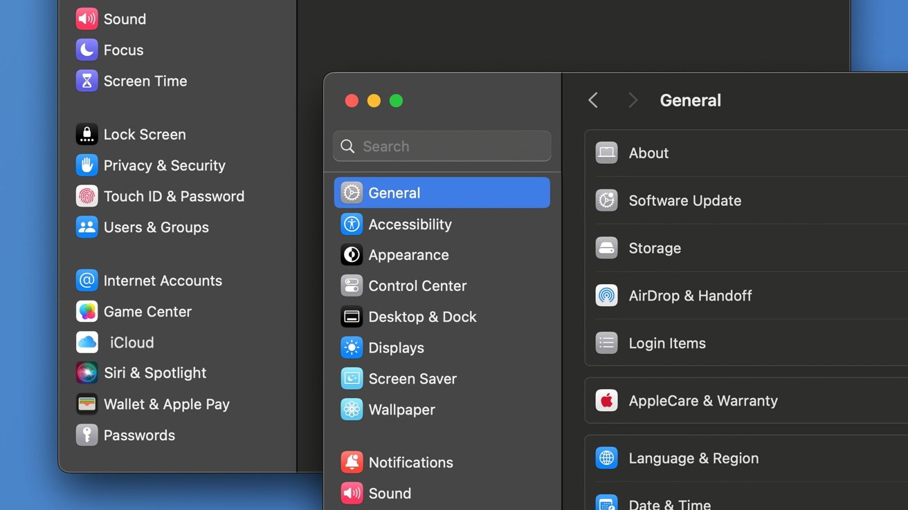
System Settings will receive a layout change with macOS 15
Privacy and security settings will be moved to a more reasonable location near related options, as opposed to its current position next to general settings. It will now be located alongside preferences for the lock screen, Touch ID, users and groups, following a clear pattern, as Apple intends to move related settings closer together.
Siri's new Menu Bar icon
The settings pane for Siri and Spotlight will also be moved to the section containing settings related to internet accounts and Game Center. This is likely because of Siri's ability to use the internet to gather relevant search results and information.
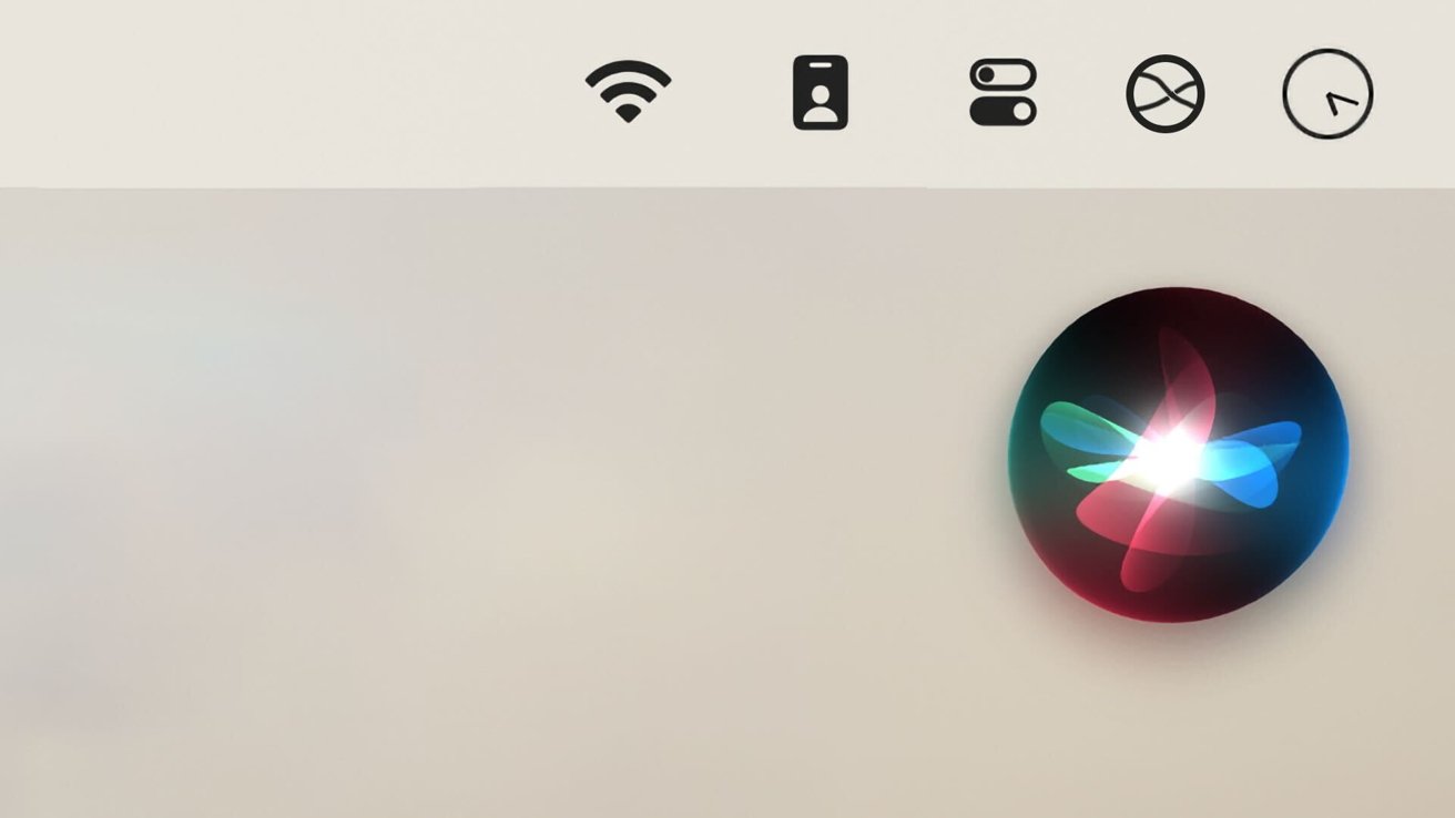
Siri will receive a new monochromatic menu bar icon with macOS 15
Siri is also expected to receive a new monochromatic menu bar icon, allowing it to better blend in with existing icons. Currently, on macOS Sonoma, the menu bar icon for Siri is multi-colored, which is why it stands out.
With macOS 15, the monochromatic Siri icon will match the surrounding menu bar icons in terms of color. It will be able to change to black or white depending on the background, as is the case with every other macOS menu bar icon.
It would make sense for Apple to introduce Siri-related design changes, given the amount of work the company has put into improving its virtual assistant. The new-and-improved Siri will be able to analyze and summarize texts or articles, answer complex questions, and transcribe Voice Memos, as was revealed in our exclusive report on Apple's Ajax LLM.
Shifting from Apple ID to Apple Account
The System Settings application, along with nearly every other built-in app, will reflect Apple's decision to rebrand its iconic Apple ID into Apple Account, as was reported previously.
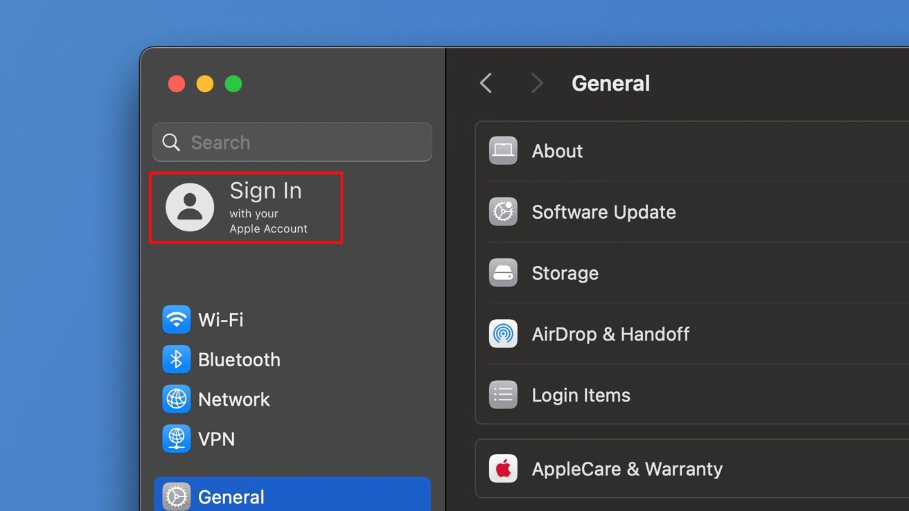
With macOS 15, Apple ID will be renamed to Apple Account
There are also indications that the company is testing new Account-related settings and features. We could see new animations or redesigned UI elements, affecting the two-factor authentication settings or the sign-in process itself.
The Apple Account rebrand could introduce more changes, as Apple is developing a new feature called Printable Account Recovery Summary, or PARS for short. While we were not provided with any specific details, the feature will likely provide users with the most important information related to their user accounts.
Internally, Apple has also created a new iCloud preference pane - separate from the Apple ID (soon to be Apple Account) settings. Apple iCloud settings will be located in the same section as the one featuring internet account settings, Apple Pay, and password settings.
The company is also testing a new "modern" user interface for AirDrop, which will contain the same core settings and interface elements, only arranged slightly differently. Users will still be able to decide how they appear in AirDrop, who they want to share files with and so on.
Individual system applications will also receive design modifications, which will allow for new OS features in some instances.
System wide user interface changes
Apart from the System Settings app and Siri, macOS 15 will include visual changes to several core apps, including Calculator, Notes, Safari and Voice Memos - all of which were exclusively revealed by AppleInsider.
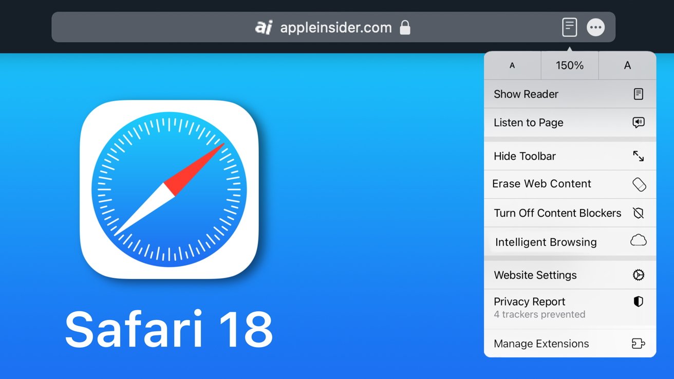
Many UI elements are moving around in Safari too
The Calculator application will receive an iOS-style redesign, with rounded buttons, improvements to the unit conversion system and an entirely new Math Notes feature. Math Notes is expected to usher in support for proper mathematical notation, allowing Apple to compete with products such as Microsoft's OneNote, PCalc, or Soulver 3.
Safari will feature an entirely new UI element in the form of a unified menu for page controls, accessible from the URL bar. This menu will allow users to toggle new features such as Web Eraser and Intelligent Browsing, while also consolidating existing settings and options.
Apple's Notes app is expected to gain new features which will enable in-app audio recording, audio transcription as well as AI-powered summarization of audio transcripts. Voice Memos will receive a similar addition, allowing for a new audio transcription view.
How often does Apple change the design of its operating systems?
Every major OS update sees the arrival of new features and related UI elements. With iOS 14, and later macOS Sonoma, for instance, Apple introduced widgets - which can be placed on the home screen or desktop, making their newest operating systems easily identifiable.
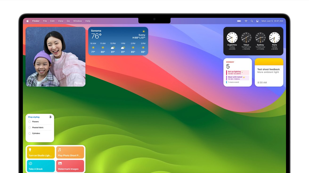
Widgets on the desktop is a feature introduced with macOS Sonoma
Major redesigns also occur every now and then, but their purpose can vary. The most significant visual change for Apple's operating systems occurred more than a decade ago when the company released iOS 7 and macOS 10.10 Yosemite, introducing a flat look across its different platforms.
While the change from the skeuomorphic look to the flat design language was a mere stylistic choice, other UI modifications are created with with more practical benefits in mind. Often, Apple will try to make their different operating systems more closely resemble one another.
With macOS Ventura for instance, Apple redesigned the System Preferences application, making it look and behave like the settings app on iOS and iPadOS. The introduction of features like Stage Manager to both macOS and iPadOS indicates that Apple's goal is the creation of a unified user experience.
The planned changes for Safari and Calculator indicate the company's goal is to standardize the overall user interface across its platforms. Introducing an iPad-style navigation menu for Safari 18, and an iOS-style Calculator for the Mac would ultimately offer added convenience, with a consistent look across different devices.
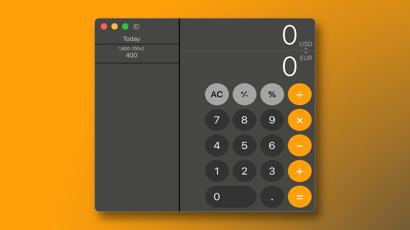
Apple will redesign the macOS Calculator app to be mimic the iOS design
Neither iOS 18 nor macOS 15 are expected to introduce any groundbreaking design changes. Instead, they will maintain the same overall look and feel as their respective predecessors, while adding minor visual tweaks to make the new releases recognizable and more user-friendly.
Apple's decision to rearrange key system settings in macOS 15 (and likely iOS 18) was obviously created with the end user in mind. By lumping together related options, the company seeks to make it easier for its users to find specific settings.
It is important to remember, however, that not all features make it to release. Apple has been known to delay features to subsequent OS releases, rename them, or cancel them entirely. AppleInsider was told that the redesigned layout for System Settings could easily be disabled within Apple's pre-release operating systems, meaning that there are no guarantees we will see this feature.
Apple will introduce its next generation of operating systems at its annual WWDC on June 10, which is when the design changes described previously are expected to debut, alongside new features and improvements.
Read on AppleInsider

Comments
Now, when in a setting's sub-hierarchy, you have to click back, then scroll to the category you want, then click again. For example, it's now three clicks to get to Time Machine settings, whereas it used to be one. If there was a second vertical pane on the left with an expansion of the top-level category you had selected, that would eliminate that issue in most cases. But it would look clunky, so instead we have a something clunky to use, but looks attractive. Though I'd say less attractive than the old System Preferences as well as less usable.
Why aren't all connectivity related settings placed under a common root called something like Connectivity? Why aren't Wi-Fi, Network, Bluetooth, and Private Relay all placed underneath a common connectivity root? Yeah, Private Relay is a paid enhancement with iCloud+, so just gray it out if the user isn't entitled to it. Don't hide it under Account related settings. Is Wi-Fi not considered a network?
Why is Advanced Data Protection not part of the Security & Privacy hierarchy? Same thing with Hide My Email.
Why is Touch ID and Password not under Account settings or Security and Privacy? Plus, there's a second root called Passwords only two spots away. Hey, why not leave that banana peel right there where it be stepped on so easily?
I'll stop here because there are way too many points of confusion and randomness to pick on each and every one. One blanket statement I would add is because the Settings app is so convoluted, confusing, and disorganized Apple could, as an act of mercy for its current users, consider allowing more than one sortation option to organize settings in the UI. I'd take a peek at 1Password's sorting options as a pretty good example. Every trip down the Settings path should not be a journey into the unknown. Things like most recently used, most frequently used, and date of access provide a way for users to implicitly establish breadcrumb trails to where they have been before. Things like this won't solve every problem and may be pig lipstick, but they may reduce some of the confusion for some users a little bit, which is a tiny step in the right direction.
I've been faced with very similar issues to what we see in Settings in applications that I have developed and worked on. This is a common challenge. As an engineer and architect I learned that software development engineers and coders are, as a group, often not particularly good at creating excellent user experiences and user interfaces for non-engineer users. This is not derogatory in any way whatsoever. Through experience you need to learn when to wave the white flag and call in the experts. I have no qualms about waving that flag. Common challenges require the expertise of those who know how to go about solving problems in the domain of interest because they keep facing similar problems time and again. This applies to pretty much every problem domain, from carpentry to neurosurgery. The Settings app is exposed to a massive number of users from all walks of life. Being "good enough" or "not bad" or "it doesn't suck" is not acceptable at Apple's position in the world. I'd say that Settings today is in the "it doesn't' suck" category, which is a step up from where it was. But everyone has their own opinion.
Settings needs the attention of UX/UI experts or a team of UX/UI experts who have intimate knowledge of how users interact with user interfaces, workflows, tasks, etc., that are presented in the Settings app on every Apple product that has human interaction. The UX/UI experts should have the final say on what's acceptable and what is not by applying their knowledge, skill, expertise, connections with other members of the development, sales, and product support teams, and by applying verification methods, with feedback, to solving problems of this nature, knowing that perfection is unachievable. While Apple has made significant improvements to Settings over the years, it's still nowhere near where it needs to be, and I'm not talking about cosmetics or aesthetics at all. A great UX/UI team will always find a way to blend the user experience, look & feel, and aesthetics of an app together in a way that make sense and truly connects better with a greater number of users.
Regardless, I certainly don't see any excuse for not having an immediate fix available in the next OS issue. This isn't recoding the OS.
Then within the wifi prefpane, you have "details" when connected, and the ellipsis ••• when not, for some reason. Within the ellipsis you can turn on/off auto join, and copy password. You can go to network settings through the ellipsis, but whilst the IP address is displayed, you can't change it. You have to go to details instead, when connected to that network. Why show it in both places, one of which you can edit and one you cannot? Why can I set some settings per network, like low data mode; and other things are shared with all networks, like IP address and DNS server, despite them likely being different between networks. It's really stupid.
Accounts shows some iCloud related data, things like optimising Mac storage which is totally unrelated to accounts, then that same data is available in AppleID -> iCloud, why? It's a mess.
You know a UI design is poor when it keeps getting re-jigged. MS does it constantly with everything because their UIs are so bad.
I still don’t know where half the stuff is from the last update.
Diverting somewhat to the subject of Safari, where’s the previously much-trumpeted ‘translate page’ menu choice in the address bar dropdown featured in the article gone? Deleted? Moved to somewhere harder to find/less logical/more annoying?
It's better than the Windows Install/Uninstall system IMHO, as that can fail, not to mention differences between Applications as to whether it even exists as an option (some Windows applications insist on running their Install and then selecting Uninstall. Most times, I have deleted the install utility long ago, so then I have to find the website and download it again. PITA!
Ultimately, the advantage of System Preferences was that you can easily see an entire overview of all your settings in one shot, and then drill down, categorically, to where you need to go. System Preferences always had room to be improved, but System Settings is poorly laid out, with things hidden in places that they don't need to be, and overall takes longer to get down into settings, if you can find them.
I absolutely hate the new System Settings in Mac OS. I feel abused by them. Safari has gone downhill by not working correctly with many sites and if they interfere with Calculator, I may abandon Mac for good. None of these changes have been in right direction. Where is the Mac team when you need them?