Leaker wars escalate, Jon Prosser shows alleged iOS 19 redesign
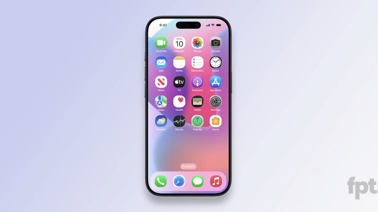
Jon Prosser has refined his iOS 19 leak concepts with more-rounded squircle icons, reflective elements, and more that bring it closer to Apple Vision Pro's visionOS.

iOS 19 concept shared by Jon Prosser. Image source: FPT
Apple operating systems rarely leak, if ever, but leaker Jon Prosser claims he has access to a recent build of iOS 19. A previous leak showed glassy elements Mark Gurman called outdated or inaccurate, but Prosser is back with a few more redesign tweaks to show off.
According to a video shared by Jon Prosser on Front Page Tech, the new leaked UI is from a more recent build. Of course, everything shown is an artist's render and not actual screenshots to protect the source.
First, there's actually not much new to discuss here. He confirmed our suspicions that the glassy edges reflect light based on device tilt, showed a new TabView UI, and more pill shapes across the system that are reminiscent of Apple Vision Pro's operating system visionOS.
The biggest part of the leak here is the Home Screen app icons. Prosser shows a more-rounded squircle that's still not quite a circle.
If these icon shapes look familiar, it is because some Android skins have this icon shape. Round app icons are also an Android thing, so it seems odd that Apple would abandon its classic squircle.
Apps with tabs will get more animations and floating bars Prosser dubbed TabView. These mimic floating UI elements already present in iOS, but have more lively animations like the Dynamic Island.
Prosser also showed off a new search UI in iMessage that wasn't in the original iOS 19 leak video. It is simply a floating pill-shaped button that sits at the bottom of the app.
The Settings app was also shown with more tweaks and a longer, skinnier toggle switch.
It isn't clear if these new tidbits will cross the threshold of "significant" by Mark Gurman's definition. Instead of writing a new social media post, he just reposted what he said before, calling the "images floating around" not "representative."
The new leak may have shown possible new icon shapes, but it really wasn't much in addition to what was shown before. It likely means Prosser will continue to push back against Gurman and attempt to find something more significant to share.
Whatever the case, all will be revealed during WWDC 2025 on June 9.
Rumor Score: Possible
Read on AppleInsider


Comments
Then again, we'll know for sure in June.
On a side topic, if the app icons are unique why is is necessary to show the text below the icon? The text is like training wheels on a child’s bicycle. Once you learn how to ride, take ‘em off. Maybe keep them on for folders, but for individual apps they are redundant. Personal choice I suppose, and it’s nice that Apple gives you a choice but only on the iPhone. I know it would make localization easier for the developers if they were no longer needed.
I think Tim Cook choosing Jony Ive and Bob Mansfeld over Scott Forstall represents one of those gigantic alternate reality decisions. Jony Ive had a couple of big hits in terms of design: Watch and AirPods. The Macs however suffered big reputational damage during the mid-2010s. iPads essentially stayed a tweener computing device. iPhones remained steady and iterative which was the right strategy, probably. And the billions spent on the EV automation and eye wearable development, with not much to show for it. At least the AVP shipped, but it could have shipped couple of years earlier as a M1 device, if someone was able to make a decision on the product so that they could move.
If Forstall remained, and Jony Ive, Mansfeld, maybe Schiller, ended up leaving in 2012. Yes interesting. I think Forstall would have been better at SVP of engineering over Federighi. Swift would be a much more dynamic language. I think the UI of Macs, iPads and iPhones would be better. Mac and iPad hardware would be better. I think Siri, ML, and LLM services would be better and earlier under Forstall. Developer relations would be better. Not sure about Watch and AirPods. Both those designs are very good and bear Jony Ive's design ethos. And perhaps they would have leaned way into audio computers, like the HomePod, which would have been a mistake, I think.