Leaker wars escalate, Jon Prosser shows alleged iOS 19 redesign

Jump to First Reply
Posted:
in iOS edited April 7

Jon Prosser has refined his iOS 19 leak concepts with more-rounded squircle icons, reflective elements, and more that bring it closer to Apple Vision Pro's visionOS.

Smartphone displaying a colorful home screen with various app icons, time showing 9:41, and a light gradient background.
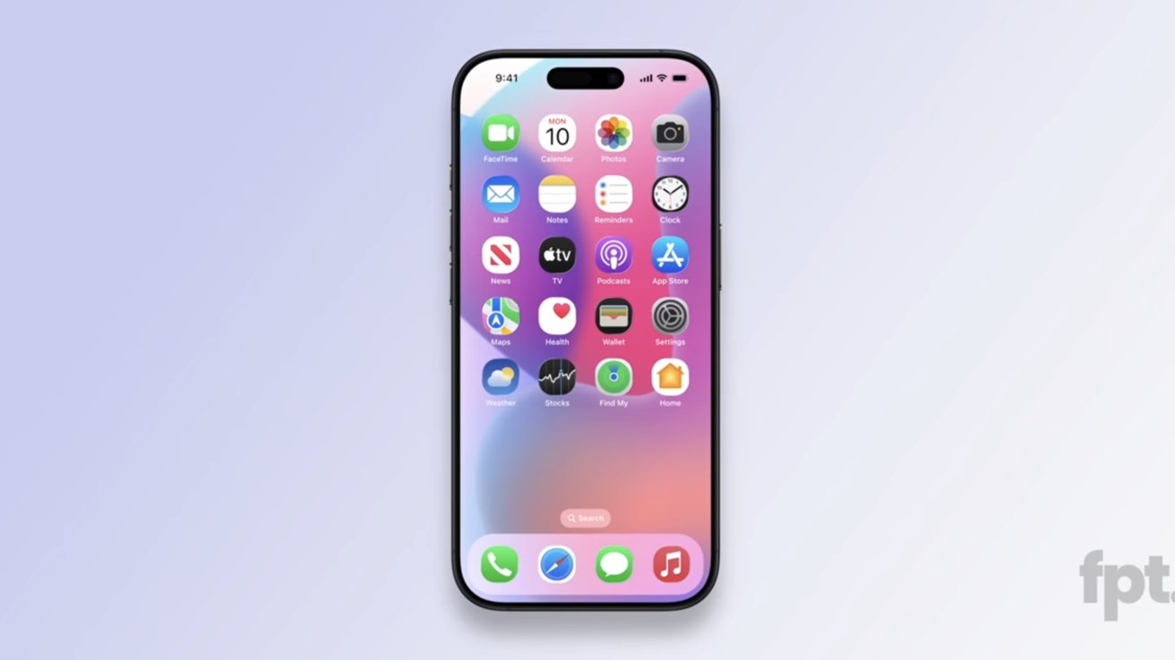
iOS 19 concept shared by Jon Prosser. Image source: FPT


Apple operating systems rarely leak, if ever, but leaker Jon Prosser claims he has access to a recent build of iOS 19. A previous leak showed glassy elements Mark Gurman called outdated or inaccurate, but Prosser is back with a few more redesign tweaks to show off.

According to a video shared by Jon Prosser on Front Page Tech, the new leaked UI is from a more recent build. Of course, everything shown is an artist's render and not actual screenshots to protect the source.


First, there's actually not much new to discuss here. He confirmed our suspicions that the glassy edges reflect light based on device tilt, showed a new TabView UI, and more pill shapes across the system that are reminiscent of Apple Vision Pro's operating system visionOS.

The biggest part of the leak here is the Home Screen app icons. Prosser shows a more-rounded squircle that's still not quite a circle.

If these icon shapes look familiar, it is because some Android skins have this icon shape. Round app icons are also an Android thing, so it seems odd that Apple would abandon its classic squircle.

Apps with tabs will get more animations and floating bars Prosser dubbed TabView. These mimic floating UI elements already present in iOS, but have more lively animations like the Dynamic Island.

Prosser also showed off a new search UI in iMessage that wasn't in the original iOS 19 leak video. It is simply a floating pill-shaped button that sits at the bottom of the app.


The Settings app was also shown with more tweaks and a longer, skinnier toggle switch.

It isn't clear if these new tidbits will cross the threshold of "significant" by Mark Gurman's definition. Instead of writing a new social media post, he just reposted what he said before, calling the "images floating around" not "representative."

The new leak may have shown possible new icon shapes, but it really wasn't much in addition to what was shown before. It likely means Prosser will continue to push back against Gurman and attempt to find something more significant to share.

Whatever the case, all will be revealed during WWDC 2025 on June 9.

Rumor Score: Possible

Read on AppleInsider

«1

Comments

  • Reply 1 of 21
    mattinozmattinoz Posts: 2,595member
    I feel like his insider sources just got fired. 

     0Likes 0Dislikes 0Informatives
  • Reply 2 of 21
    I do not like the look of these "squircle" icons. I prefer the icons to be either round, or square with subtler rounded edges, like they are now.

    Then again, we'll know for sure in June.
    edited April 8
    9secondkox2lotoneswilliamlondon
     2Likes 1Dislike 0Informatives
  • Reply 3 of 21
    Vision1vision1 Posts: 10member
    It’s funny how many say that circle icons are an android thing, but icons on the Apple Watch have them from the start 
    grandact73Afarstarwilliamlondonneoncat
     2Likes 2Dislikes 0Informatives
  • Reply 4 of 21
    9secondkox29secondkox2 Posts: 3,337member
    While iOS 7 was a major move forward in terms of modern ui and UX, this update just seems pointless. Look more like the headset ui? Why? No point. The headset ui just looks like the watch, but with frosted windowing. And it makes sense there. The phone doesn’t need windowing or greater elements. Whatever those icon shapes are-they are genuinely ugly. Looks like a beginner homemade android mod. 

    I’m not opposed to change at all. Actually was kinda excited about it. But then I remembered this is a different design team. Reminiscent of whoever thought white bezels and plopping the power supply on the floor was a good idea in the new baby iMac. 

    I understand Prosser is just showing renders trying to reproduce what his team saw. But st the same time, I hope it’s not anywhere near that style. Msjor backward step if that’s the case. 

    But I don’t believe apple would head back into skeuomorphism (with the fake glass buttons) or degrade into amateur style design. I’m sure it will combine the best parts of each is and make it consistent across the board. 
    grandact73radarthekat
     2Likes 0Dislikes 0Informatives
  • Reply 5 of 21
    I turned on an iPhone 5c the other day and instantly nostalgia hit, and I remembered that the gyroscope on the phone can let you also see the background move. With that being said, it feels off because of how outdated the UI is, especially being used to iOS 17 and 18. (The iPhone 5c’s last update is in iOS 10.)
    radarthekat
     1Like 0Dislikes 0Informatives
  • Reply 6 of 21
    ITGUYINSDitguyinsd Posts: 568member
    Vision1 said:
    It’s funny how many say that circle icons are an android thing, but icons on the Apple Watch have them from the start 
    Because were talking phones, not watches.  Or TV's.  Or any other device that happens to have round icons.
     0Likes 0Dislikes 0Informatives
  • Reply 7 of 21
    dewmedewme Posts: 5,967member
    Definitely a wait & see on this topic. If Apple is making fundamental changes to the user experience and interface they’ll have to put it in front of developers in June at WWDC.

    On a side topic, if the app icons are unique why is is necessary to show the text below the icon? The text is like training wheels on a child’s bicycle. Once you learn how to ride, take ‘em off. Maybe keep them on for folders, but for individual apps they are redundant. Personal choice I suppose, and it’s nice that Apple gives you a choice but only on the iPhone. I know it would make localization easier for the developers if they were no longer needed.
    edited April 8
     0Likes 0Dislikes 0Informatives
  • Reply 8 of 21
    hypoluxahypoluxa Posts: 702member
    I think they are going to be circles, like the watch and headset.  That shape makes the most sense if they are wanting to integrate all the device UI elements. This squircle shape is weak-sauce. It's like a bad design compromise for both shapes. Who cares if the Android OS UI has been using that shape for years now. Both companies have copied from each other now at this point.
    williamlondon
     0Likes 1Dislike 0Informatives
  • Reply 9 of 21
    If you really want to make a significant change to the iPhone, put the wake/sleep button back on the top where God and Steve Jobs intended.  Then I won't take accidental screenshots when I pick up the phone or use the volume buttons.  Everyone I know has the same issue, even the workers at the Apple store.  Worst ergonomic design since the hockey puck mouse.
    ththypoluxadewmegrandact73tyler82williamlondonradarthekat
     6Likes 1Dislike 0Informatives
  • Reply 10 of 21
    Who cares. This is such a waste of bandwidth
    tiredskillswilliamlondon
     1Like 1Dislike 0Informatives
  • Reply 11 of 21
    9secondkox29secondkox2 Posts: 3,337member
    Who cares. This is such a waste of bandwidth
    Let’s be real. We all do. 

    Just about everyone is a heavy smartphone user and the ui heavily impacts our day. 
    mattinozradarthekat
     2Likes 0Dislikes 0Informatives
  • Reply 12 of 21
    dewmedewme Posts: 5,967member
    Rockaday said:
    If you really want to make a significant change to the iPhone, put the wake/sleep button back on the top where God and Steve Jobs intended.  Then I won't take accidental screenshots when I pick up the phone or use the volume buttons.  Everyone I know has the same issue, even the workers at the Apple store.  Worst ergonomic design since the hockey puck mouse.
    Yes indeed, an irritant that keeps on irritating. How many blurry pictures of hands and fingers does a person really need?
    edited April 8
    grandact73
     1Like 0Dislikes 0Informatives
  • Reply 13 of 21
    lotoneslotones Posts: 123member
    On the other hand, "Leaker Wars" sounds like a great idea for a new Apple TV+ series. 
    apple4thewin
     1Like 0Dislikes 0Informatives
  • Reply 14 of 21
    tyler82tyler82 Posts: 1,115member
    I know I'm in the minority but I miss Scott Forstall.
    thtwilliamlondon
     1Like 1Dislike 0Informatives
  • Reply 15 of 21
    While iOS 7 was a major move forward in terms of modern ui and UX, this update just seems pointless. Look more like the headset ui? Why? No point. The headset ui just looks like the watch, but with frosted windowing. And it makes sense there. The phone doesn’t need windowing or greater elements. Whatever those icon shapes are-they are genuinely ugly. Looks like a beginner homemade android mod. 

    But I don’t believe apple would head back into skeuomorphism (with the fake glass buttons) or degrade into amateur style design. I’m sure it will combine the best parts of each is and make it consistent across the board. 

    Ios7 wasn’t some move forwards, it was just a move AWAY. They needed to break from the assumption of a 320px width UI because they were about to introduce larger screens and just threw everything away in favor of outlines, text, or ONLY text as a button. Terrible.  They went with what they had time to get done in such a small period of time. That’s what ios7 was. 
    tiredskills
     0Likes 1Dislike 0Informatives
  • Reply 16 of 21
    lukeilukei Posts: 403member
    Rockaday said:
    If you really want to make a significant change to the iPhone, put the wake/sleep button back on the top where God and Steve Jobs intended.  Then I won't take accidental screenshots when I pick up the phone or use the volume buttons.  Everyone I know has the same issue, even the workers at the Apple store.  Worst ergonomic design since the hockey puck mouse.
    You are holding everything wrong 

    williamlondon
     0Likes 1Dislike 0Informatives
  • Reply 17 of 21
    thttht Posts: 5,889member
    tyler82 said:
    I know I'm in the minority but I miss Scott Forstall.
    Hard to tell one way or the other. I think Jony Ive's reputation went down given what we saw from Apple between 2012 to 2018 or so. I too miss Forstall.

    I think Tim Cook choosing Jony Ive and Bob Mansfeld over Scott Forstall represents one of those gigantic alternate reality decisions. Jony Ive had a couple of big hits in terms of design: Watch and AirPods. The Macs however suffered big reputational damage during the mid-2010s. iPads essentially stayed a tweener computing device. iPhones remained steady and iterative which was the right strategy, probably. And the billions spent on the EV automation and eye wearable development, with not much to show for it. At least the AVP shipped, but it could have shipped couple of years earlier as a M1 device, if someone was able to make a decision on the product so that they could move.

    If Forstall remained, and Jony Ive, Mansfeld, maybe Schiller, ended up leaving in 2012. Yes interesting. I think Forstall would have been better at SVP of engineering over Federighi. Swift would be a much more dynamic language. I think the UI of Macs, iPads and iPhones would be better. Mac and iPad hardware would be better. I think Siri, ML, and LLM services would be better and earlier under Forstall. Developer relations would be better. Not sure about Watch and AirPods. Both those designs are very good and bear Jony Ive's design ethos. And perhaps they would have leaned way into audio computers, like the HomePod, which would have been a mistake, I think.
     0Likes 0Dislikes 0Informatives
  • Reply 18 of 21
    dee_deedee_dee Posts: 134member
    Who cares. This is such a waste of bandwidth
    Let’s be real. We all do. 

    Just about everyone is a heavy smartphone user and the ui heavily impacts our day. 
    No we don’t.  The changes shown will not “heavily impact” anyone using these devices.  
    williamlondon
     1Like 0Dislikes 0Informatives
  • Reply 19 of 21
    mattinozmattinoz Posts: 2,595member
    The best thing is looks like the projects to renovate springboard are coming to the conclusion and we will see fully modern Home Screen 
     0Likes 0Dislikes 0Informatives
  • Reply 20 of 21
    Lettucelettuce Posts: 35member
    I turned on an iPhone 5c the other day and instantly nostalgia hit, and I remembered that the gyroscope on the phone can let you also see the background move. With that being said, it feels off because of how outdated the UI is, especially being used to iOS 17 and 18. (The iPhone 5c’s last update is in iOS 10.)
    The gyroscope effect is still there, just less prominent. 
    apple4thewin
     1Like 0Dislikes 0Informatives
Sign In or Register to comment.