Apple objects to app's pear logo trademark application

Jump to First Reply
Posted:
in General Discussion
Apple has reportedly objected to a meal planner app's logo of a pear, with the iPhone maker allegedly objecting to a trademark application for a fruit-based logo.


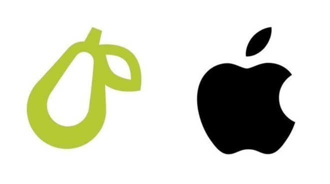
The founders of Super Healthy Kids, a site about meal planning for children and families, have found themselves the target of a complaint from Apple over the logo it is using for a spin-off company, the meal-planning app Prepear. It is claimed Apple objects to the use of the logo and an attempted trademark application, demanding for the logo to be changed.

In an Instagram post and a Change.org petition set up by Prepear co-founder and COO Russell Monson, first reported by iPhone in Canada, Prepear believes the legal action is unwarranted.

"Apple has been opposing small businesses with fruit-related logos by starting expensive legal action," starts the petition, "even when those logos don't look anything like Apple's logo, or aren't in the same line of business as Apple at all."

The post goes on to point out Apple's vigorous defense of its trademark against "small businesses with fruit related logos," with the logos either changed or abandoned as "most small businesses cannot afford the tens of thousands of dollars it would cost to fight Apple."

Citing the small five-person team at Prepear and that legal action has already cost the company "many thousands of dollars," forcing the layoff of one employee, the company claims it is a "very terrifying experience to be legally attacked by one of the largest companies in the world."

Prepear feels a "moral obligation to take a stand against Apple's aggressive legal action against small businesses and fight for the right to keep our logo," and intends to "send a message to big tech companies that bullying small businesses has consequences."

At the time of publication, the Change.org petition has reached over 9,000 supporters, and is quickly closing in on 10,000.
«1

Comments

  • Reply 1 of 38
    baconstangbaconstang Posts: 1,182member
    To quote that Liberty Mutual ad..."I don't see it."
    gatorguyrezwitsanantksundaramdysamoriadoozydozenchemengin1
     6Likes 0Dislikes 0Informatives
  • Reply 2 of 38
    jsug9jsug9 Posts: 2member
    Apple will soon sue Death Note because Ryuk eats Apples
    williamlondon
     0Likes 0Dislikes 1Informative
  • Reply 3 of 38
    netroxnetrox Posts: 1,560member
    Apple has no legal basis. It's for cooking and nothing to do with Apple. 
    williamlondonanantksundaramdysamoriaviclauyyccornchipchemengin1
     4Likes 0Dislikes 2Informatives
  • Reply 4 of 38
    M68000m68000 Posts: 940member
    This is outrageous.  The logo looks nothing like the Apple logo.  Apple is wrong here.  They need to apologize at once to this company.
    rezwitswilliamlondongregoriusmGrayeagleanantksundaramdysamoriadoozydozenelijahgviclauyycchemengin1
     9Likes 0Dislikes 1Informative
  • Reply 5 of 38
    Beatsbeats Posts: 3,073member


    Almost as good as the Samsung and Huawei stores!

    doozydozenelijahgcornchipllamawatto_cobra
     5Likes 0Dislikes 0Informatives
  • Reply 6 of 38
    mainyehcmainyehc Posts: 146member
    Objectively and geometrically speaking, the leaf design is way too similar and it’s on the same side. Also, its angle is similar, only mirrored. Apple does have a bit of a leg to stand on here, I’m afraid.

    And no, I’m not (just) a fanboy, but a future PhD in design, and even an undergrad with a keen eye would spot the similarities right away… This isn’t much different from spotting plagiarism in typography, you just have to overlay the curves and see how well they match. Do you want me to?
    edited August 2020
    pichaelBeatsRayz2016doozydozenronnwatto_cobra
     5Likes 0Dislikes 1Informative
  • Reply 7 of 38
    pichaelpichael Posts: 52member
    The leaf design is way too similar and it’s on the same side. Apple does have a bit of a leg to stand on, here.
    I did think the leaf looks identical as well. 
    edited August 2020
    Beatswilliamlondonronnwatto_cobra
     4Likes 0Dislikes 0Informatives
  • Reply 8 of 38
    M68000m68000 Posts: 940member
    mainyehc said:
    Objectively and geometrically speaking, the leaf design is way too similar and it’s on the same side. Also, its angle is similar, only mirrored. Apple does have a bit of a leg to stand on here, I’m afraid.

    And no, I’m not (just) a fanboy, but a future PhD in design, and even an undergrad with a keen eye would spot the similarities right away… This isn’t much different from spotting plagiarism in typography, you just have to overlay the curves and see how well they match. Do you want me to?
    If you and Apple lawyers are upset about the Leaf part of the graphic,  that is truly sad.  So, in other words, no other company in the world can now have a tiny bit of whatever logo they have include such a leaf.  WOW.    It does not take a PHD to see that this is BS.  The color they are using is green as well,  does Apple have a problem with that too??   
    williamlondongregoriusmGrayeagledysamoriaCloudTalkincflcardsfan80elijahgviclauyycmazda 3schemengin1
     9Likes 0Dislikes 1Informative
  • Reply 9 of 38
    richsrichs Posts: 13member
    Trademark law requires you actively pursue any possible infringement or lose that right in a future infringement case if you've "demonstrated indifference" in the past. They're not being a bully. Apple is just showing they're serious about protecting the logo... now, and in the future. As a graphic designer, I think Apple has somewhat of a case... the leaf element being similar, and the left inner curve of the pear mimics the negative space of the bite in the Apple logo. It's enough to be concerned about.
    bsnjonBeatswilliamlondonbageljoeyGrayeagletenthousandthingsdocbburkcflcardsfan80cornchipronn
     8Likes 0Dislikes 4Informatives
  • Reply 10 of 38
    bsnjonbsnjon Posts: 39member
    richs said:
    Trademark law requires you actively pursue any possible infringement or lose that right in a future infringement case if you've "demonstrated indifference" in the past. They're not being a bully. 
    This is the real story, Trademark law is notoriously strange and causes behaviour like this quite regularly. (Disney is often mentioned in stories like this)
    The problem is there is too much money at stake in Trademark and Patent law to achieve any kind of reasonable reform in Congress, not to mention attempts to make international law in this area. 
    williamlondonDogpersondysamoriadocbburkcflcardsfan80ronnrazorpitwatto_cobra
     5Likes 0Dislikes 3Informatives
  • Reply 11 of 38
    S12s12 Posts: 27member
    If anyone should be objecting, it's Pear Computers. https://www.facebook.com/PearComputers/
    M68000rezwitsGrayeagledoozydozen
     4Likes 0Dislikes 0Informatives
  • Reply 12 of 38
    carnegiecarnegie Posts: 1,085member
    I don't mean to suggest that Apple has a strong case for opposing the registration based on confusion or dilution. But why is the applicant, when making their case to the public and asking for support, juxtaposing a green mark against Apple's black mark? The service mark registration application doesn't claim color, and the design submitted is black. I find the use of a green mark when asking for support to be a bit disingenuous. Why not use the black mark from the application? It seems they are trying to create the impression that there's even more difference between the marks than there really is. If the applicant is right, then the differences between the marks should be clear enough even when both are presented in black as they appear in the registration applications.
    Dogpersondocbburkronnwatto_cobra
     3Likes 0Dislikes 1Informative
  • Reply 13 of 38
    rezwitsrezwits Posts: 916member
    mainyehc said:
    Objectively and geometrically speaking, the leaf design is way too similar and it’s on the same side. Also, its angle is similar, only mirrored. Apple does have a bit of a leg to stand on here, I’m afraid.

    And no, I’m not (just) a fanboy, but a future PhD in design, and even an undergrad with a keen eye would spot the similarities right away… This isn’t much different from spotting plagiarism in typography, you just have to overlay the curves and see how well they match. Do you want me to?
    You're kidding right?  I don't even think Apple has an OUTLINED LOGO...

    I am glad my CSC 269 Professor gave me a C- three times in a req'd "C" grade class, making me drop out of college WOW.  Whew...

    I always knew college was a joke for computers and computer science.  They are always at LEAST 10 years behind...more like 30 in this case!
    If you need "all of this" explained to you, you obviously wouldn't understand.
    edited August 2020
    agilealtitudewilliamlondonGrayeagleelijahgchemengin1
     4Likes 0Dislikes 1Informative
  • Reply 14 of 38
    carnegiecarnegie Posts: 1,085member
    M68000 said:
    mainyehc said:
    Objectively and geometrically speaking, the leaf design is way too similar and it’s on the same side. Also, its angle is similar, only mirrored. Apple does have a bit of a leg to stand on here, I’m afraid.

    And no, I’m not (just) a fanboy, but a future PhD in design, and even an undergrad with a keen eye would spot the similarities right away… This isn’t much different from spotting plagiarism in typography, you just have to overlay the curves and see how well they match. Do you want me to?
    If you and Apple lawyers are upset about the Leaf part of the graphic,  that is truly sad.  So, in other words, no other company in the world can now have a tiny bit of whatever logo they have include such a leaf.  WOW.    It does not take a PHD to see that this is BS.  The color they are using is green as well,  does Apple have a problem with that too??   
    The service mark application doesn't claim color. The design submitted is black.
    gregoriusmGrayeagledysamoriaronnwatto_cobra
     4Likes 0Dislikes 1Informative
  • Reply 15 of 38
    A bit weak. Does this mean that if my logo involves a coffee cup with the handle on the right side that Apple is going to come after me because from a distance, at night, through the fog and heavy rain my logo might resemble a piece of fruit?

    I’m guessing that Tim was out of the office when this decision was made. 
    edited August 2020
    williamlondonGrayeagledysamoriamazda 3s
     3Likes 0Dislikes 1Informative
  • Reply 16 of 38
    mainyehc said:
    Objectively and geometrically speaking, the leaf design is way too similar and it’s on the same side. Also, its angle is similar, only mirrored. Apple does have a bit of a leg to stand on here, I’m afraid.

    And no, I’m not (just) a fanboy, but a future PhD in design, and even an undergrad with a keen eye would spot the similarities right away… This isn’t much different from spotting plagiarism in typography, you just have to overlay the curves and see how well they match. Do you want me to?
    Not necessarily.
    I have a PhD in zoology and can tell you this resembles an aborted Panda bear rather than an Apple logo of any imaginable kind. 
    The only rationale I can think of is that Tim may want to preserve it for his Chinese friends
    edited August 2020
    BeatswilliamlondonGrayeaglechemengin1
     2Likes 0Dislikes 2Informatives
  • Reply 17 of 38
    Beatsbeats Posts: 3,073member
    A bit weak. Does this mean that if my logo involves a coffee cup with the handle on the right side that Apple is going to come after me because from a distance, at night, through the fog and heavy rain my logo might resemble a piece of fruit?

    No.

    mainyehc said:
    Objectively and geometrically speaking, the leaf design is way too similar and it’s on the same side. Also, its angle is similar, only mirrored. Apple does have a bit of a leg to stand on here, I’m afraid.

    And no, I’m not (just) a fanboy, but a future PhD in design, and even an undergrad with a keen eye would spot the similarities right away… This isn’t much different from spotting plagiarism in typography, you just have to overlay the curves and see how well they match. Do you want me to?

    How the hell does Samsung get away with blatantly biting Apple?


    Knockoff Apple Store with Apple App icons


    Samsungs iKnockoff default apps

    GrayeagleDogpersonanantksundaramrezwitscflcardsfan80cornchipronnwatto_cobra
     8Likes 0Dislikes 0Informatives
  • Reply 18 of 38
    tundraboytundraboy Posts: 1,932member
    richs said:
    Trademark law requires you actively pursue any possible infringement or lose that right in a future infringement case if you've "demonstrated indifference" in the past. They're not being a bully. Apple is just showing they're serious about protecting the logo... now, and in the future. As a graphic designer, I think Apple has somewhat of a case... the leaf element being similar, and the left inner curve of the pear mimics the negative space of the bite in the Apple logo. It's enough to be concerned about.
    Careful, lots of Dunning-Kruger* cases will be very upset and will soon be posting to point out that their ignorance of trademark law and graphic design does not make their indignation any less valid.

    *Google it, you lazy bum.
    edited August 2020
    bulk001ronn
     2Likes 0Dislikes 0Informatives
  • Reply 19 of 38
    The fact that anyone allowed Apple to trademark a piece of fruit is the problem here.  Their logo is a generic apple, it begs the question why don't I trademark a carrot and go after Instacart for trademark infringement?  This is yet again a case of a pathetic user hostile company looking to screw over whoever they can.
    WarrenBuffduckhmariowincobulk001
     2Likes 0Dislikes 1Informative
  • Reply 20 of 38
    Franculesfrancules Posts: 122member
    Honestly. Apple sucks. After over 10 years of using apple iphones and etc. i’m done. Goodbye. 
    WarrenBuffduckhking editor the grateBeats
     1Like 0Dislikes 2Informatives
Sign In or Register to comment.