watchOS 10 rumored to get big redesign, featuring widgets

Apple's major improvements to watchOS 10 will include more interactive widgets, a report claims, which could be similar to how the elements were introduced in iOS 14.
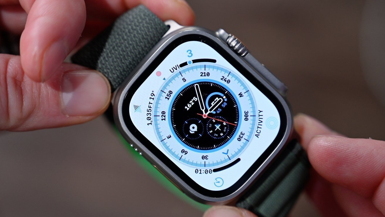
Apple Watch Ultra
It is believed that, with a milestone number release on hand, Apple's updates to watchOS 10 will be considerable. It seems that a big focus of the changes will be widgets.
According to Mark Gurman's "Power On" newsletter for Bloomberg on Sunday, the widgets will be a central feature of watchOS 10. The widgets update will combine earlier watchOS Glances with widget styles used in iOS 14, Gurman believes.
The plan for the widgets will involve users scrolling through widgets, such as activity tracking, weather, stocks, and calendar appointments, rather than tapping them to launch apps.
This interface will also be "reminiscent" of the Siri watch face that was introduced back in watchOS 4. However, it will be usable as an overlay for any watch face, the report adds.
The widget system will in theory be similar to widget stacks used in iOS and iPadOS, which allowed multiple widgets to occupy the same space on the home screen.
Under the same batch of changes, Apple is potentially going to change how the Digital Crown works. While a press of it opens up the home screen at the moment, Apple is exploring whether the Digital Crown could be used to summon the widgets interface instead.
Gurman reasons that the move is an "admission" from Apple that an iPhone-like app format isn't necessarily that useful on a watch, which is a device where you need access to as much information as possible with the least effort.
While a plausible rumor, no-one outside of Apple will ultimately know what the company will introduce during WWDC, the usual venue where it introduces its operating system updates.
Read on AppleInsider
Comments
I like my watch. I want it to be simple and reliable and easy. IOW...not complicated or confusing or some mysterious puzzle.