Apple designers shed light on the new iPhone 16 Camera Control button

Jump to First Reply
Posted:
in iPhone

While some may pooh-pooh the iPhone 16 lineup as a boring addition to Apple's smartphone catalog, many people are excited for one single feature: the Camera Control button. Here's what Apple designers have to say about it.

Hand holding smartphone displaying camera app with photo mode active, focused on a person standing on grass with greenery in the background.
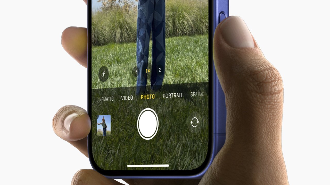
The new Camera Control button


Human interface designer Johnnie Manzari and senior director of product design Rich Dinh sat down with Design Tangents to discuss what it took to make the iPhone 16's new camera a reality. The interview took place in Apple's own podcast studio in Cupertino following September's "It's Glowtime" event.

Much of the interview centers on discussing Apple's design philosophy and how designers figure out what makes the cut and what doesn't.

"I think sometimes people think we have a recipe that we're trying to adhere to when we make these devices, when we think of these devices, and we really don't," Dinh says. "We really set off focusing on the customer experience, not trying to make new hardware, not trying to make new software, but really how do we move that customer experience forward and using your iPhone."

And that philosophy is reflected in the new iPhone 16 Camera Control button. Dinh points out that the button was designed to be somewhat inconspicuous, sitting flush against the device.

"...So, for day-to-day use we're hoping that the phone feels very much like your phone today in terms of how you grip it and handle it, but we've added a little chamfer in there to give that really lovely half press and full press experience with the button flush," he says.

And by designing a button that could detect both full- and half-presses, the designers realized that they could embrace the playfulness of a dedicated camera button.

"The idea that by lightly pressing on the button, you could signal to the phone that you were intending to take a capture," Manzari notes. "That led to all sorts of interesting new experiences that we started to design."

Intentionality is another thing Apple prizes. The moment you press the camera button, the interface clears, allowing for better composition of designs. This intentional removal of distractions is something the design team was most excited about.

"I'm probably more of the prosumer level photographer and being able to have Zoom control on your fingertips and have the screen really free of any obstruction to what you're composing and what you're seeing," Dinh notes. "You're making these videos of family, friends, kids, whatever, and it feels cinematic."

And, to give credit where credit is due, the pair notes that the camera button wouldn't exist without extensive collaboration across teams.

"... It's work from across the whole company, the sensor team, passing that information down into the architecture stack. And then on the design side, just trying to understand how would a professional do this? How would they do the ramps? And pulling it all together," Manzari says.

"And again... hopefully, people don't have to think about any of this. They're just getting the video that they want of their friends and family, but it's really built off this really deep collaboration across the entire company."


Read on AppleInsider

Comments

  • Reply 1 of 9
    elijahgelijahg Posts: 2,882member
    I like it, but I think it's in the wrong place. It needs to be nearer the edge of the phone, unless you have huge hands you end up half covering the display whilst stroking the button.
    grandact73
     1Like 0Dislikes 0Informatives
  • Reply 2 of 9
    elijahg said:
    I like it, but I think it's in the wrong place. It needs to be nearer the edge of the phone, unless you have huge hands you end up half covering the display whilst stroking the button.
    Agreed. If the button was moved toward the bottom end of the phone so the left edge started where the current buttons right edge is, that would be perfect placement to me.
    edited September 2024
    elijahgwilliamlondongrandact73watto_cobra
     2Likes 0Dislikes 2Informatives
  • Reply 3 of 9
    elijahg said:
    I like it, but I think it's in the wrong place. It needs to be nearer the edge of the phone, unless you have huge hands you end up half covering the display whilst stroking the button.
    Moving it over would make it difficult if not impossible to use in portrait mode. The current place allows it to be used in both landscape and portrait modes. 
    StrangeDayswilliamlondonwatto_cobra
     3Likes 0Dislikes 0Informatives
  • Reply 4 of 9
    elijahgelijahg Posts: 2,882member
    elijahg said:
    I like it, but I think it's in the wrong place. It needs to be nearer the edge of the phone, unless you have huge hands you end up half covering the display whilst stroking the button.
    Moving it over would make it difficult if not impossible to use in portrait mode. The current place allows it to be used in both landscape and portrait modes. 
    I don't really know why you'd use the button in portrait mode. It's much easier to just use the screen one handed and avoid the button altogether, stroking the button in portrait mode is really awkward. It even looks awkward in the portrait mode marketing pictures. The place @602warren suggested it'd be a good improvement for landscape photos, whilst not really making much different to the already awkward portrait.
    watto_cobra
     1Like 0Dislikes 0Informatives
  • Reply 5 of 9
    elijahg said:
    elijahg said:
    I like it, but I think it's in the wrong place. It needs to be nearer the edge of the phone, unless you have huge hands you end up half covering the display whilst stroking the button.
    Moving it over would make it difficult if not impossible to use in portrait mode. The current place allows it to be used in both landscape and portrait modes. 
    I don't really know why you'd use the button in portrait mode. It's much easier to just use the screen one handed and avoid the button altogether, stroking the button in portrait mode is really awkward. It even looks awkward in the portrait mode marketing pictures. The place @602warren suggested it'd be a good improvement for landscape photos, whilst not really making much different to the already awkward portrait.
    I’m not a huge fan of vertical video so I wouldn’t use it. I did try it and I don’t think it is awkward or difficult at all.  Also, the  Camera Control button isn’t just there to enable one handed use, that is just one of the use cases for it. .I use both hands because it is easier to stabilized the camera with two hands. What I like about it is that it gets all the controls off the screen so I can focus on composition. Putting it where 602warren suggested would make the phone fairly off balance  for one handed use and is way more awkward even with two handed. 

     Anyway, my use doesn’t really matter. During the announcement Apple specifically said that the placement was so that people could use it for vertical and landscape use. That is why it is in that location. 

    I think you are falling into the mental trap of thinking that your use case for the phone is everyone’s use case. There are different use cases and Apple designed it for multiple use cases. Look at the picture in the article, It is from Apple’s marketing materials and it clearly shows the Camera Control being used vertically. 
    williamlondonjas99watto_cobra
     3Likes 0Dislikes 0Informatives
  • Reply 6 of 9
    Honestly it’s a gimmick.  I don’t think it will last many iterations of iPhone. Half press is not easy and feels nothing like a real camera half press.
    williamlondongrandact73
     1Like 0Dislikes 1Informative
  • Reply 7 of 9
    ralphie said:
    Honestly it’s a gimmick.  I don’t think it will last many iterations of iPhone. Half press is not easy and feels nothing like a real camera half press.
    Agreed. It's a bit tough to get the hang of it. The positioning as others mentioned seems a bit too far up the frame.

    The half press is really a soft squeeze not an actual press; I'm starting to figure that out now. After spending last night at a concert taking pictures and videos I realize it does slow the picture taking process down if you wanna fiddle with settings while in the moment. However, once you pick some settings it's just taking photos or videos at that point.


    grandact73
     1Like 0Dislikes 0Informatives
  • Reply 8 of 9
    "The idea that by lightly pressing on the button..."

    My biggest issue with the button is the way that it's flush with the side of the phone, Would have preferred something more like the sleep/wake button so it's easier to find and one that's not as hard to press. The camera control is way, way too firm.
    grandact73
     1Like 0Dislikes 0Informatives
  • Reply 9 of 9
    elijahgelijahg Posts: 2,882member
    I think the haptic detent doesn’t feel anything like an actual camera’s half-press detent, in fact you feel nothing though your finger whatsoever. Therefore especially with no actual movement, it’s hard to know if you’ve actually pressed hard enough or if it’s in half-pressed “mode”; since it ignores your finger completely unless you’ve “half pressed” for some reason. As others have said, a real protruding button would have been better. 

    I find there is quite a disconnect between the physical moving of your finger and actual zooming. It’s a bit unresponsive imo. 

    That said I think just having it as an instant camera button is probably the most useful feature.  
    edited September 2024
     0Likes 0Dislikes 0Informatives
Sign In or Register to comment.