AppleInsider · Kasper's Automated Slave
About
- Username
- AppleInsider
- Joined
- Visits
- 52
- Last Active
- Roles
- administrator
- Points
- 10,964
- Badges
- 1
- Posts
- 66,634
Reactions
-
Apple's 'F1' ad in Wallet won't hurt you, but it might save you $10
Apple Wallet has begun advertising Apple Pay promotions via notifications, and while iPhone users are losing their mind, they can toggle the feature off starting in iOS 26.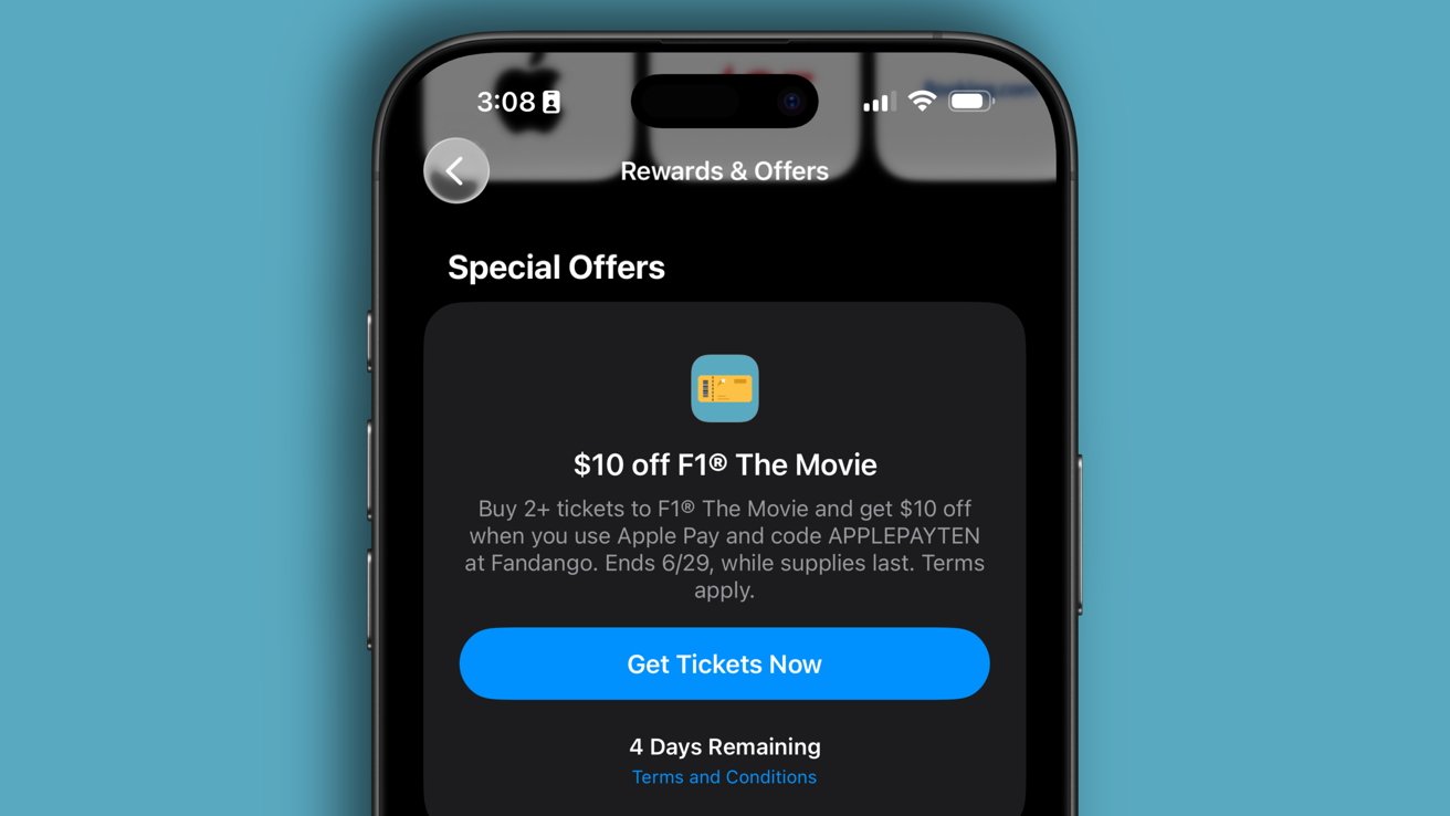
Apple Wallet tells people how to save money with notification and in-app promotion feature
Advertising has become a blunt instrument in surveillance capitalism largely as a result of Google's success. This shouldn't mean we reject the premise of advertising as a whole, given that for now, it remains the fuel for the content engine on the Internet.
Ads can run from silly and useless to invasive and annoyingly persistent. Somewhere in the middle is a genuinely useful tool for consumers.
This discussion has been prompted by Apple letting advertising creep into yet another facet of its business -- Apple Wallet. Users were surprised on Tuesday to discover an ad sent via push notification for $10 off two tickets to see the F1 movie when paid for via Apple Pay on Fandango.
Ignoring the fact that movie, concert, and plane tickets live in Apple Wallet, the negative reactions are understandable, as Apple has increased its use of advertising across its ecosystem into various places. This includes Apple TV, Apple Music, the App Store, and even Settings.
However, I believe there has been a bit of an over-correction in recent years when it comes to advertising. And, the over-reaction to the ad in Wallet today is out of proportion.
Because, if you don't like the F1 ad and others like it from Wallet, there's a toggle to turn them off, permanently, coming in iOS 26. It can be found in the Wallet app by tapping the ellipsis in the top right, tapping notifications, and it is the bottom toggle.Vertical integration of hardware and services
Apple clearly set this up with Fandango as a way to promote Apple Pay, the Apple Wallet ticket function, and F1 in one swing. It is ecosystem synergy at its finest.
As an Apple user and someone that uses Apple Wallet, Apple Pay, and plans to see F1 this weekend, the promotion is dialed in perfectly for me. Of course, Apple sent the notification to everyone, not just me, and that's triggered some anger from iPhone users.
Apple's use of advertising about itself versus paid ads in Apple News are totally different subjects. I think that Apple's system apps providing notifications or banners are fine, but at the same time I believe Apple News ads to paid subscribers are an abomination that should be scrapped and rethought.
Apple's placement ads in Apple News are just plain bad
If Apple is going to continue bringing more ads to iPhone, it needs to ensure it can maintain user trust. Stick to advertising Apple Services and device functions and avoid taking advantage of enabled notifications like Uber Eats might, which shows ads for food discounts when it should be showing delivery status.
Apple Wallet will likely get more notifications about promotions in the future. There's a toggle present in iOS 26 that lets users turn off all promotions in Apple Wallet that weren't available previously, so use that if you like.
Even if you're not getting the push notification, realize that promotions are viewable at any time via the Apple Card section of Apple Wallet. Tap the ellipsis in the top right corner, then "Rewards and Offers" to see active promotions.
Apple has to earn the right to use its system notifications and in-app banners for advertising like any other app, and I believe it has so far. If Apple breaks that trust, the outrage will be swift and necessary.The education problem
Apple is a big company and it has a lot of devices, services, and partnerships that its multiple billions of users could take advantage of. The problem is, users can't and likely won't know about any or all of these ecosystem benefits without being told.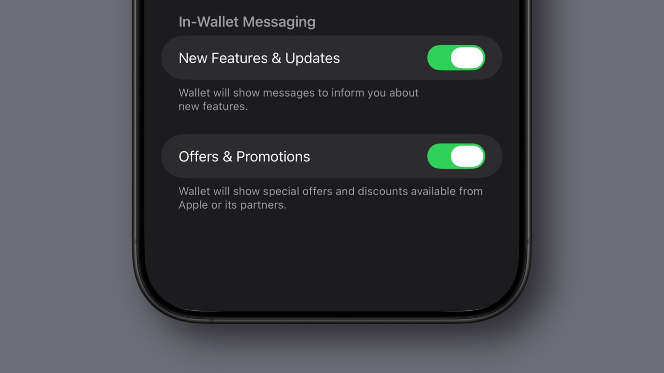
Apple should always offer toggles when it comes to promotions and ads
There's really only two ways a consumer can be informed about such things -- Apple waits patiently for them to seek out information themselves, or they push the information out via advertising. This advertising can and does take on many forms, from the Today view in the App Store to AppleCare coverage details in the Settings app.
The thing is, these are actually quite useful to consumers, even if they are annoying to some of them. Yes, you paid some thousand plus dollars for the device and you don't expect ads, but that's a blanket view likely brought on by advertising fatigue.
For example, YouTube is so dominated by ads you likely spend more time watching ad breaks for nonsense than you do actual content. So, users have no choice but to pay for YouTube Premium and block those ads to get a proper viewing experience.
Sure, advertisers get paid when users see the ads, and Google makes money from selling those ads, but the persistence and annoying nature of the ad breaks is the point. It is a form of psychological warfare that has programmed us to instantly reject all ads and pay premiums to get rid of them.
So, when an ad comes along, we automatically reject them even though the service or product would be useful to the individual. Apple One is a genuinely good service that many iPhone users would benefit from, but not everyone on Earth reads AppleInsider, so consumers need a way to be informed broadly, and that's via advertisement.Apple proves advertising can be good, actually
I wholly reject how Google, Amazon, and the others have monetized the internet through data collection and privacy violations. The weaponization of ads helped lead to the destruction of the internet thanks to Search Engine Optimization and LLMs.
What started as a promise to websites like AppleInsider as a way to show up in search and monetize our platform has turned into a tool that is slowly shuttering businesses. Ad revenue has been on the decline for years thanks to cuts from Google, and now it's using its access and data to render websites useless with summarized, and incorrect, search results.
Advertising is a necessary part of the free and open web. You'll see ads on AppleInsider, though we believe they are thoughtful, not intrusive, and we've earned the reader trust by not abusing our ability to advertise.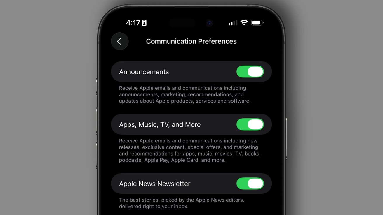
Email isn't a reliable way to educate consumers
However, those placement ads you see from Google on webpages are a wholly different thing than Apple's service and promotion advertising. Google ads are a result of surveillance capitalism -- targeted ads using swaths of consumer data.
Apple's ads are closer to billboards you'd see on a highway. Everyone can see them, and you can simply ignore them, and they're gone once you pass by.
Google could realistically do the same thing with billboard-style ads on the web. In fact, that's more or less how it used to work until they abused their position and started gathering incredible amounts of user data in the name of "showing more relevant ads."
On iPhone, dismiss the notification, hit the "X" in Settings, tap into the feature, then exit, and those ads go away. They can sometimes return as a reminder some weeks or months later, but they are just as easily dismissed -- which can't be said of ads that abuse users from other companies.
And those users stating they paid for their iPhone and should get ads ever are also right. That's why Apple does and should provide users with the ability to turn off promotional features at any time.
Apple advertises without relying on mountains of consumer data, and the things they share are actually useful to consumers of Apple technology. If you're not going to see the F1 movie this weekend, swipe the notification away and move on with your life. It's gone.
Meanwhile, I'll happily take my $10 in savings and look for another opportunity to bundle or save thanks to a dismissible notification on my iPhone. We should reject surveillance capitalism, but billboards still have their place, even if they are sometimes inconvenient or annoying.
You clearly don't have to like it. That's fine, of course, to each their own. But to say that it's some kind of epic betrayal, from an App that literally stores tickets, is just plain hyperbole.
Read on AppleInsider

-
macOS Tahoe beta 2 swaps Finder icon colors back after historic design fumble
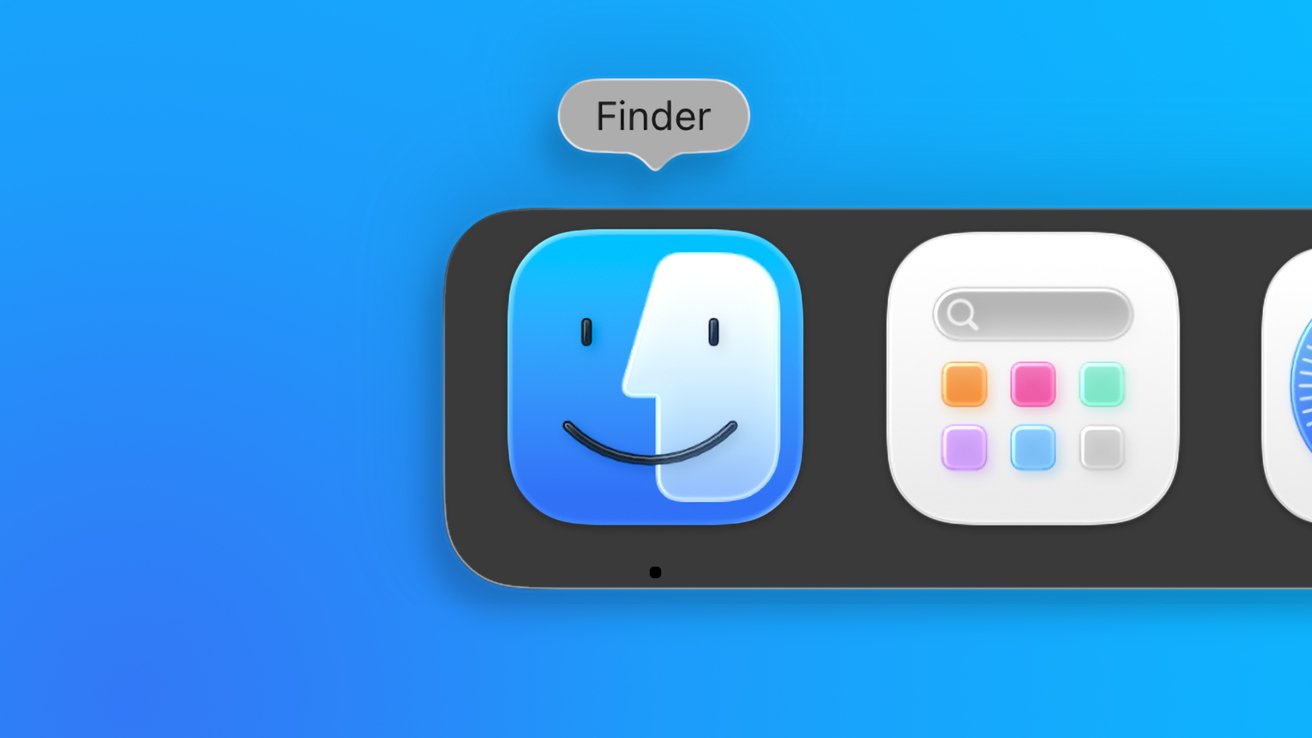
When Apple initially announced macOS Tahoe 26, it showed a redesigned Finder icon that moved the blue color to the right side, which went against nearly 30 years of history. Monday's beta fixes that.
Finder's original color scheme has been restored in macOS Tahoe
Apple's attention to detail has widely been regarded as near-perfect, at least in terms of design. However, there are moments when the need to introduce something new for the sake of new wins out.
As Stephen Hackett, 512 Pixels writer, Apple history buff, and cofounder of Relay.fm podcasting network pointed out, the swapped color scheme in the macOS Tahoe 26 Finder icon was an abrupt departure from history. The darker color has always been on the left side of the Finder icon.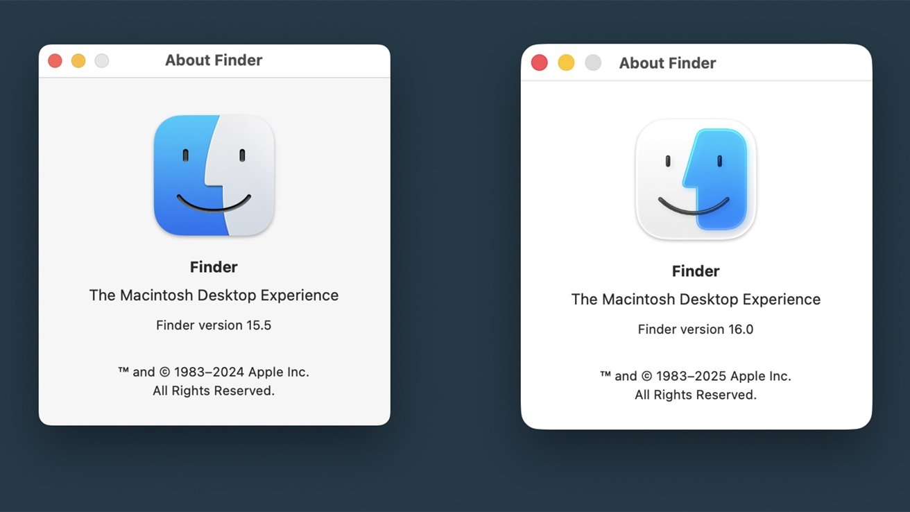
Apple initially swapped the colors for the new macOS redesign. Image source: 512 Pixels
Thankfully, with the second developer beta of macOS Tahoe, the icon coloring has been restored while retaining the new style. It seems that Hackett's vocal and passionate outcry against the change, which he repeated across his numerous podcasts and blog posts, brought about some change.
This was confirmed during WWDC by MacStories Editor-in-Chief Federico Viticci while interviewing the Apple SVP of Software Engineering Craig Federighi. While not shared in his published interview, he shared it later during the Connected podcast that Federighi had indeed heard about Hackett's plea to fix the Finder icon.
It goes to show that Apple is paying attention to feedback, at least when it comes to the more vocal folks writing and podcasting about Apple. While it doesn't always work, it is important for all of us Apple enthusiasts to remain critical and provide useful feedback, especially where Apple forgets itself and its history so blatantly.Finder's iconic icon
The Finder icon originated as a logo in the System 7.5.3 boot screen and survived as an icon in various screens until it was used for Finder in Mac OS X. The darker color was on the left through all of that and various redesigns over the decades, so it seemed odd that Apple swapped the colors in the first place.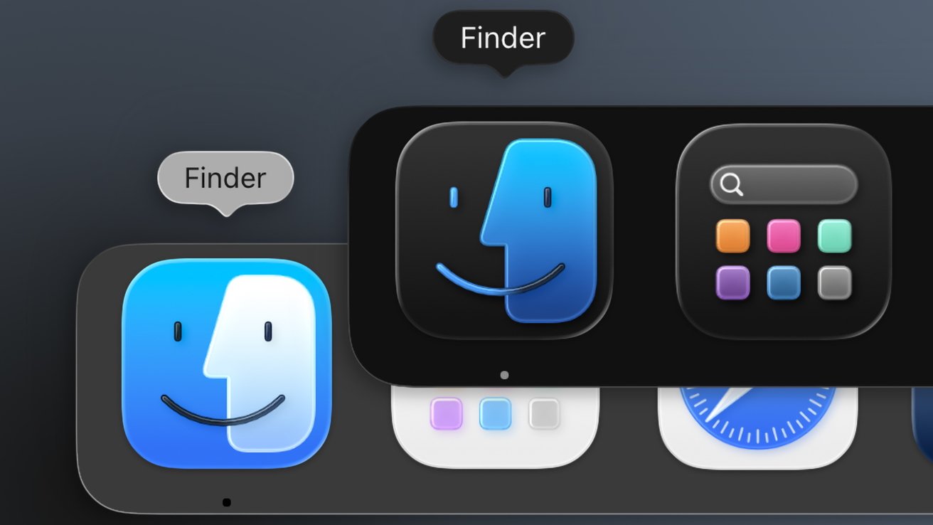
The dark mode icon maintains the darker color is on the left
I'm not sure that I buy that it was a random designer making a change for the sake of change. It seems they arrived at a design that allowed the color to wrap the icon and made the transparent color the dominant one to emphasize the Liquid Glass material.
That design philosophy carried over into the new beta 2 icon, which has the color on the left side wrap the entire icon, enclosing the color on the right. This time, however, it is the blue that dominates the logo with the smaller side now transparent white.
When in dark mode, the Finder icon swaps the dark blue to the right, but in keeping with tradition, the left side color is still the darker gray/black. That dark icon is a big departure for the Finder, but at least it and the light icon maintain the previous design standard.
Some have already taken to calling it a "half mask," referencing opera costumes and the like. At the least, even with the subtle changes, Finder's latest icon continues a tradition into the new glassy era of Apple design.
Read on AppleInsider
-
Apple faces iCloud lawsuit after after judge reverses victory
After initially dismissing a proposed class action lawsuit over Apple's allegedly forcing users to use iCloud, a judge has now accepted further evidence and ruled that the case must continue.
iCloud logo
Originally filed in March 2024, the class action complaint accused Apple of violations the Sherman Act and the Clayton act. The allegation is that Apple has established "an illegal monopoly" because of its requiring Apple device users to use its iCloud backup.
A year later in March 2025, US District Judge Eumi Lee in San Jose, California, dismissed the case. However, she allowed that the plaintiffs could file an amended case, and according to Reuters, they have now done so.
Judge Lee has furthermore ruled that the consumers involved in the case have added substantial new allegations. While Apple had defended itself in part by arguing that users were free to use alternative storage, the new complaint focuses on elements such as settings data, which are restricted to iCloud.
Apple's lawyers originally also maintained that the complaint was what was described as untimely. This is because plaintiffs ordinarily have a four-year window to sue under US antitrust law.
According to the court's new full filing, Judge Lee ruled that the case was timely because the main plaintiff sued within four years of her first iCloud purchase.
However, despite Judge Lee describing that timeliness claim as being premature, she has allowed that it may be revisited later. This is "because it is unclear when Plaintiffs' claims accrued and whether Apple engaged in a continuing antitrust violation."
Regarding the issue of how Apple says users are able to choose alternative cloud storage, the revised complaint argues that the company coerces its customers into choosing iCloud. The reasoning here is that few buyers choose alternatives, even though the Plaintiffs allege that iCloud is inferior to these other offerings.
Apple has not commented on the new decision. It is now required to file a response to the court by July 7, 2025.
Read on AppleInsider
-
Trump Mobile's made-in-US iPhone 17 competitor is really made in China
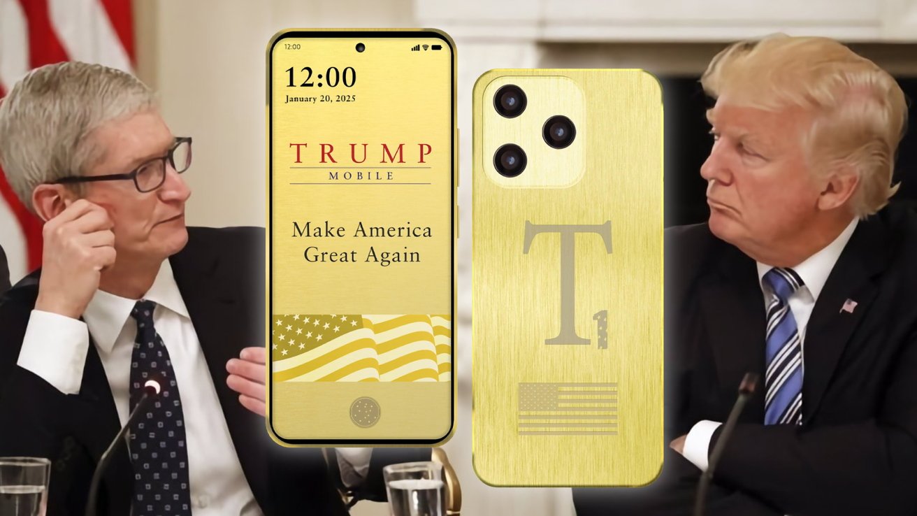
The Trump Organization has launched Trump Mobile and plans to release the T1, a smartphone that it says is "made in USA" at the same time that the iPhone 17 will launch. The problem is, the phone was made in China.
Trump takes on Cook with the T1
Marking ten years after the launch of President Donald Trump's original presidential campaign, the Trump Organization has decided to launch its own mobile phone network. Dubbed Trump Mobile, it is a network that is being promoted as an All-American service," and heavily leaning on the Trump brand.
Trump Mobile frames itself as a "next-generation wireless provider," with mentions of it delivering "top-tier connectivity" and "unbeatable value." All with a "customer-first" approach and an "all-American service."
This includes U.S. call centers, extensive services as part of the plan, and a new smartphone, the T1.
While the launch of a new mobile phone network will certainly draw an audience of Trump followers, it feels more like a cash-in on the Trump brand rather than a real attempt to take on the U.S. mobile market.
The Trump Mobile offering falls into two main offerings, consisting of the phone plan itself and the smartphone. Neither look particularly great from a consumer point of view.
And that smartphone that the Trump organization claims is made in the US, is a cheap Chinese android device, that they are tripling the Amazon price of, slapping on new plastic, and calling it a day.The 47 Plan
The 47 Plan, named after the fact that Trump is the 47th President of the U.S., is the main offering for the network. While it does offer a smartphone for sale, the bread and butter for a carrier is the service.
Trump Mobile is a mobile virtual network operator (MVNO). It will likely work on three major U.S. carriers, leveraging the 5G networks and coverage of AT&T, Verizon, and T-Mobile.
What it is not, is a new network. It resells AT&T, Verizon, and T-Mobile network access.
The $47.45 per month, clearly another presidential number reference, is a fairly high price for a mobile service. But, there are promises of it going far beyond the typical cellular service.
Trump Mobile says it will provide unlimited talk, texts, and data, with the first 20GB offered at "high speed." These are very common features of modern-day phone plans.
The free international calling to over 100 countries is framed as a benefit for families who regularly call American military bases.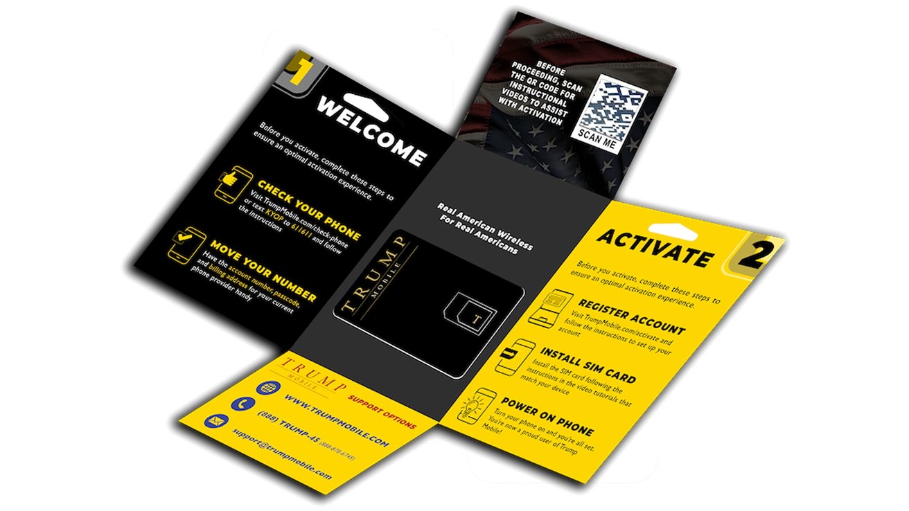
Trump Mobile SIM pack - Image Credit: Trump Mobile
Going into the realm of extended services, Trump Mobile also touts "Device Protection," but stops short of saying what it is, save for it not being insurance. It is being handled by a third-party provider, but again Trump Mobile doesn't say what that would be.
There is also included roadside assistance provided by Drive America. There's also telehealth and prescription services, again handled by third-party providers.
This is a lot for Trump to offer as part of a mobile plan, and at face value it could justify the monthly fee. However, the extra services may cause users to incur fees if they use them beyond a basic level. There is a complete lack of disclosure on the website about additional fees, so it's hard to tell how much, or how often.
The site does say that you can bring your own phone over to the network, with a SIM card supplied by the company. It is unclear if eSIMs are being supported.
Since current-gen iPhones don't have a SIM card slot and rely on eSIM support with networks, this could rule out Apple users until that support is added.
At the time of reporting, Trump Mobile is not listed on Apple's eSIM support page.T1 takes on iPhone 17, maybe
The constant calls and pressure from the administration of President Donald Trump for Apple to make its iPhone in the United States are well documented. It's therefore apt that Trump Mobile will be offering its own smartphone to consumers as well.
The T1 is described in the Trump Mobile press release as a device that is "designed and built in the United States." This nationalistic claim is also a shot against Apple, which often uses the phrase "Designed by Apple in California," followed by a statement about the phones being assembled in India or China in most cases.
Clad in a gold-colored casing, the T1 is said to have a 6.8-inch Punch-Hole AMOLED display, with an under-screen fingerprint sensor and an "AI Face Unlock."
All of these parts will need to be imported for the phone. There are no domestic AMOLED display manufacturers, and the VCSEL used for face unlock technologies is also produced overseas.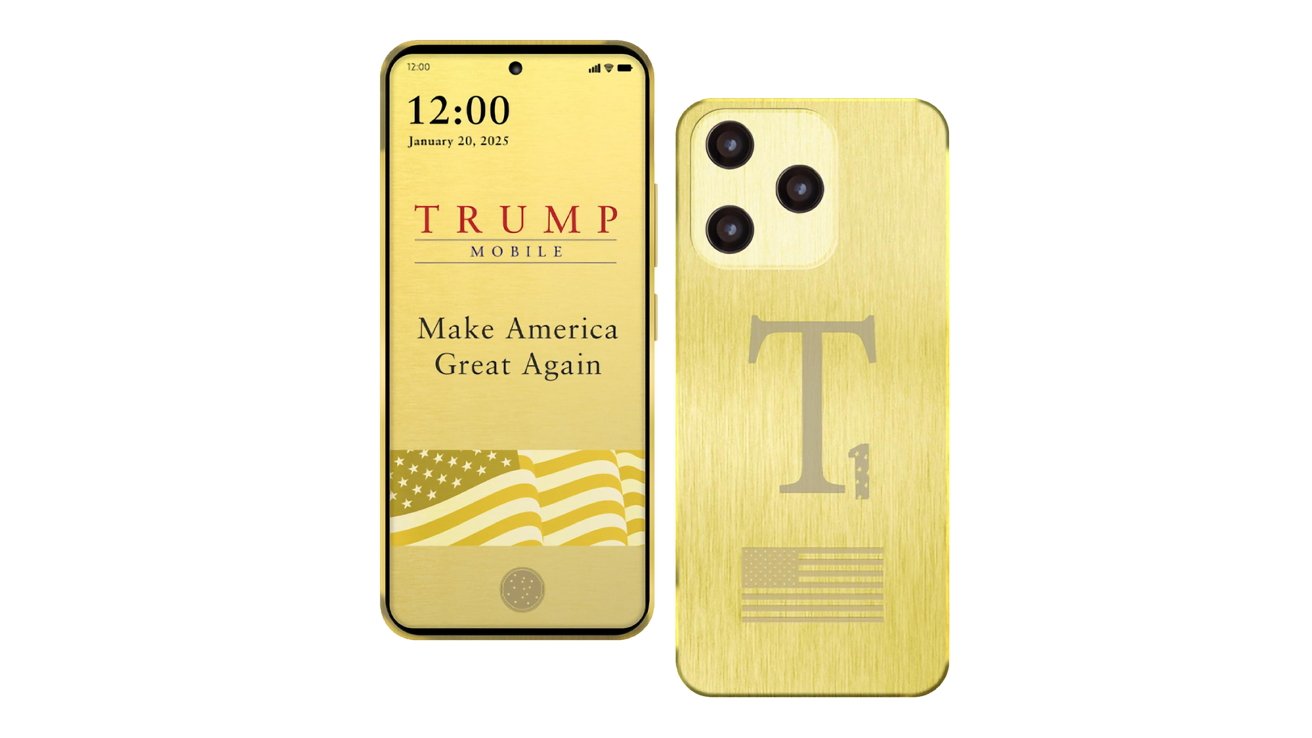
Trump Mobile T1 - Image Credit: Trump Mobile
Running on Android 15, it is listed as having 256GB of internal storage, expandable by a memory card slot, and 12GB of memory.
On the back are a 50MP main camera but surprisingly low-resolution depth and macro cameras at 2MP, but the front has a 16MP selfie camera. The camera modules will have to be imported too for any kind of US manufacture.
Battery capacity is said to be a generous 5,000mAh, charged using USB-C with 20W of fast charging. That USB Type-C port is also limited to slow USB 2.0 speeds, and is joined by a 3.5mm headphone jack. These are typical for the price point.
The T1 is also seemingly going to be an attempt to spoil the September launch of the iPhone 17 range, with Trump Mobile planning to ship it by August.
The price of $499 with a $100 down payment for pre orders, makes it a mid-range device price-wise. The Amazon sale price on the device is about $180.A reskinned import?
While there is a lot of bravado that it will be US-made, it took social media about an hour to find out where the phone actually comes from.
In a post to X by analyst Max Weinbach, it seems that the T1 closely resembles the T-Mobile REVVL 7 Pro 5G. The specifications of the display and the odd camera resolutions match up with the T-Mobile device, along with other details.
That smartphone is made by Wingtech, owned by the Chinese-owned manufacturer Luxshare. The T-Mobile version is believed to be built in Kiaxing, Wuxi, or Kunming, in China.
The T1 appears to be a reskinned version of the REVVL 7 Pro 5G, in a new enclosure and with slightly moved around cameras. This smartphone normally costs $250 at full retail, and even goes down to $169 on sale like it is on Amazon right now.
For the Amazon price, you don't get the gold-colored trim, of course.
The T1 phone may be modded in the USA. It certainly wasn't designed or assembled in the US.Made in America?
The promotion surrounding Trump Mobile and the T1 certainly paint the operation as a US-centric approach, including for manufacturing the T1. The press release specifically mentions the T1 as "proudly designed and built in the United States."
A press release's mention of Trump Mobile's T1 being designed and built in the U.S. - Image Credit: Trump Organization
In interviews, Eric Trump has also repeatedly mentioned the manufacture of smartphones. "You're gonna have phones that are made right here in the United States of America," he told Fox Business.
On stage for the launch, he declared "Making phones in America, it's about time we bring products back to our great country."
The fact that it is a reskinned smartphone notwithstanding, the repeated claim of the T1 being designed and made in the United States is one that should be further questioned. The information provided about the smartphone is missing quite a few key areas, and goes against the usual expected cost of manufacture, if it is truly a US-made product.
For a start, the specifications list is missing the description of the chip that powers the mobile device. Even though Qualcomm, the main U.S. chip company for mobile processors, is based in the United States, it still outsources chip production to foreign third parties, such as TSMC in Taiwan.
TSMC does have a factory in the United States, but that is still far from being an adequate source of chips, even for Trump Mobile.
The obvious logic here is that the chip is being ignored because it's not a component made in the United States. This can be said of the screen, and the camera modules as well.
That leads to another issue with the claims of it being made in the United States. As AppleInsider has repeatedly discussed, Apple cannot easily bring manufacturing of the iPhone to the United States without significant expenditure, as well as years of planning with its many supply chain partners.
Then there's the issue of somehow building up a skilled workforce in the U.S., to a skill level of what is available from workers in China. Or better robots.
All of these problems that apply to Apple also apply to Trump Mobile's T1, except it doesn't have the massive baggage Apple would have to deal with to do the same thing.
Assembling smartphones in the United States is possible, but on an extremely small scale. There are producers such as Purism who design and assemble smartphones entirely in the United States.
They do not source all of their parts from US manufacturers, though. Cameras, RAM, storage, processors, and screens are all imported.
So assembling a smartphone in the US is not completely impossible, just difficult. And by definition, it will have to be in low volumes.
Trump Mobile would still have to source the components before assembling them in the United States. Add in that those components would ideally have to be sourced from within the U.S. as well, and it becomes a very expensive operation.
Possibly one that on a per-smartphone basis would leave little to no profit from the sub-$500 selling price. Given that Trump businesses want to make a profit, something has to give to make the T1 for $500.
We believe that the device will be assembled and designed in the US. We do not think it will make the Trump Organization's deadline.
Furthermore, the parts the company will need to assemble the phone will need to be imported. They will be subject to the tariffs that the administration applied, unless some kind of special deal is carved out by the Trump administration, making a $500 price point generating a profit unlikely.
So, unless there is some real supply chain magic happening, and there does not appear to be any at this moment, it's extremely unlikely that this will be an entirely U.S.-produced smartphone.
Trump Mobile is clearly aiming for the Trump fan vote with the T1. What they'll get from their money is a mid-rate Android device that won't live up to the plastic shine of its golden exterior.
Updated on June 16, 2025 at 1:04 P.M. Eastern: Added discussion of reskinning from social media.
Read on AppleInsider


-
iOS 26 vs iOS 18: Is Apple's 'Liquid Glass' a true redesign?
With iOS 26, Apple unveiled a unified design language with translucent elements that mimic the look of real-world glass. Here's how it compares to iOS 18.
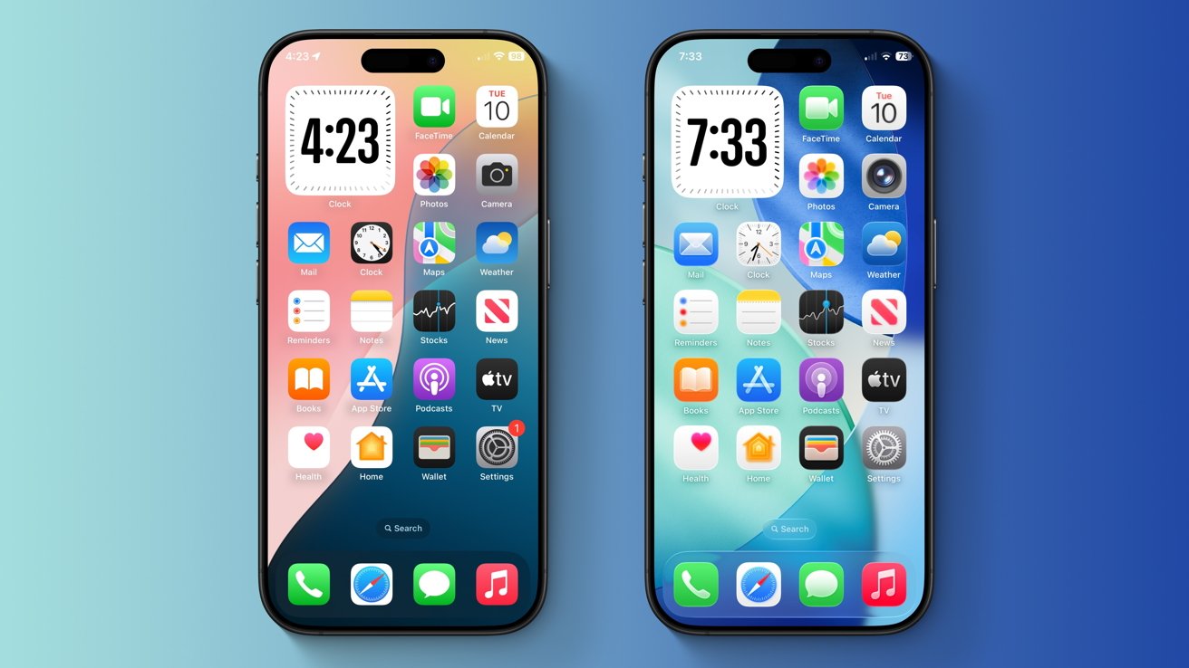
iOS 26 vs iOS 18: iOS 26 (right) features slightly larger icons compared to iOS 18 (left) -- but they both use the same color palette.
On June 9, at its annual Worldwide Developers' Conference, the iPhone maker finally unveiled the long-rumored visionOS-style redesign we were all waiting for. The company's latest operating systems all received a revamped user interface with a new material dubbed 'Liquid Glass.'
Apple says that Liquid Glass uses real-time rendering to imitate the way glass refracts light, and explains that the new material reacts to movement dynamically with specular highlights. It's used across various user interface elements, including buttons, switches, app icons, the Lock Screen, Control Center, and more.
The company called Liquid Glass its "broadest design update ever," but the claim is a bit of an exaggeration. Apple compared the redesign to iOS 7, saying that it "sets the stage for the next era" of its products, even though the change is nowhere near as drastic as it was back in 2013.iOS 26 vs iOS 18: 'Liquid Glass' feels like a derivative change rather than a fresh new look
More than a decade ago, with the release of iOS 7, Apple phased out its iconic skeuomorphic design language. Gone were the hyper-realistic icons and app designs that mimicked real-world objects, most notably in iBooks and Calendar. The company switched it all out in favor of a flat design with bright colors and dynamic blur effects.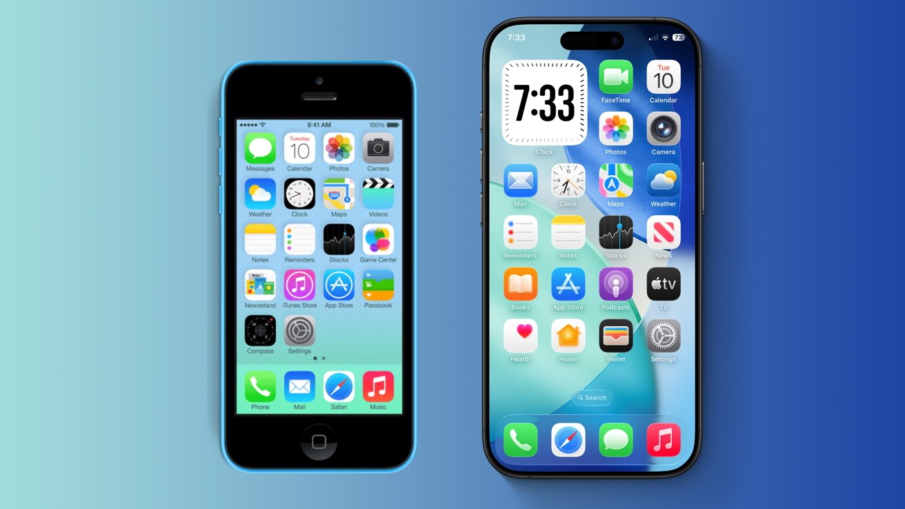
iOS 26 vs iOS 18: Even though it was announced more than a decade later, iOS 26 (right) still resembles iOS 7 (left).
That design language stuck with iOS for the next eleven years, but its influence still lingers even in iOS 26. The operating system has retained the distinct color palette introduced with iOS 7, though its app icons have received a few visual tweaks. Even the all-new Liquid Glass material bears some resemblance to the blur effect introduced in iOS 7 and used through iOS 18.
The cross-platform design aspect of iOS 26 isn't anything new either -- Apple has tried to unify its operating system designs before. Years ago, iOS 7 and macOS 10.10 Yosemite were early incarnations of the company's design unification efforts.
macOS Big Sur is the most obvious example, as Apple's desktop operating system gained square app icons and a redesigned Dock, both reminiscent of iOS and iPadOS. Previous releases of macOS maintained a distinct set of icons and UI elements that set them apart from Apple's mobile OS releases.
Despite all the hype, other operating systems have used arguably similar glass-like transparency effects in the past. Windows Vista and Windows 7, for instance, featured a visually distinct Aero theme, which some users have compared to the newly announced iOS 26.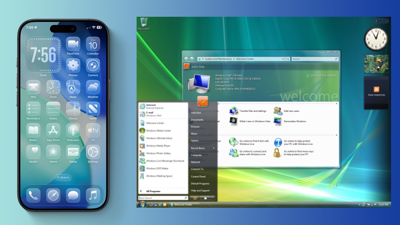
iOS 26 vs iOS 18: Apple's iOS 26 (left) looks somewhat similar to Microsoft's Aero theme, used in Windows 7 and Vista (right)
Microsoft phased out its iconic Aero interface with Windows 8, though, meaning that it hasn't been in use for over a decade. Relative to the Aero theme, Apple's implementation is much better at emulating real glass, as the Liquid Glass effects are dynamic rather than static.
Overall, Apple's latest Liquid Glass material arguably represents consistency rather than true innovation, given Apple's previous design unification efforts. It's in line with what Apple and other manufacturers have done in the past, rather than something that has never been done before. It may not be up to everyone's liking.
Though iOS 26 leaves a lot to be desired, the operating system does have a few areas where it truly stands out.iOS 26 vs iOS 18: Where Apple's latest OS truly shines
iOS 26 introduces an entirely new "Clear" look that makes Home Screen apps fully transparent. It's an interesting choice, but not exactly groundbreaking either.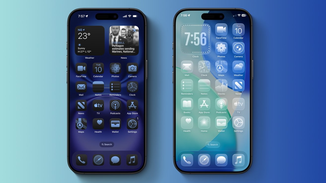
iOS 26 vs iOS 18: The newly announced iOS 26 (right) adds a Clear look for Home Screen icons.
It builds upon the customization options introduced with prior iOS versions, such as the Light, Dark, and Tinted options that were already available in iOS 18. One benefit of the new Clear look is that users no longer have to rely on jailbreak tweaks to achieve transparent Home Screen icons, as they once did with Cydia tweaks such as WinterBoard and similar tools.
Another key change with iOS 26 is the introduction of dynamic elements that can increase or decrease depending on the user's needs. These upgraded context menus and tab bars utilize Apple's new Liquid Glass look, replacing the rectangular and often white UI elements found in previous iOS releases.
You'll notice the new UI elements across various system applications, including the App Store and Apple News. In the News app, for instance, the tab bar moves out of the way when you're scrolling, providing an almost full-screen experience that prioritizes the content you're trying to read. It's a neat change, overall.
The dynamic user interface elements allow for greater consistency across system applications and make navigation easier. Still, it's unlikely that the average user will notice the difference, given that iOS has been a mix of blur effects and rounded corners for years.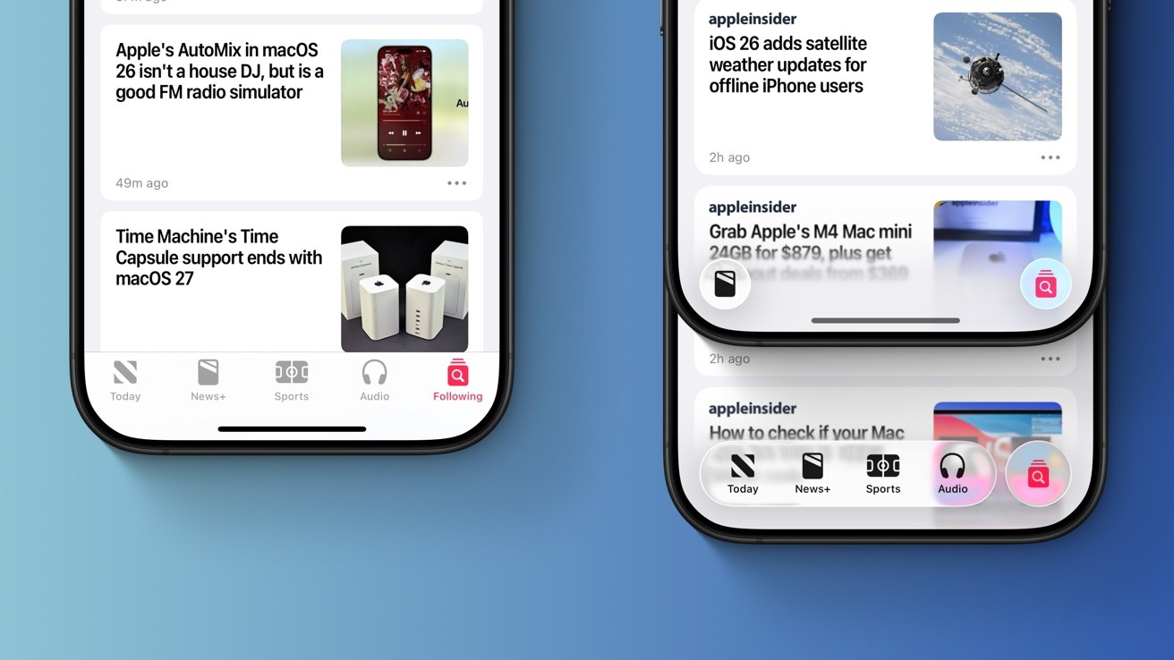
iOS 26 vs iOS 18: Apple's iOS 26 (right) adds dynamic UI elements that move out of the way when you're scrolling, while iOS 18 (left) features a static tab bar.
The Liquid Glass material is also noticeable in the Safari app. The new material is used for the URL bar and back buttons.
The Camera app now has a simplified user interface, and its buttons feature rounded corners as well. It makes for a useful change, unlike most of the redesign-related alterations in iOS 26.
Even so, the new user interface elements wouldn't have looked out of place, even if they were added years ago. As for why this type of design wasn't implemented earlier, hardware limitations are a possible explanation.
Apple says that its Liquid Glass material was created through the close cooperation of its hardware and software teams. The software takes advantage of the improved hardware available in Apple's latest A18 and A18 Pro chips, which have the necessary processing power to achieve these glass-like effects.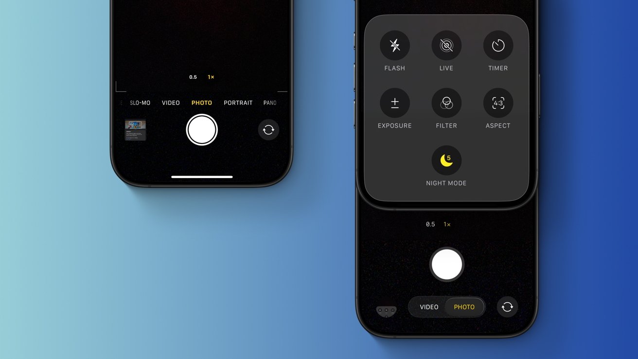
iOS 26 vs iOS 18: The new-and-improved iOS 26 (right) introduces a simplified user interface for the Camera app, which prioritizes certain options.
Older hardware would likely struggle with Liquid Glass, so it's not much of a surprise that iOS 26 dropped support for the 2018 iPhone XR and iPhone XS. Years ago, when the iPhone 4 received iOS 7, the device never got any of its impressive blur effects.
Enabling the blur effects through jailbreak tweaks revealed just how poorly the device performed, and a similar scenario likely would have affected 2018 iPhone models with iOS 26.iOS 26 vs iOS 18: Why Apple may have opted for a redesign
Though rumors of an operating system redesign have been floating around for at least a year, Apple may have chosen 2025 for a specific reason. The redesign is little more than a fresh coat of paint, but the company may have used it to hide imperfections, so to speak.
iOS 26 vs iOS 18: Apple showed off various physical lenses during WWDC, as they were presumably used for Liquid Glass development. Image Credit: Apple.
To be more specific, Apple's iOS 26 redesign serves as the perfect distraction from its Apple Intelligence debacle. Siri still lacks the personal context and in-app awareness features that were promised a year ago at WWDC 2024, and this very issue is the subject of two separate lawsuits filed against the company.
In short, Apple over-promised and failed to deliver, and the company was reportedly embarrassed about it, behind closed doors. With that in mind, it's not much of a surprise that WWDC 2025 was relatively light in terms of Apple Intelligence features. Sure, there's a new Foundation Models framework and an improved Shortcuts app, but not much else.
Apple may have wanted users to focus on the new glass-like design more than anything else, which is why it was featured at the beginning of the WWDC 2025 keynote. The company even went so far as to show off some of the tools presumably used during development -- physical lenses and magnifying glasses in the shape of iOS user interface elements.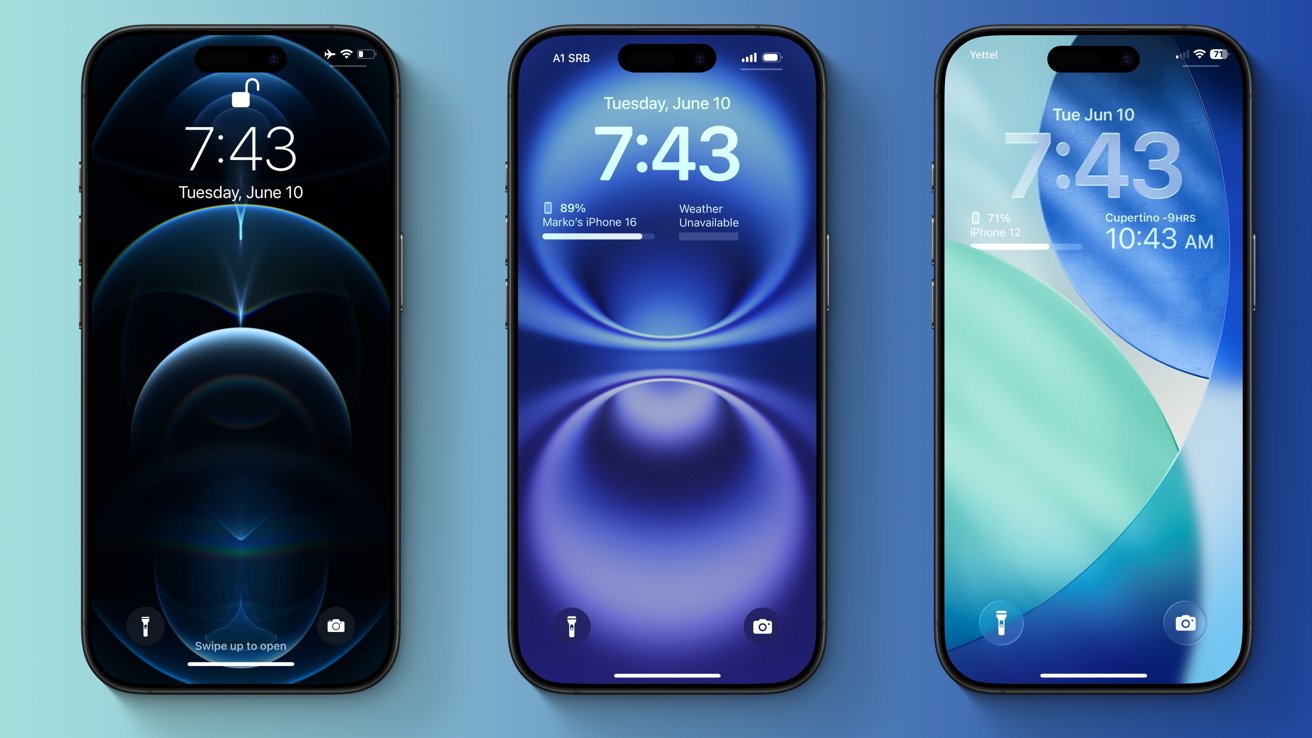
iOS 26 vs iOS 18: The iOS Lock Screen has changed over the past five years, but it has retained the same overall look. Left: iOS 14, Middle: iOS 18, Right: iOS 26
The distraction aspect alone, however, wouldn't have been enough to justify the redesign. During the keynote on June 9, Apple said that Liquid Glass would set the stage for future products, and the company may have had a specific device in mind. There have been rumors of an all-glass iPhone, with no display bezels, a curved frame, and no camera cutout.
It's been rumored that iOS 26 would serve as an indicator of what future products strive toward, that the operating system will influence the look of new hardware.
Specifically, the 20th anniversary iPhone is said to have the codename "Glasswing," referring to a type of butterfly with translucent wings. It's set to debut in 2027, so we'll know soon enough if Apple's software influenced its hardware, and to what extent.
Read on AppleInsider