Apple debuts redesigned online store with dedicated 'Store' tab

Apple on Tuesday introduced a new online Apple Store experience for the web with fresh design cues borrowed from iOS, including product cards, curated selections, informational sections and more.
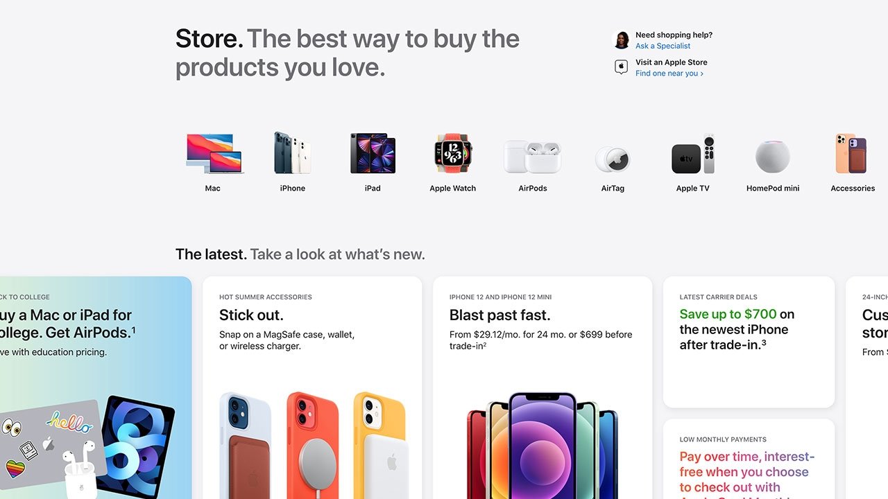
Among the most prominent changes is a "Store" tab that sits next to Mac, iPad, iPhone, Watch, TV, Music and Support categories on Apple.com's navigation bar. Apple's website previously featured a "Store" tab that directed users to the online Apple Store, but that mechanism was replaced by "Buy" links buried in each category.
The top of Apple's Store page now reads, "Store. The best way to buy the products you love."
Sitting at the top are links to contact a retail specialist and find a nearby retail store. Like the "Store" tab, Apple had for years buried an interactive list of brick-and-mortar stores within its main site's search feature.
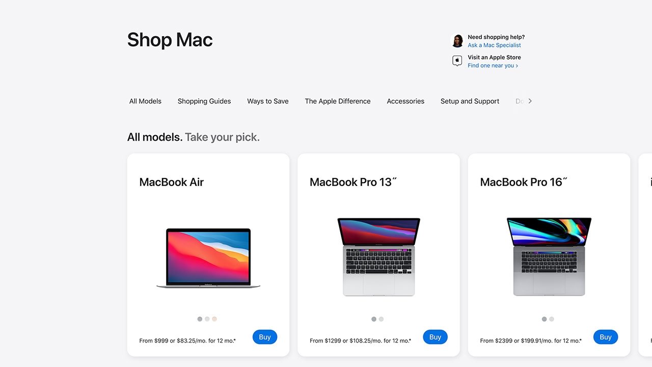
Below the welcome text is a row featuring Apple's major product lines. Clicking on a product like Mac directs to a page of browsable devices arranged neatly into a row of cards that can be navigated scrolling horizontally. Each card links to configuration and purchasing options for specific models, while other rows on the page direct to shopping guides, accessories, trade-in options and discounts, setup and support, and informational user guides. These sections can be quickly accessed through a scrolling navigation bar at the top of the page.
Back to the main page, a "What's New" section highlights new products, current deals, carrier discounts and more. Below that is a help section where users can request to shop with a specialist, get device assistance or schedule a Genius support appointment.
Apple touts the "Apple difference" in a set of cards promoting services like free delivery or courier delivery, in-store pickup, device trade-in, Apple Card, Mac and Apple Watch customization, and emoji engraving.
It appears Apple will regularly cycle new curated content into the Store page. For now, a row of "extracurricular accessories" shows off first-party products that are "perfect for the college-bound," while another row throws a spotlight on AirTag and related accessories.
Overall, the online store feels like it belongs on iOS or, more specifically, iPadOS, with a gesture-focused interface and copious use of cards. The clean design owes much to the Apple Store app and while the new horizontal scroll-based navigation is a bit clunky with mouse or trackpad, Apple offers directional arrow buttons at each row to compensate.
Read on AppleInsider
Among the most prominent changes is a "Store" tab that sits next to Mac, iPad, iPhone, Watch, TV, Music and Support categories on Apple.com's navigation bar. Apple's website previously featured a "Store" tab that directed users to the online Apple Store, but that mechanism was replaced by "Buy" links buried in each category.
The top of Apple's Store page now reads, "Store. The best way to buy the products you love."
Sitting at the top are links to contact a retail specialist and find a nearby retail store. Like the "Store" tab, Apple had for years buried an interactive list of brick-and-mortar stores within its main site's search feature.
Below the welcome text is a row featuring Apple's major product lines. Clicking on a product like Mac directs to a page of browsable devices arranged neatly into a row of cards that can be navigated scrolling horizontally. Each card links to configuration and purchasing options for specific models, while other rows on the page direct to shopping guides, accessories, trade-in options and discounts, setup and support, and informational user guides. These sections can be quickly accessed through a scrolling navigation bar at the top of the page.
Back to the main page, a "What's New" section highlights new products, current deals, carrier discounts and more. Below that is a help section where users can request to shop with a specialist, get device assistance or schedule a Genius support appointment.
Apple touts the "Apple difference" in a set of cards promoting services like free delivery or courier delivery, in-store pickup, device trade-in, Apple Card, Mac and Apple Watch customization, and emoji engraving.
It appears Apple will regularly cycle new curated content into the Store page. For now, a row of "extracurricular accessories" shows off first-party products that are "perfect for the college-bound," while another row throws a spotlight on AirTag and related accessories.
Overall, the online store feels like it belongs on iOS or, more specifically, iPadOS, with a gesture-focused interface and copious use of cards. The clean design owes much to the Apple Store app and while the new horizontal scroll-based navigation is a bit clunky with mouse or trackpad, Apple offers directional arrow buttons at each row to compensate.
Read on AppleInsider
Comments
The page you’re looking for can’t be found.
Beware of the bad link https://www.apple.com/us/shop/goto/store on Apple main URL hierarchy
s/b https://www.apple.com/store
What you're seeing is a very common design pattern -- a centered content column. But in this case the "cards" scroll horizontally, so they continue to the right. Or the left:
You can find this design pattern everywhere. Like on this very website:
And Yahoo:
And Amazon:
And CNN:
And MacRumors:
...it's not weird. It's an extremely common design pattern that's over a decade old.
Have you never maximized your browser on any popular website before? Very confused how you folks think this is new or unique to Apple. The only difference is Apple's Store page has "cards" that scroll horizontally across the width...but it's the same centered column:
The site is fine once horizontally scrolled, but weird until that point. The rest of the site isn't like it save for the occasional arm or something extending right. Centrally positioned horizontal <divs> would be fine, like in the iPhone page you showed - because it's balanced, it is extended left and right. Exactly none of the sites you posted a picture of is the same as Apple's design. Nothing extends further right outside the centre column. It'd be like having "juiciest Apple rumors" in the AI screenshot having several more columns extending off to the right. Doesn't look right because it's unbalanced.
It in fact gets worse the more you vertically scroll because all of a sudden all of the horizontal scrolls start 1/3 the way across the page and extend off the right side. Looks stupid like you're zoomed into a portion of the page. Please do point out another website that does this.
Apple should gradient those carousels out, or balance them with a background in some way. Looks silly otherwise, like someone forgot to finish the job.
Apple:
Apple Insider:
You are grasping at straws very, very hard. But I understand - you are upset. Outraged. Apple didn’t run their horizontally-scrolling cards by you first!
I’ve really never seen such shrieking violets butthurt about web design.