How to send images from the Messages app on the iPhone in iOS 12

Posted:
in iOS edited October 2020
One of the more controversial changes in iOS 12 has to do with the way images from your photo library are shared in the Messages app. AppleInsider walks you through the easy, though perhaps a bit more convoluted than it has to be, method of sharing your images.

Messages in iOS 12


To start, we are going to hop into the Message of our iOS 12 equipped iPhone, though of course the same methodology applies to the iPad as well.

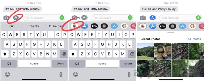
The biggest change is that sharing photos is no longer done by tapping the camera icon. Photos is instead, its own full-blown iMessage app.

If you want to take and share a photo, it is roughly the same as it always has been. Tap the camera icon, shoot, and hit the blue arrow to send.

Sending one from your library however, uses the new Photos iMessage app.

Sharing Photos in iOS 12 Messages App

  • In Messages, jump into a message thread.

  • Tap the App Store icon and tap on the Photos app icon.

  • Now tap the photos you'd like to send.

  • When finished, tap the send icon.

This new method isn't exactly intuitive, and we'll be the first to admit we still haven't gotten used to it after a month on iOS 12. It doesn't Apple will be changing its course any time soon, so better to adjust sooner rather than later.
«13

Comments

  • Reply 1 of 43
    512ke512ke Posts: 782member
    I hope we all get used to it. Personally i don't like having to re learn basic functions or to discover that previous functionality has quietly disappeared. I guess it's the price of progress!
    ajlbonobobbloggerblogmuthuk_vanalingam
  • Reply 2 of 43
    mike1mike1 Posts: 3,275member
    What is the supposed benefit of this change? If there will be more functionality because of this change, fine. But, I hope it's not just change for change's sake.
    Is it possibly an attempt to get people into that App bar more often so they see other stuff???
    aylkarthurbacaladanianmuthuk_vanalingamredgeminipa
  • Reply 3 of 43
    macseekermacseeker Posts: 544member
    I have friends who hate to learn new ways.  It took them a little over a month to learn the changes between iOS 10 and 11.
  • Reply 4 of 43
    arthurbaarthurba Posts: 154member
    mike1 said:
    Is it possibly an attempt to get people into that App bar more often so they see other stuff???
    Yes I think that’s exactly it.  But in this case there should be a way to preference what the ‘other’ icon is - ie: Instead of the camera and ‘app’ button, a ‘favourite’ Messages app and the ‘app’ button.  Then your favourite can by default be the camera, but you could change it to be the photos app, or a 3rd party app that perhaps still combines the camera and photos. 
  • Reply 5 of 43
    command_fcommand_f Posts: 421member
    Sorry to disagree but that looks like an improvement to me. The camera icon normally means "use the camera": that is, take a picture. Using the photos icon to mean "use one of my photos" seems more intuitive to me. I suspect that the previous operation was due to someone taking a shortcut in the design and bundling photos in with the camera. If the iOS change was in the opposite direction, I would anticipate accusations of obscurity 🤓.
    steven n.fastasleepnewBelieverbestkeptsecretwatto_cobrawilliamlondonjony0
  • Reply 6 of 43
    bonobobbonobob Posts: 382member
    I must always send photos directly from Photos or some other app (not Messages), because I was totally surprised by what the interface is like in iOS 11!  I suppose I won’t have too much trouble adjusting to the new interface. 
  • Reply 7 of 43
    hexclockhexclock Posts: 1,243member
    ajl said:
    512ke said:
    I hope we all get used to it. Personally i don't like having to re learn basic functions or to discover that previous functionality has quietly disappeared. I guess it's the price of progress!
    It's not progress, but the lack of Steve, I believe.
    Come on now, enough invoking the ghost of SJ. 
    Apple gave us a new button to push. Big deal. It’s not like they changed the whole UI. 
    cecil4444cecil4444mac_dognewBelieverwatto_cobracommand_fredgeminipawilliamlondon
  • Reply 8 of 43
    kenokeno Posts: 5member
    So, instead of hitting a button that looks like a camera to take pictures, then click on the albums button to find what picture you want to send, you tap the the button that looks like 'apps' and then tap the photos app?

    you're telling me that you'll use the actual app you store photos in and are used to the interface instead of going through the camera app to find photos? 

    Isn't that better?
    watto_cobraredgeminipawilliamlondon
  • Reply 9 of 43
    SpamSandwichSpamSandwich Posts: 33,407member
    command_f said:
    Sorry to disagree but that looks like an improvement to me. The camera icon normally means "use the camera": that is, take a picture. Using the photos icon to mean "use one of my photos" seems more intuitive to me. I suspect that the previous operation was due to someone taking a shortcut in the design and bundling photos in with the camera. If the iOS change was in the opposite direction, I would anticipate accusations of obscurity 🤓.
    I think you might be correct. Single function icons may improve the speed of attaching or taking photos. We'll soon see.
    cecil4444steven n.command_fjony0
  • Reply 10 of 43
    bloggerblogbloggerblog Posts: 2,462member
    512ke said:
    I hope we all get used to it. Personally i don't like having to re learn basic functions or to discover that previous functionality has quietly disappeared. I guess it's the price of progress!
    Agreed. A friend of mine and I were baffled for about 5 minutes trying to figure out how to record and iMessage an memoji.
  • Reply 11 of 43
    Andrew_OSUAndrew_OSU Posts: 573member, editor
    mike1 said:
    What is the supposed benefit of this change? If there will be more functionality because of this change, fine. But, I hope it's not just change for change's sake.
    Is it possibly an attempt to get people into that App bar more often so they see other stuff???
    Personally, I think the change makes more sense, even if it is annoying. The camera should launch the camera, and photos should live where all the other imeages, stickers, etc all live.  
    cecil4444watto_cobracommand_f
  • Reply 12 of 43
    Looks like it requires the same number of taps, just in slightly different places. That’s not a big issue to me. The problem I have is with the app drawer never staying put — no matter how many times I organize it the apps inevitably rearrange themselves. If the Photos app stays anchored to the left side, then fine. But if it gets jumbled up with all the other apps and I have to swipe three times to find it, then I’m going to have a big problem with this change.
    watto_cobra
  • Reply 13 of 43
    steven n.steven n. Posts: 1,229member
    command_f said:
    Sorry to disagree but that looks like an improvement to me. The camera icon normally means "use the camera": that is, take a picture. Using the photos icon to mean "use one of my photos" seems more intuitive to me. I suspect that the previous operation was due to someone taking a shortcut in the design and bundling photos in with the camera. If the iOS change was in the opposite direction, I would anticipate accusations of obscurity 🤓.
    100% agree. The new method is much easier to use AND teach. 
    watto_cobracommand_f
  • Reply 14 of 43
    georgie01georgie01 Posts: 436member
    command_f said:
    Sorry to disagree but that looks like an improvement to me. The camera icon normally means "use the camera": that is, take a picture. Using the photos icon to mean "use one of my photos" seems more intuitive to me. I suspect that the previous operation was due to someone taking a shortcut in the design and bundling photos in with the camera. If the iOS change was in the opposite direction, I would anticipate accusations of obscurity 🤓.
    I disagree. Often the images I want to send were very recently taken, so when I press the camera icon the image I want to send is right there. It’s quick and simple. Sometimes quick and simple takes precedence over ‘sensible’, when sensible means it takes more time. And it’s not like it’s a stretch to associate photos with the camera. One might say it’s a pretty reasonable association.
    command_fwilliamlondonmike1
  • Reply 15 of 43
    SoliSoli Posts: 10,035member
    512ke said:
    I hope we all get used to it. Personally i don't like having to re learn basic functions or to discover that previous functionality has quietly disappeared. I guess it's the price of progress!
    It took me exactly three "oopsies" of going into the Camera app before I learned to hit the correct button. I can't say my speed in sending an image in Messages is any slower on iOS 12, but I guess it technically has to be since it's an extra virtual button. Regardless, I think we'll all be fine and as others have stated it's arguably more intutiive. I'm more concerned about how Apple will improve their MacBook Pro keyboard in future releases.
    edited July 2018 watto_cobra
  • Reply 16 of 43
    SoliSoli Posts: 10,035member
    cecil4444 said:
    Looks like it requires the same number of taps, just in slightly different places.
    Is it? I thought with iOS 11 and earlier you tap the Camera icon to see the camera window pane and a list of recent photos (so 2 taps total to add a photo), but with iOS 12 it's the Apps icon, the Photos icon, and then the photo (so 3 taps).
    mike1
  • Reply 17 of 43
    fastasleepfastasleep Posts: 6,408member
    ajl said:
    512ke said:
    I hope we all get used to it. Personally i don't like having to re learn basic functions or to discover that previous functionality has quietly disappeared. I guess it's the price of progress!
    It's not progress, but the lack of Steve, I believe.
    Right, because Steve Jobs designed every single user interface in iOS and they were all the most amazing UI you ever saw, and they've gotten progressively worse ever since he died. /eyeroll

    Jobs, and Forstall more directly, oversaw a TON of mystery meat navigation and other questionable UI/UX choices over the years. Forstall was the worst enabler of Jobs' design impulses, like the Corinthian leather and torn paper on the Calendar, bookshelves and felt tables and the stupid fucking Podcasts reel to reel player and the stupid Passbook shredder animations. 

    We've moved on from all that nonsense, thankfully. Things will continue to iterate and the pendulum has swung back and forth a few times, but I feel like things are starting to get much more refined than they have been.

    512ke said:
    I hope we all get used to it. Personally i don't like having to re learn basic functions or to discover that previous functionality has quietly disappeared. I guess it's the price of progress!
    Agreed. A friend of mine and I were baffled for about 5 minutes trying to figure out how to record and iMessage an memoji.
    That's not re-learning a basic function, it's a brand new (optional) feature. 
    watto_cobra
  • Reply 18 of 43
    The user and all related content has been deleted.
  • Reply 19 of 43
    Nobody asked for this. 
    [Deleted User]williamlondon
  • Reply 20 of 43
    SoliSoli Posts: 10,035member
    smithsfan said:
    Nobody asked for this. 
    If you want to start basing Apple's success on what was "asked" the you're on the wrong side of history.
    fastasleepRayz2016bonobobwatto_cobraredgeminipamike1
Sign In or Register to comment.