AppleInsider · Kasper's Automated Slave
About
- Username
- AppleInsider
- Joined
- Visits
- 52
- Last Active
- Roles
- administrator
- Points
- 10,973
- Badges
- 1
- Posts
- 66,634
Reactions
-
Getting started with Apple Vision Pro developer software
Apple released its visionOS SDK and developer tools on Wednesday, along with more info about developing for Apple Vision Pro. Here's an overview of what it is, what it can do, and how to get started.
Apple's SDK for the Apple Vision Pro is included in the second Xcode beta. It includes Command Line Tools for Xcode 15 beta 2, Font Tools for Xcode 15 beta, and the visionOS 1 Beta Simulator Runtime, which is packaged as a .dmg disk image file.
To get the new SDK and Xcode beta files, go to developer.apple.com/download/ and log in with your Apple ID. These tools are included in the new free developer membership.How to install Apple Vision Pro developer software
You'll need the Xcode 15 beta 2 download, which contains the Xcode 15 beta 2 app itself, macOS 14 beta 2, and assorted simulators. You'll also want the Command Line Tools for Xcode 15 beta 2, and the Xcode 15 beta 2 which also contains macOS 14 beta 2.
If you haven't previously, also download the Font Tools for Xcode 15 beta at the bottom of the page released on June 5th.
When downloading Xcode 15 beta 2, be sure to check the visionOS beta 1 checkbox at the bottom of the list, which weighs in at a whopping 6.85GB: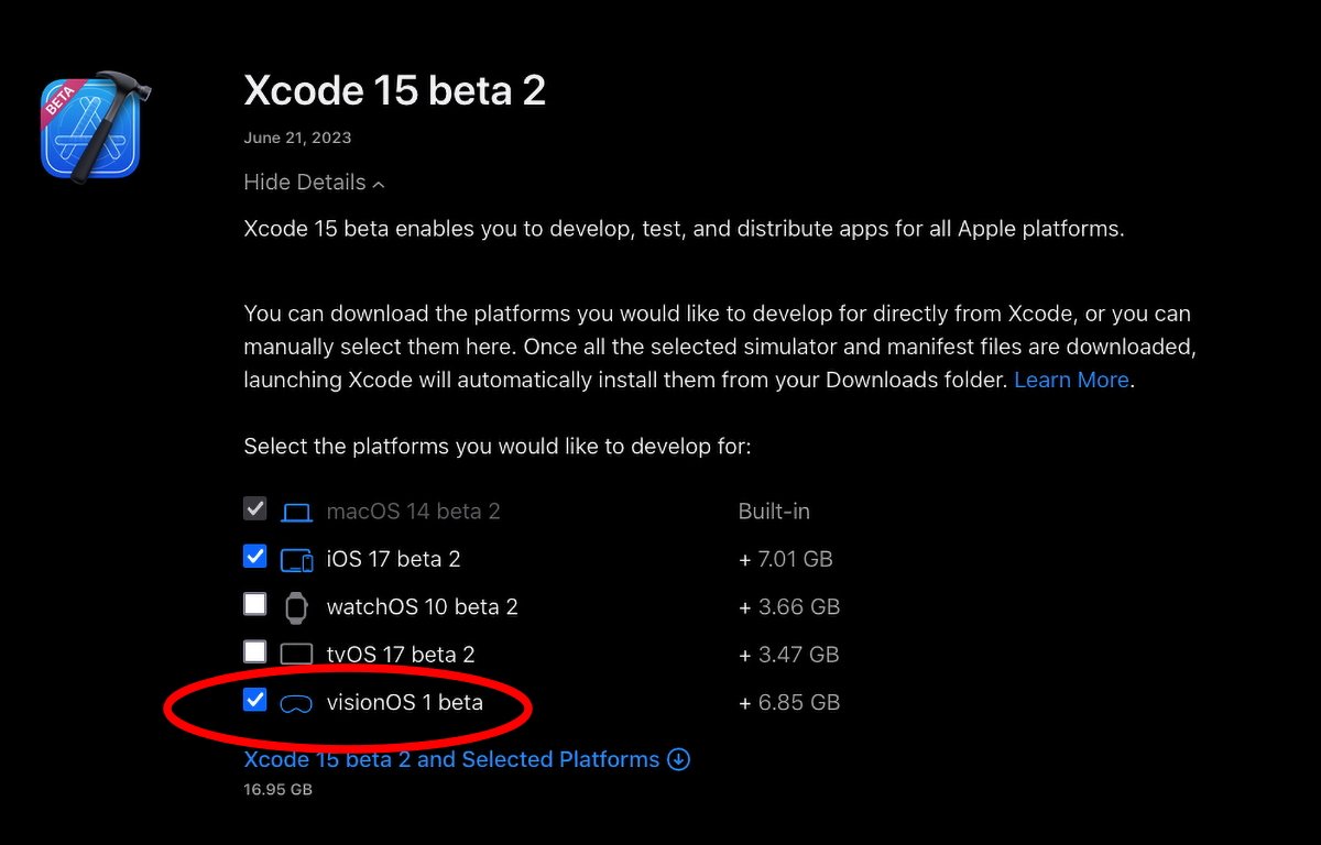
Be sure to check "visionOS 1 beta".
Note that in all cases you do need the iOS download components as well.
This provides the what Apple is still calling the xrOS 1.0.simruntime file on a .dmg which you import into Xcode to install the visionOS simulator (more on this below).Additional downloads for Apple Vision Pro developer software
The learning curve for visionOS can be quite steep - crossing several computing disciplines in addition to mere programing. These include 3D object and scene design, Augmented Reality (AR), materials and surfaces, and lighting and rendering.
In addition to the Xcode pieces, you'll want to learn and grab a few additional items used by Apple's AR ecosystem:- ARKit 6
- RealityKit
- Reality Composer app
- AR Quick Look plugin for 3D object file previews
Most of these are available on Apple's developer site at developer.apple.com/augmented-reality/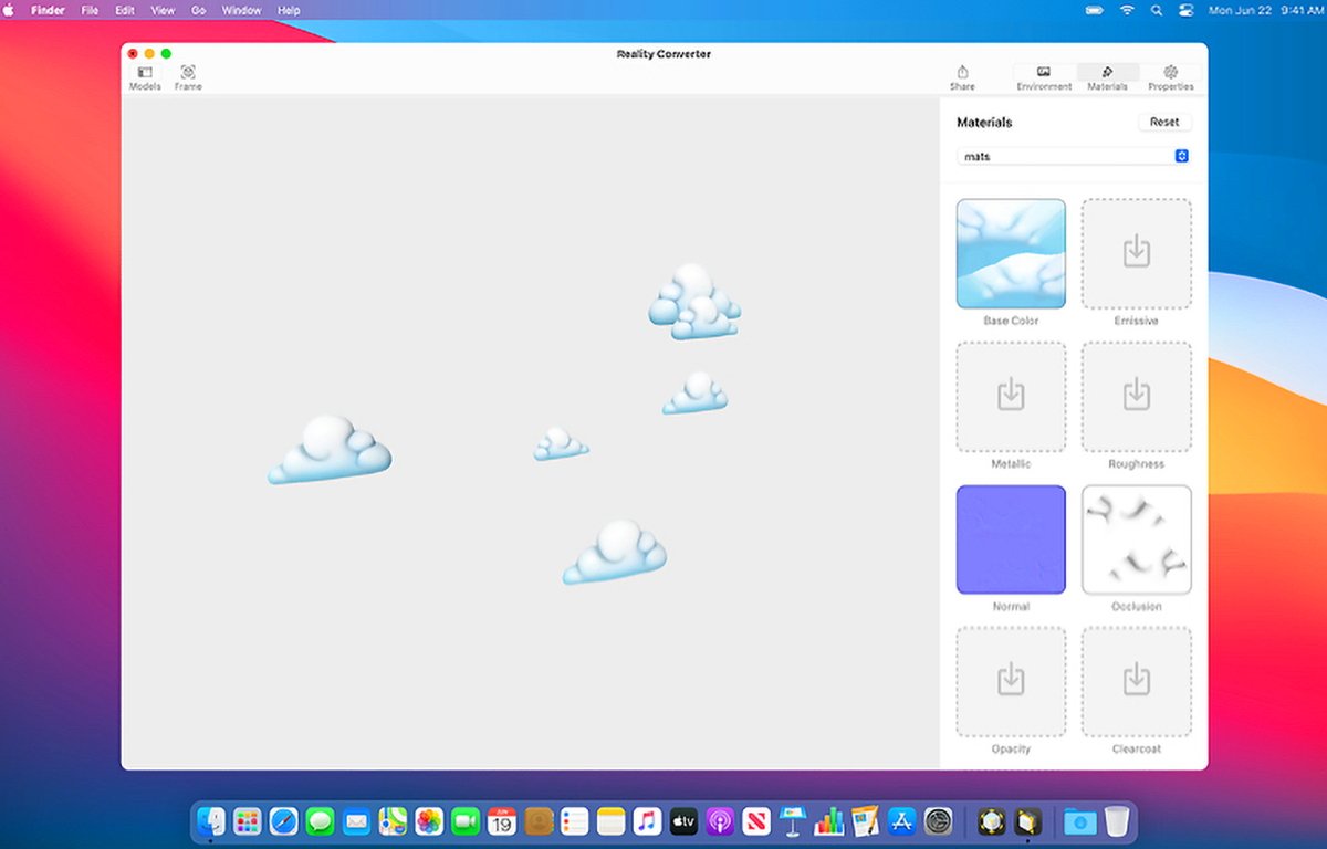
Apple's Reality Composer.
The SDK also includes Reality Composer Pro which was promised at WWDC 23 in the visionOS presentations. Reality Composer Pro is an app designed to help prepare and preview 3D content for visionOS.
As part of the SDK release Apple also released Reality Converter beta which allows you to convert between AR file formats such as .obj, .gltf and .usd and convert them all to standard USDZ format. You can also change some texture properties in Reality Converter beta.
There's also an additional .dmg download on the AR tools page called USDZ Tools which is a set of Python scripts for USD conversion. All of Apple's AR tools can be found on the main AR page at developer.apple.com/augmented-reality/tools/
The AR Quick Look plugin can be found at developer.apple.com/augmented-reality/quick-look/ along with samples.
With all this installed, you can now also use Unity's 3D development tools to develop Apple Vision Pro apps. Visit the Unity site at unity.com.Apple Vision Pro SDK -- File and graphic formats
Designing and writing your visionOS app is just one part of visionOS development. The other part is mastering 3D models and spaces.
After all, Apple calls the Vision Pro an AR headset. As such, your visionOS apps are presented to the user in 3D space in the Apple Vision Pro device.
You'll also need to be familiar with Pixar's Universal Scene Description and USDZ files, which contain descriptions of 3D objects.There are a number of resources to learn about USDZ files. For instance, NVIDIA's developer site also has a good discussion of USD.
In most cases you'll need to convert your 3D content to USDZ for use in visionOS.
In additional to USD, you'll also want to learn Industrial Light + Magic's MaterialX standard - an open-source universal 3D object material standard first created in 2017 for the film Star Wars: The Force Awakens.
Materials refer to the surfaces of 3D objects and what those surfaces look like. In real world terms, this means materials like wood, metal, or glass that they are simulating.Apple Vision Pro SDK -- User experience and interface
There are four modes of presentation supported in visionOS:- Windowed apps
- Volumes
- Spaces
- Immersive apps
Windowed apps act essentially like iOS and iPadOS apps in visionOS's main Shared Space, except that you can fling them to the side - kind of like you can in macOS with Stage Manager.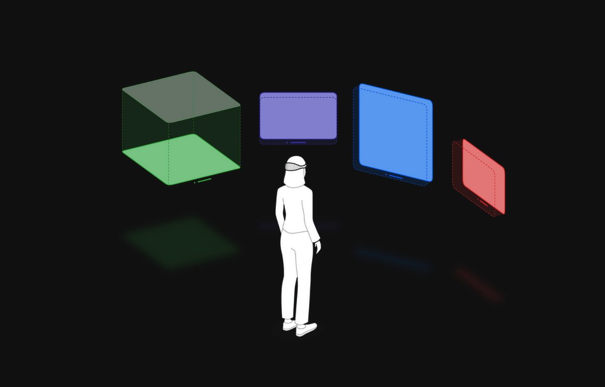
visionOS provides four types of user experience.
Volumes are basically SwiftUI scenes embedded in windowed apps which display RealityKit or Unity 3D objects in parts of windows. Users can reposition windows and volumes in the Shared Space wherever they like.
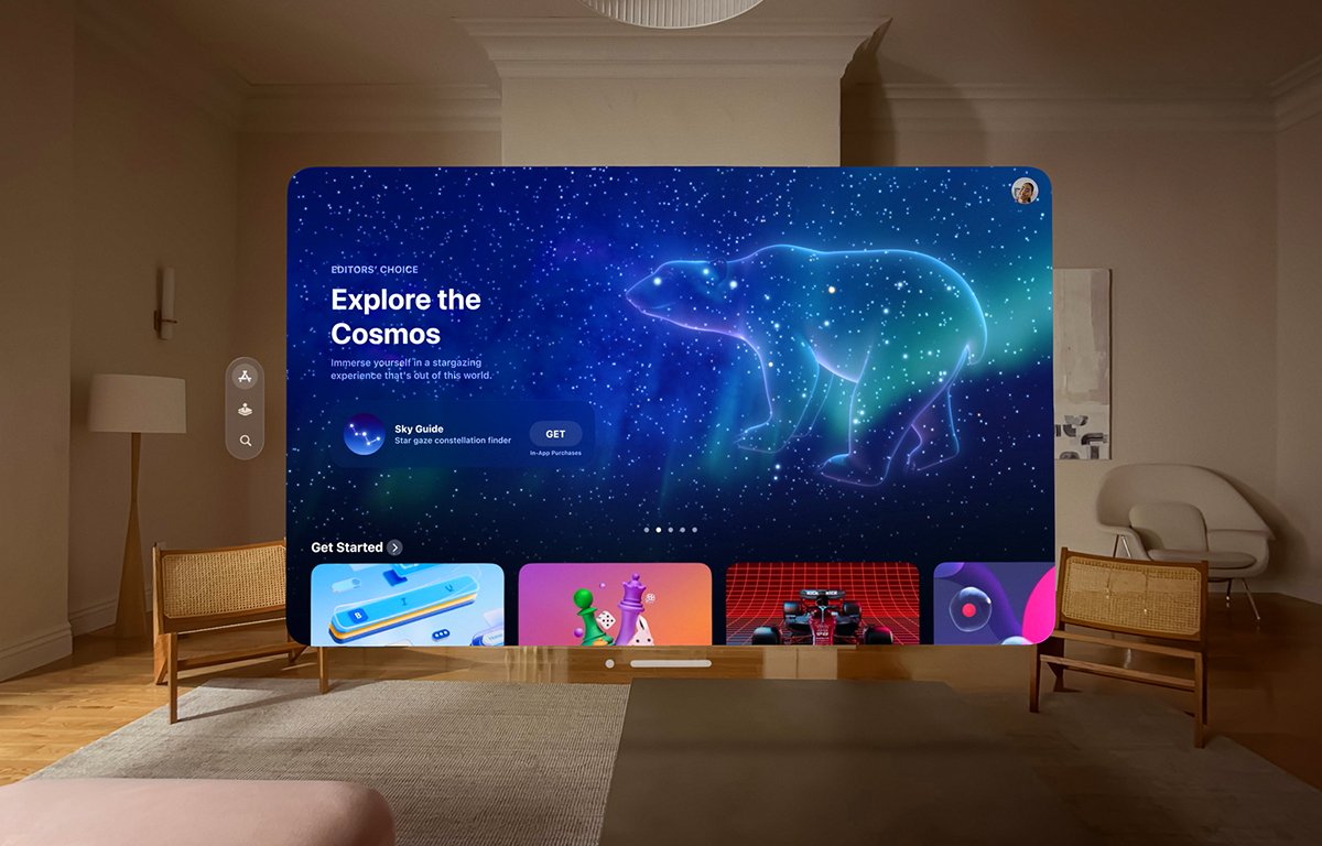
Spaces are immersive "Full Spaces" dedicated to one app where only one app's content can appear. Inside a Full Space an app can display windows or 3D content, or it can display an entire 3D rendered scene such as a game or simulation, immersing the user in another world.Apple calls this "Unbounded 3D content."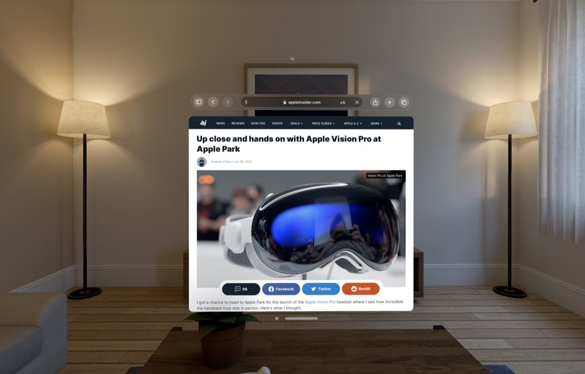
Safari running in windowed mode in visionOS.
As a developer, in visionOS you can allow the user to transition between any of these states and back whenever you like.Installing the Apple Vision Pro SDK and simulator
We won't delve step-by-step into how to install the visionOS simulator in Xcode since it's already documented in the Xcode developer pages. First you'll want to install everything from the first Xcode 15 beta mentioned above, in particular the Xcode_15_beta_2.xip file which is a signed .zip file containing the Xcode 15 beta app.
After you install the first Xcode beta, download and install the command line tools, and the second beta.
You have to do this in that order since if you use the web install method (mentioned below) it requires the Xcode beta app to be installed first in order to work.
The entire process and all its options are described on the Xcode Devices and Simulators pages at Installing and managing Simulator runtimes.
The visionOS simulator download is substantial at around 7GB.
There are several ways you can install the simulator:- Install Simulator runtimes from the Apple Developer website.
- Install Simulator runtimes during first launch.
- Install a Simulator runtime from the Xcode run destination.
- Install and manage Simulator runtimes in settings.
- Install and manage Simulator runtimes from the command line.
The first option requires you leave all the downloaded components and the manifest files in the Downloads folder in your user folder since Xcode looks for them there. When they finish dowloading Xcode automatically installs them from that location.
It's probably best to use Safari for this option. You'll need to log in to the developer site using your Apple ID for this option.
The second option -- install on first launch -- only works the very first time you launch Xcode on a new installation. It asks you which simulators you want to install and if you're running the Xcode 15 beta on macOS 14 beta, those options will include the visionOS simulator.
To install the simulator manually from within Xcode go to Settings->Platforms. Click the Get button next to each simulator you want to install. Be sure you have enough disk space first for each one.
To install the simulator from the command line in Terminal you'll first want to run Xcode and when prompted the first time, install the additional Xcode tools. This installs a command-line tool calledsimctl. You can get more info onsimctlin Terminal by typing:simctland pressing Return.
You can also install the command line tools by downloading the Additional Command-line Tools package mentioned above and running the Command Line Tools.pkg installer contained on the .dmg in the Finder.
Thesimctlcommands required are listed on Apple's Xcode developer pages:xcode-select -s /Applications/Xcode-beta.appxcodebuild -runFirstLaunchxcrun simctl runtime add "~/Downloads/visionOS_1_beta_Simulator_Runtime.dmg"
Note that thexcrun simctl runtime addcommand requires the simulator .dmg file itself in the Downloads folder to install the simulator, so don't open the .dmg directly.
You can also install one or more simulators by using the simplerxcodebuildcommand, and either the-downloadAllPlatformsor a specific simulator option.
For example, the iOS simulator can be downloaded and installed by entering:xcodebuild -downloadPlatform iOSApple Vision Pro SDK -- Getting started
The visionOS SDK is similar to Apple's various other OS frameworks and developer tools. The basic parts you'll need to know are Xcode, SwiftUI, RealityKit, ARKit and TestFlight - and some 3D modeling tools.
There are two major 3D views you can use in visionOS for 3D objects and scenes: ARView and RealityView (which is still in beta).
There are a variety of other beta objects you'll want to check out including Model3d, RealityRenderer, SceneRealityCoordinateSpace and RealityCoordinateSpaceConverting.
Most visionOS apps and views are built using SwiftUI and Swift classes. Some of the newer objects don't have Objective-C versions.
In any existing iOS or iPadOS Xcode project you can add a new visionOS target to the existing project, or build an entirely new app by creating a new Xcode project based on visionOS from the Xcode's template chooser.
To do so, in Xcode go to File->New->Project and click the visionOS icon in the template chooser. Click Next, name the project, set its options, then click Next again and save it to disk by clicking Create.
You can add a new visionOS Target to your existing iOS or iPadOS Xcode project by selecting the project icon on the left side of the Xcode project window, then selecting the project name under "Project", then selecting File->New->Target from the File menu:
Add a new Target.
When the Xcode template chooser appears, select visionOS from the tab bar at the top just as you would if you had created a new project. Set the new target's details in the next sheet, then click the Finish button - a new visionOS target will be added to your existing Xcode project.Apple Vision Pro SDK -- App compatibility
Apps using iOS, iPadOS, and visionOS can share many, but not all of the same technologies. To port your app to visionOS you'll need to focus on checking your apps and converting any incompatible parts to compatible or new visionOS technologies.
For example if you use Metal in your iOS or iPadOS apps, you can use Metal in visionOS, but only in immersive mode since Metal relies on sampling pixels and if you were to use it in windowed mode Metal might sample the user's background - potentially disclosing sensitive information when samples are taken from the environment.
In addition to brand new visionOS apps, most iOS and iPadOS apps can be adapted to visionOS. visionOS was designed this way to make it easy to port your existing apps.
When developing for Vision Pro using iOS or ARKit apps, you have several choices: you can see if your app is already compatible with visionOS, you can make your existing app work with visionOS, or you can make a brand new ARKit app which works with visionOS.
In the visionOS documentation, there's a section titled iOS migration and compatibility. In this section there are three subsections:- Checking whether your existing app is compatible with visionOS
- Bringing your existing apps to visionOS
- Making your existing app compatible with visionOS
Apple's main visionOS documentation page hosts most of the information you'll need to get started. It also has a section covering the Xcode visionOS simulator.
We'll dive deeper into the technical aspects of building visionOS apps in a future article.Developer labs open in July 2023
Apple also announced they will be opening developer labs in several major cities around the world in which developers can test their apps on prototype Vision Pro hardware for compatibility and robustness. And, in July, developers can apply to purchase developer's kits containing the hardware.
Over the course of the next nine months -- and maybe more, depending on actual release date -- we'll dive deeper into porting and creating apps for visionOS, and what the platform means to everyday users. For now, though, Apple's expansive developer documentation contains huge amount of new material to learn.
After all, there's a reason Apple announced the hardware at the 2023 WWDC for a 2024 release.
Read on AppleInsider
-
Apple's machine learning head departs to run AI thinktank
The Allen Institute for Artificial Intelligence, a non-profit aimed to furthering AI research, has named Apple machine learning chief Ali Farhadi as its new CEO.

Starting from July 31, Farhadi will become the CEO of the Allen Institute for Artificial Intelligence (AI2), the research institute explained on Tuesday. The move will have Farhadi overseeing the work of the non-profit, which performs AI research and engineering.
An AI professor in the Paul G. Allen School of Computer Science and Engineering at the University of Washington, Farhadi joined AI2 in 2015 to work on its Computer Vision team. He went on to co-found Xnor.ai, a deep learning startup that was acquired by Apple in 2020 for $200 million.
After spending time at Apple leading its Machine Learning efforts, Farhadi rejoins AI2 to head up the organization. AI2 has over 200 researchers and engineers around the world, working on advances in science, medicine, and conversation through AI.
The organization has published nearly 700 papers over eight years, with its incubator creating 19 companies collectively worth $767 million and employing 500 people.
"As we face unprecedented changes in the development and usage of AI, I could not think of a better time to return to AI2 as CEO," said Farhadi. "Today more than ever, the world needs truly open and transparent AI research that is grounded in science and a place where data, algorithms, and models are open and available to all."
"Ali is the truly rare leader who combines expertise as an executive, entrepreneur, academic, and researcher. Throughout his career, he has demonstrated the transformative power of AI through his unique ability to channel deep scientific research into product solutions," said AI2 board member and Microsoft Research and Incubations corporate VP Dr. Peter Lee.
Farhadi replaces the previous founding CEO, Oren Etzioni, who stepped down from the role on June 15 in favor of serving as a board member and advisor, as well as a technical director for the AI2 incubator. Peter Clark, an AI2 research leader, has been working as interim CEO.
Read on AppleInsider
-
Geekbench reveals M2 Ultra chip's massive performance leap in 2023 Mac Pro
Geekbench has revealed performance statistics for the M2 Ultra chip inside the 2023 Mac Pro and it has over double the performance of the older Intel-based machine.
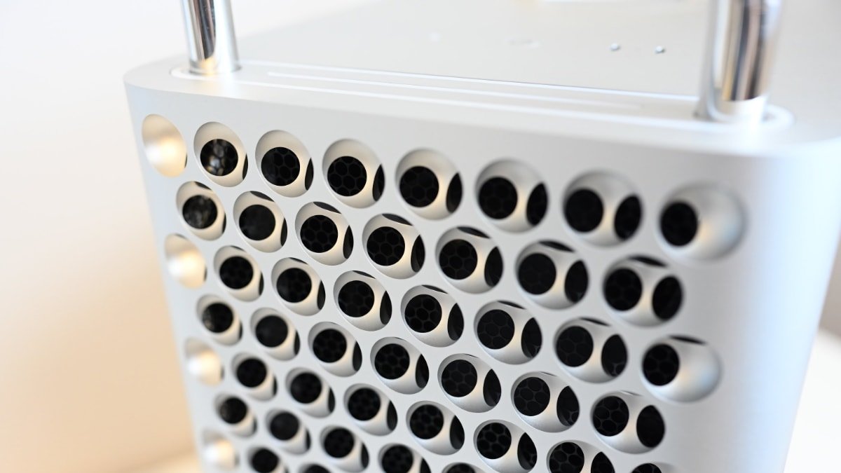
Geekbench shares stats for the M2 Ultra
During the WWDC event on June 5, Apple introduced the New Mac Pro along with the M2 Max and M2 Ultra chips, as well as an enhanced version of the Mac Studio. While there are currently no benchmarks available for the new Mac Studio, Geekbench has recently published specifications for the 2023 Mac Pro with an M2 Ultra.
The benchmark reveals a single-core score of 2,794 and a multi-core score of 21,453 for the 2023 Mac Pro, in contrast to the highest-end Intel-based Mac Pro equipped with a 28-core Xeon W processor, which scored 1,378 in single-core and 10,390 in multi-core performance. As a result, the new Mac Pro offers more than double the speed of the fastest Intel-based model and at a significantly lower price.
As well as performance increases, the most recent Mac Pro also brings PCIe expansion to Apple Silicon. The new Mac Pro has seven PCIe expansion slots, and six support gen 4 -- meaning this two sees a doubling of speed compared to previous models.
Apple highlights this expandability of the new Mac Pro, featuring dual 10Gb Ethernet ports, two HDMI ports, and the capacity to support up to six Pro Display XDR monitors. In this case, the new Mac Pro boasts up to twice the speed of the fastest Intel-based Mac Pro and up to seven times the speed of the base configuration of the Intel-based Mac Pro.
However, the latest Mac Pro no longer offers support for graphics cards. Consequently, the PCIe slots are limited to options such as extra storage, rather than giving the ability to install and use high-performance graphics cards for gaming, rendering software, or other demanding tasks.
Read on AppleInsider -
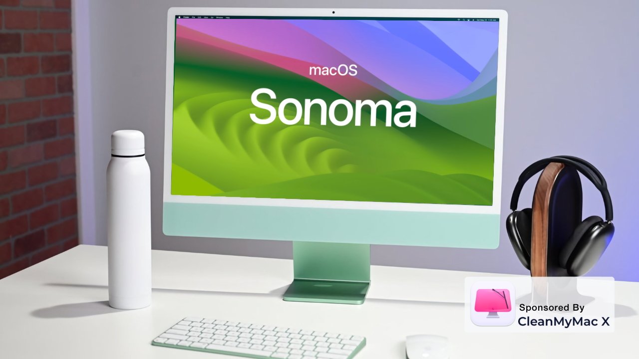
macOS Sonoma beta review: Few major updates, but very welcome
In its initial beta version, the new macOS Sonoma only presents a few significant features -- such as Presenter Overlay, and desktop widgets -- but they're well done and they will make you want to update.
Just don't update your macOS yet. As well as Apple making the new macOS 14 seem like the best thing in the world ever, it has also this year made it much easier to get an early copy.
Really, seriously, do not do it. What's new with this beta release is that Apple has opened up the developer beta much wider than before. Much wider.
Hopefully that's a sign of Apple's confidence in even this first beta release, but that's nice for them. Statistically, it's always unlikely that you will totally brick your Mac by using an early beta release, but let Apple play the statistics: you only need betas to go wrong once for it be a big problem.
So this wider release than usual is new, but what remains the same with Apple and every other beta release of anything at all, is that there is a cycle. There will be multiple iterations of the macOS Sonoma beta over the next few months, and then there will be an official release.
When that happens and you either update an old Mac, or you buy a new one that comes with it, you're going to like macOS Sonoma -- it might just take a little while.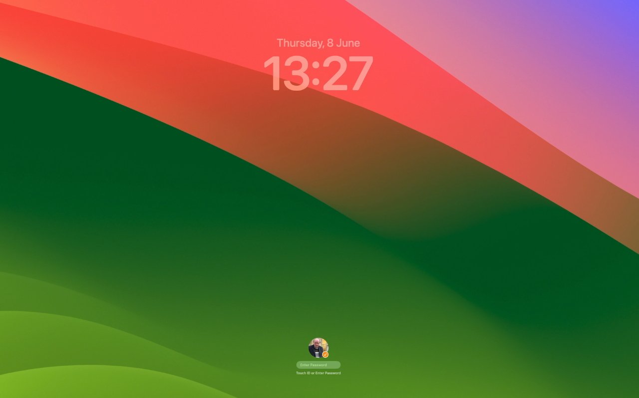
The new lock screen has a clock and is mostly very greenYou won't want to go back
Except when macOS Big Sur came along and changed just about everything, macOS releases always appear only subtly different at first. Routinely, you will install the new macOS and apart from a dramatically different wallpaper, there won't be an obvious change.
That wallpaper, incidentally, is now very green in macOS Sonoma, compared to being very yellow in macOS Ventura. When Apple announced the name, though, the animated wallpaper graphic it used made it look a lot like the famous Windows grass.
In person, it's somehow lost that PC similarity and is just very, very green.
Unless you have strong feelings about yellow or green, however, macOS Sonoma initially appears to be just a different wallpaper. As with every macOS release, though, once you've started using it, things change.
Mostly, it's that as you work, you find pleasing little touches like the way that Mail now surfaces travel-related emails as the date of a trip nears.
Next thing you know, the last macOS suddenly seems very old. For AppleInsider, switching back and forth between macOS Sonoma and macOS Ventura, it took less than an hour before we wanted to stay in Sonoma.
In our case, it was widgets on the desktop and also turning websites into apps that sold us on macOS Sonoma. Once you've used those, it's not just that they are good things to have, they become the way it always should have been.
Apple does talk up its new macOS features at launch, but in use, it tends to leave you to find things by yourself. That's good because it means you don't have to learn anything before you can carry on with your work.
But of course it means you can miss out on features because there's no obvious way to use them.Visually obvious changes
Once you've updated and are using macOS Sonoma, the first thing you see every day is the new lock screen. You may not have thought that the lock screen needed any improvement, but you'll see that it's had some, and it's good.
Just as before, the lock screen shows a macOS background and there is a space for you to type your password to unlock it.
However, that space is now at the foot of the screen and nearer the top is a clock. It's the simplest of changes, yet it makes that lock screen useful.
Then also new is what happens when you have two or more users of the same Mac. Now the most recent one is shown prominently with an image of them, or an avatar they chose, in a circle, and any others are in smaller circle that briefly pop out and disappear.
It's meant to show you that there are multiple users and if you click on the front one, the view switches to a column of all users' names and avatars.
Click on the right user, and you can log in.Screensavers and the lock screen
Apple made a big deal about the screensavers in macOS during the keynote launch. It was the very first thing Craig Federighi showed us, and that was an peculiar choice since that seemed to confirm rumors that nothing new was coming to macOS.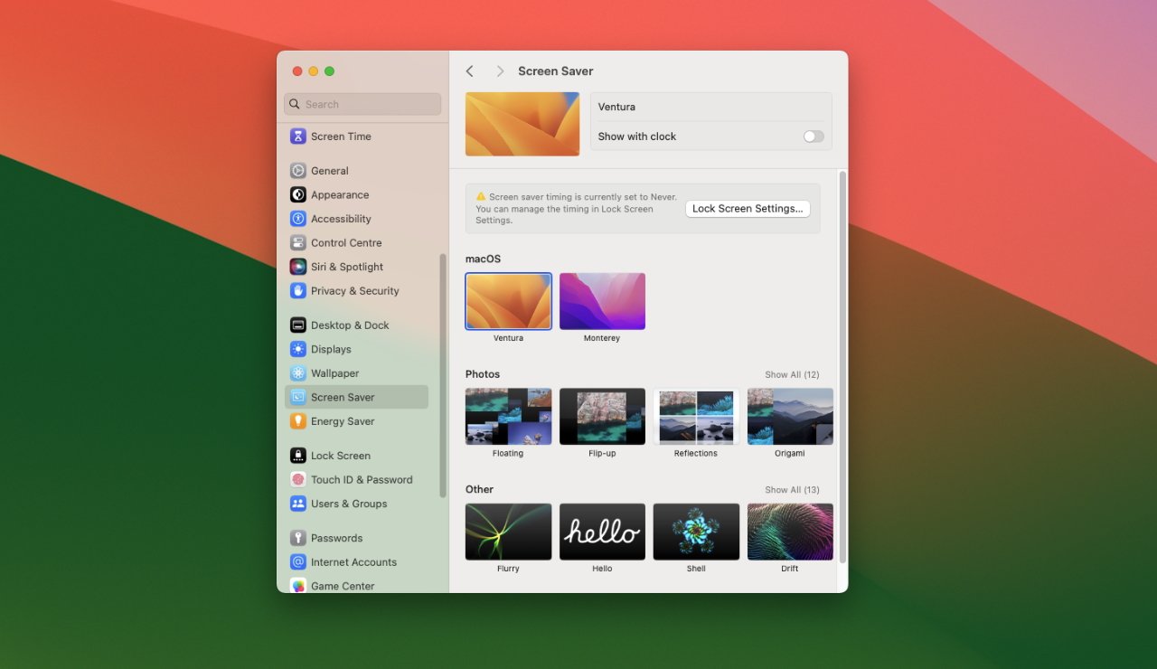
The beta release doesn't have the new screensavers yet
Nonetheless, screensavers have been improved in such a way that they are noticeably better -- or they will be later on in the beta. Federighi showed off moving screensavers that are clearly inspired by the rightly popular ones on Apple TV, but they're not here yet.
At present, none of the rather gorgeous photography we saw has been included in the screensaver's section of System Settings. You can use a range of older macOS system images, such as the wallpaper for Ventura, or your own photography.
What has been included is the mechanics of how screensavers work now. The best element is how when you click to end a screensaver and get back to work, the image transitions to your desktop beautifully.
At present, it's not so gorgeous going the other way. When your screensaver automatically kicks in after a few minutes, there's a judder to black before the animated image starts.
It's enough that you think your monitor has just switched off.
Just as with the new lock screen, there is an optional clock in view when a screensaver is running. That's again useful, but it isn't presented as well as the lock screen version.
Instead of being prominent at the top of the screen, it appears that the screensaver clock slots in to different points depending on the screensaver. It never seems part of that screensaver, it always seems a separate overlay, and isn't as aesthetically well done.
Note that there were no clocks in view in the examples that Federighi showed, and you're likely to switch it off too.Widgets on the desktop
Maybe most of us fill up our Mac screens with windows and documents, but then maybe the new widgets will make us want to be tidier. Instead of living in a pop-out side bar that means you rarely use them, widgets can now be left permanently on the desktop.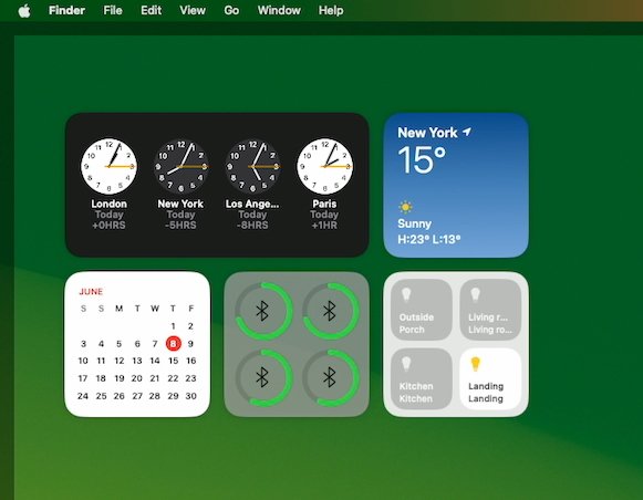
Widgets are shown clearly when you're in the Finder.
Just as with iOS 17, too, the new desktop widgets are interactive. Previously they displayed information and if you clicked or tapped, you were taken through to the widgets' parent application.
Now you can have a Home app widget and, for instance, just click in the widget to turn lights on or off. All there in the widget itself, with no opening or closing of the Home app.
It would be good to be able to resize widgets, but you can place them anywhere you want, and Apple has worked to both stop them being distracting, and for them to look good on the screen.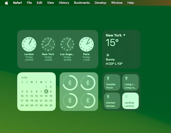
Widgets are dimmed when you're in an application
By right-clicking on the desktop, you get the option to see and edit widgets. You can still tug in from the side of the screen and, once you have the column of widgets, click on Edit at the bottom.
In either case, you end up with a widget panel that seems to pop up out of the Dock. It looks oddly squat, as if its animated move didn't quite finish, but it contains all the widgets available to you on your Mac.
Click to select one and you can drag it out onto the desktop.
There is seemingly no limit on how many widgets you can have, and there definitely is no constraint on where they can go. But there are guides.
Especially as you drag a second widget out, you will notice a white outline appears where Apple thinks you should place it. That's a nice touch, because it means it's easy to drag a widget and have it neatly lined up next to, below, or above the first one.
Choosing from Apple's pop-up panel is the most efficient because it shows you everything, including widgets from your iPhone if that is nearby. But if you already use and like the existing widget bar on macOS Ventura, the odds are that you've previously chosen the widgets you want.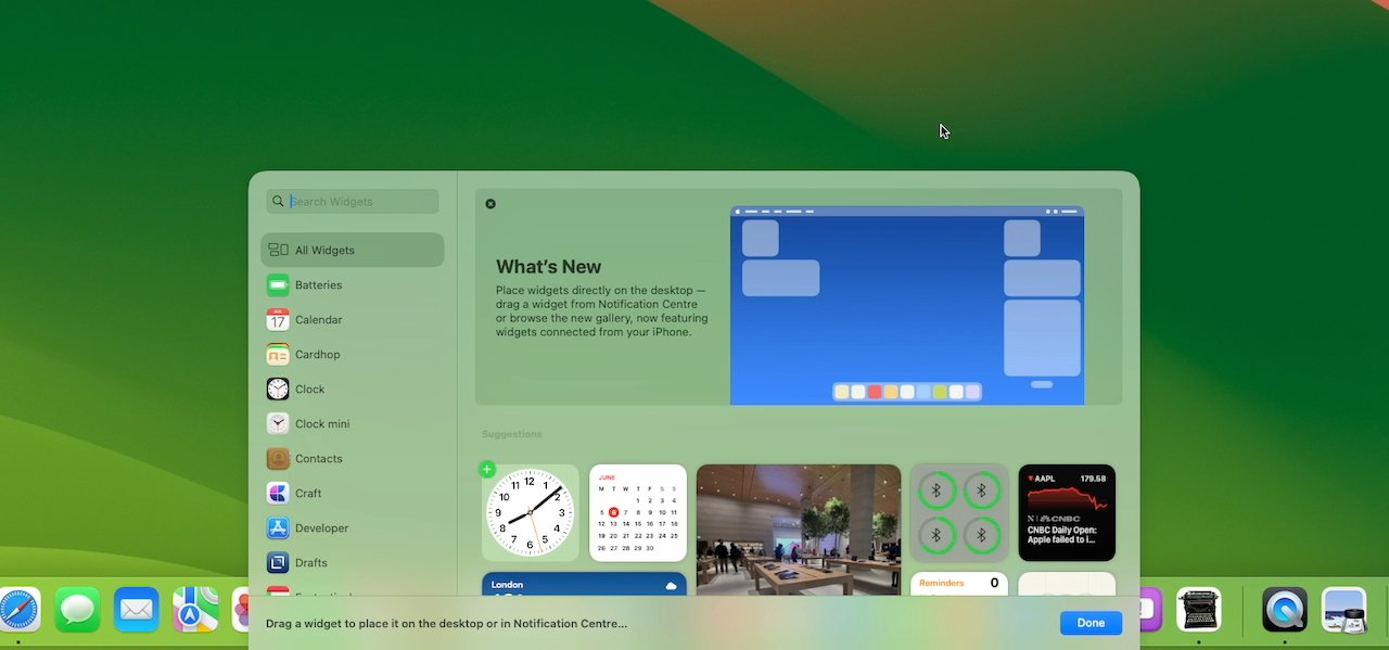
Widgets can be dragged from the sidebar or chosen from the new widget picker
In which case, you may prefer to open that side widget bar and just drag off what you need onto the desktop.
Whichever you do, those widgets then stay on the desktop as if they were part of it, and they also update live. So the Apple News+ widget, for instance, will show headlines and those will change throughout the day.
In testing, those headlines didn't seem to change very often, however. It isn't like a ticker update app where new headlines are added and shown all the time.
Maybe it's been a series of slow news days, or maybe Apple is limiting how distracting a news widget can be.
Apple has definitely worked on making widgets prominent yet not overwhelming. Obviously if you drag a document window over the widget, that widget is no longer visible.
But if you open a document near your widgets, if you are concentrating on some work, then the widgets subtly fade into the background. It's not that they become ghost widgets, they are still clear enough that you can read the information on them, but they are blended more into the background.
That means that, as with the Mac's menu bar, the widgets appear transparent. They're also dimmed, and the combination is almost always effective.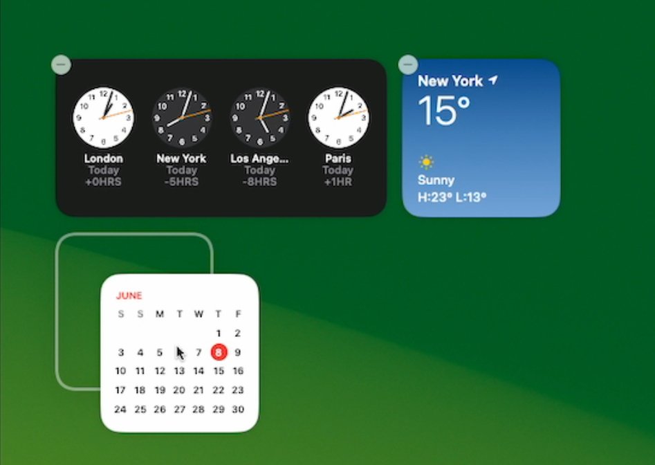
As you drag widgets, Apple provides highlighted guidelines
With just a glance at even the dimmed transparent widgets, you can read what you need. The one exception so far appears to be with certain analog clock widgets where it is possible to see the hands, but not very clearly.
Nonetheless, you will be tempted to arrange widgets where you can see them all day. But if you for some reason feel absolutely the opposite about them, you can flick a System Settings toggle and completely turn them off.
In this first beta, though, there are some issues with System Settings.System Settings and the desktop
One of the persistent frustrations with last year's macOS Ventura beta was in System Settings. Behind the scenes, all of the old System Preferences worked exactly as they did -- Shortcuts and AppleScripts could address them unchanged -- but the visual look was changed.
It was a change for the better with settings grouped intelligently, and with commonly-used ones surfaced far better. But over and over, there were bugs -- and there's one in macOS Sonoma.
If you select any section in System Settings, then come out of it and launch Settings again, a different section is selected.
Currently, it also appears that some System Settings controls simply don't work. In Desktop & Dock, there are options, for instance, for turning desktop widgets on or off, and for showing or not showing items on the desktop.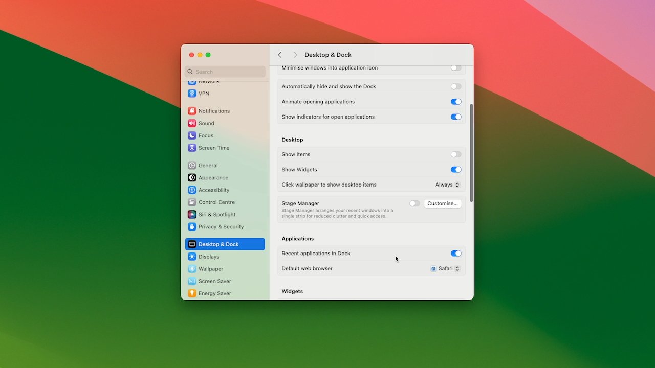
Widgets and showing desktop items in System Settings
Back in 2001 when the classic Mac OS was replaced by what was then OS X, a complaint was that the desktop no longer showed icons for hard drives. Following complaints, Apple brought those icons back, but made them optional.
Over the years since, enough people have elected to hide those drives that it's noticeable how macOS Sonoma shows them again by default.
This is one of those settings where you are so used to the way you have it set that you can't remember what was your choice and what was the default. But if you do want to hide the drives, the way you do it has changed.
In Desktop & Dock, and under the heading Desktop, turn off Show Items and the drives are gone.
However, so is everything else. Previously you either needed to use a Terminal command, or a third-party app such as CleanShot X or ScreenFlow to hide desktop icons.
Or from macOS Ventura, your mess on the desktop would be automatically hidden when you used Stage Manager. If you used Stage Manager.
Now when you've chosen not to show items, the way you temporarily change that to see them again, is to click on the desktop. You do then get to see your drives, plus any folders or documents on the desktop, but it's as if you chose to use Mission Control.
On a Mac, Mission Control is the name for several gestures and effects, but one is for showing the desktop. Spreading four fingers out on a trackpad sends all of your application windows off screen, with just a shading around the border to show they ever existed.
That's what happens now when you click on the desktop, having chosen in System Settings to hide items.
Otherwise, you can't see items on the desktop and while that can be appealing for hiding the mess, currently it is a pain. For normally if you actually have an empty desktop, the way you open a new window is to click on the Finder icon in the Dock -- and now you can't.
Or rather, if you do, you get an error bleep and you do not get a window. To open a Finder window in this situation, you have to right-click on the Dock icon and choose a window from the list that appears.
Choose any window, it opens, and then you can navigate through it to wherever you need.
It feels like an attempt to make Stage Manager more a part of the Mac instead of a separate feature that you can choose to use or not.
Currently, this is all more of an irritation than it should be, though, because there is another bug in System Settings. Once you've turned on this option to hide items, you seemingly can't turn it off.
You should be able to. There is a toggle for turning this feature on or off, and right next to it is one for turning desktop widgets on or off -- and neither work.
Or at least, once you've turned on the option to hide items, the toggles for that and widgets react, but have no effect.
Doubtlessly, this will be fixed before the final release and that does appear to be just minor a kind of fit-and-finish job.
At this early stage in the beta testing, it's fair to assume Apple is concentrating on the major features instead of making the last 1% perfect. And there is one major feature that is very visible -- to everyone but you.Video conferencing
It's not in your face, it isn't there unless you want it, but the updated video conferencing features are dramatically improved with Presenter Overlay. This is the feature that works with services like Zoom to let you combine slides and yourself in the same view.
From everyone else's perspective on the video call, your slides or anything else you want are full screen. Then if you choose, your head and shoulders can be inserted as a small live image to one side of the screen.
Or you can have it so that you are approximately the same size and position in the frame as you were on the regular call, but standing in front of your slides.
It's very good from everyone else's perspective. From yours, it's takes some setting up and it's also a little glitchy so far.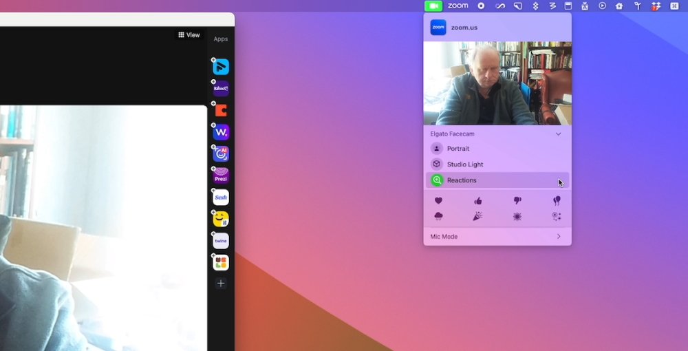
This menubar app changes depending on the app, but with Zoom, it offers Reactions in a panel at the bottom
You do it via a new menubar app that macOS Sonoma adds if there is a compatible app running. The icon for the menubar changes, showing a green camera when you're in apps such as Zoom, or a yellow microphone when another app is using, or could be using, the mic.
That can be a distraction -- it will even appear if you are not running an app, but you do have its helper app working in the background.
If you're a ScreenFlow user, for instance, even when you are not actively using that screen recording app, the new menubar item is there. Distractingly, it's also highlighted.
It's highlighted so that you know there is something running, and seemingly in the case of the ScreenFlow helper app, it's that your Mac wants you to set options for the microphone. A Mic Mode option is in the menubar app, offering Standard and Voice Isolation.
However, it's when you intentionally launch an app like Zoom -- and are in a call -- that this menubar feature becomes useful.
During any Zoom call, a Reactions option appears in that menubar app. You can choose from a range of reactions, such as some kind of happy congratulations, and when you do, a bunch of balloons appears to float behind you.
Reaching up for a menubar app, then moving the cursor down to a Reactions panel, and then choosing one of the quite similar-looking white-on-black icons isn't the fastest thing you can do.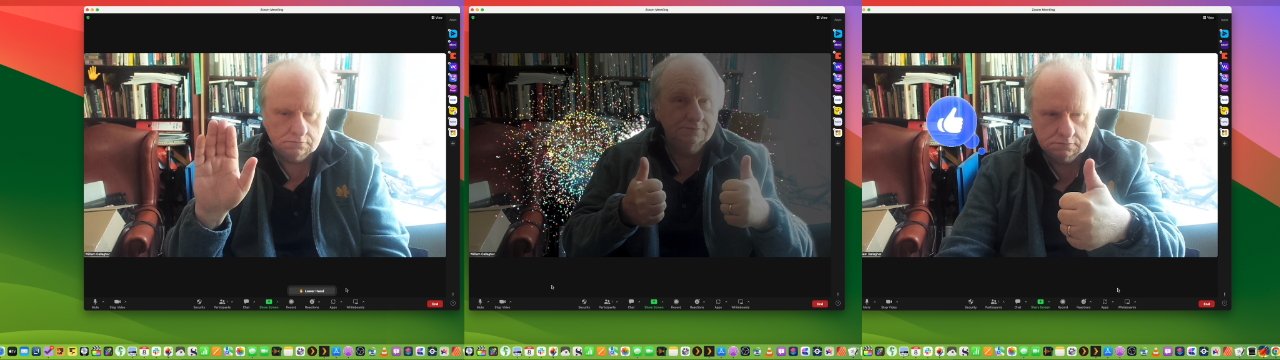
Just raise your hand, your thumbs, or one thumb and Zoom automatically reacts - after a moment
But just gesticulating with two thumbs up is. During a call, you can simply do gestures like that, and after a beat where you feel a little foolish, starburst explosions will happen behind you.Presenting in video conferences
If instead of whooping at someone else, you are presenting slides in a Zoom call, you first share your screen as you always would. Then that same menubar app changes to offer you Presenter Overlay.
You can choose off, Small, or Large. The small version is the little inset of your face over the slide, while the Large one is turning you into a weather presenter with slides behind you.
However, when you choose Screen Sharing in Zoom, it always removes the main view that you see in a regular call. Your face is moved to a small window off to the side so that you can see whatever it is on your screen that you're sharing.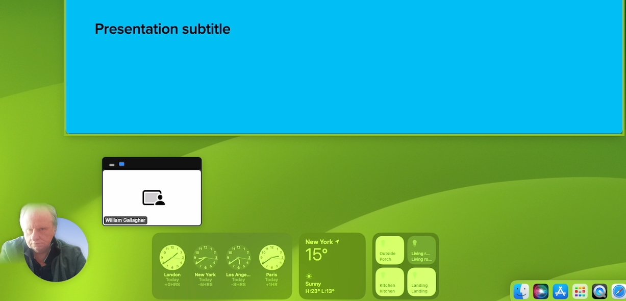
This is the small Presenter Overlay but it's glitchy so far -- and larger than the Large one
Which means that you alone don't get to see the full effect of Presenter Overlay.
In the present beta, there's also a difference in what you do see, and how well it appears to work, when you chose between the Small and Large options.
If you select Small in a Zoom call, then at present you get a very little preview to one side of your screen, showing the slide and your inserted image. If you choose the large one, then Zoom's normal small window attempts to show you how you appear to other callers, but it's flickery.
It looks like when someone uses Zoom's own background replacement feature, and it vanishes as someone moves around.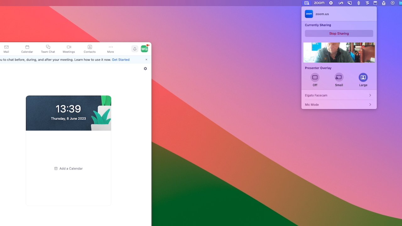
The large Presenter Overlay is not that large for you
So that's something else that will improve as the beta cycle progresses. When it's ready, it's a feature that will only be used by a portion of the Mac user base, but they will use it to death.
Whereas the new features in Safari are going to potentially be a boon for an enormous number of Mac users.Safari
Safari is of course Apple's web browser app, but it's also deeply integral to macOS. And there are no macOS releases that don't feature several improvements to Safari.
This time out, the key developments are in webapps, profiles, and passwords.Webapps
A webapp is not a new idea. For years, you've been able to get third-party apps that would take a website and create a kind of app out of it.
Such a webapp could be put in your Dock, and launched by itself. Rather than launching Safari and being one window or one tab amongst others, a webapp is on its own.
When you use particular sites a lot, turning them into a webapp could be handy enough that it was worth doing. But it wasn't handy enough that they became commonly used.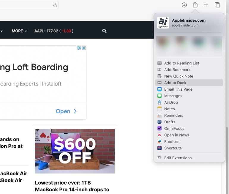
Apple has added webapps and made them clearer, too, with "Add to Dock"
Now Apple has included it in Safari and you create a webapp just by choosing that new option in the Share menu. What's more, Apple only uses the term "web app" when you are in the middle of creating it -- until then, the term used is "Add to Dock."
More people will find this, and more people will immediately understand what it means, so more people will use it. Plus under Apple's approach, the whole thing is typically simple and, so far, reliable.
If you choose to create a webapp out of a site, you click on that option in Share and then get the ability to name it. So rather than a site's full title, which is the default, you can choose any shorter name.
So far you can't, though, choose the icon. The webapp gets saved into your Dock with whatever favicon the site uses, which can be fine.
But also can be a pain if, for instance, you end up with a row of webapps and each one has the same Google icon.Profiles
Curiously, Safari's second new feature is all about distinguishing between different uses of the browser. Profiles is an optional new feature that lets you separate work from leisure or home use of Safari, if you need.
It's already possible to have tab groups that mean with a click or two, you are looking at all the sites you need for work -- and none that you use at home. Or vice versa.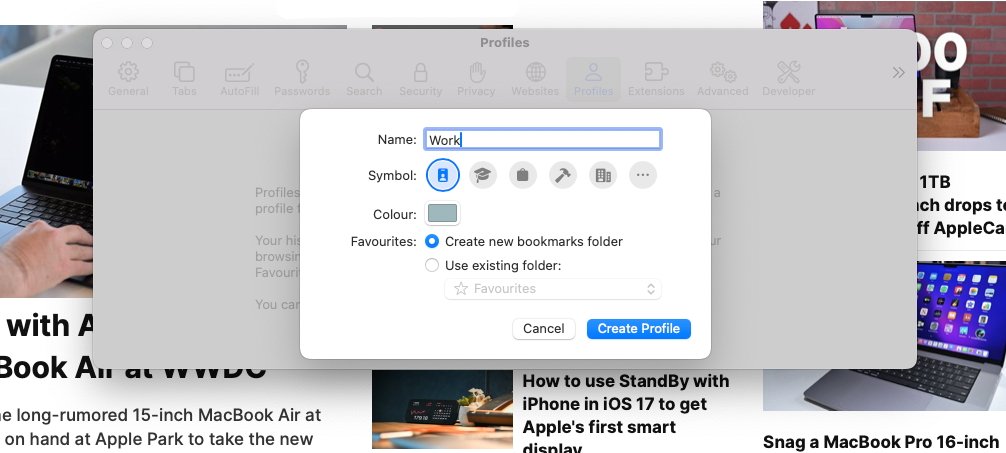
Safari lets you separate work from home tabs and even extensions
But with Profiles, you can elect to have a a deeper separation of Church and state. Set up one Profile for work and one for Home, and not only can the tab groups be different, but your browser history will be.
So, too, will bookmark favorites, cookies -- and even extensions. It doesn't appear that you can also have different sets of passwords, but then macOS Sonoma is more about sharing passwords than hiding them.Sharing passwords
The line between Safari's own password manager and third-party ones continues to blur to the point of invisibility. It's still the case that if you use multiple browsers, you need a third-party password manager, but it used to be that this was also true when you had a team using the same websites.
Third-party password managers like 1Password even have Teams subscriptions that let a group share the same central database of accounts and passwords. Now while not yet as thorough as that, Safari has introduced group password -- and passkey -- sharing.
You can set up a group, saying which of your contacts are in it, and which website or other accounts they can see. Then when you change a password for a site everyone uses, everyone immediately gets the new password and probably never even notices.
In Safari's Settings, the existing Passwords pane now includes Family Passwords. In a similar way to all of Apple's collaboration features, you then get to pick your "trusted contacts," and then "choose what to share."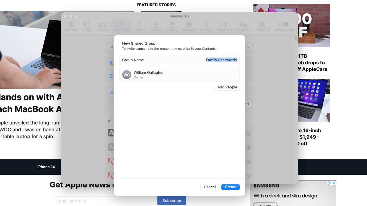
You can now share Safari passwords with friends and familyMessages, stickers and autocorrect
For a release that rather resembles the way OS X Leopard was followed by a lower-key, practically maintenance update with OS X Snow Leopard, macOS Sonoma has a lot going on. It's like Apple went over every possible pixel of macOS Ventura, it just then chose to add only minor updates across it all.
They're minor compared to the introduction of, say, Continuity Camera, but if you use them in your daily work and life, they are significant.
Such as the annual expansion of Messages, this time with what Apple cals an "all-new stickers experience."
To anyone who doesn't use Messages, or doesn't use these features, the all-new experience looks very much like the old one. But stickers are now held together with Memoji in a new stickers drawer, meaning you have one place to go to, or one place to completely ignore.
There are more updates to Messages than just the ability to send icons instead of text, however. If you come late to a long Messages conversation, you can tap a "catch-up arrow" and be taken to the first message you've yet to read.
Searching for messages is also improved by gaining some of the same search features that Mail has. So now you can combine searches, looking for a particular person and when they sent a message from a particular place, for instance.
Here macOS is offering to complete that last word. It should also do sentences but so far it's completed a couple of words at most.
And when you are writing in Messages, or at present in any Apple app, you get a new autocorrection and autcompletion feature. It's intended to work on whole sentences, both by offering you the next word and by examining grammar.
As you type, macOS Sonoma offers what it thinks the rest of the current word should be. That suggestion is in grey, and if you like it, you can tap the space bar to accept and move on.
If you don't like what the Mac is suggesting, you just keep typing.
That sounds like a chore, like you have to read the suggestion and consider what you think. But in practice, it feels very natural to tap the spacebar to accept, or carry on tapping any other key to dismiss the suggestion.
Lastly for Messages and anywhere you can write, there's a caps lock indicator. Unlike the autocompletion, this appears to already be working in more than just Apple's apps.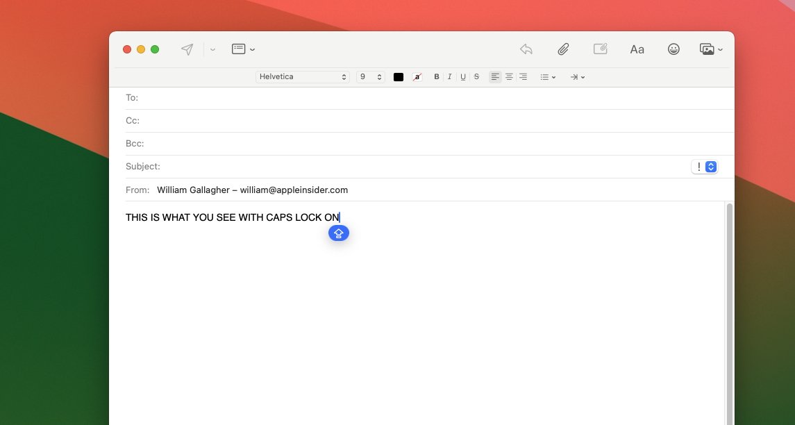
You can no longer miss when you've got Caps Lock on
Wherever it does work, when you click into a text field while caps lock is on, you get a blue warning icon that replaces your cursor. If you ignore it and keep typing anyway, the warning icon moves along with you.Privacy and sharing
Doubtlessly, Apple does that work of checking your caps lock is on or not, without calling out across the internet to some caps lock security server. The new macOS continues Apple's on-device stance where, whenever possible, what you do and see on your Mac is protected locally.
Such as now with Communication Safety. New to macOS Sonoma, Communication Safety detects what Apple euphemistically calls sensitive videos and photos. This appears to be coming later in the beta cycle, but Apple says that images of, for instance, naked people, can be blurred out if you choose.
So if you've elected to turn this feature on and you get sent such an image, you will instead see a chiefly grey box with "This may be sensitive" written in it. There'll be a "Show" button you can click if you want to.Helping you get your work done
Much of macOS Sonoma is about how you communicate with the rest of the world. So as well as this blurring of unwanted images you're sent, Apple has also added collaboration to working on PDFs in Notes, for instance.
But macOS 14 is also about you and how you work for yourself, how you concentrate on doing what you need to do. So the new PDF features in Notes also improve how you can read and annotate them.
Notes now recognizes when a PDF is actually a form, and it makes it easier to click to enter text into its sections.
Or if you have the right Mac, or the right AirPods Pro, you can now just say "Siri," instead of "Hey, Siri." That doesn't sound like it will save a lot of time, but saying "hey" doesn't come naturally to everyone, so it is an improvement.
That "Siri" improvement requires you to have either the second-generation AirPods Pro, however, or a Mac with Apple Silicon.
Apple has said which Macs the new macOS will work on, but inevitably it's going to be that not all of its features will work on all apparently compatible Macs.Compatibility
The Macs confirmed by Apple to be able to run the new OS are:- iMac 2019 or later
- iMac Pro
- MacBook Air 2018 or later
- MacBook Pro 2018 or later
- Mac Pro 2019 or later
- Mac Studio
- Mac mini 2018 or later
Many or most of those Macs are Intel-based rather than using Apple silicon. That's significant because it's already clear that Intel Macs that can run macOS Sonoma at all, will not have certain key features.
As well as them still requiring "Hey, Siri," Intel Macs will not get the Presenter Overlay feature. Nor a new Game Mode, which on Apple silicon will improve gaming performance.
This is all a shame if you love games and have an Intel Mac, but it's inevitable -- and a reason why Apple made the switch to Apple silicon. The Mac is now capable of much more than it was with Intel processors, and Apple is rightly making the most of it.
It's great that Apple is still supporting older machines, but the combination of Apple silicon and macOS Sonoma is night and day compared to what the Mac was just a couple of years ago.macOS Sonoma - Pros
- Presenter Overlay is superb
- Reactions in videoconferencing work well
- Safari makes webapps easy and useful
- Widgets on the desktop -- and now interactive
- PDFs handled better in Notes
- Messages gains useful improvements, and more stickers
macOS Sonoma - Cons
- It cuts out some older Macs than macOS Ventura did
- Some features won't work on Intel Macs
- Not as significant an update as recent macOS versions
Score: 4 out of 5
Read on AppleInsider


-
Future iPhone or iPad screen could unroll like a scroll
Apple is continuing to investigate making roller screens for iPhone and iPad, where a user can pull at the ends to make the display large or small as needed.
It won't look like this - but it could. Apple's patent includes drawings similar to this. (Scroll source: Fae on Wiki Commons
Picture Caesar, or more probably a minion, standing at the Colosseum, holding forth the decree of the land, read from parchment stretched out between two cylinders. Now change Caesar to Tim Cook, switch Apple Park for the Colosseum, and you're seeing how Apple might introduce a future roller iPhone.
It's not likely to happen at this year's iPhone 17 launch, and actually it may never happen at all. Apple's latest exploration of this roller display idea comes in a newly-granted patent, and Apple applies for thousands of patents a year.
Apple gets a lot of patents granted every year, too, and yet even then they may not make it into a finished product. But Apple does seem to be a dog with a bone on this one particular idea.
Back in 2015, another filing showed the same idea used as just a retractable cover, offering "Active screen protection for electronic device." Then in 2017, we saw the first sign of a true roll-up display for the iPhone, and 2020 saw a different twist on the idea.
Now there's this "Electronic Device With Flexible Display Structures," which goes still further down the same line.
"Displays are often formed from rigid structures such as glass substrates... This can make it challenging to form compact electronic devices with desired features," says the patent. "[But a] flexible display may be wrapped around one or more rollers."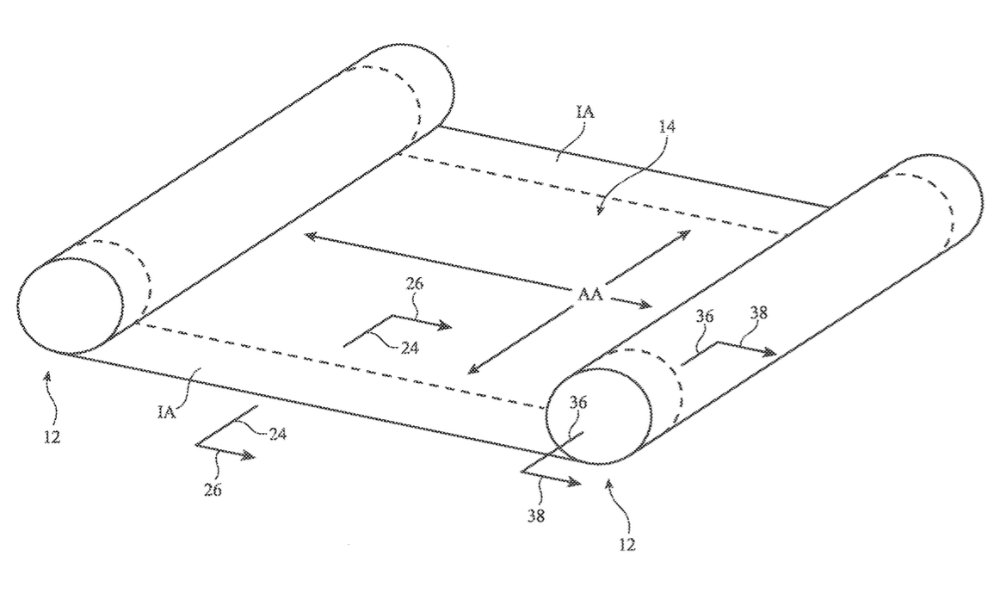
Detail from the patent showing one method of rolling out a screen between two rollers
"In a stored position, the flexible display may be wrapped around a storage roller," it continues. "Optional deployment rollers may be used to help deploy the display as the display is pulled out of the housing."
As ever with patent applications, Apple is careful to phrase things so that they cover the maximum possible interpretation of its idea. So there are repeated references to how this could be used for "a cellular telephone, tablet computer, wristwatch device etc."
There's also, though, quite a lot of variations on just what this roller idea entails. Some don't look like rollers at all, and instead appear to be as much about folding.
"Flexible displays may be bent about a bend axis to allow an electronic device to be folded and may be rolled around rollers," says Apple. "This allows the flexible display to be stored in an electronic device housing when a compact device arrangement is desired and to be pulled from within the electronic device housing when an enlarged display area is desired."
"An electronic device may incorporate both foldable and scrollable displays or may have foldable displays and/or scrollable displays in a housing that also includes one or more rigid displays," it continues.
Consequently, some illustrations in the patent application show two-part devices, with a screen bending around or being folded into, one of them. But the key sections focus on a true roller system, showing cross-sections of a device where all or the majority of the screen can be held inside the device until needed.Rollable, not breakable
Alongside lists of the practically endless types of devices that could potentially have such screens, the patent application concentrates on making these displays durable. So there are references to what they could be made from, such as "metal, plastic, or other suitable materials."
Key to making such a screen useful, and not readily breakable, is to optionally have "bistable support structures." These are supports that stable in at least two positions.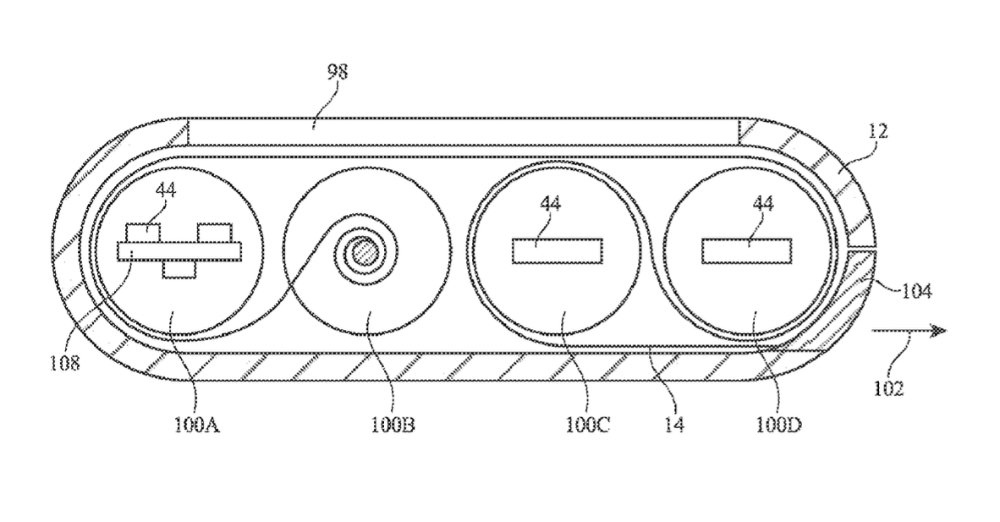
Cross-section of an unspecified device containing a rolled-up screen
"Bistable support structures... may be stiff and supportive when deployed into [one] configuration," says the patent application, "while being flexible enough when sufficient bending force is applied to allow the bistable support structures to be rolled onto a roller..."
It's hard to see from the patent application's drawings just how such a screen would be fitted into the tight space of an iPhone or iPad. However, it is easy to see from those same drawings just how compact a roller system might be.
The invention is credited to Scott A. Myers, whose previous related work includes a patent application for an iPhone with a wrap-around display.
Read on AppleInsider

