Actual US broadband penetration & speed falls far short of FCC claims

A new dataset of actual broadband speeds that consumers are seeing in the U.S. is showing a stark disparity between Federal Communication Commission claims and the reality of the situation.
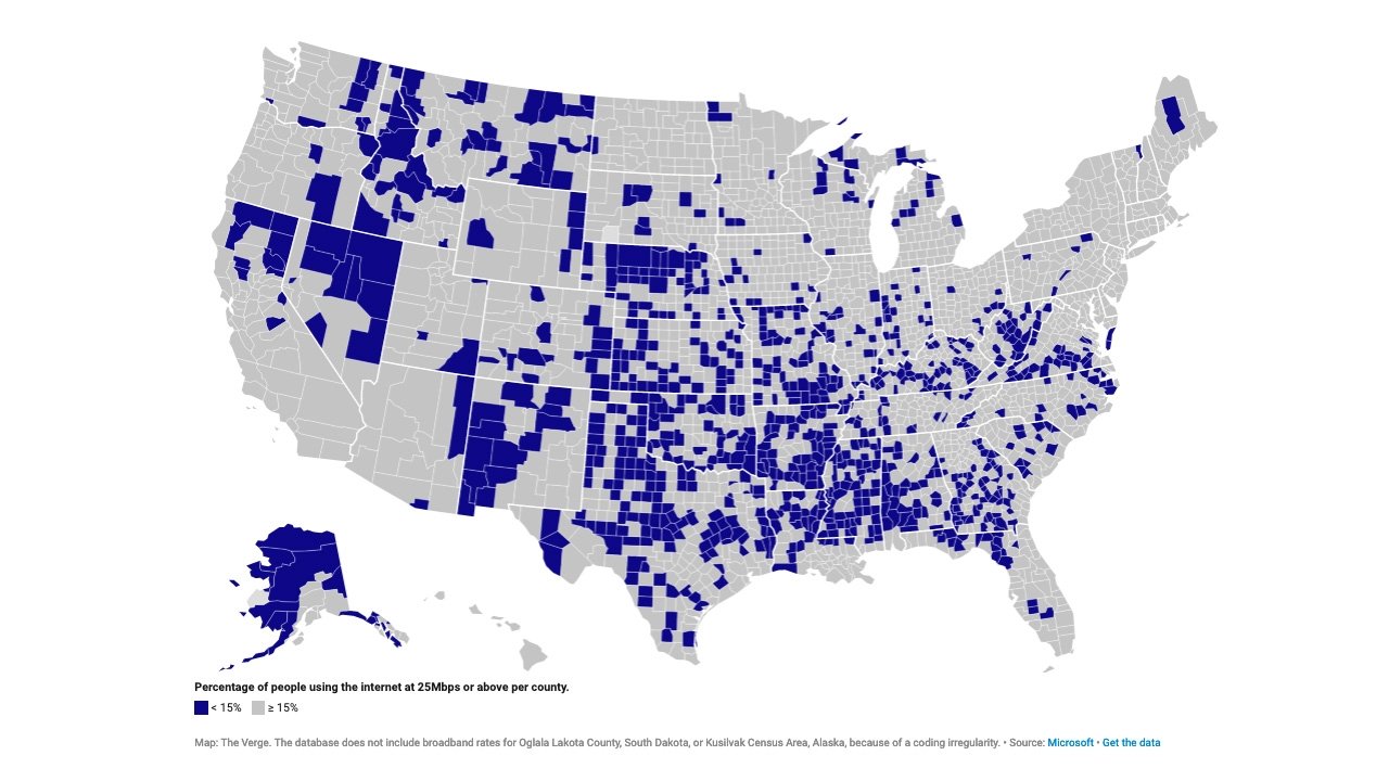
Credit: The Verge
The anonymized data was collected by Microsoft through its cloud services and published over the past 18 months. The Verge used the data to create a map of the U.S. showing where the broadband problem is the worst.
The blue-colored areas are U.S. counties where less than 15% of people are using the internet at a 25Mbps download speed, which is the FCC's definition of high-speed internet.
This data conflicts with the FCC's own broadband maps, which are known to be wildly inaccurate. That's largely because the FCC relies on self-reported data from internet service providers on the areas they serve.
In Lincoln County, Washington, for example, the FCC data says that only 100% of households have broadband internet speeds. The Microsoft data seen by The Verge indicates that the rate is closer to 5%.
Alongside the speed disparities, the Microsoft-based map also shows the severity of the broadband problem in certain states. Most of Alaska is a dead zone, while nine counties in Nevada fall under the 10% threshold. Similar gaps in broadband coverage exist in New Mexico or central Texas.
The data shows broadband usage, which doesn't draw any distinctions between areas where higher speeds aren't available or areas in which the people can't afford faster connections. In Apache County, Arizona, broadband usage clocks in at about 5%. Among the 70,000 that live in the county, about 23,000 are in poverty -- the highest poverty rate in the state.
There are signs of change on the horizon, however. President Joe Biden has proposed investing $100 million in broadband funding as part of his American Jobs Plan. A bipartisan group of U.S. senators earlier in 2021 called upon the FCC to dramatically boost its definition of high-speed internet.
In March, the FCC also announced an initiative to collect broadband speed and access data directly from consumers. That data will be used to create service maps to use as evidence for proposed regulations.
Comments
Also, this is precisely where the SpaceX StarLink is most apt.
This means only people accessing Microsoft cloud services would have been included in this data. Which Microsoft cloud services are used by non-Microsoft client software (Office suite, etc.)? I know Microsoft collects all kinds of data but I have to wonder why they're publishing it and how much they're selling it for.
When you look at the map, I can totally understand the results for the western states. There's nothing but desert in the blue area of Nevada. The northern end of California is mountains on the west and high desert (Mt. Lassen) on the east. This is grazing land for the most part. That swath of Washington state is interesting but it's also not a highly populated area until you get closer to the eastern border. Alaska is a no-brainer. There's almost no towns in most of that state. In most of these internet-limited areas I see the Starlink satellite access as being the most cost-effective way to deliver internet. Installing fiber/coax cables just won't work.
The surprising part is the midwest and south where it should be easier to install landlines but I see this as being a political problem with taxpayers money not being spent on services to enhance internet access.
--What I'd like to see is more cellular access in many of these blue areas because more people drive through these areas than live in them.
-- Fiber
That is the one thing that bothers me about Biden's plan: Yes, it's a problem that government can and must solve if we are to move forward. But how it is done is important.
You seem to be missing the overarching point which is broadband coverage isn't actually what the government says it is because the government is relying on self reporting from ISP's who have continually lied about the state of broadband coverage in the US. Not only have they lied, they've taken tax payer funds to strengthen broadband coverage without actually doing it.
What MS's data shows is only a small part of the disparity between paid for promises and unfulfilled delivery. As long as the telecom lobbying arm pumps inordinate amounts of money into political coffers... ain't nuttin' gon change.
You won't see more cellular access in those blue areas for some of the same reasons the areas are blue. The telecoms don't have to offer coverage because no one is making them do it. Can't say they aren't being incentivized because the government continues to give them money to do it but won't make them actually do it.
Particularly over the past 4 years the FCC, like the FAA, FDA and USDA has been mostly a shill for the industry it is meant to regulate.
“The blue-colored areas are U.S. counties where less than 15% of people are using the internet at a 25Mbps download speed, which is the FCC's definition of high-speed internet.”
The FCC judges by available. Microsoft judges by using. Two very different metrics. I would not expect The Verge’s sophomoric “journalism” to pick up on this.
The FCC doesn't judge by available. The FCC judges by what the ISP's say is available. What the ISP's say isn't reflected in actual deployment. Ars Technica does a great job of covering the debacle of broadband deployment. You should check out some of their coverage. Suffice it to say, Microsoft's data isn't a revelation. We already knew the ISP's were doing a crappy job.
Are you arguing with yourself? The premise of the article is that actual speeds are lower than what the FCC says they are, not that it makes sense to provide faster broadband in rural areas.